Luxe Minimal Vegan Snack Brand Landing Page Template
A luxury, masonry-layout vegan food landing page built for plant-based snack brands that take provenance seriously. This template uses a Japanese Zen color system, cinematic macro photography, and an ingredient-origin story structure to carry visitors from first scroll to event registration. Every design choice earns trust before the call to action ever appears.
by Rocket studio
Quick summary
This landing page template is built for premium vegan snack brands that lead with story, not a sales pitch. The masonry grid layout and Japanese Zen color system create a calm, editorial feel. A floating registration bar and minimal modal form drive event sign-ups without interrupting the visual narrative. The design makes healthy snacks feel as considered as fine cuisine.
Who this template is for
This template is made for people who have decided that their vegan snack brand deserves more than a generic product page. It works equally well for direct-to-consumer founders and business-to-business brand pitches.
- Founders and brand teams launching or refreshing a premium plant-based snack line who want a landing page that communicates depth and quality at a glance.
- Yoga studio owners and specialty grocery buyers who found that a standard brochure site does not do justice to artisan snacks they want to store and sell.
- Wellness-focused creative directors and freelance designers who need a polished, ready-to-customize vegan food landing page template to update for a client project.
What problem this template solves
Many vegan food landing pages look the same. They use bright green stock imagery, bold discount banners, and paragraph after paragraph of health claims. Health-conscious people who read ingredient lists carefully and research where their food comes from are tired of that approach. They want landing pages that feel as intentional as the snacks themselves.
- There is no built-in way in most page builders to tell an ingredient origin story through a masonry grid that gives each provenance chapter its own visual weight.
- Generic landing page templates lack the design depth to support macro close-up hero photography, scroll-triggered card animations, and a floating registration bar as one cohesive experience.
- Brands targeting specialty grocers and wellness professionals need a landing page that communicates premium positioning without needing a full e-commerce site rebuild.
What you get with this template
You get a complete, single-page layout that moves visitors through a sensory brand story before asking anything of them. The template is structured so the design does the storytelling and the registration bar closes the loop.
- A full masonry origin grid section with varied-height cards for provenance photography, farmer portraits, and process imagery, all designed to scroll like turning pages in a linen-bound cookbook.
- A floating call-to-action bar with a minimal modal form collecting first name, email, preferred city, and one optional dietary notes field, purpose-built for tasting event registration.
- A complete Japanese Zen design system with four defined palette colors, two-typeface typographic pairing, hover states, and active call-to-action styling built into every component.
Feature list
This template is built around a set of purposeful features. Each one was decided upon to serve the specific needs of a luxury vegan snack brand landing page.
Macro Close-Up Hero Section
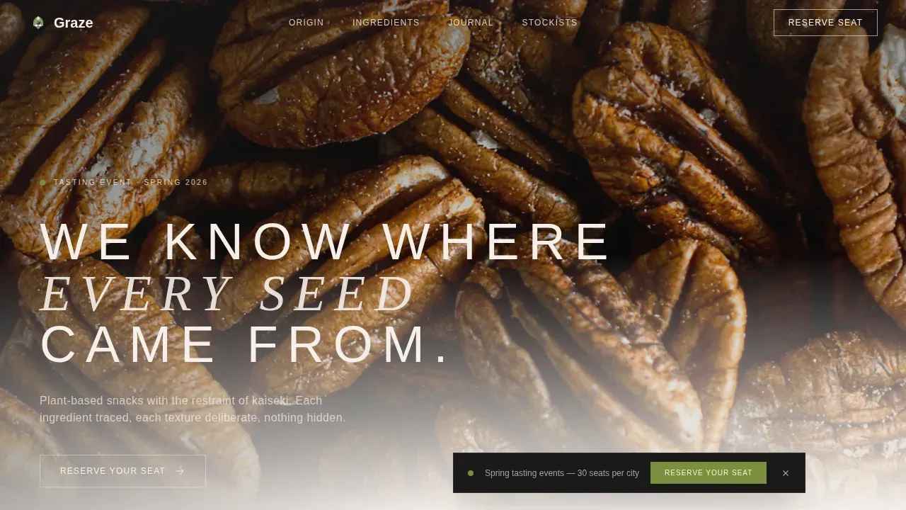
The hero section is structured around a single extreme close-up photograph. The layout places a tracked-out uppercase headline over the image with typographic weight calibrated for lacquer black on a warm, creamy background. A floating event badge sits in the corner, giving people an immediate signal that something is happening before they scroll. High-resolution images that showcase a product's texture can evoke a mouth-watering response, and this hero is built to deliver exactly that.
Pinterest-Style Masonry Origin Grid
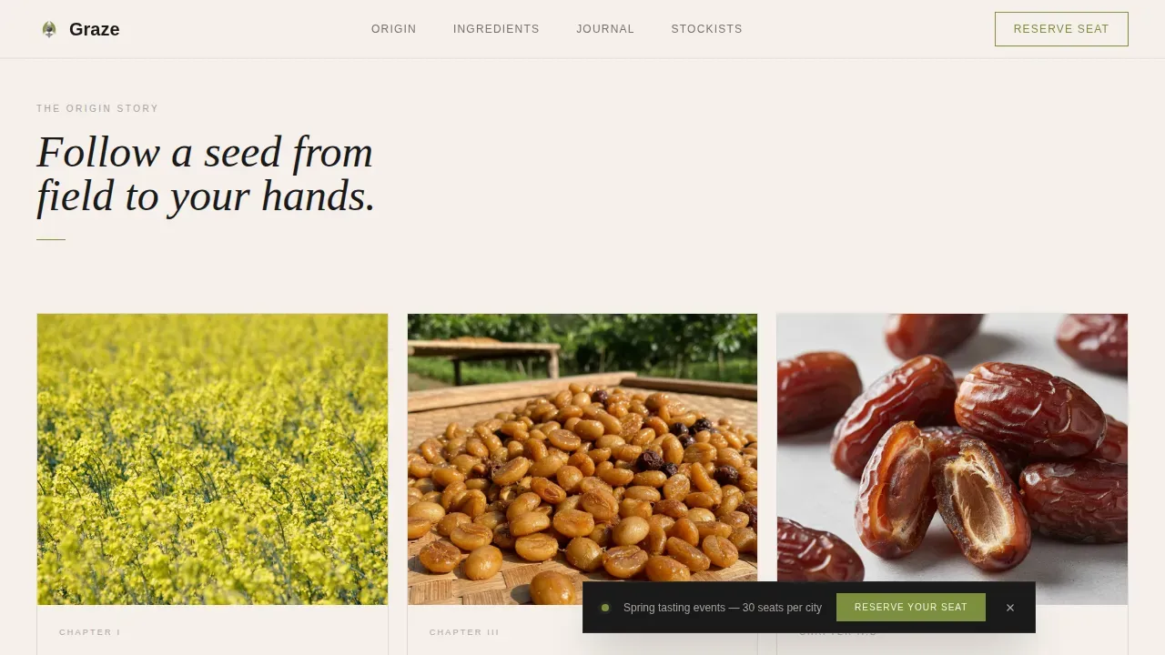
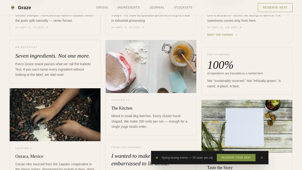
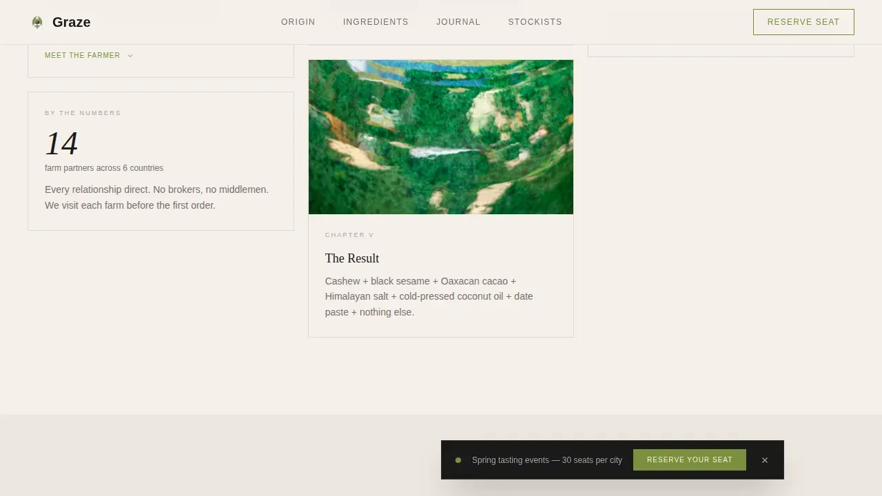
The masonry grid is the narrative engine of this landing page template. Cards vary in height and hold different content types: provenance photographs of sesame fields and cacao hands, single-sentence captions, and expandable farmer portrait panels. The staggered entrance animation, triggered by scroll depth, gives the grid the feeling of a living editorial spread rather than a product catalog. This section makes healthy snacks feel like chapters in a story.
Ingredient Journey Alternating Sections
Below the masonry grid, full-width alternating image-and-text sections carry the sensory storytelling forward. Each pairing moves from raw ingredient to kitchen process to finished snack styled on handmade ceramic. The rhythm builds naturally, so visitors feel they have experienced the entire recipe of a product before they ever see a price or a form. Typography balances boldness and approachability through a mix of Fraunces display serif for headlines and DM Sans for body text.
Farmer Portraits and Trust Signal Section
An asymmetric split layout holds farmer portraits alongside credibility numbers and sourcing details. Illustrations of hands holding snacks and provenance photography work together to make the brand's claims visible rather than stated. Packaging that emphasizes taste and tactility with product photography and illustrations of hands holding snacks is one of the strongest signals a vegan snack brand can send to health-conscious people. This section is built to deliver that signal clearly.
Floating Event Registration Bar and Modal Form
After the third scroll, a gentle floating bar appears at the bottom of the landing page. The bar carries the primary call to action in matcha dust on lacquer black. Clicking it opens a minimal modal form with four fields. The form design keeps the experience focused, allowing the visitor to commit to attending without leaving the page or losing the visual context they just moved through.
Japanese Zen Color and Typography System
Every color, typeface, spacing decision, and hover state in this template is part of one cohesive design system. The palette uses ceramic white for backgrounds, dry stone gray for borders, matcha dust for active states, and lacquer black for all primary typography. A cohesive design approach in packaging can improve brand visibility and consumer engagement for vegan snacks, and that same principle applies here at the landing page level. The logo placement, masthead design, and typographic hierarchy are all part of a system built to stay consistent across every section.
Page sections overview
| Section | Purpose |
|---|---|
| Hero Macro Header | Opens with extreme close-up product photography and a tracked headline to establish brand tone immediately |
| Masonry Origin Grid | Tells the ingredient provenance story through varied-height cards with photos, captions, and expandable farmer portraits |
| Ingredient Journey Rows | Alternating full-width image and text panels that move from raw ingredient to finished snack |
| Farmer Portraits Stats | Asymmetric split layout combining human faces, sourcing numbers, and trust-building copy |
| Event Registration Area | Floating call-to-action bar plus minimal modal form for tasting event sign-ups |
| Footer Pattern | Horizontal footer with dot separators for brand links and supporting information |
Design & branding system
The design system in this template is built on the principle that luxury digital experiences are characterized by simplicity and deliberate interactions. Every visual decision serves the brand story without adding noise. The color palette for a vegan snack brand landing page should be muted or neutral, and this template follows that principle precisely. Generous white space is used throughout the design to prevent visual overload, keeping the focus on product photography and editorial copy. The logo position and masthead design create a cohesive entry point that enhances retail visibility for both direct-to-consumer and business-to-business brand presentations.
- Palette: ceramic white (#F5F0EB) for all backgrounds, dry stone gray (#A8A29E) for card borders, matcha dust (#7B8F3C) for hover states and active call-to-action elements, and lacquer black (#1A1A1A) for all headlines and dividing lines.
- Typography: Fraunces display serif for all headlines and Fraunces-driven display moments, with DM Sans for all body copy, captions, and form labels, creating a mix of functional and expressive typefaces.
- Visual language: the updated color palette is vibrant yet natural, conveying positivity and modernity while staying grounded in the warm, linen-bound aesthetic of a Kyoto tearoom at dawn.
Mobile & speed optimization
The template is built desktop-first, with a careful mobile masonry collapse built into the layout. On smaller screens, the masonry grid reflows into a single-column stack without losing the card-height variety that makes the origin story feel editorial. The floating registration bar remains accessible on mobile, keeping the primary call to action reachable at all times. Page load speed targets under three seconds for optimal user experience and conversion rates, and the template structure supports that goal through Next.js Image optimization and native CSS scroll behavior.
- The masonry grid collapses cleanly on mobile, with card expand interactions preserved for farmer portrait panels on touch devices.
- Scroll-triggered animations use Intersection Observer so they run only when sections enter the viewport, avoiding unnecessary rendering work.
- The modal form is designed for one-thumb usability on mobile, with large touch targets and a minimal four-field structure.
How this template helps you convert
A landing page for a vegan snack brand should focus on a single, clear call to action. This template earns that click by building genuine appreciation before asking for anything. The headline is benefit-driven and short. The story does the persuasion. The registration bar arrives only after the visitor has moved through enough of the narrative to feel invited rather than sold to.
- The macro hero and masonry grid create an immersive first impression that communicates brand quality and ingredient transparency before any copy makes a claim, so visitors arrive at the registration bar already engaged.
- The floating call-to-action bar appears after the third scroll, timed to coincide with the moment a visitor has absorbed enough of the story to feel motivated, and the minimal form keeps the commitment feel low so more people complete it.
Other information about this template
This template is one of the most contextually specific vegan food landing page designs available in this category. It was built for people who have decided that a generic page builder template cannot carry the weight of a premium snack brand story. Several additional details are worth knowing before you use it.
- The design is intentionally similar in spirit to a flapjack recipe card approach: a flapjack is a simple bar made with a handful of honest ingredients, cooled on parchment paper and sliced with confidence. This template applies that same philosophy to design: a clear recipe of sections, no filler, nothing hidden. Flapjacks are a quintessential teatime treat, and like that classic bar, this template is simple, rich, and not excessively ornate. The base recipe holds because every element earns its place.
- The graze luxe minimal vegan snack brand landing page template is the only design in this collection that pairs a masonry origin grid with a floating event registration bar and a Japanese Zen color system in a single landing page build.
- The template supports a video embed slot in the ingredient journey section, allowing brands to drop in a short origin film or a process clip without restructuring the layout.
- Using stock images is a valid starting point during early brand development. This template is structured so stock photography can be swapped for original macro product shots as they become available, without layout changes.
- Typography in this template balances boldness and approachability by pairing a serif display face with a clean sans-serif body font, a mix that works for tasty snack brands that want to feel editorial without feeling precious.
- The brand's logo, positioning, and overall visual identity can be updated directly within the design system. The color tokens and type scale are built so a logo update flows through every section consistently.
- Health-conscious people, including children accompanying parents to specialty food markets and yoga studio lobbies, respond well to design that communicates clean ingredients visually. This template communicates that story through photography and layout rather than claims alone.
- The page is also practical for wholesale pitches. A specialty grocer deciding whether to bring a snack line into their store can be sent this landing page as a brand deck replacement.
- Illustrations of hands holding snacks or close-up bowl shots of mixed ingredients can be placed in the masonry cards with no layout modification.
- The color system is described as vibrant yet natural, anchored by an evolved approach to green that the team named matcha dust to convey both modernity and deep appreciation for origin.
- Messaging that emphasizes healthy benefits and ingredient transparency can resonate well with people who prioritize nutrition, and this template is structured to lead with that story at every section.
- A sale event, a seasonal launch, or a pop-up tasting in a new city can be promoted through this same landing page by updating the event badge and the city dropdown in the modal form.
- The page structure also works as a lookbook or a pitch tool for brands creating new snack lines, including crisp and chip-style formats, cookie varieties, or energy bar products, because the masonry grid accommodates any ingredient-origin story.
Theme
Luxe Minimal
Creative direction
Origin Story
Color system
Japanese Zen
Style
Masonry/Pinterest
Direction
Event Registration
Page Sections
Macro Close-up Cinematic Hero
Pinterest Masonry Origin Grid
Ingredient Journey Alternating Layout
Farmer Portraits and Trust Section
Floating Registration Bar and Modal
Japanese Zen Design System
Related questions
Can I use this template for a snack brand that sells chips or cookie products, not just nut clusters?
Do I need original photography to launch this landing page?
Is the event registration form limited to tasting events?
How does the floating bar behave on mobile screens?
Can a specialty grocer or yoga studio owner use this page as a wholesale pitch tool?



