Lineworker (Power Line) Business Specialist Reviews Website Template
Gridline is an editorial landing page template built for lineworker portfolio and gallery presentations. It pairs a full-viewport manifesto header with a scrolling testimonial mosaic, educational sidebars, and a two-path conversion flow. The Monochrome Steel palette and magazine-spread rhythm make every section feel as grounded and earned as the work it documents.
by Rocket studio
Quick summary
Gridline is a single-page editorial template designed for lineworker professionals who want to present their craft with the weight it deserves. The layout combines a quote-driven header, a scrolling testimonial mosaic, and technical field-guide sidebars into one cohesive narrative. Two clear conversion paths guide visitors toward a full portfolio or a downloadable resource.
Who this template is for
This template is built for skilled tradespeople in the power line industry who need a serious, credible online presence. It speaks the visual language of the trade and earns trust before asking for a click.
- Journeyman and apprentice lineworkers building a professional portfolio
- Utility crew leads and foremen showcasing storm restoration and high-voltage work
- Independent line contractors looking to attract utility HR managers and hiring teams
What problem this template solves
Most portfolio templates are built for designers or photographers. They feel lightweight next to the scale and stakes of power line work. Gridline solves that mismatch directly.
- Generic portfolio layouts fail to communicate the technical depth of linework to industry hiring managers
- A plain photo grid does not explain what is shown, leaving apprentices and non-specialists without context
- Standard call-to-action patterns push too early and lose visitors who need to build trust first
What you get with this template
You get a fully structured, single-page editorial layout that doubles as both a portfolio and a field reference. Every section is intentional and matched to the real expectations of the linework industry.
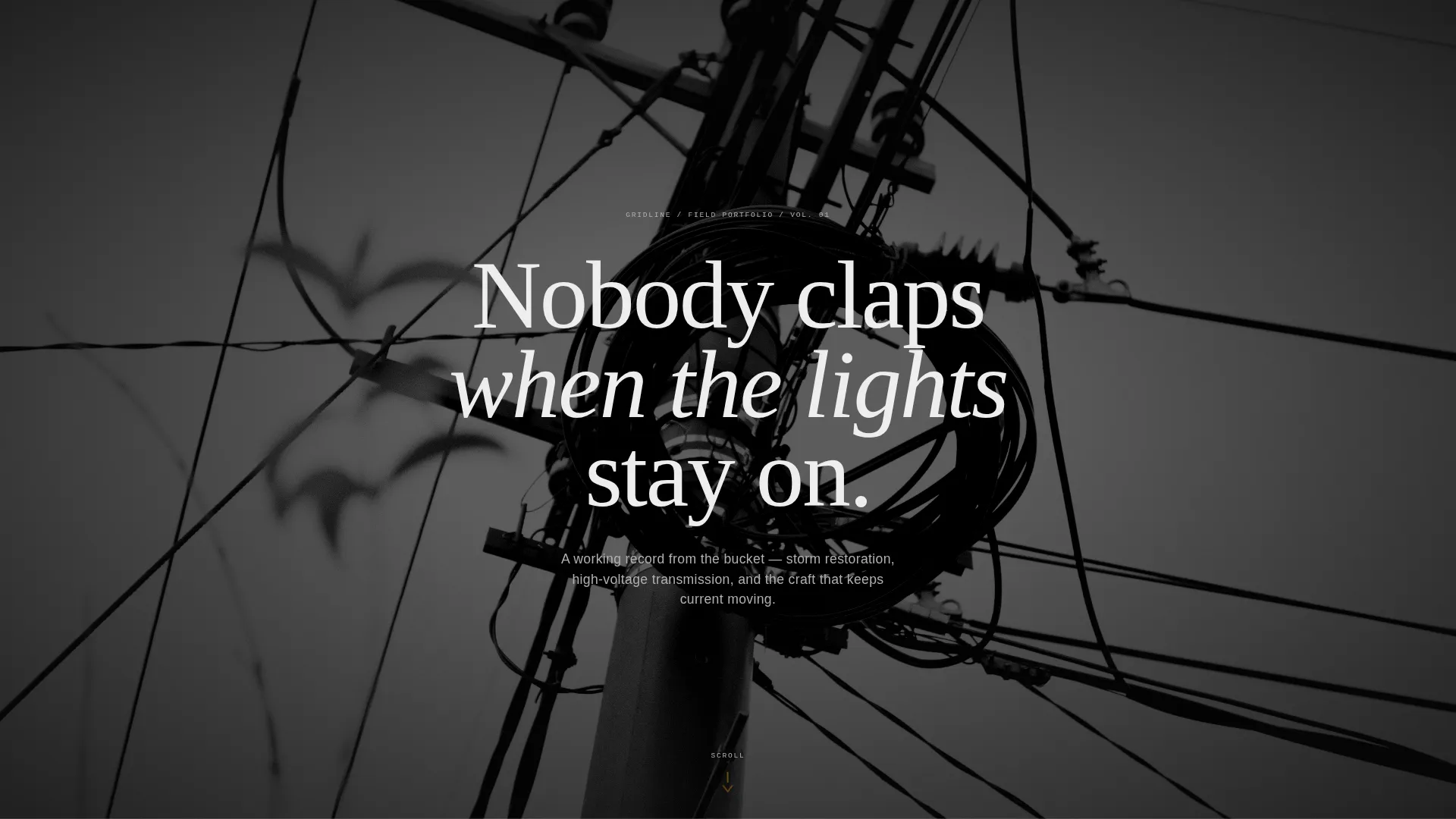
- A full-viewport manifesto header with a grainy, atmospheric photograph and knockout typography
- A scrolling testimonial mosaic with variable grid spreads, pull-quotes, and educational sidebars
- A two-path conversion system with a primary portfolio link and a secondary lead-capture download offer
Feature list
This template delivers a tight set of purpose-built components, each chosen to serve the portfolio and gallery use case for power line professionals.
Full-Viewport Quote Header
The opening section fills the entire screen with a single bold statement set in white knockout text over a desaturated, grain-heavy photograph. No navigation, no logo. Just the words and the weather. The amber scroll indicator at the bottom edge invites the visitor forward without interrupting the mood.
Variable-Grid Testimonial Mosaic
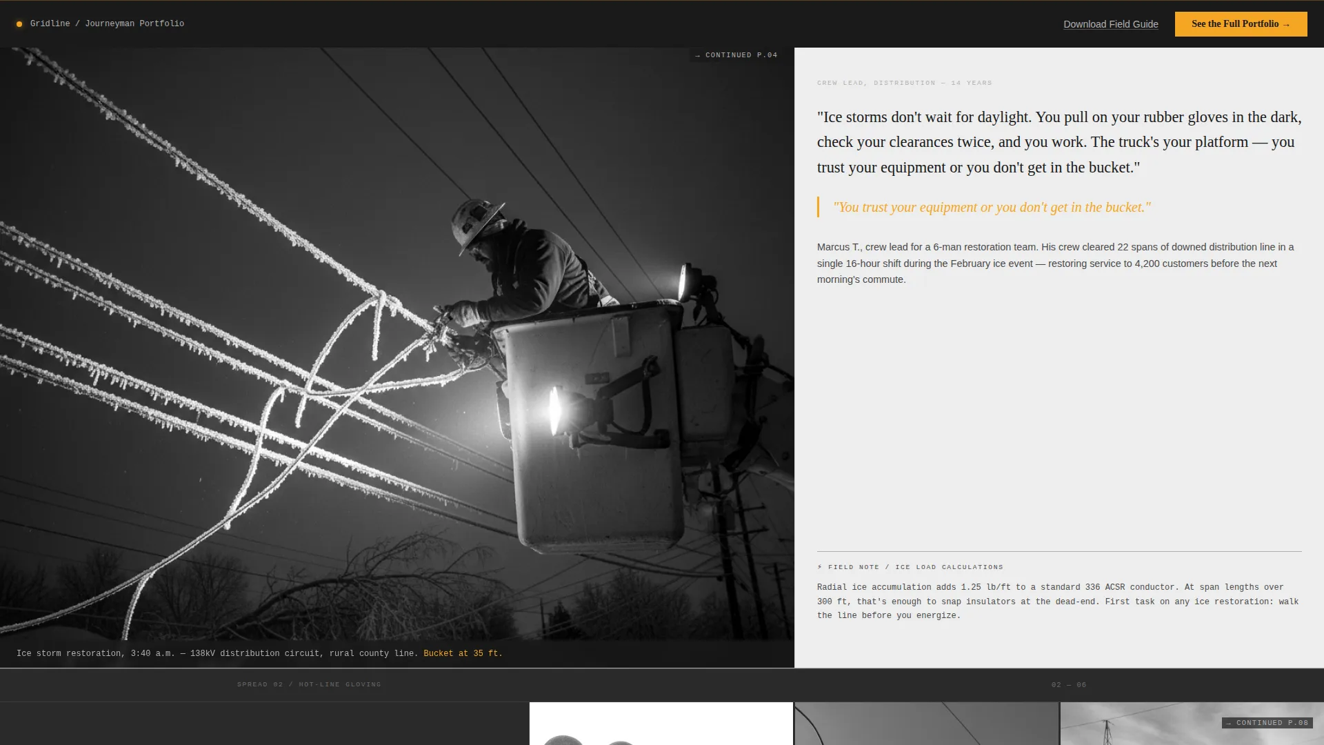
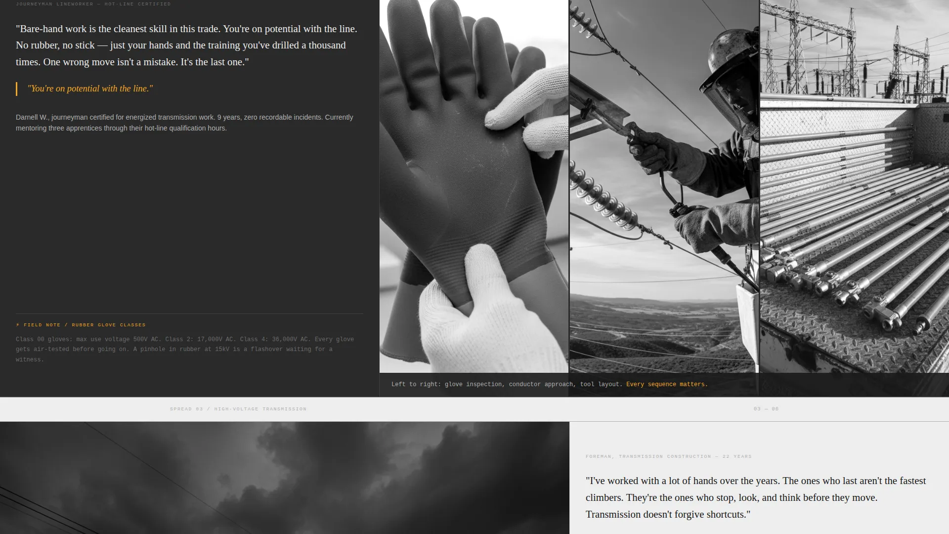
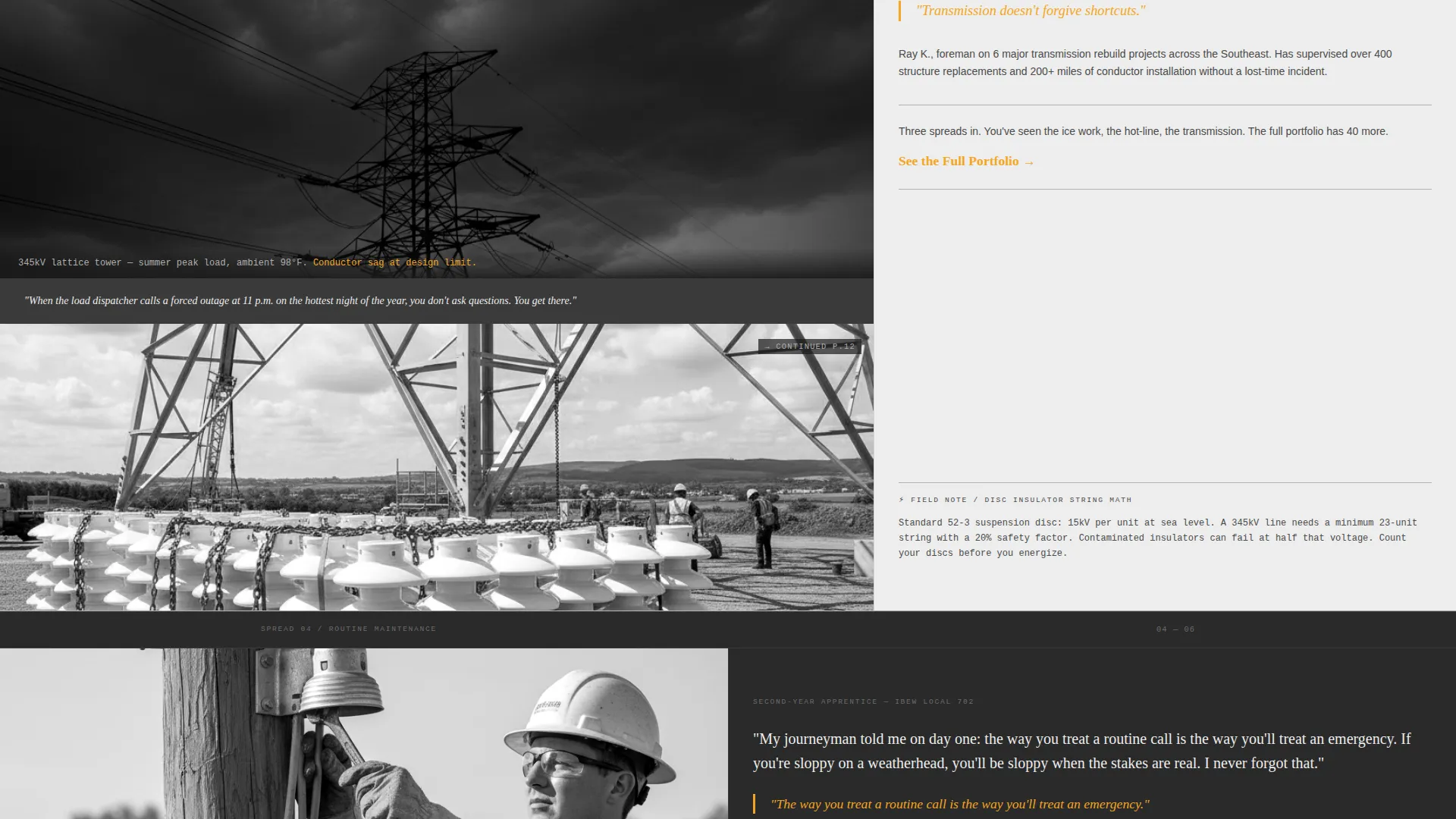
The core scrolling section uses a mosaic of editorial spreads rather than a uniform grid. Layouts shift between 60/40 splits, stacked vertical arrangements with caption bars, and three-image contact sheets. Each spread pairs a full-bleed job photograph with a first-person testimonial typeset in editorial serif, keeping the reading experience feel like a field manual rather than a slide deck.
Educational Field-Guide Sidebars
Every spread includes a steel-gray sidebar explaining the technique or equipment visible in the photograph. These callouts turn the portfolio into a practical educational resource, adding credibility for hiring managers and genuine value for apprentices studying for their journeyman card.
Escalating Narrative Structure
The mosaic is sequenced deliberately. Spreads progress from routine maintenance tasks through hot-line gloving and storm restoration up to high-voltage transmission work. The escalation shows range and depth, letting a visitor feel the full scope of skill before reaching the conversion point.
Dual Conversion Path System
The primary call to action, "See the Full Portfolio," appears first as an amber text link beneath the third testimonial spread. It then returns as a fixed bottom bar after six spreads, earned by accumulated proof of craft. A secondary path, "Download the Field Guide," captures email leads from visitors who want to study but are not yet ready to hire.
Monochrome Steel Visual System
The entire template runs on a four-value palette: transformer gray, galvanized silver, crossarm white, and arc-flash amber. Amber is reserved strictly for interactive highlights, pull-quotes, and hover states. Alternating backgrounds between deep gray and crossarm white create the magazine-spread rhythm that makes long scrolling feel structured rather than monotonous.
Page sections overview
| Section | Purpose |
|---|---|
| Manifesto Header | Opens with a bold full-viewport quote over an atmospheric photograph |
| Amber Scroll Indicator | Pulses at the bottom edge to guide the visitor below the fold |
| Spread One | Introduces routine maintenance work with a testimonial and sidebar |
| Spread Two | Escalates to hot-line gloving with a crew-member first-person account |
| Spread Three | Features storm restoration imagery with the first primary call to action appearance |
| Spreads Four to Six | Continue the escalating narrative through to high-voltage transmission |
| Fixed Bottom Bar | Reintroduces the primary call to action after six spreads have built trust |
| Field Guide Capture | Offers a downloadable PDF in exchange for an email address |
Design & branding system
The template uses a Monochrome Steel color system that references the physical materials of power line infrastructure. The result is a palette that feels authoritative and trade-specific without relying on color for decoration.
- Four-value palette: transformer gray (#4A4A4A), galvanized silver (#B0B0B0), crossarm white (#EDEDED), and arc-flash amber (#F5A623) for interactive and accent elements only
- Alternating section backgrounds between deep transformer gray and crossarm white produce a magazine-spread rhythm that keeps long pages readable
- Galvanized silver ruling lines separate editorial columns the way gutters do in print layouts, reinforcing the field-manual aesthetic
Mobile & speed optimization
The editorial magazine structure translates to smaller screens through deliberate layout choices. Variable grid spreads adapt their proportions so the mosaic reads clearly without horizontal scrolling.
- Stacked vertical spread variants handle narrow viewports naturally, keeping photographs and testimonials readable at any screen width
- The fixed bottom bar conversion element stays visible on mobile without obscuring page content
- Grainy, desaturated photography keeps the visual weight intentional rather than a technical liability on smaller displays
How this template helps you convert
Gridline is structured as a click-through landing page, meaning every design and copy decision builds toward a single earned action. The conversion approach is patience-first: prove craft repeatedly before asking for anything.
- The escalating mosaic sequence withholds just enough detail in each spread, using cropped edges and "continued" markers to make the full gallery feel genuinely irresistible by the time the primary call to action appears.
- The fixed bottom bar only appears after the visitor has scrolled past six spreads, so the click request arrives at the moment of maximum trust rather than interrupting early curiosity.
- The secondary lead-capture path gives visitors who are not ready to hire a meaningful reason to share their email, turning passive browsers into warm future prospects.
Other information about this template
Gridline is designed specifically for the lineworker portfolio and gallery niche within the broader professional services category. A few additional details are worth noting for anyone evaluating the template.
- The template style is Editorial and Magazine, suited to tradespeople who want their work presented with the same seriousness as print journalism
- The theme is Educational Guide, making it equally useful as a learning resource and a hiring portfolio
- The header concept is Quote and Manifesto, a format that prioritizes earned credibility over brand identity
- The creative direction is Testimonial Mosaic, meaning social proof is the primary narrative engine rather than a supplementary section
- The landing page direction is Click-Through, focused on moving visitors to a full gallery or contact form on the next page
Theme
Educational Guide
Creative direction
Testimonial Mosaic
Color system
Monochrome Steel
Style
Editorial/Magazine
Direction
Click-Through
Page Sections
Full-viewport Quote Header
Variable-grid Testimonial Mosaic
Educational Field-guide Sidebars
Escalating Narrative Sequence
Dual Conversion Path System
Monochrome Steel Color System
Related questions
Who is this template designed for?
Can I use this template to capture leads, not just link to a portfolio?
How does the testimonial mosaic section work?
Is this a single-page template or a multi-page website?
Can the color palette be adjusted to match a personal or company brand?



