Smart Parking Landing Page Template
Gridlock is a full-width immersive landing page template built for smart parking platforms. It opens with an interactive isometric configurator that adapts to four facility types in real time. A structured comparison flow, a progressive multi-step form, and a steel-toned visual identity make this template ideal for B2B parking technology companies targeting serious infrastructure buyers.
by Rocket studio
Quick summary
Gridlock is a full-width immersive landing page template for intelligent parking platforms. It leads with an interactive facility configurator, flows through a layer-by-layer comparison structure, and closes with a progressive conversion form. The Corporate Precision design system uses a Monochrome Steel palette to communicate technical authority from the first scroll.
Who this template is for
This template is built for companies selling smart parking technology to serious infrastructure operators. It speaks directly to buyers who manage real facilities and need to justify investment with hard data.
- Municipal transport authorities managing downtown parking structures
- Commercial real estate operators dealing with tenant parking complaints
- Hospital facility directors whose visitors lose time circling lots
- Airport operators balancing short-term turnover with long-term revenue
What problem this template solves
Generic software landing pages fail parking technology buyers. These buyers need to see the system working, understand the cost-per-bay impact, and move through a decision process at their own pace. Gridlock is designed around exactly that buying journey.
- Visitors cannot visualize how a smart parking system fits their specific facility type
- Static comparison tables do not convey the operational gap between legacy lots and sensor-driven management
- Generic contact forms create friction before buyers are ready to commit
What you get with this template
You get a single-page layout that puts the product in motion before the visitor reads a headline. Every section is built around a distinct persuasion layer, from live system simulation to detailed operational comparisons.
- An interactive isometric configurator in the header that responds to facility type selection
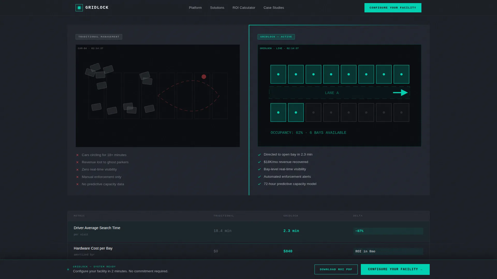
- A scroll-driven comparison structure spanning five operational dimensions
- A three-step progressive conversion form and a secondary email-gated PDF download path
Feature list
This template is built around six tightly scoped components, each serving a clear role in the buyer journey.
Interactive Facility Configurator
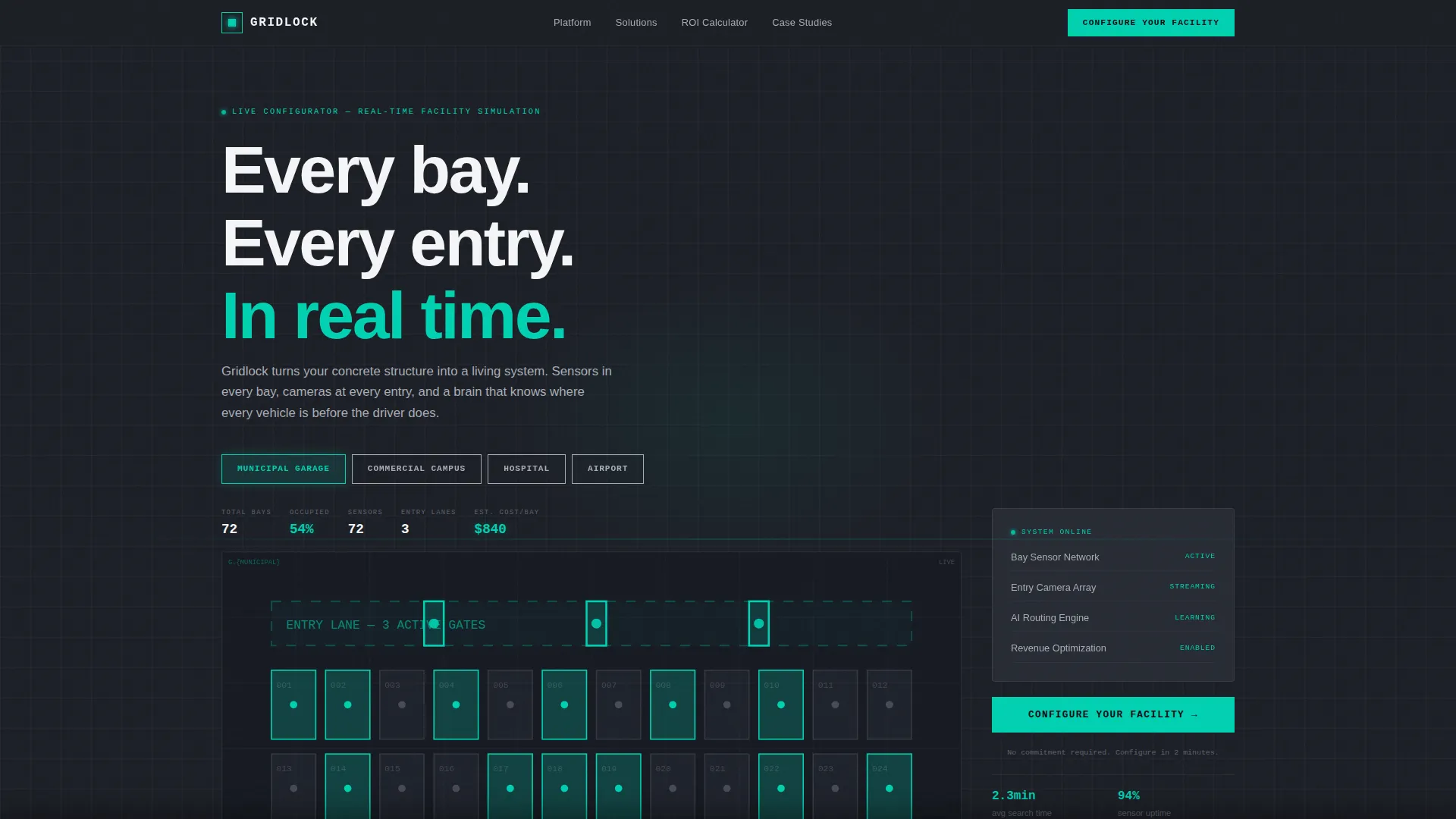
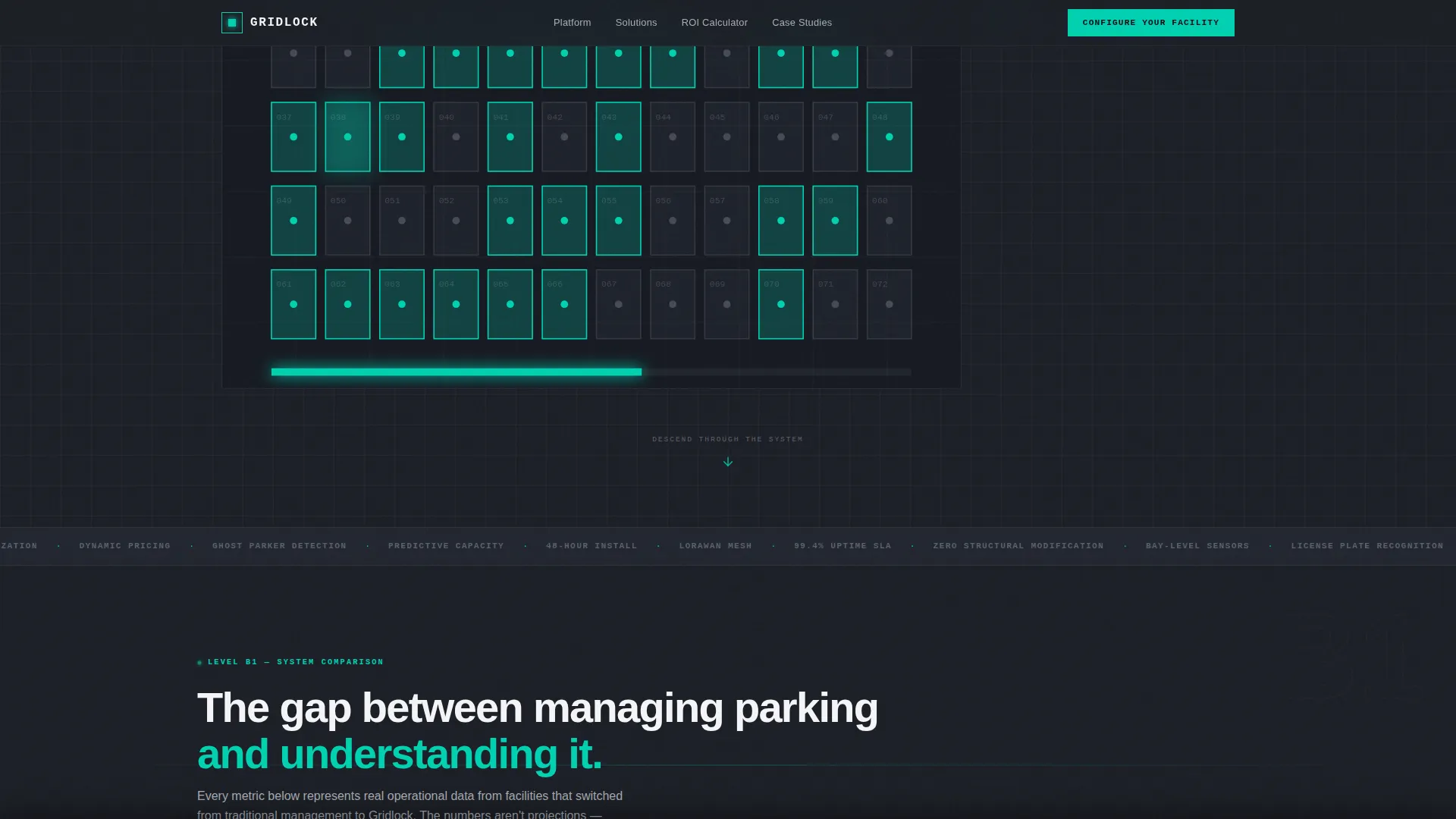
The header is a top-down isometric blueprint of a parking structure rendered in clean vector lines. Visitors select from four facility types using a horizontal toggle, and the blueprint updates in real time. Bay counts shift, entry lanes reconfigure, sensor placements redraw, and a live cost-per-bay estimate appears. The product is working before the visitor has scrolled once.
Scroll-Driven Comparison Sections
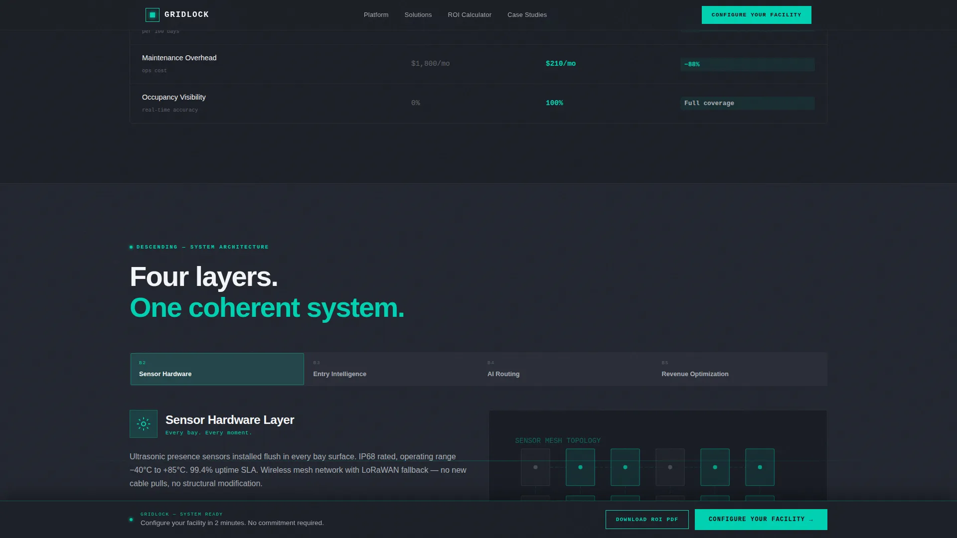
Each scroll section presents a split environment. The left side shows a grainy security-camera view of a traditional lot with circling cars and visible bottlenecks. The right side shows the same lot reimagined through an intelligent system, complete with sensor overlays and real-time occupancy data. Five comparison dimensions are covered: hardware cost per bay, time to install, driver average search time, revenue recaptured from ghost parkers, and maintenance overhead.
Three-Step Progressive Conversion Form
The primary call to action, "Configure Your Facility," expands into a three-step form. Step one captures facility type and total bay count. Step two presents a visual card selector for the visitor's primary pain point. Step three collects name, email, and preferred demo format. The form is designed to feel like a natural continuation of the configurator, not a cold request.
Sticky Bottom Bar with call to action
After the third comparison section, a sticky bottom bar surfaces and keeps the primary call to action visible without interrupting the reading flow. It reappears at the right moment in the buyer's scroll journey and stays available through the remainder of the page.
Secondary PDF Download Path
A "Download the ROI Comparison PDF" conversion path sits at the midpoint of the page. It is gated behind email only, making it a low-friction option for visitors still in the research phase. This path captures leads who are not yet ready to schedule a demo but are clearly evaluating options.
Monochrome Steel Design System
The visual identity uses structural charcoal as the primary background, brushed aluminum for dividers and secondary surfaces, and signal white for text and data overlays. A single electric teal accent is reserved for live data points, active states, and call-to-action elements. The result is a precise, engineered visual language with no decorative warmth.
Page sections overview
| Section | Purpose |
|---|---|
| Header Configurator | Lets visitors simulate their own facility in real time |
| Facility Type Toggle | Switches blueprint layout across four operator profiles |
| Cost Per Bay | Compares hardware investment between legacy and smart systems |
| Install Time Comparison | Shows time-to-deploy difference side by side |
| Driver Search Time | Quantifies time lost in traditional versus managed lots |
| Ghost Parker Revenue | Highlights recoverable revenue from untracked occupancy |
| Maintenance Overhead | Contrasts ongoing operational burden across both approaches |
| Midpage PDF Offer | Captures research-phase leads with email-gated download |
| Sticky call to action Bar | Keeps primary conversion action visible after scroll depth |
| Progressive Demo Form | Guides buyers through a three-step qualification sequence |
Design & branding system
The Monochrome Steel palette is engineered to feel like a control room, not a marketing brochure. Every color choice reinforces operational authority and system precision.
- Structural charcoal (#1C1F26) as the primary background, brushed aluminum (#A8ADB5) for dividers, and signal white (#F4F5F7) for all body text and data overlays
- Electric teal (#00D1B2) used exclusively for live data indicators, active interface states, and all call-to-action elements
- No stock photography anywhere on the page; the isometric blueprint and split-environment comparisons carry the full visual weight
Mobile & speed optimization
The full-width immersive layout is structured to translate cleanly across screen sizes. The configurator's isometric blueprint and the split comparison sections are designed with responsive proportions in mind.
- The horizontal facility type toggle and split comparison environments are built for clear rendering on smaller viewports
- The sticky bottom bar and progressive form steps are sized and spaced for easy interaction on touch screens
How this template helps you convert
Gridlock earns the conversion before the form appears. By the time a visitor reaches the call to action, they have already interacted with a working simulation of the product.
- The configurator turns passive browsing into active product engagement, so visitors arrive at the form already invested in their own facility scenario.
- The five-layer comparison structure builds evidence progressively, giving buyers the operational justification they need before committing to a demo request.
- Two conversion paths, a full demo form and a low-friction PDF download, serve visitors at different stages of their decision process without forcing a single choice.
Other information about this template
Gridlock is categorized under Automotive and Transport, with a specific focus on the Parking and Traffic subcategory and the smart parking solution niche. The template style is Full-Width Immersive and the layout direction is Comparison/Versus, making it well suited for competitive positioning in a market where differentiation relies on operational data rather than brand recognition alone.
- The Creative Direction is Spatial and Architectural, meaning the scroll experience mirrors descending through physical levels of a parking structure
- The Header Concept is a Configurator, a deliberate choice to put the platform's core capability front and center before any marketing copy
- The theme is Corporate Precision, which informs every spacing, type, and color decision across the page
Theme
Corporate Precision
Creative direction
Spatial & Architectural
Color system
Monochrome Steel
Style
Full-Width Immersive
Direction
Comparison/Versus
Page Sections
Interactive Isometric Configurator
Scroll-driven Split Comparisons
Three-step Progressive Form
Sticky Call to Action Bottom Bar
Email-gated PDF Download
Monochrome Steel Visual System
Related questions
What facility types does the header configurator support?
How does the comparison section present its data?
What are the two conversion paths included in this template?
Is this template suitable for a single facility type operator?
Who is this landing page template built for?