24-Hour Access Gym Open House Event Landing Page Template
Grind is a 24-hour access gym landing page built for event registration. It uses a modular card grid layout, a forest-toned soft gradient palette, and a full-bleed header photo to draw visitors into a free open-house weekend. A step-by-step guide format walks prospects through time slots, coaches, equipment zones, and sample classes before asking them to commit.
by Rocket studio
Quick summary
Grind is a single-page event registration template designed for a 24-hour access gym. It combines a calming Forest Trust color system with a modular card grid that guides visitors step by step through an open-house weekend. The goal is simple: answer every objection before the visitor reaches the sign-up form.
Who this template is for
This template fits gym owners and fitness operators who want a low-friction way to fill seats at a free open-house event. It speaks directly to people who train outside normal hours and need reassurance that showing up will feel comfortable.
- Owners of 24-hour access gyms running a first-look or trial event
- Fitness center operators targeting shift workers, new parents, or irregular-schedule members
- Gym marketers who need a clean registration page ready to publish quickly
What problem this template solves
Most gym landing pages ask visitors to commit before earning their trust. Grind flips that order. It uses a visual step-by-step guide to remove the fear of walking in cold, answering the four biggest objections before the form appears.
- Visitors do not know when to show up or who they will meet
- A cluttered or aggressive design signals the wrong kind of energy for a welcoming gym
- Generic forms with too many fields push hesitant prospects away
What you get with this template
You get a fully structured single-page layout built around event registration for a free open-house weekend. Every section has a clear job, and the visual hierarchy guides the visitor from curiosity to commitment without confusion.
- A full-bleed header with a headline overlay and a primary call-to-action button
- A four-card modular grid covering time slots, coach introductions, equipment zones, and a sample class schedule
- A three-field registration form and a secondary email-capture path for day-pass interest
Feature list
This template is built around a focused set of components that serve one purpose: turning a curious visitor into a confirmed open-house attendee.
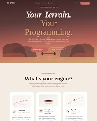
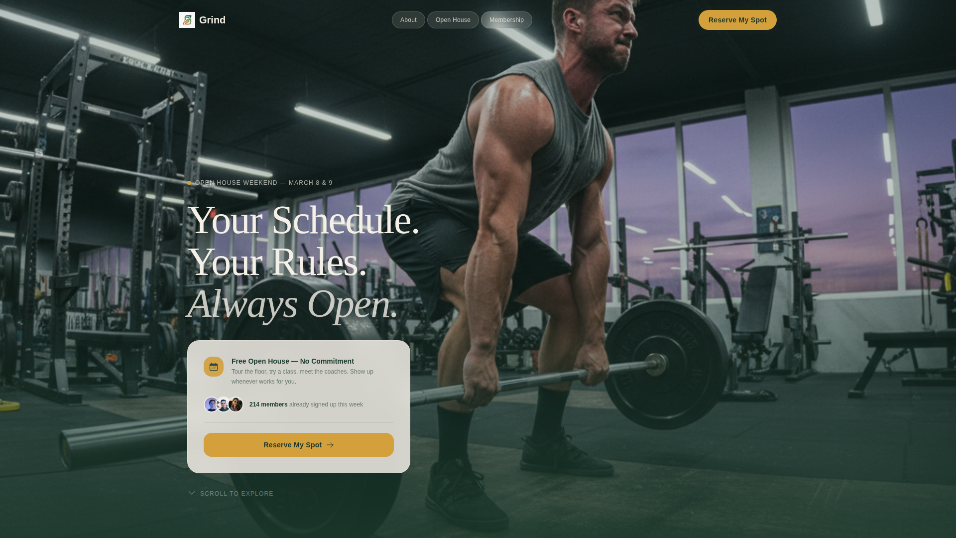
Full-Bleed Header with Headline Overlay
The header fills the screen with a gym-floor photo taken at 5:30 AM. One member is mid-deadlift under soft LED lighting, with a purpling sky visible through a wall of windows. A fade-in headline sits over the lower third of the image, and the primary "Reserve My Spot" button appears here in amber on evergreen.
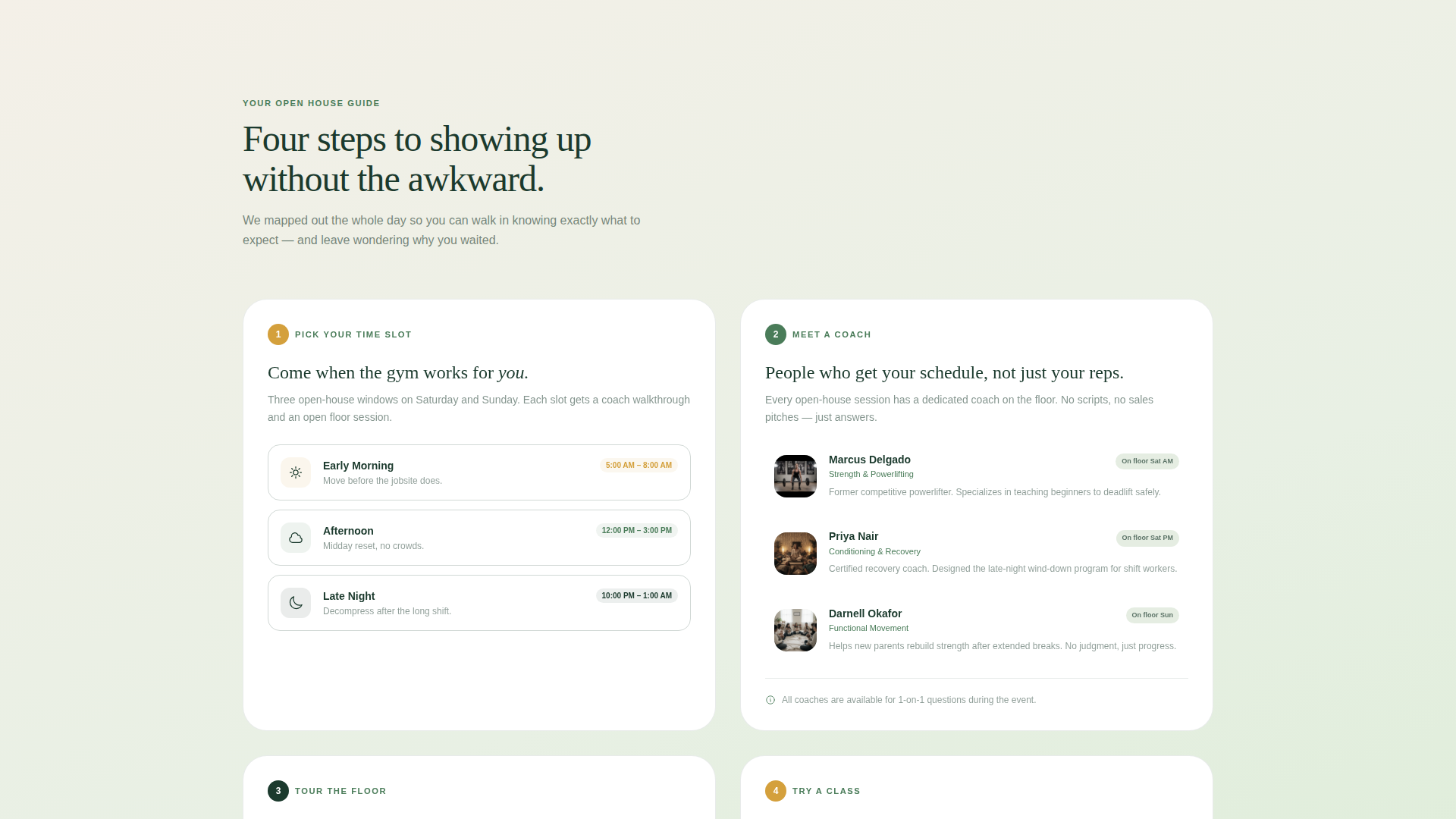
Step-by-Step Card Grid
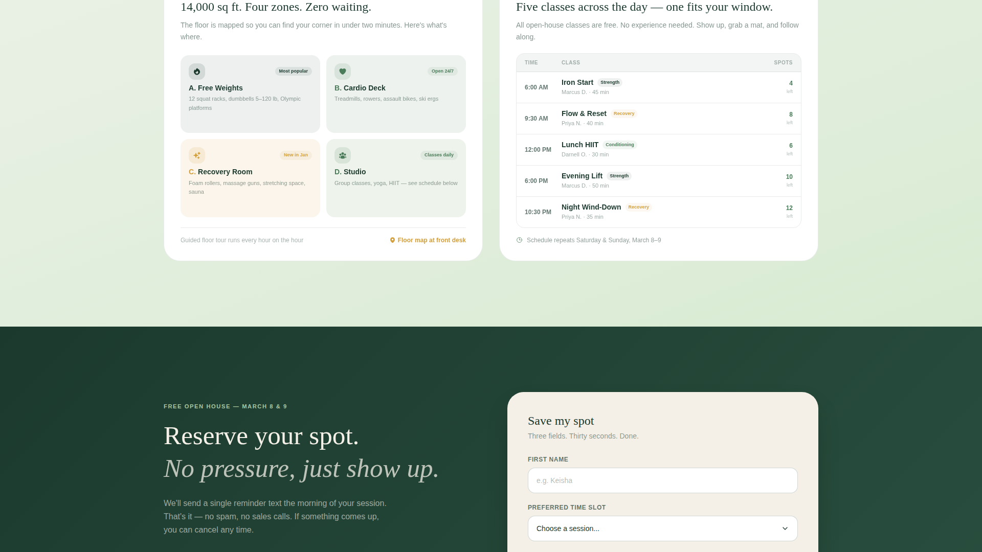
Four modular cards walk the visitor through the open-house experience in sequence. Card one shows time slot options as gradient-tinted cards. Card two introduces coaches with thumbnail portraits and one-line bios. Card three maps equipment zones visually. Card four displays a mini-schedule grid of sample sessions running that day.
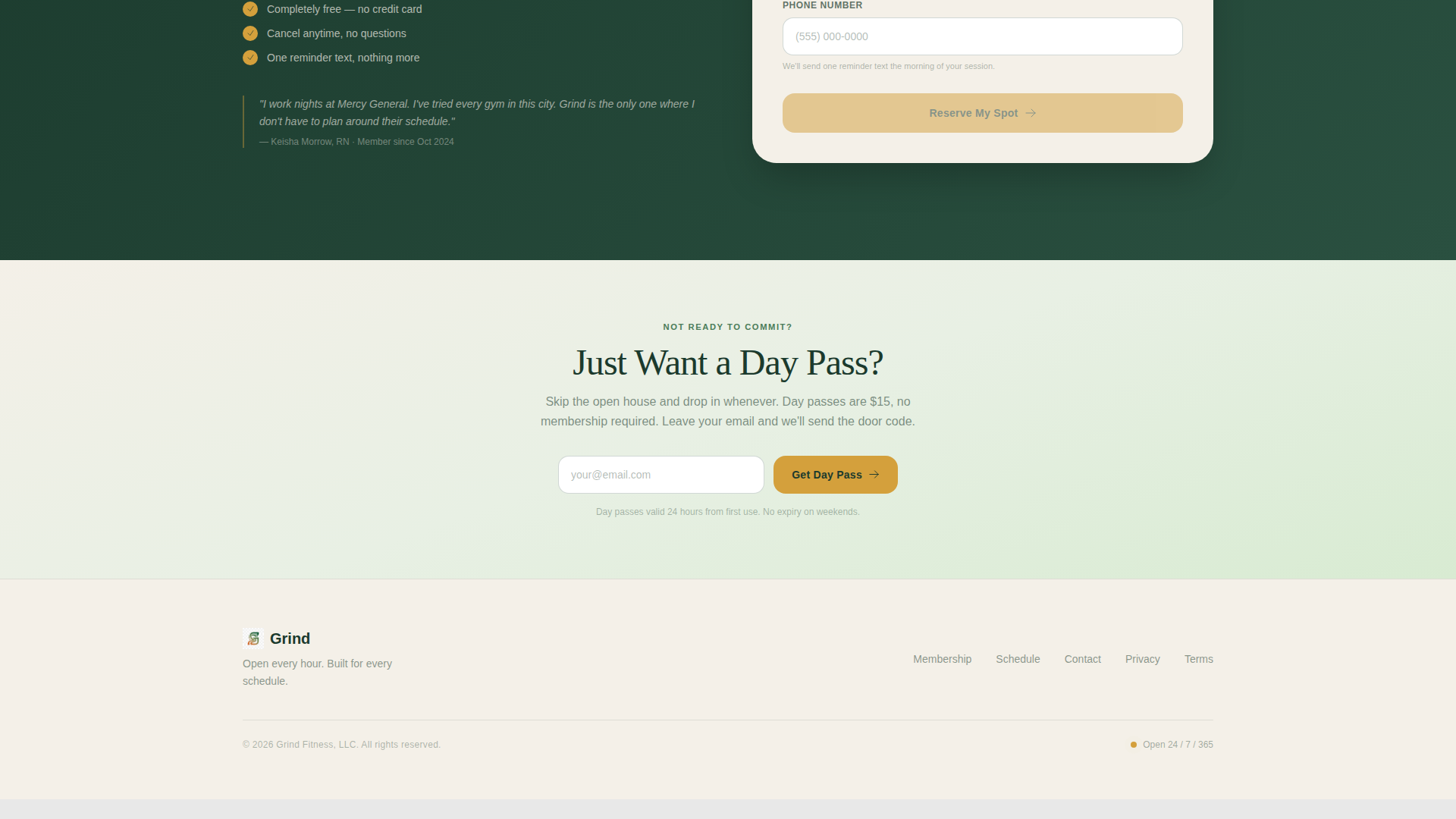
Three-Field Registration Form
The sign-up form asks only for a first name, a preferred time slot via dropdown, and a phone number for a day-of reminder text. Keeping the form short reduces hesitation and increases completions.
Sticky Mobile Call-to-Action Bar
On mobile screens, the "Reserve My Spot" button reappears as a sticky bar fixed to the bottom of the viewport. Visitors always have a visible path to register without scrolling back to the top.
Secondary Day-Pass Path
Below the card grid, a lighter secondary section offers a simpler route for visitors who are not ready to commit to the event. A single email-capture field with a "Just Want a Day Pass?" label gives them a low-stakes next step.
Forest Trust Color System
The template uses a carefully layered palette of deep evergreen, mossy mid-tone, soft sage, and warm birch cream. Amber accents appear only on buttons and hover states, keeping the visual focus sharp and the tone grounded rather than aggressive.
Page sections overview
| Section | Purpose |
|---|---|
| Full-Bleed Header | Establish tone and prompt first registration click |
| Headline Fade-In | Anchor the brand promise above the fold |
| Primary call to action Button | Drive immediate open-house sign-ups |
| Time Slot Card | Let visitors pick a comfortable arrival window |
| Coach Introduction Card | Build personal connection before the visit |
| Equipment Zone Card | Preview the gym floor and reduce first-visit anxiety |
| Sample Class Card | Show what a session looks like on the day |
| Registration Form | Collect name, time slot, and phone number |
| Day Pass Path | Capture lower-intent visitors with a single email field |
| Sticky Mobile Bar | Keep the primary call to action visible on all scroll depths |
Design & branding system
The visual identity uses a Soft Gradient theme rooted in the Forest Trust color system. Backgrounds shift from warm birch cream to soft sage in gentle gradient washes, keeping the page calm and inviting rather than high-intensity. Cards sit on white with evergreen body type, and amber draws attention only where a click matters.
- Color palette: deep evergreen (#1B3A2D), mossy mid-tone (#4A7C59), soft sage (#A8C5A0), warm birch cream (#F4F0E8), and amber accent (#D4A03C)
- Gradient backgrounds move from birch cream to sage; amber is reserved strictly for buttons and hover states
- Typography uses evergreen text on white card surfaces for strong contrast and a grounded, readable feel
Mobile & speed optimization
The template is structured to perform cleanly on mobile devices. The sticky bottom bar ensures the call-to-action is never out of reach, and the modular card grid stacks naturally into a single column on smaller screens.
- The card grid reflows to a single-column layout on mobile without breaking visual hierarchy
- The sticky "Reserve My Spot" bar anchors to the bottom of the mobile viewport throughout the session
- The three-field form is sized and spaced for easy thumb interaction on touch screens
How this template helps you convert
The layout is deliberately sequenced to lower resistance at every stage. By the time a visitor reaches the form, they already know when to show up, who to expect, what the floor looks like, and what a class feels like. That sequence does the persuasion work.
- The step-by-step card grid answers the four most common objections in order, building confidence before the form ever appears
- The short three-field form removes commitment friction by asking only for the minimum information needed to confirm a spot
- The secondary day-pass path captures visitors who are not ready for the event, keeping them in reach for a future visit
Other information about this template
This template lives in the Wellness and Fitness category under the Gym and Fitness Center subcategory, with a specific focus on the 24-hour access gym niche. It is designed as a standalone event registration landing page, not a full website.
- The creative direction follows a Step-by-Step Guide format, making it easy for any gym to adapt the card content to their own open-house flow
- The header concept is a Full-Bleed Photo, so the template is best paired with a high-quality, wide-format gym interior image
- The template style is a Card Grid (Modular) layout, meaning individual cards can be reordered or relabeled without redesigning the full page
- The Soft Gradient theme and Forest Trust color system are production-ready and do not require external font or color libraries to function as designed
Theme
Soft Gradient
Creative direction
Step-by-Step Guide
Color system
Forest Trust
Style
Card Grid (Modular)
Direction
Event Registration
Page Sections
Full-bleed Header with Call to Action
Step-by-step Card Grid
Short Three-field Form
Sticky Mobile Registration Bar
Secondary Day-pass Capture
Forest Trust Color System
Related questions
Can I change the open-house event details to match my gym's schedule?
Does the sticky mobile bar appear on desktop screens too?
Can I use this template for something other than an open-house event?
What type of header image works best with this template?
Is the day-pass path a separate page or part of the same landing page?