Grind - Artisan Ayurvedic Landing Page Template
Grind is a warm artisan landing page template built for small-batch Ayurvedic snack brands. It features a modular card grid with flip interactions, a dosha quiz, and a persistent floating cart. The design blends Japanese Zen mineral tones with gallery-walk editorial photography to create a direct-to-consumer experience that feels crafted, credible, and genuinely inviting.
by Rocket studio
Quick summary
Grind is a single-page direct-sales template designed for Ayurvedic snack brands. It combines a macro cinematic hero, a shifting density card gallery, and an interactive dosha recommendation quiz. Every design decision serves one goal: turn a first-time visitor into a confident buyer before they scroll back to the top.
Who this template is for
This template is built for founders and makers who sell small-batch wellness food products directly to consumers. It works especially well when the product has a strong ingredient story and a wellness-aware audience who shops with intention.
- Ayurvedic snack brands selling adaptogen bites, functional crackers, or whole-food wellness snacks
- Direct-to-consumer food brands that need a high-aesthetic, conversion-focused landing page
- Wellness entrepreneurs targeting yoga practitioners, postpartum mothers, or health-curious millennials
What problem this template solves
Most food brand templates look either clinical or overly rustic. Neither earns trust from a modern wellness buyer who expects editorial quality and honest ingredient storytelling in the same breath.
- Visitors leave product pages when the visual story feels generic or the purchase path is cluttered
- Ayurvedic and adaptogen brands struggle to explain product benefits without sounding like supplement labels
- Cart abandonment rises when there is no guided recommendation path for first-time buyers unfamiliar with the product range
What you get with this template
You get a fully structured, single-page layout that covers every stage of the buyer journey, from first visual impression to cart completion. The layout is modular, so each section works independently while building a coherent brand narrative as the visitor scrolls.
- A macro close-up hero section with delayed serif brand reveal and scroll cue
- A modular gallery grid with flip cards, density shifts, and staggered scroll animations
- A dosha quiz flow, a floating persistent cart with a free-shipping progress bar, and a social proof mosaic
Feature list
This template ships with a set of purposeful interactive and visual components. Each one is designed to match the specific conversion needs of a direct-sales Ayurvedic snack brand.
Macro Close-Up Hero Section
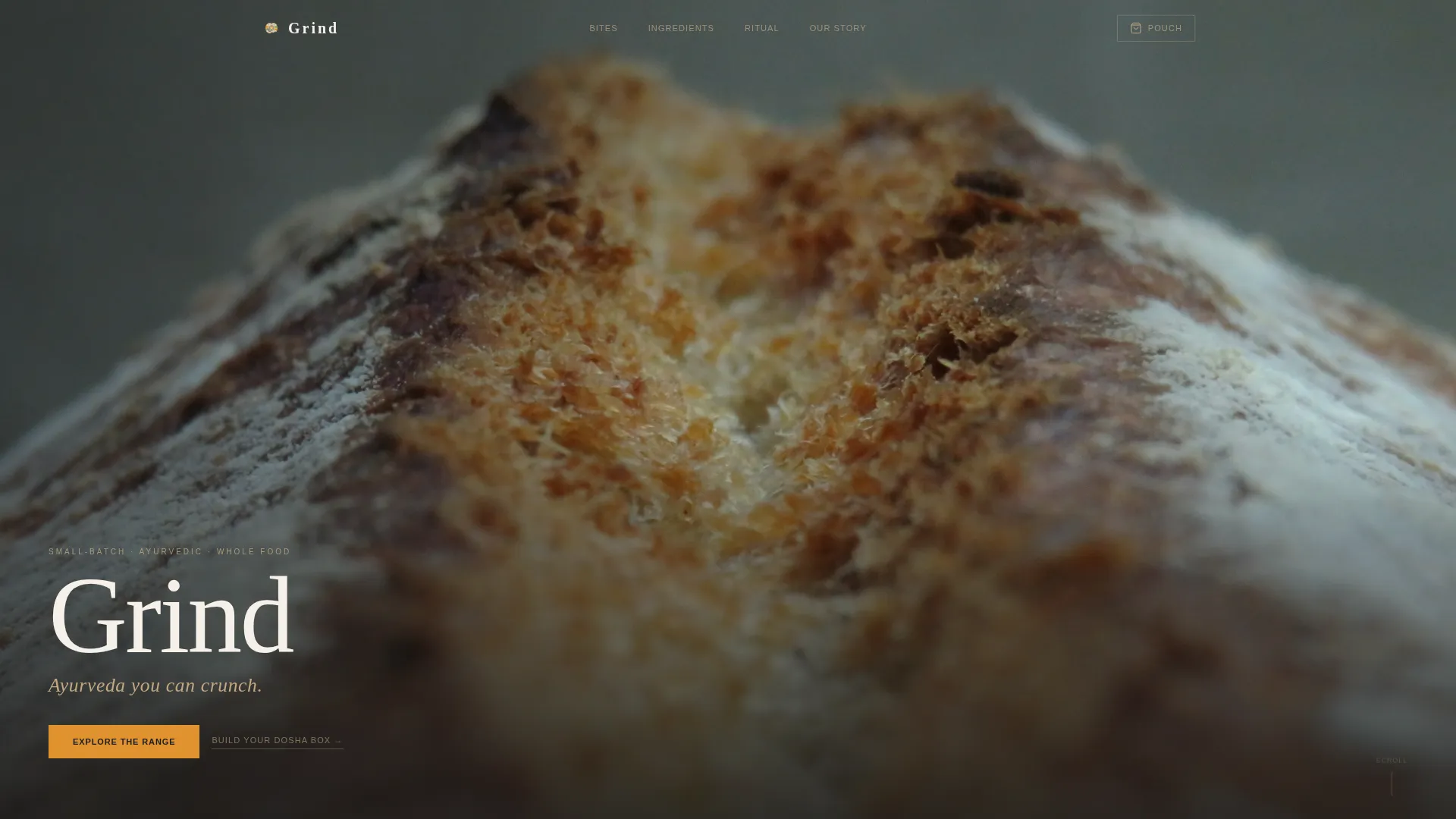
The hero opens on a full-viewport photograph shot at near-microscopic distance on the fractured edge of a turmeric-dusted cracker. No headline appears on the first beat. The brand name fades in through thin, unhurried serif type, followed by the tagline "Ayurveda you can crunch." Shallow depth of field dissolves the background into warm amber, making the texture feel almost edible before a word is read.
Modular Flip Card Gallery Grid
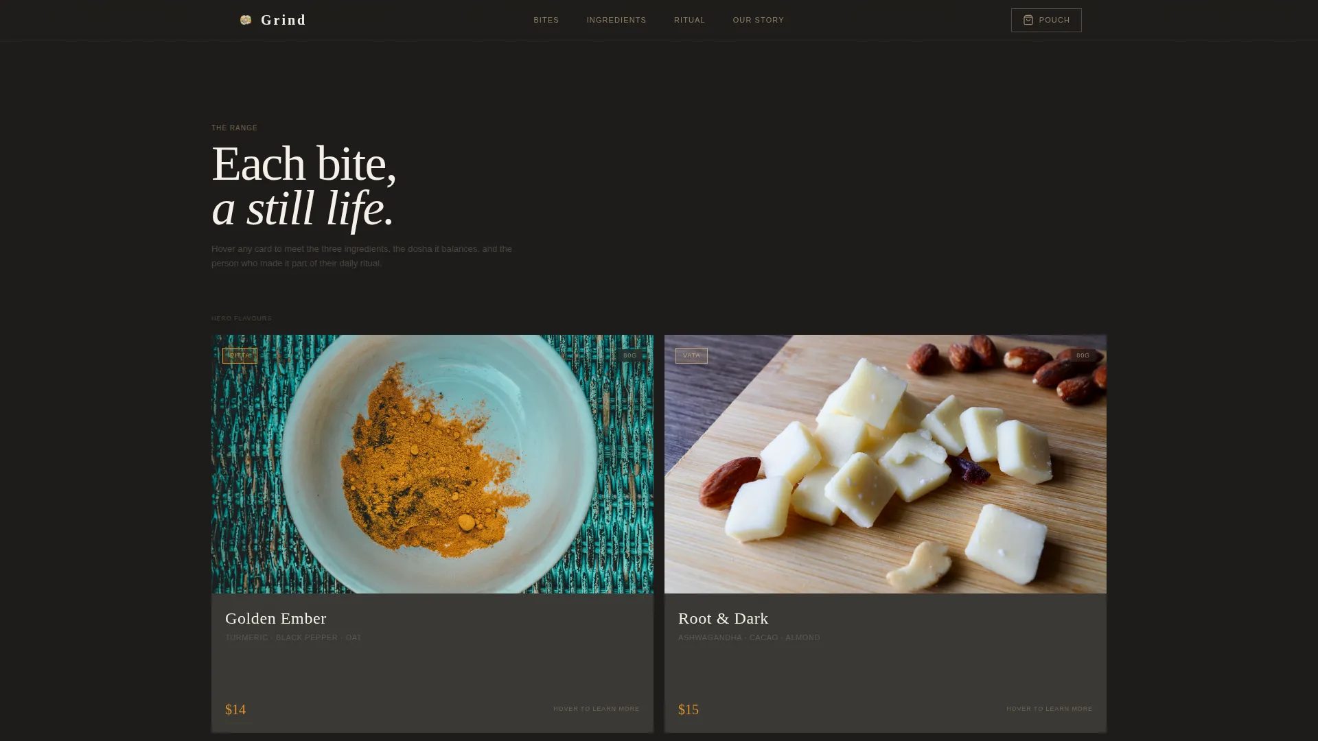
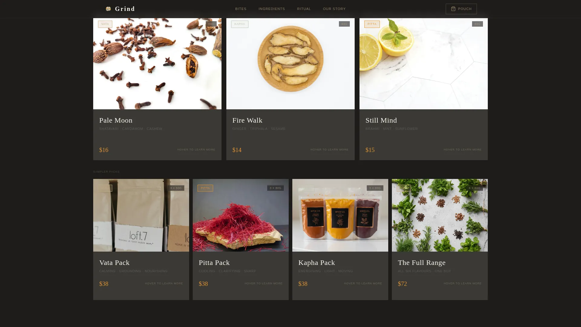
The product grid shifts density as the visitor scrolls: two wide hero-flavor cards first, then three across for the core range, then four tight sampler-pack cards. Each card is a self-contained still life photographed like a museum object. Hovering a card flips it to reveal the Ayurvedic dosha it balances, the three-ingredient story, and a single customer quote.
Dosha Quiz Recommendation Path
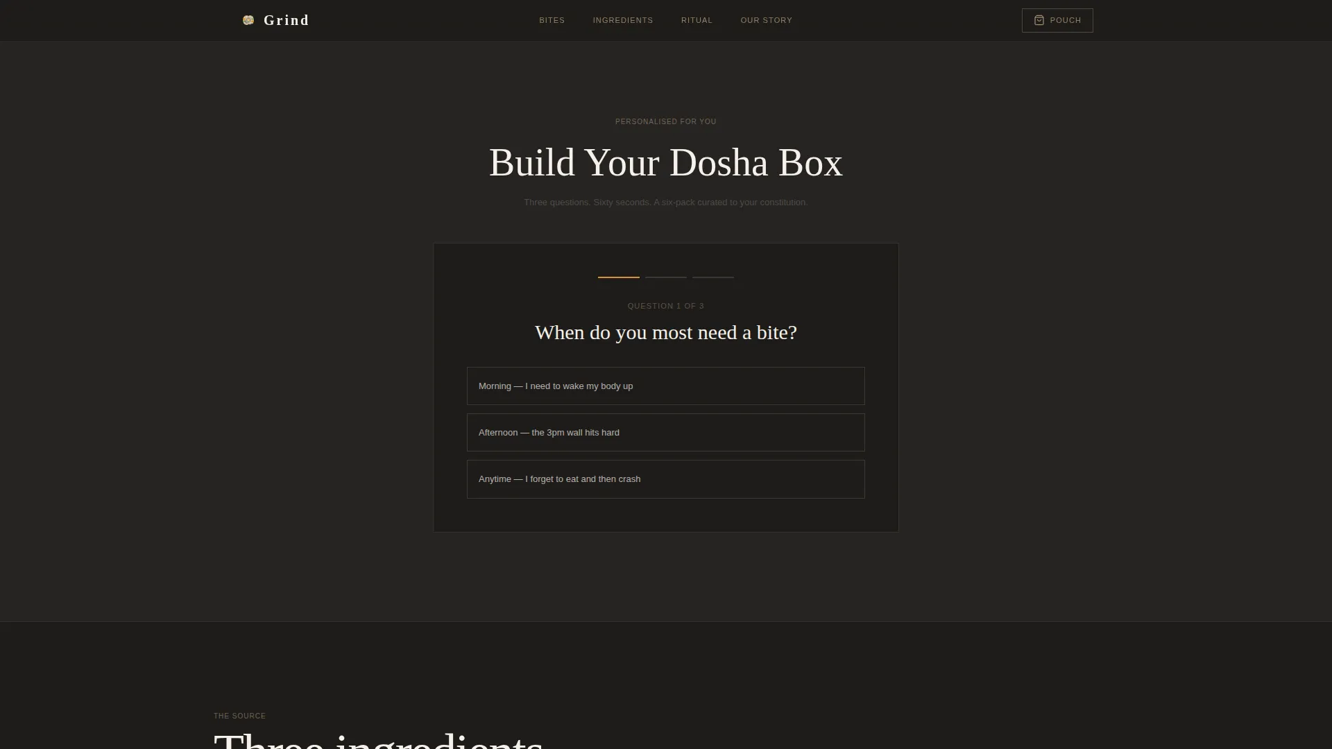
A three-question taste-preference quiz titled "Build Your Dosha Box" guides visitors toward a curated six-pack recommendation. This gives first-time buyers a confident starting point without requiring them to already understand Ayurvedic principles. It functions as a secondary conversion path alongside the primary "Add to Pouch" action.
Persistent Floating Cart with Progress Bar
A floating cart stays visible as visitors scroll and adds items instantly when a card call to action is activated. Inside the cart, a visual progress bar shows how close the order is to unlocking free shipping. This creates gentle purchase momentum without countdown timers or false scarcity tactics.
Ritual and Ingredient Sourcing Section
A dedicated section presents the three hero ingredients, turmeric, black pepper, and ashwagandha, through close-up photography and a short sourcing narrative. This grounds the brand's claims in tangible, real-world origin rather than marketing language, which builds trust with ingredient-conscious buyers.
Social Proof Mosaic
Customer quotes appear in two places: on the flip side of each product card and inside a dedicated mosaic section with names and roles. This repetition reinforces credibility at multiple scroll depths without feeling redundant, because each placement serves a different reading context.
Page sections overview
| Section | Purpose |
|---|---|
| Hero close-up | Opens with texture-first cinematic photograph and delayed brand reveal |
| Gallery flip grid | Showcases product range through density-shifting, interactive flip cards |
| Dosha quiz flow | Guides first-time buyers to a personalised six-pack recommendation |
| Ingredient ritual story | Tells the sourcing story for turmeric, black pepper, and ashwagandha |
| Social proof mosaic | Displays customer quotes with names and roles for layered credibility |
| Footer linear row | Closes the page with a clean, single-row navigation and brand footer |
Design & branding system
The visual identity follows a Warm Artisan direction expressed through a Japanese Zen mineral color palette. Every tone is drawn from natural, tactile references: unglazed ceramics, stone garden gravel, matcha foam, and a single thread of saffron for action moments. Typography pairs a thin Fraunces serif display face with DM Sans for body copy, balancing editorial quietness with readable clarity.
- Color palette: unglazed clay (#C4A882), stone garden charcoal (#3B3936), matcha foam (#D5DCCC), and saffron thread (#E0922F) reserved for price tags, "Add to Pouch" buttons, and quantity selectors
- Saffron accent is used sparingly and consistently so it reads as a clear action signal without shouting
- Typography uses Fraunces thin serif for display headings and DM Sans for body text, creating a calm editorial hierarchy
Mobile & speed optimization
This template is built mobile-first to match the real behavior of its target audience. Yoga teachers checking their mat-bag pouch supply and postpartum mothers browsing between feeds need a layout that performs on a phone screen before it performs on a desktop monitor.
- The card grid reflows gracefully from four-across on desktop to single-column stacked cards on mobile
- Client-side interactive components, including flip cards, the dosha quiz, and the floating cart, are isolated from static server-rendered sections to keep the initial page load lean
- Images are optimized and the hero photograph uses shallow depth of field so large-format visual quality is preserved without bloating file size
How this template helps you convert
Every structural decision in this template points toward one outcome: a completed purchase. The layout removes hesitation, adds context at the right scroll depth, and keeps the cart visible without being aggressive.
- The "Add to Pouch" button appears in saffron on charcoal on every product card, making the primary action impossible to miss without disrupting the gallery atmosphere.
- The "Build Your Dosha Box" quiz catches visitors who are interested but unsure which product to start with, turning curiosity into a specific, committed cart recommendation.
- The free-shipping progress bar inside the floating cart encourages visitors to add one more item to reach the threshold, increasing average order value through visual cues rather than pressure copy.
Other information about this template
This template is a strong fit for brands entering the growing direct-to-consumer wellness food space where visual storytelling and product transparency drive purchase decisions. It is designed as a single landing page with a clear linear scroll path, not a multi-page storefront.
- Template style is Card Grid (Modular), making it straightforward to swap in new product photography without restructuring the layout
- The Gallery Walk creative direction means each product card functions as a standalone visual unit, which also makes the page easy to extend with additional flavor variants over time
- Staggered card reveal animations and parallax scrolling are included to reinforce the editorial, exhibition-like pacing of the gallery grid
- The deep kiln tone (#1E1C1A) is available in the design system as a rich background alternative for high-contrast moments within the layout
- Localization is set for English language, USD pricing, and the US market out of the box
Theme
Warm Artisan
Creative direction
Gallery Walk
Color system
Japanese Zen
Style
Card Grid (Modular)
Direction
Direct Sales
Page Sections
Macro Close-up Hero with Brand Reveal
Density-shifting Flip Card Gallery
Build Your Dosha Box Quiz
Persistent Cart with Shipping Progress Bar
Ingredient Ritual and Sourcing Story
Social Proof Mosaic Section
Related questions
Can I add more product variants to the card grid later?
How does the dosha quiz work for visitors who are new to Ayurveda?
Is the floating cart accessible on mobile screens?
What makes this template different from a standard food e-commerce layout?
Can I use this template if I sell only one or two snack flavors?



