Immigrant-Owned Business Pre-Launch & Coming Soon Website Template
Grind is a scroll-reveal fitness landing page built for an immigrant-owned gym with a bold Neo-Retro visual identity. It guides existing Basic members toward an upgrade using a live countdown timer, progressive section reveals, and a single-step confirmation modal. Every scroll adds urgency, stacks visible perks, and makes staying on the Basic plan feel like leaving value on the table.
by Rocket studio
Quick summary
Grind is a single-page upsell experience designed for an immigrant-owned fitness studio. It opens with a tilted device mockup and a grainy VHS-textured video loop, then walks visitors through a timed upgrade offer using progressive scroll reveals. Each section adds a new reason to act, a new perk to want, and a countdown that never lets the moment feel comfortable.
Who this template is for
This template is built for gym owners who already have paying members and want a high-energy upgrade campaign. It fits studios with a strong local identity, a culturally specific community, and a limited-time offer worth promoting through email or text message.
- Immigrant-owned fitness studios running member upgrade campaigns
- Gym operators targeting second-shift workers, families, and young adults
- Studio owners who want a bold, personality-driven page without a generic look
What problem this template solves
Most upgrade prompts feel flat. A plain email link or a bland pricing page does not create urgency, and it does not remind existing members what they are missing. Basic members need to feel the gap between where they are and where the upgrade takes them.
- Removes the friction of a multi-step upgrade flow with a single modal confirmation
- Replaces passive pricing pages with a scroll-driven narrative that builds desire
- Gives time-limited offers a visual container that holds the urgency from top to bottom
What you get with this template
You get a complete scroll-reveal landing page structured around a flash deal mechanic. The layout is designed to escalate urgency with every section while keeping the upgrade path simple and emotionally resonant.
- A sticky countdown timer bar pinned to every viewport
- Three progressive content reveals: current plan, upgraded tier, and bonus add-ons
- A pre-filled single-step confirmation modal with family member toggle and gift upgrade path
Feature list
This template packs every conversion element into a focused, single-page layout. Each feature is purposeful and tied directly to the upgrade story the page tells.
Device Mockup Header
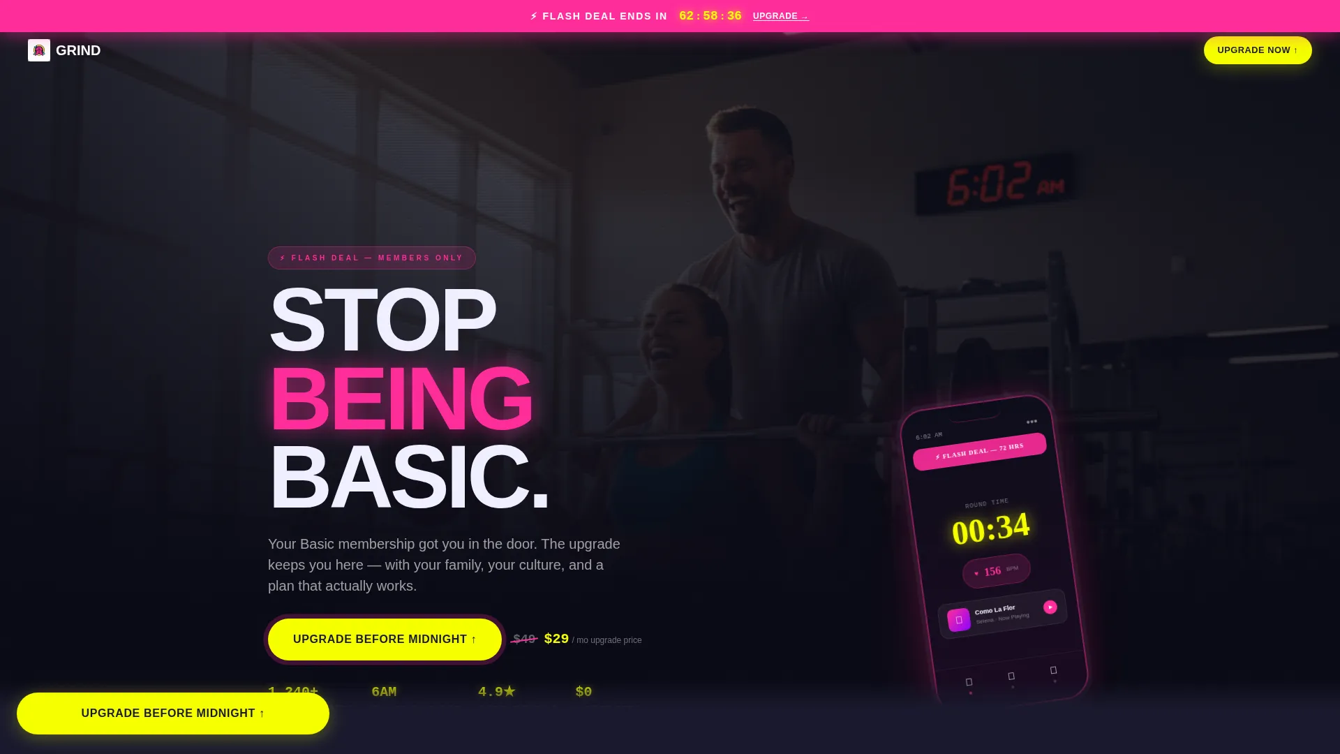
The header centers a tilted phone screen showing a mid-workout member app state: a countdown timer at 00:47, a heart rate reading of 156, a Selena playlist thumbnail, and a flashing "FLASH DEAL - 72 HRS" banner. A grainy VHS-textured video loop plays behind it, showing the gym owner spotting a teenager on bench press at 6:02 AM. The pairing of real life and live tech creates immediate trust.
Progressive Scroll Reveals
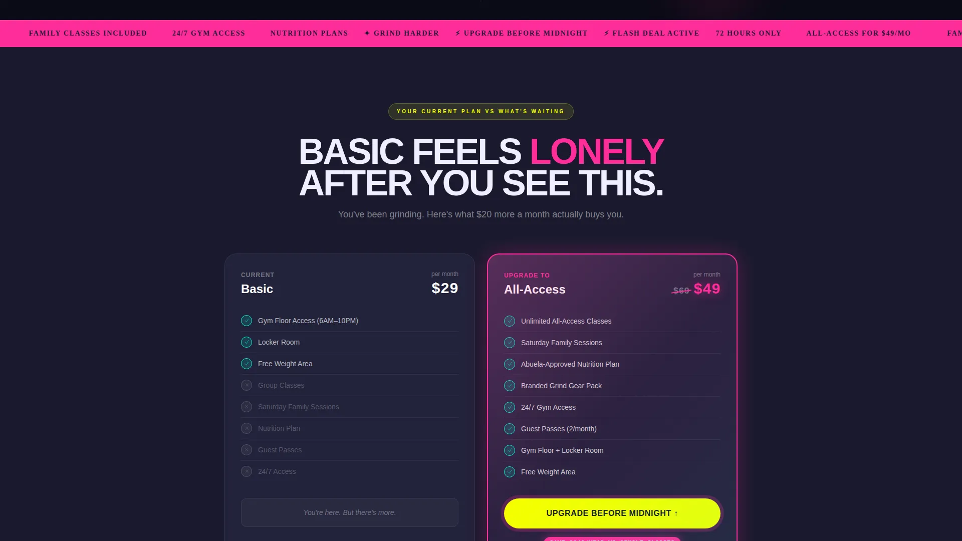
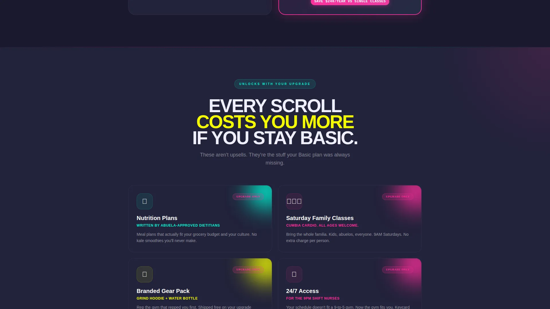
Each scroll snaps a new section into view with a static grain channel-change transition. The first reveal shows the current Basic membership. The second drops the upgraded tier beside it with a pulsing countdown. The third unlocks bonus add-ons including nutrition plans, Saturday family classes, and branded gear. Urgency builds naturally without any manual prompt.
Sticky Countdown Timer
A countdown timer bar stays pinned at the top of every viewport throughout the scroll. It is always visible, always ticking, and always tied to the magenta color that owns urgency in this palette. The savings number grows visibly as add-ons stack with each reveal.
Autoplay Testimonial Videos
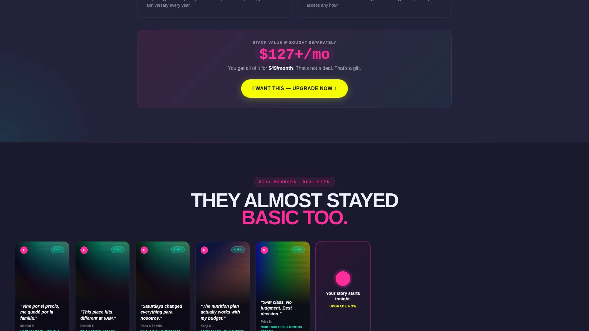
Member testimonial videos autoplay in portrait orientation, styled like short social stories. Each clip is six seconds of someone mid-rep delivering one sentence in Spanglish about their experience. The format is familiar, fast, and credible in a way that written quotes rarely are.
Single-Step Upgrade Modal
Clicking the primary call to action opens a modal pre-filled with the member's current plan. The price difference is highlighted in magenta, added perks are checked in mint, and a toggle lets members add family at a discounted rate. A secondary "Gift This Upgrade" button opens an alternative path for members who want to bring someone along.
Sticky Bottom Call to Action
The primary call to action, "Upgrade Before Midnight," appears in highlighter yellow on asphalt and stays pinned to the bottom of every viewport. It is always reachable without scrolling back up, removing any friction between decision and click.
Page sections overview
| Section | Purpose |
|---|---|
| VHS Header | Anchors identity with device mockup and grainy video loop |
| Sticky Timer Bar | Keeps countdown and savings visible at all times |
| Basic Plan Reveal | Shows current member tier to establish the baseline |
| Upgrade Tier Reveal | Drops the improved plan beside the basic with pulsing urgency |
| Bonus Add-Ons Reveal | Stacks nutrition plans, family classes, and gear perks |
| Testimonial Stories | Plays six-second autoplay portrait videos from real members |
| Upgrade Modal | Confirms upgrade in one step with pre-filled member details |
| Sticky Bottom call to action | Pins the primary action button to every viewport scroll position |
Design & branding system
The visual identity follows a Neo-Retro theme built on a Dopamine Pop color system. The palette feels like a neon sign buzzing above a late-night taquería: loud, warm, and impossible to ignore against the dark background.
- Deep asphalt (#1A1A2E) dominates all backgrounds; electric magenta (#FF2D9B) owns headlines, countdowns, and price slashes; highlighter yellow (#F5FF00) fires on hover states and price callouts
- Cool mint (#00F5D4) is reserved for confirmation states, active buttons, success messages, and checkmarks
- The grainy VHS texture, static grain transitions, and fluorescent color pops give every scroll moment a channel-changing, retro-broadcast energy
Mobile & speed optimization
The template is designed around a mobile-first visual hierarchy. Portrait-oriented autoplay videos, a phone device mockup header, and a sticky bottom call to action all assume the visitor is on a small screen.
- Portrait testimonial videos and the phone mockup header are built for vertical scroll on mobile devices
- The sticky countdown bar and pinned call to action remain accessible without zooming or horizontal scrolling
- Static grain transitions and snap-scroll behavior are scoped to stay visually sharp on narrow viewports
How this template helps you convert
Every design and layout decision in this template serves the upgrade goal. Nothing is decorative without purpose. The page earns the click by making the Basic plan feel incomplete before the visitor reaches the modal.
- Progressive reveals stack perceived value with each scroll, so by the time the call to action is reached, the upgrade feels like a logical conclusion rather than a sales pitch.
- The sticky countdown timer creates consistent time pressure without interrupting the reading experience, keeping the emotional cost of waiting visible at all times.
- The single-step modal removes second-guessing by pre-filling the member's current plan, highlighting the price difference, and letting them add family members before confirming.
Other information about this template
This template is part of the Neo-Retro theme family and uses a Dopamine Pop color system that pairs well with high-contrast, late-night, or urban aesthetic brands. The creative direction is Limited Time, meaning the entire page narrative is built around scarcity and a ticking clock rather than evergreen product descriptions. The landing page direction is Direct Sales, with every section serving a single conversion goal: upgrade now, before the timer runs out.
- The template style follows a Bento Grid layout adapted into a progressive single-column scroll reveal for mobile-first delivery
- The header concept draws from a Device Mockup approach, showing in-app content to communicate product value before any text is read
- This template is well-suited to fitness studios, culturally specific wellness brands, and any membership-based business running SMS or email-triggered flash campaigns
Theme
Neo-Retro
Creative direction
Limited Time
Color system
Citrus Burst
Style
Bento Grid
Direction
Direct Sales
Page Sections
Device Mockup Header with VHS Loop
Progressive Scroll Reveal Sections
Sticky Countdown Timer Bar
Six-second Autoplay Testimonial Stories
Single-step Upgrade Confirmation Modal
Sticky Bottom Primary Call to Action
Related questions
Who is the intended visitor for this landing page?
Can the countdown timer and pricing be customized?
Does the modal support adding family members?
What makes this template different from a standard pricing page?
Is this template suitable for a studio that is not gym-focused?



