Fitness PPC Agency Landing Page Template
The Grind high performance fitness PPC agency landing page template is built for performance marketing shops that serve gyms, boutique studios, and fitness brands. It uses a masonry layout, a cinematic hero section, and a three-step audit form to turn cold traffic into qualified leads. The Ink and Paper visual identity pairs deep carbon black with iridescent accents for a bold, credible first impression.
by Rocket studio
Quick summary
Grind is a single-page fitness landing page template designed for pay per click agencies that work with gym owners, boutique studio founders, and fitness brands. It delivers a full case study narrative inside a masonry grid, a full-viewport hero with letterpress-style typography, and a progressive three-step audit form. Every section is crafted to build trust fast and convert qualified prospects into booked strategy calls.
Who this template is for
This template speaks directly to a very specific target audience: performance marketing agencies that focus entirely on the fitness vertical. If your agency runs paid advertising for gyms, studios, franchise operators, or supplement brands, this landing page positions you with the authority those clients are looking for.
- Pay per click agencies specializing in gym and studio clients
- Fitness marketing consultants who want a dedicated landing page that proves results
- Digital marketers who manage ad campaigns for boutique fitness brands and franchise operators
What problem this template solves
Most fitness agency landing pages look like generic corporate websites. They talk about services instead of showing results. They fail the attention test in under three seconds. This ppc landing page template solves that by leading with verified campaign outcomes and layering social proof across every scroll depth.
- Gym owners and studio founders are skeptical. They have been burned by agencies that ran ad campaigns without moving the needle on leads or revenue.
- A generic landing page design cannot communicate the CPL and ROAS fluency these clients expect from a specialist agency.
- Without a dedicated landing page built around case study evidence, potential customers leave before they ever reach the call to action.
What you get with this template
This template delivers a complete, conversion-ready fitness landing page with a full narrative structure. You get every section needed to move a skeptical gym owner from cold visitor to booked audit call, all inside a single standalone web page built around one clear goal.
- A full-viewport hero section with cinematic gym photography and off-register letterpress headline typography
- A three-tier masonry case study grid covering before-state dashboards, strategic pivot cards, and payoff testimonials
- A three-step progressive audit form plus a secondary PDF lead magnet for visitors who are not yet ready to call
Feature list
This section walks through the key elements built into the Grind landing page template and explains what each one delivers for your target audience.
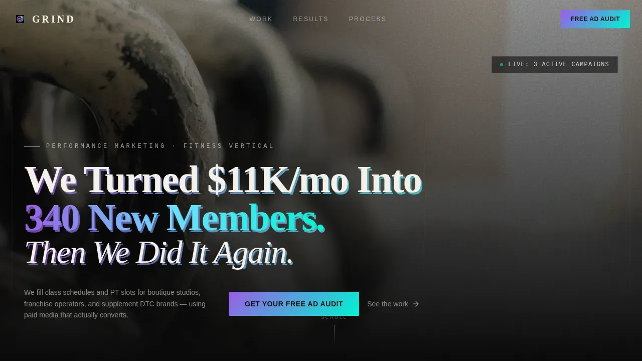
Full-Viewport Letterpress Hero
The hero section fills the entire screen with a high-contrast black-and-white gym photograph. Chalk dust, kettlebells, and blurred movement create an immediately recognizable, high-intensity environment. A massive serif headline stamped across the image uses a deliberate off-register effect, with one cream layer and one iridescent violet shadow layer, to evoke a freshly printed broadsheet. This attention grabbing headline technique is one of the most effective ways to stop scroll and signal credibility to a fitness business audience. The above-the-fold placement ensures the call to action cta lands in the visitor's first view, capturing immediate intent before any scrolling begins.
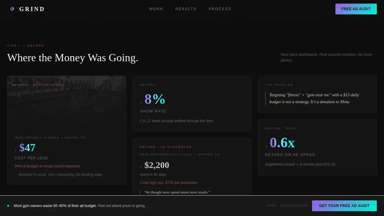
Case Study Narrative Masonry Grid
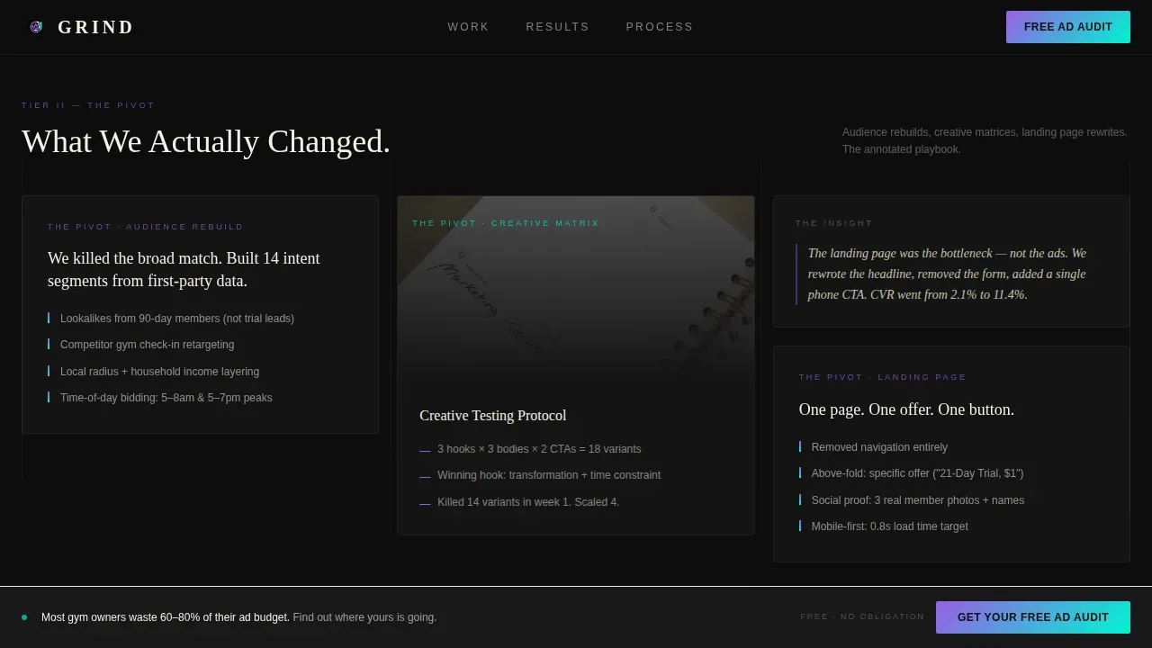
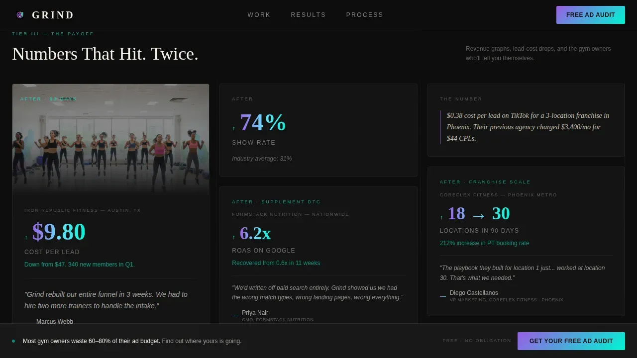
The core of this ppc landing page is a three-row masonry grid that tells a complete campaign story. The first row shows "before" states: wasteful ad dashboard screenshots, actual spend numbers, and red-arrow indicators that resonate with any gym owner who has watched their return on ad spend collapse. The second row presents the strategic pivot, displayed as annotated notebook-sketch style cards covering audience restructuring, creative testing, and landing page rewrites. The third row delivers the payoff: revenue graphs, lead-cost reduction data, and testimonial pull-quotes from named gym owners with their locations. Cards vary in height and width, creating a rhythm that rewards both quick scanning and deep reading. This layout is a great example of how social proof and data can be woven into a visually appealing design rather than isolated in a single testimonial block.
Three-Step Progressive Audit Form
The primary conversion path is a three-step form sequence designed to reduce friction while collecting high-quality lead data. Step one asks for monthly ad spend range and primary pay per click platform, whether Meta, Google Ads, or TikTok. Step two asks for location count and front-end offer price, the kind of detail a serious sales team needs before a strategy call. Step three captures name, email, and a calendar embed for a 20-minute strategy session. Frictionless lead forms like this multi-step sequence are proven to improve conversion rates compared to single long forms that ask for everything at once.
PDF Lead Magnet Secondary Path
Not every visitor is ready to book a call. The secondary conversion path lets visitors download a full campaign case study PDF, gated behind just an email address. This low-commitment lead magnet follows a well-established lead generation principle: give potential customers something valuable before asking for a bigger commitment. It catches the portion of your target audience that is ready to believe in your results but not yet ready to talk. This approach broadens the effective reach of a single landing page without adding a second page or weakening the primary call to action.
Persistent Bottom-Bar Call to Action
After the visitor passes the second scroll depth, a persistent bottom bar appears with the primary "Get Your Free Ad Audit" call to action button. This ensures the call to action is always visible without interrupting the reading experience. Placing a clear call to action within constant reach is one of the most reliable conversion rate optimization tactics for long-form landing pages. The bar uses the iridescent violet-to-cyan gradient so the call to action button visually stands out against the carbon black background at every scroll position.
Scroll-Linked Iridescent Animation System
The template uses scroll-linked animation intensity that increases as the visitor moves deeper into the page. The iridescent accents on data callouts, metric highlights, and card borders intensify with depth, creating a sense that the evidence itself is building momentum. This is powered by CSS animations and IntersectionObserver for smooth performance without heavy JavaScript payloads. The effect reinforces the case study narrative direction: the deeper you scroll, the stronger the proof becomes.
Page sections overview
| Section | Purpose |
|---|---|
| Hero viewport section | Cinematic gym photo with off-register serif headline and primary metric callout |
| Before-state masonry row | Wasteful dashboard screenshots, actual spend figures, and red-arrow indicators |
| Strategic pivot row | Annotated notebook-style cards showing audience restructuring and creative testing |
| Campaign payoff row | Revenue graphs, lead-cost drops, and gym owner testimonial pull-quotes |
| Audit call to action form | Three-step progressive form with calendar embed for strategy call booking |
| PDF playbook section | Email-gated case study download for visitors not ready to book a call |
| Persistent bottom bar | Scroll-triggered call to action bar visible after the second scroll depth |
| Footer row | Linear single-row footer with minimal navigation |
Design & branding system
The Grind landing page template uses an Ink and Paper visual identity fused with an iridescent digital color system. The result feels like a matte-black notebook cracked open under a UV lamp: analog in its bones, digital in its nerve endings. The landing page design is deliberately raw and editorial, which signals credibility to an audience that speaks in CPLs and show rates.
- Color palette: deep carbon black (#0D0D0D) as the primary background, uncoated cream (#F5F0E8) for card surfaces, holographic violet (#9B5DE5) and electric cyan (#00F5D4) as iridescent accent gradients across hover states and metric highlights
- Typography: Fraunces serif for headlines, which renders with the weight of hand-pressed type, and DM Sans for body text in cream on carbon for maximum legibility
- Visual texture: grainy, high-contrast photography, off-register type layering, and shimmer hover states that give the page a tactile, editorial quality not found in other landing pages built for this niche
Mobile & speed optimization
While the template is designed desktop-first to match how gym owners and franchise operators review agency proposals on a laptop, it also includes responsive support for mobile devices. This ensures no lead is lost when a prospect clicks through from a mobile ad or social media channels link.
- The masonry grid reflows gracefully for narrower screens, preserving the card hierarchy and narrative flow on mobile devices
- CSS animations and IntersectionObserver power all scroll-linked effects, keeping the animation system lightweight and avoiding render-blocking scripts
- The persistent bottom-bar call to action button remains accessible on smaller screens, so the primary conversion path stays intact regardless of device
How this template helps you convert
This fitness landing page is engineered around a single goal: turning qualified traffic into booked audit calls. Every design and content decision traces back to conversion rate optimization principles specific to the fitness PPC agency niche.
- The hero section uses an attention grabbing headline with a specific campaign result stamped directly above the fold, so the unique value proposition is clear before the visitor scrolls. Above-the-fold call to action placement captures immediate intent from high-intent traffic arriving from paid advertising.
- The masonry case study grid builds credibility through layered social proof. First-time visitors often need substantial evidence before trusting a new agency. By presenting before-states, strategic pivots, and campaign payoffs in a single scrollable flow, this landing page makes the case without requiring a visitor to navigate away. Social proof builds trust and credibility in a way that copy alone cannot.
- The three-step progressive audit form and the PDF lead magnet create two distinct conversion paths for two distinct buyer readiness levels. Visitors ready to talk book a call. Visitors still evaluating download the playbook and enter a follow-up sequence. This two-path structure maximizes the conversion rate of every visitor who lands on the page.
Other information about this template
This section covers additional practical context about the Grind template and how it fits within the broader landscape of fitness landing page design and digital marketing strategy.
The Grind template is a great example of a dedicated landing page built for a specific niche rather than a general-purpose site. A dedicated landing page removes standard website navigation to keep users focused on the single conversion goal. This distraction-free approach is a core principle of effective ppc campaigns and is consistently supported by conversion optimization research. The average conversion rate for ppc landing pages across industries stands at around 2.35%, but niche-specific, message-matched landing pages regularly outperform that benchmark.
This template follows key elements of landing page best practice. A compelling headline communicates the unique value proposition instantly. Landing page content is organized so the most persuasive evidence appears early and the call to action is impossible to miss. Customer testimonials from named gym owners with real locations serve as trust signals that encourage users to take the next step. The three-step form mirrors what digital marketers know about frictionless lead capture: asking for information in stages reduces perceived commitment and increases completion rates.
The landing page headline strategy here is message-matched. The hero stat ties directly to the kind of outcome a potential client is already thinking about when they click an ad. This is aligned with ppc landing page best practice, which states the landing page content should closely match the specific ad copy and ad group targeting that brought the visitor in.
From a broader digital marketing perspective, this template can support search engine optimization goals when used as a dedicated landing page for organic traffic, as well as conversion rate optimization for paid search and social ppc campaigns. Keyword research and search engine results strategy are outside the template itself, but the structural clarity of the page supports both use cases. Search engines reward pages with clear, focused landing page content and fast load times, both of which are built into this template.
The template is particularly useful for agencies running ad campaigns across multiple ppc platforms. Whether traffic comes from Google Ads, Meta, or TikTok, the message-matching hero and distraction-free layout help maintain conversion rates across different ad group sources.
The PDF playbook download is a practical implementation of a low-commitment lead magnet. This tactic is well-established for fitness business lead generation, where potential customers want proof before committing to a call. A free guide or case study download has been shown to help start a relationship with potential clients who are not yet ready for a sales team conversation.
The Ink and Paper aesthetic makes this template stand out from other landing pages in the fitness marketing category. Most fitness agency pages rely on loud gradients or corporate stock photography. The Grind template uses editorial texture, matte-black surfaces, and iridescent accents to signal the kind of craft and precision that gym owners and franchise operators want from a growth partner.
Agencies that build landing pages for clients in sectors ranging from boutique studios to supplement direct-to-consumer brands, or even unrelated verticals like a meal kit delivery service, will recognize the structural thinking behind this template. The case study narrative format, the progressive form, and the two-path conversion structure are transferable principles. However, this specific template is purpose-built for the fitness PPC agency niche and delivers the most impact when used in that context.
- Localization is set to USA, United States Dollar, and MM/DD/YYYY date format, matching the primary market for fitness franchise operators and boutique studio founders
- The footer follows a linear single-row pattern, keeping the end of the page clean and directing attention back to the primary call to action rather than scattering it across multiple links
- Word of mouth marketing and earned credibility are reinforced by the testimonial cards, which show real names and locations rather than anonymous quotes, adding specificity that generic social proof cannot match
- Tools like Instapage, Unbounce, and ClickFunnels are popular platforms for deploying and A/B testing landing pages in the fitness and agency space; this template is designed as a standalone deliverable but is compatible with most modern page deployment workflows
- The template supports A/B testing of headline variants, call to action button copy, and form step sequences, making it practical for agencies that want to run conversion optimization experiments on their own pages over time
- Agencies looking to build landing pages for personal trainer clients or local gym campaigns will find the masonry card structure and social proof layout directly applicable to those use cases as well
Theme
Ink & Paper
Creative direction
Case Study Narrative
Color system
AI Iridescent
Style
Masonry/Pinterest
Direction
Partnership/B2B
Page Sections
Letterpress Hero with Cinematic Gym Photography
Three-tier Masonry Case Study Grid
Three-step Progressive Audit Form
PDF Lead Magnet Secondary Path
Scroll-triggered Persistent Call to Action Bar
Scroll-linked Iridescent Animation System
Related questions
Who is this landing page template designed for?
Can I use this template for a personal trainer or local gym client?
How does the three-step audit form work?
What makes this different from other landing pages in the fitness space?
Does the template include a secondary lead capture option?


