Athletic Training Facility Landing Page Template
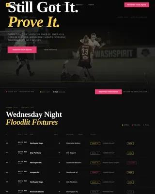
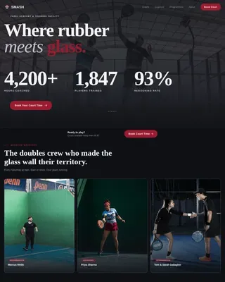
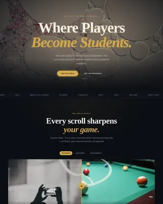
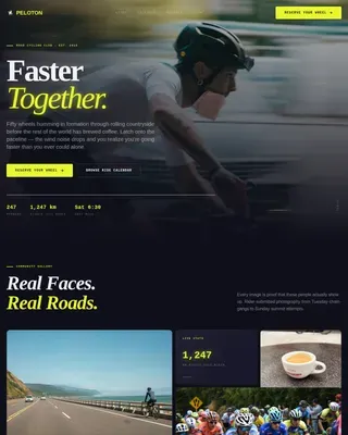
Grind is a full-width immersive landing page built for high-intensity athletic training facilities. It opens with a looping short-form reel, flows into a dense community gallery of real member proof, and drives visitors toward a three-step booking flow. The design runs on abyss black, electric volt, and adrenaline magenta, built to feel like the gym at 6 AM.
by Rocket studio
Quick summary
Grind is a single-page booking template designed for athletic training facilities that mean business. The layout combines raw video energy, dense social proof, and a frictionless session-booking flow. Every section is built to move fast, feel real, and push serious athletes toward their first booked session without hesitation.
Who this template is for
This template is built for training facilities and coaches who work with driven, performance-focused clients. If your gym is not a wellness retreat, this is your page.
- High-intensity athletic training facilities running structured performance programs
- Coaches offering athlete performance tracks, group training, and one-on-one coaching sessions
- Facility owners targeting high school athletes, competition-prep clients, and adult professionals done with maintenance-mode training
What problem this template solves
Most gym landing pages feel like brochures. They are polished, forgettable, and do nothing to communicate the culture of the place. Serious athletes and competitors can sense the difference immediately.
- Generic gym pages fail to show community energy, real member results, or facility credibility
- Friction-heavy contact forms lose the mobile-first audience that books fast and moves on
- No visual identity strong enough to match a facility with a real competitive edge
What you get with this template
You get a fully structured, single-page layout that captures facility energy and converts it into booked sessions. Everything is designed to feel earned rather than marketed.
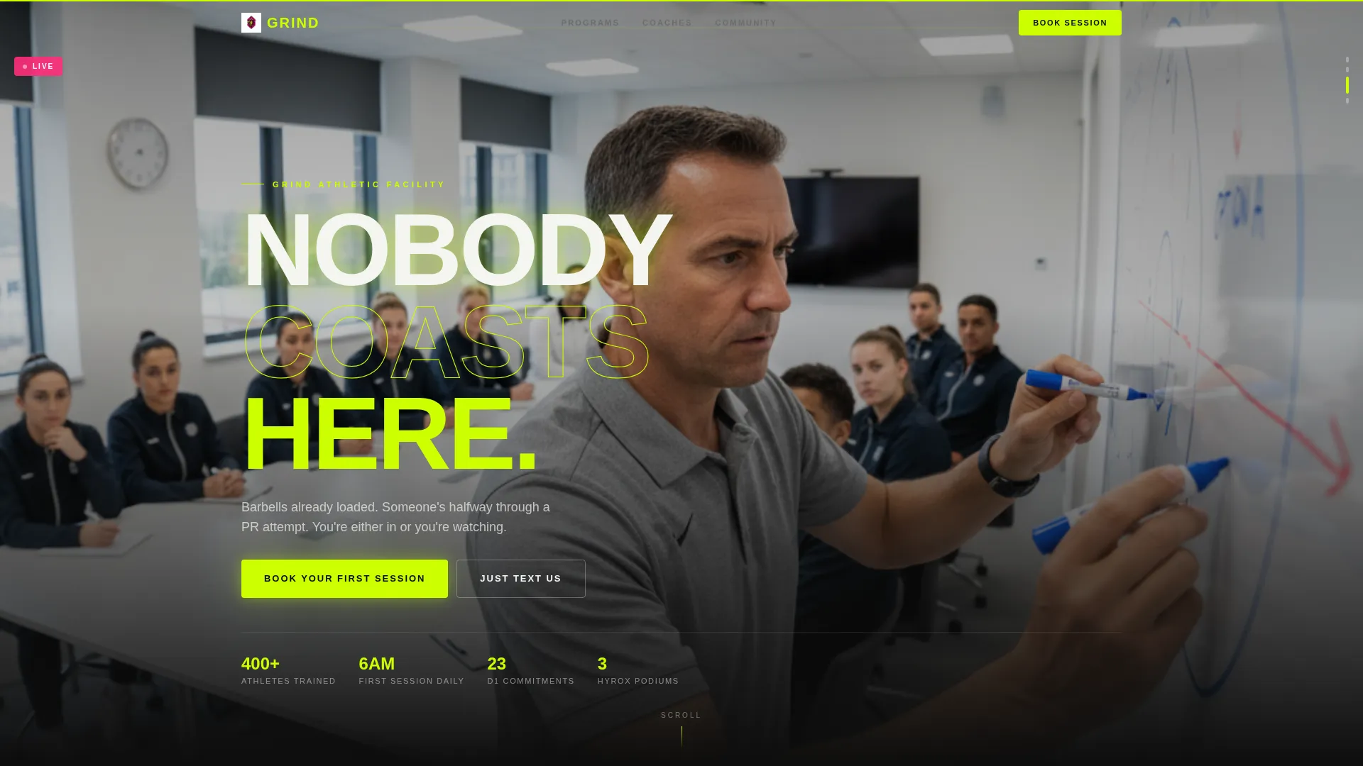
- An autoplay short-form reel header cut to heartbeat pacing, with a bold punching headline
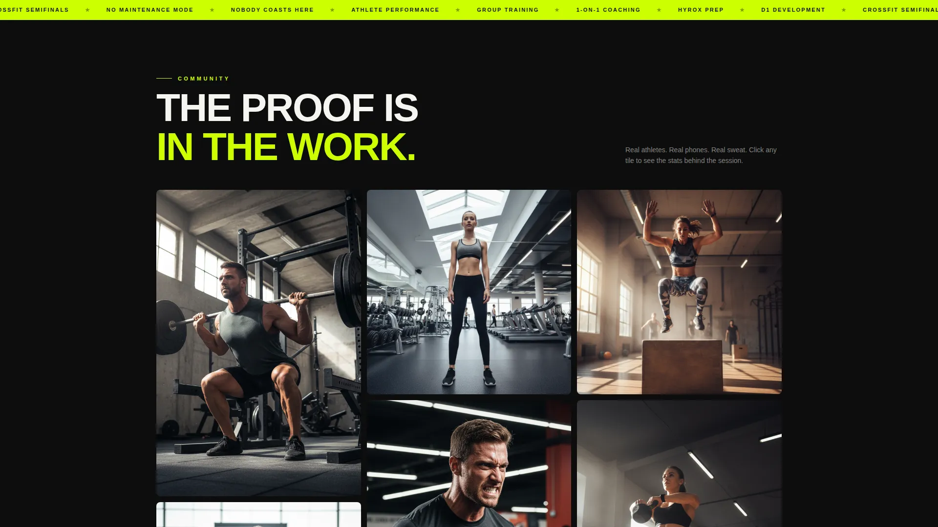
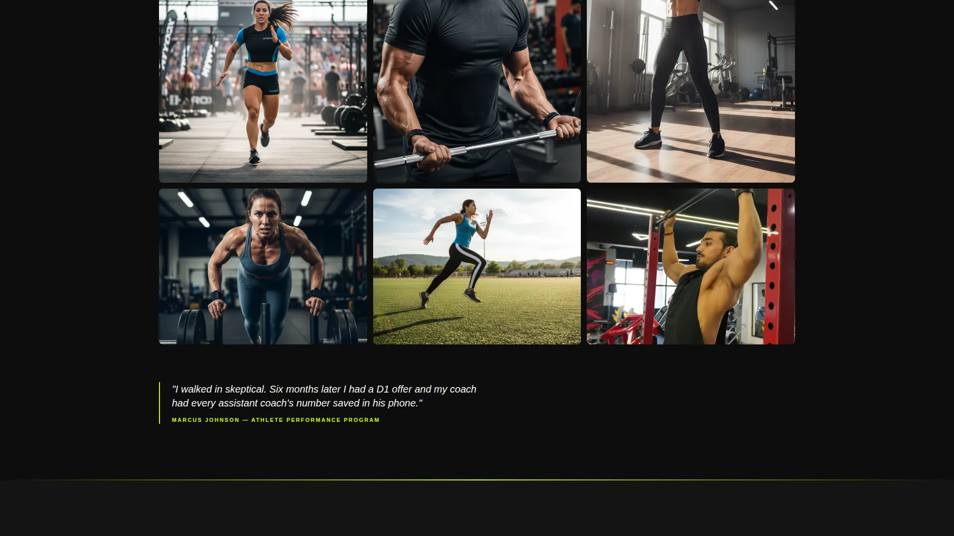
- A masonry community gallery with expandable member tiles showing names, programs, and individual stats
- A pinned floating booking bar with a three-step scheduling flow and a direct text link for low-friction contact
Feature list
This template ships with purpose-built sections and interaction patterns designed specifically for a high-intensity training environment. Each component earns its place the same way the athletes in your gym do.
Autoplay Short-Form Reel Header
The header section autoplays a looping vertical video cut to a fast, heartbeat-paced rhythm. Frames move from chalk hands in slow motion to sled pushes at ground level to a post-finisher grin. Facility audio replaces voiceover. The bold headline "NOBODY COASTS HERE" punches in on beat.
Masonry Community Gallery
Past the header, the page opens into a scrollable masonry grid of member-submitted clips and coach-tagged progress shots. Each tile expands on click to show the athlete's name, enrolled program, and one key stat. No stock photography. Real phones, real sweat, real proof.
Floating Booking Bar with Three-Step Flow
After the first scroll, a volt-on-black "Book Your First Session" bar pins to the screen. Tapping opens a three-step flow: choose a program type, select a date from an embedded calendar showing real-time availability, then enter a name and phone number. No email required.
Direct Text Contact Path
Alongside the primary booking bar, a "Just Text Us" secondary link gives skeptical visitors a no-commitment way to ask one question. It reduces drop-off from people who are interested but not yet ready to commit to a full booking.
Program and Coach Section
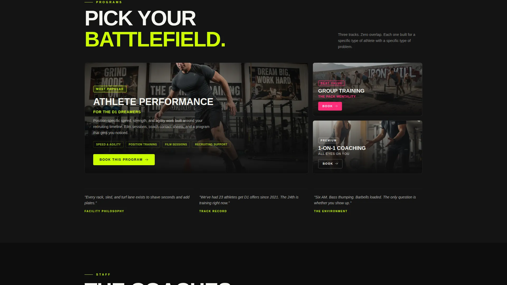
Below the gallery, the page transitions into structured program breakdowns and coach bios. Community pull quotes and tagged moments are woven throughout so the energy does not drop between sections. Visitors get clarity on what each track delivers without losing the facility's atmosphere.
Competition Edge Visual System
The full-width immersive layout uses a high-contrast color palette with zero visual softness. Volt accents drive calls to action, magenta signals interaction states and community highlights, and chalk white keeps body text readable against the abyss black background. Every color is functional.
Page sections overview
| Section | Purpose |
|---|---|
| Reel Header | Hooks visitors with raw autoplay video and a bold headline |
| Community Gallery | Shows real member proof through an expandable masonry grid |
| Program Breakdowns | Explains available training tracks in structured detail |
| Coach Bios | Builds trust through coach profiles and credentials |
| Floating Booking Bar | Keeps the primary call to action visible after first scroll |
| Three-Step Booking Flow | Guides visitors through program selection, date, and contact |
| Text Contact Link | Offers a low-friction alternative for visitors with questions |
Design & branding system
The visual identity runs on a Dopamine Pop color system inside a Competition Edge theme. The palette is built around contrast, urgency, and high visibility. Nothing is decorative for its own sake.
- Abyss black (#0D0D0D) as the dominant background, electric volt (#CCFF00) for calls to action and section dividers, adrenaline magenta (#FF2D7B) on hover states and community highlights, and chalk white (#F5F5F0) for body text
- Video footage is slightly desaturated with volt and magenta accents graded into the highlights, keeping the raw feel intact while reinforcing brand color
- Full-width immersive layout ensures no visual margin breaks the intensity from section to section
Mobile & speed optimization
This template is built phone-first. The booking flow, the gallery, and the floating bar are all designed for thumb navigation and fast decision-making.
- Vertical-shot video in the header is native to phone screens and loads without disrupting page flow
- The three-step booking flow requires only a name and phone number, keeping mobile form completion fast
- The floating booking bar remains accessible at all scroll depths on mobile without covering critical content
How this template helps you convert
Every layout decision pushes toward one outcome: a booked first session. The page is structured so hesitation has nowhere to hide.
- The autoplay reel creates immediate emotional buy-in before a visitor reads a single word, anchoring them in the facility's energy from the first second.
- The masonry gallery stacks social proof so densely it shifts the visitor's frame from "is this place legit?" to "how do I get in?" before they reach the booking section.
- The pinned floating booking bar and the "Just Text Us" link together remove every remaining excuse not to take action, whether the visitor is ready to commit or still has one question.
Other information about this template
This template sits in the Sports and Recreation category with a Stadium and Arena subcategory classification. It is purpose-matched to the athletic training facility niche with an intersection match score of nine out of ten.
- The template style is Full-Width Immersive, meaning the layout extends edge to edge with no contained columns breaking the visual momentum
- The header concept is Short-Form Reel, a format native to the social media habits of the core audience this facility serves
- The creative direction is Community Gallery, a proof-stacking approach that replaces traditional testimonial carousels with a living wall of real member content
- The primary landing page direction is Booking and Scheduling, with every structural choice serving that conversion goal
Theme
Competition Edge
Creative direction
Community Gallery
Color system
Dopamine Pop
Style
Full-Width Immersive
Direction
Booking/Scheduling
Page Sections
Autoplay Short-form Reel Header
Masonry Community Gallery
Pinned Floating Booking Bar
Three-step Scheduling Flow
Direct Text Contact Link
Competition Edge Visual System
Related questions
Can I customize the program types in the booking flow?
Does this template require video content to function?
What type of images work best in the community gallery?
Can this landing page work for a single-program facility?
How does the 'Just Text Us' link work?