Family-Owned Business Specialist Professional Website Template
Grind is a masonry-style landing page built for a family-owned café that runs on morning urgency. It combines a full-bleed counter photo, a flash-deal grid, and a persistent floating cart into one warm, direct-sales page. The Citrus Burst palette and time-sensitive deal cards make every visit feel like the last chance to grab something still-warm off the shelf.
by Rocket studio
Quick summary
Grind is a single-page café landing page designed around flash deals and direct sales. A full-bleed header photo sets the mood instantly, while a masonry grid below presents time-sensitive menu offers with live inventory counts. The floating cart and pickup-time selector keep the path from browsing to buying short and frictionless.
Who this template is for
This template is built for café owners who want to sell directly from their website without relying on a third-party ordering platform. It suits small, family-run operations where personality and freshness are the real selling points.
- Family-owned cafés and coffee shops running daily specials or limited batches
- Neighborhood bakeries offering weekly subscription boxes or pastry bundles
- Small food businesses that want to drive local pickup and delivery orders online
What problem this template solves
Most café websites are static menus that do nothing to create urgency. Customers browse, shrug, and move on. Grind replaces that passive experience with a living, deal-driven page that communicates scarcity and warmth at the same time.
- No clear way to show limited stock or time-sensitive pricing on a standard menu page
- Visitors leave without ordering because there is no easy, visible cart or checkout path
- Generic templates fail to communicate the handmade, family-run character that makes a neighborhood café worth visiting
What you get with this template
You get a complete, ready-to-customize landing page layout built around the café's direct-sales flow. Every section has a defined role, from the opening header that sets the scene to the floating cart that closes the sale.
- A full-bleed header with headline overlay, masonry flash-deal grid, and persistent floating cart
- Deal cards with countdown ribbons, inventory badges, and single-line item stories
- Subscribe-and-save path, pickup-time selector, and local delivery zip code field built into the cart
Feature list
This template ships with a focused set of layout components. Each one is designed to serve a specific part of the customer's journey from first scroll to confirmed order.
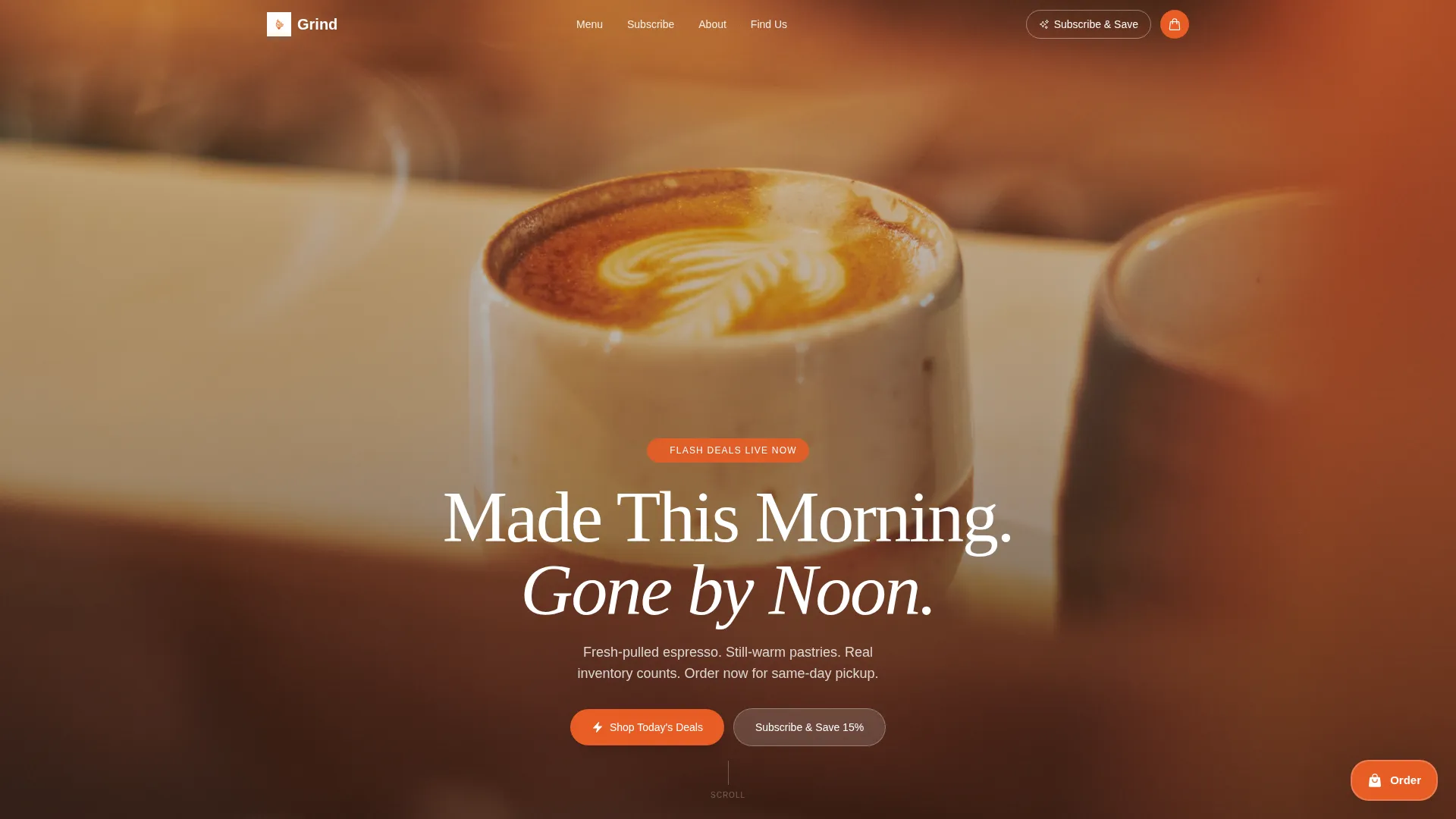
Full-Bleed Counter Header
The header fills the entire viewport with a behind-the-counter photo. Morning light, steam, and flour-dusted hands fill the frame. A single headline fades in over the image to anchor the mood before the visitor scrolls.
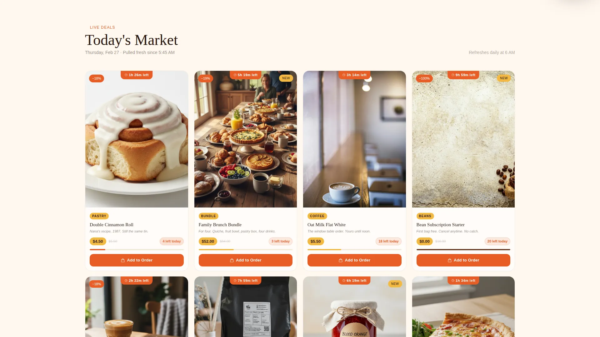
Masonry Flash-Deal Grid
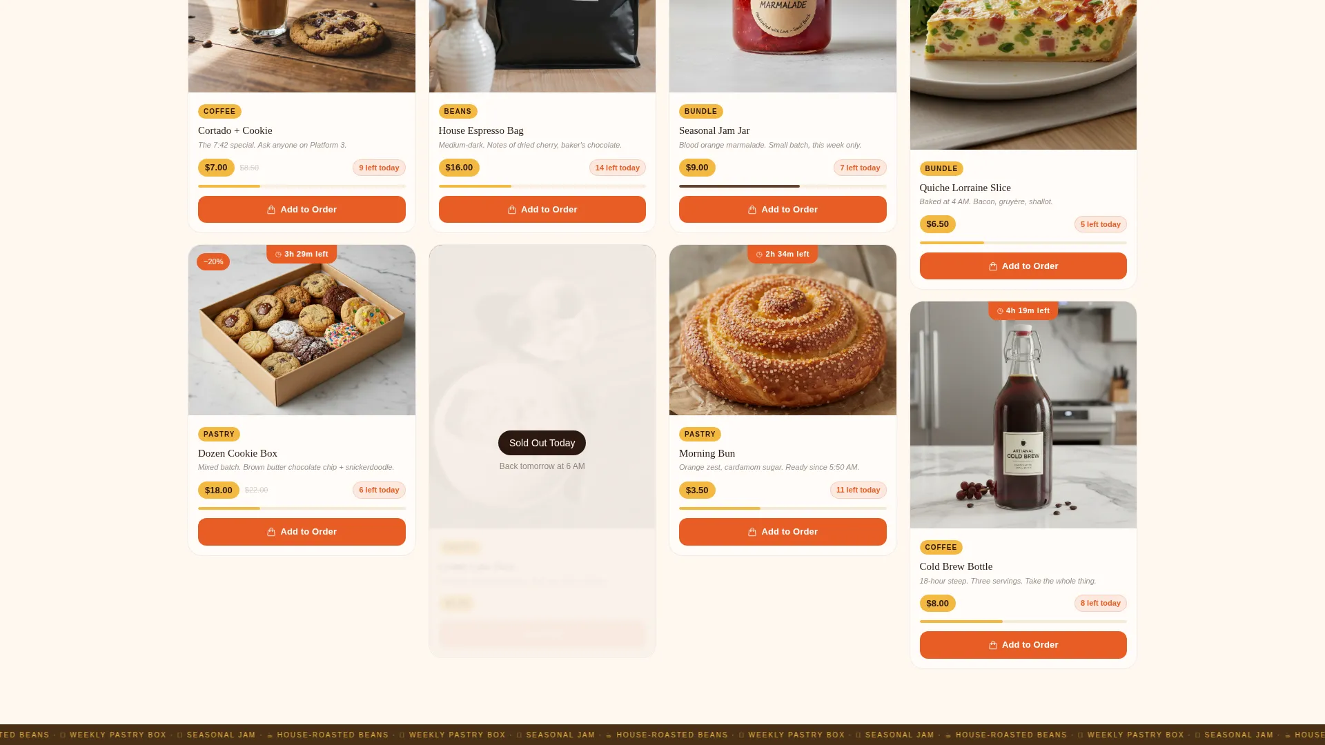
The main content area is a variable-height masonry grid. Each card shows a menu item photographed on the actual café table. Cards carry countdown ribbons, sold-out states that flip to reveal the next drop, and a gentle pulse animation as deals near expiration.
Persistent Floating Cart
A cart icon stays pinned to the bottom right of the page at all times. It expands to show selected items, a pickup-time selector with 30-minute windows, and a zip code field for local delivery. Customers never lose their order while browsing.
Live Inventory Badges
Each deal card displays a real stock count such as "6 left today." This single detail adds honest urgency without manufactured pressure. Sold-out cards change state automatically to show what is coming next.
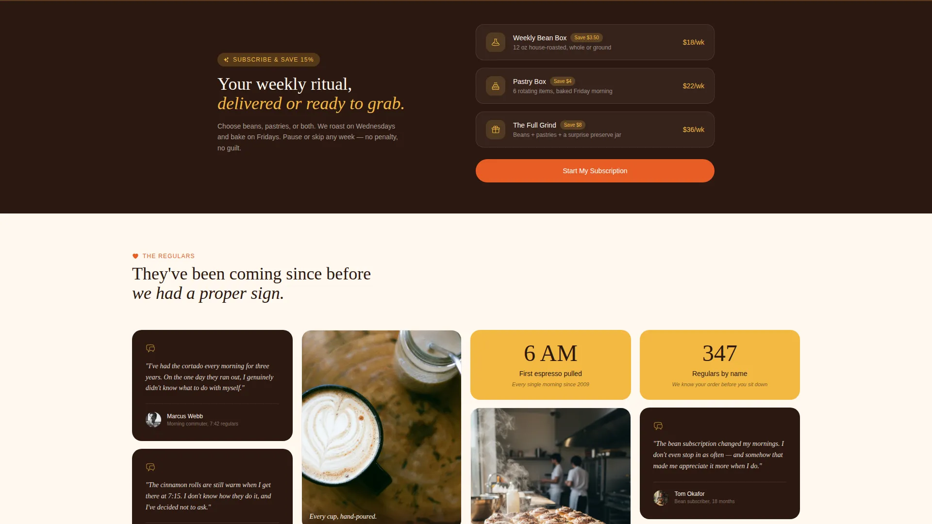
Subscribe and Save Path
A secondary conversion path at the top of the page invites visitors to subscribe to weekly bean or pastry boxes. It runs alongside the flash-deal grid without competing with the primary add-to-order flow.
Single-Line Item Stories
Every deal card pairs its price and photo with one short line of origin or context, for example "Nana's recipe, 1987." These micro-stories build trust and differentiate the café from faceless delivery apps.
Page sections overview
| Section | Purpose |
|---|---|
| Full-Bleed Header | Sets mood, displays headline |
| Subscribe and Save | Secondary conversion path |
| Masonry Deal Grid | Flash deals, urgency, browsing |
| Deal Card Ribbons | Countdown and discount signals |
| Inventory Badge Row | Live stock count display |
| Floating Cart Panel | Order building and checkout path |
| Pickup Time Selector | Confirms collection window |
| Delivery Zip Field | Qualifies local delivery radius |
Design & branding system
The visual identity uses a Citrus Burst color system built around four purposeful tones. Warm cream dominates the background, keeping the page easy on the eyes during long browsing sessions. Espresso brown grounds all headlines and body text with the weight that food photography needs around it.
- Blood orange (#E85D26) fires on every primary call-to-action button and deal ribbon, creating a clear visual hierarchy
- Meyer lemon zest (#F4B942) highlights price tags and countdown timers scattered across the masonry grid
- Deep espresso brown (#2C1810) carries all headline and body typography for maximum contrast against the cream canvas
Mobile & speed optimization
The masonry grid reflows cleanly on smaller screens so deal cards remain legible and tappable without horizontal scrolling. The floating cart stays accessible on mobile, keeping the order path intact whether a customer is at home or standing in line.
- Card images are framed to remain impactful at mobile widths without cropping the key food detail
- The pickup-time selector and zip code field are touch-friendly input elements sized for easy one-thumb use
How this template helps you convert
Every design decision on this page points toward a completed order. The layout removes friction at each step and replaces passive browsing with active decision-making.
- The countdown ribbons and inventory badges create honest, time-based urgency that moves hesitant visitors toward the "Add to Order" button before a deal expires.
- The persistent floating cart means visitors never have to navigate away from the deal grid to review their selections, which keeps momentum and reduces drop-off.
- The single-line item stories and family-kitchen photography build the kind of trust that turns a first-time visitor into a regular pickup customer.
Other information about this template
This template sits inside the Retail and E-Commerce category with a Family-Owned Business subcategory focus. It is built on a Directory and Discovery theme with a Flash Deal creative direction, making it equally useful for other food retail businesses that run limited-batch or time-sensitive offers.
- The Overlap and Layered template style means deal cards and ribbons sit in deliberate visual layers, reinforcing the market-stall browsing feel described in the brief
- The Click-Through landing page direction supports a checkout or ordering system of your choice connected downstream from the cart panel
- This layout works well for seasonal pop-up menus, holiday gift bundles, and weekly community-supported agriculture style food subscriptions alongside its core café use case
Theme
Directory & Discovery
Creative direction
Flash Deal
Color system
Ink & Paper
Style
Overlap/Layered
Direction
Click-Through
Page Sections
Full-bleed Counter Header
Masonry Flash-deal Grid
Persistent Floating Cart
Live Inventory Badges
Subscribe and Save Path
Single-line Item Stories
Related questions
Can I change the menu items and photos to match my café?
How does the countdown timer on each deal card work?
Does the floating cart connect to a payment processor?
Is this template suitable for a bakery or small food market, not just a café?



