Hand Surgeon Booking Website Template
Grip is a single-column landing page template built for hand surgery practices. It leads with hard outcome data, guides patients through a five-step inline symptom assessment, and earns consultation bookings through a stats-first evidence wall. The Medical Clarity design system pairs surgical teal with sterile white and a single warm coral accent for calls to action.
by Rocket studio
Quick summary
Grip is a precision-focused hand surgery landing page template that puts outcome data front and center. Patients see real procedure statistics before they read a single line of marketing copy. A five-step progressive symptom quiz then moves them naturally toward booking, while a direct consultation path serves referrals who are already diagnosis-ready.
Who this template is for
This template is built for hand surgery practices that want to convert website visitors into booked consultations without a generic, brochure-style page. It works best when the practice can back its copy with real patient outcome data.
- Hand surgeons and microsurgery specialists running a solo or group practice
- Medical marketing teams who need a patient-facing portal that leads with clinical credibility
- Practices serving a mixed patient base, from acute trauma referrals to patients still self-diagnosing at home
What problem this template solves
Most medical landing pages bury their credibility. They open with a headline, then a tagline, then eventually some credentials in the footer. By that point, an anxious patient searching on their phone has already left. Grip reverses that order.
- Patients arrive scared and skeptical; the stats-first layout gives them a reason to trust before they read any copy
- The five-step symptom quiz reduces friction for patients who are not yet ready to call a clinic directly
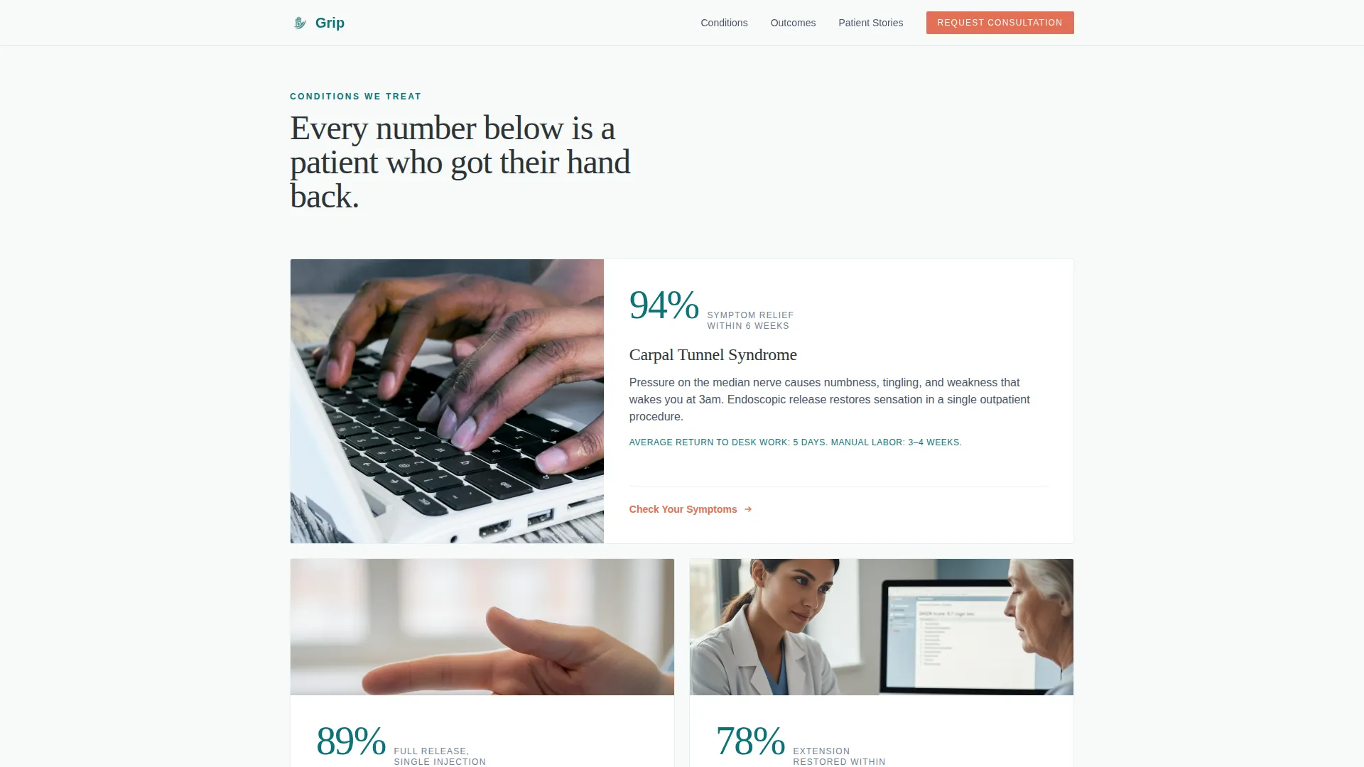
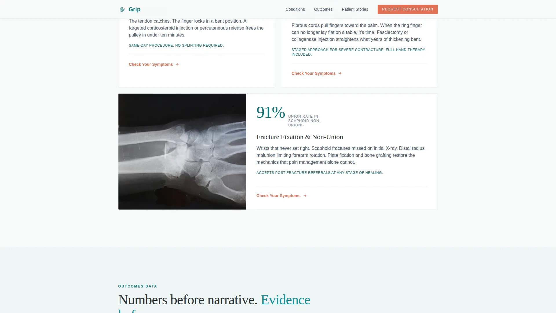
- Condition-specific outcome blocks for carpal tunnel, trigger finger, Dupuytren's contracture, and fracture fixation give each patient type a clear entry point
What you get with this template
Grip includes a fully structured single-column landing page with six purpose-built sections, a dual call-to-action system, and a detailed design specification ready to build from.
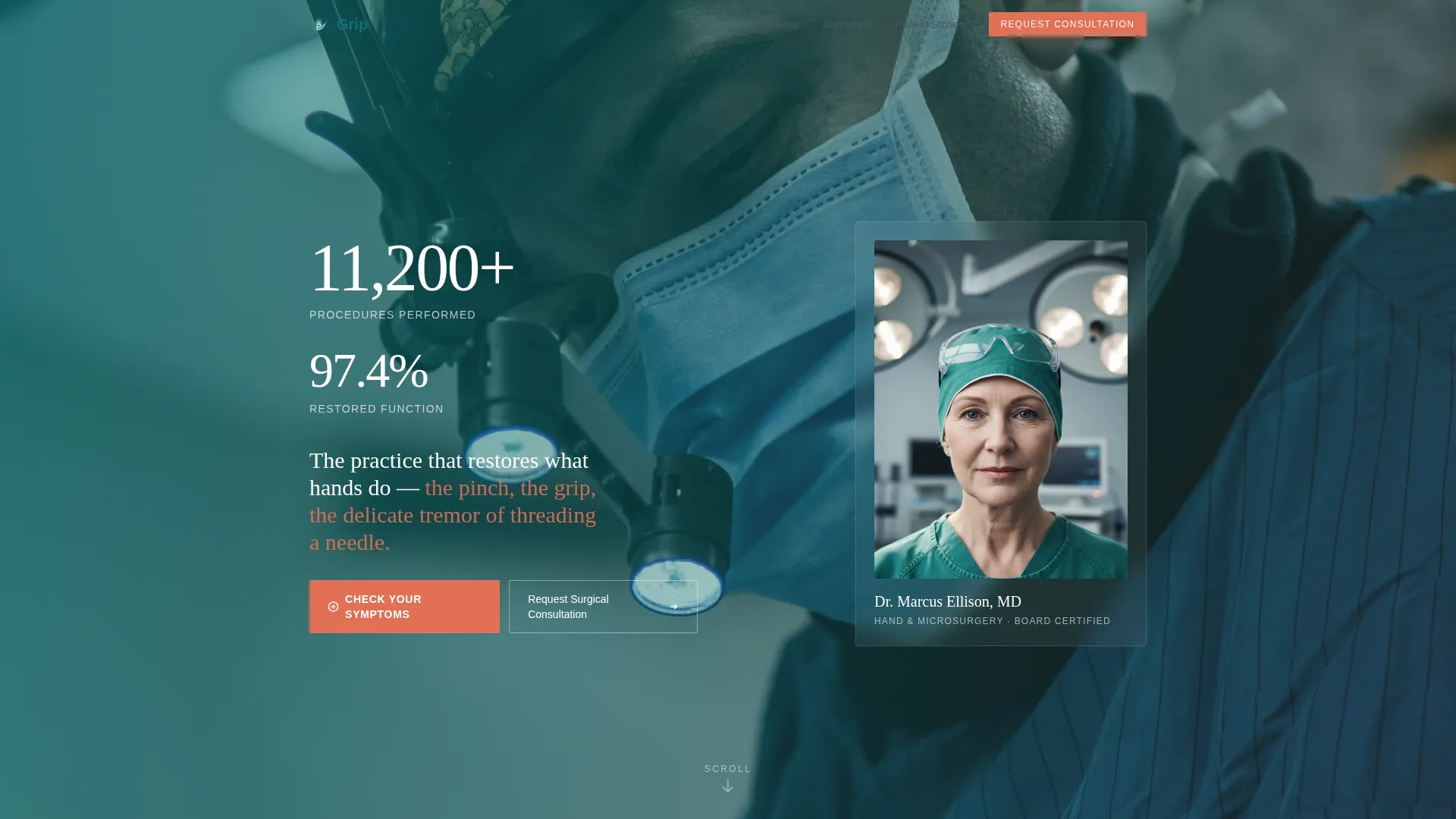
- A portrait-centered hero section with a cascading stat reveal and two distinct conversion paths
- An inline five-step symptom assessment quiz with a teal progress bar and one question per screen
- Three patient story slots with procedure type and return-to-work timeline details built into the layout
Feature list
A paragraph introducing the feature set: every major feature in Grip is grounded in a specific clinical conversion need. The template does not rely on decorative user interface. Each component earns its place by moving a hesitant patient one step closer to a confirmed appointment.
Stats-First Hero Section
The hero opens with a tightly composed portrait of the lead surgeon, hands visible and in focus. A single statistic fades in beside the portrait before any headline appears. This sequence builds trust through specificity rather than through claims.
Five-Step Symptom Assessment Quiz
The inline quiz walks patients through five sequential questions: affected hand, primary symptom, duration, previous treatment history, and insurance carrier. Each step occupies its own screen with a teal progress bar tracking advancement. The design keeps one question visible at a time to reduce overwhelm.
Condition-Specific Outcome Blocks
Four condition blocks, covering carpal tunnel syndrome, trigger finger, Dupuytren's contracture, and fracture fixation, each open with a bold isolated outcome statistic. An explanatory paragraph follows the number. This cascading rhythm makes the symptom assessment feel like a natural next step rather than a sales prompt.
Dual Call-to-Action System
Two conversion paths run in parallel throughout the page. "Check Your Symptoms" guides patients who need answers first. "Request Surgical Consultation" serves post-diagnosis referrals who are ready to book without the quiz. Both calls to action use the coral accent exclusively, making them impossible to miss against the sterile white background.
Patient Story Section
Three patient story slots are structured to include the patient type, the procedure performed, and a specific return-to-work or recovery timeline. The layout draws from real-world patient profiles: a construction worker, a pianist, and a grandmother, giving each visitor a recognizable analog for their own situation.
Outcomes Evidence Wall
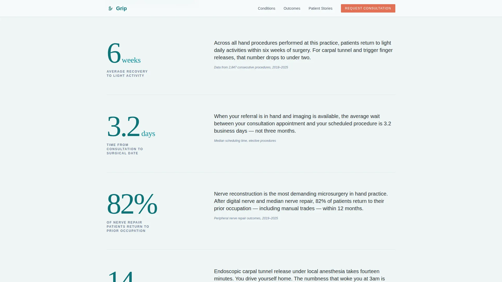
A dedicated scroll section presents bold, isolated numbers with supporting paragraphs underneath each one. Metrics include nerve repair success rates, average recovery timelines, and return-to-work percentages organized by procedure type. The rhythm alternates between number, pause, and context throughout the scroll.
Page sections overview
| Section | Purpose |
|---|---|
| Hero Portrait | Surgeon photo, cascading stat reveal, dual call to action |
| Conditions Grid | Four condition blocks each leading with an outcome stat |
| Outcomes Evidence Wall | Bold isolated numbers with explanatory paragraphs |
| Symptom Assessment Quiz | Five-step inline progressive questionnaire |
| Patient Stories | Three testimonials with procedure type and recovery timeline |
| Footer | Linear single-row footer with practice contact information |
Design & branding system
The visual identity follows a Medical Clarity theme. The overall feeling is a modern surgical suite: cool hygienic light, open space, and one warm indicator that draws the eye exactly where it needs to go.
- Color system: surgical teal (#0D7377) as the dominant accent, sterile white (#F7FAFA) for open backgrounds, charcoal scrub gray (#2D3436) for body text, and warm catalyst coral (#E17055) reserved exclusively for interactive elements and call-to-action pulses
- Typography: Fraunces handles display and serif headlines; DM Sans handles body copy, both chosen for legibility and premium medical positioning
- Animations are set to medium intensity with staggered fade-up on scroll and a count-up effect on numeric statistics
Mobile & speed optimization
Grip is built mobile-first. Patients searching for hand pain relief often do so on a phone, sometimes mid-episode. The layout prioritizes fast, thumb-friendly interaction from the first scroll.
- The single-column flow stacks cleanly on small screens without horizontal overflow or content reflow issues
- The five-step quiz is designed with one question per screen, which keeps mobile interaction focused and reduces tap errors
- Static page sections are structured for Server Component rendering, with the quiz isolated as a Client Component to keep interactivity scoped
How this template helps you convert
Grip is built around a conversion logic that matches how anxious patients actually behave online. It does not ask for commitment before it earns trust.
- The stats-first layout front-loads clinical proof, so patients stay on the page long enough to reach the quiz or the direct consultation button
- The dual call-to-action system captures two distinct patient intents in one page flow, self-diagnosing patients and referral-ready patients, without either path interrupting the other
Other information about this template
Grip is part of a broader template system designed for specialty medical practices that need precise, patient-facing conversion tools. A few additional details worth knowing before you build with this template:
- The footer follows Pattern 1, a linear single-row layout suited for practices with a minimal footer need
- Credential badge slots are included in the layout to display board certifications or hospital affiliations
- The template is localized for United States audiences with English copy, USD pricing references, MM/DD/YYYY date format, and 12-hour time display
- Animation intensity is set to medium by default; staggered fade-up effects and the number count-up can be adjusted during implementation
- The Fraunces and DM Sans typeface pairing is embedded in the design specification and chosen deliberately for its non-generic, premium medical feel
Theme
Medical Clarity
Creative direction
Stats-First Impact
Color system
Teal Catalyst
Style
Single Column Flow
Direction
Quiz/Assessment
Page Sections
Stats-first Hero with Portrait
Five-step Symptom Assessment Quiz
Condition-specific Outcome Blocks
Dual Call-to-action System
Outcomes Evidence Wall
Patient Story Section
Related questions
Can I use this template without the symptom quiz?
Do I need real outcome statistics to use this template effectively?
What hand conditions does the template cover?
Is this template suitable for a group practice with multiple surgeons?
Can the quiz questions be customized?



