Construction Finance Landing Page Template
Groundbreak is a dashboard-style construction finance landing page built for private lenders who move faster than traditional banks. It combines animated stat cards, a loan product comparison matrix, a funded-project map, and a sticky call-to-action bar to turn site visitors into qualified loan applicants, before they ever submit a single form field.
by Rocket studio
Quick summary
Groundbreak is a single-page, data-dense landing page template for construction loan providers. It opens with a scrolling logo ticker and live-styled metric cards, walks visitors through a benchmark comparison and loan product grid, then closes with a sticky "See Your Rate" call-to-action bar. Every section is designed to replace vague promises with specific, verifiable numbers.
Who this template is for
This landing page is built for private construction lenders whose core advantage is speed. It is also well-suited for real estate finance companies, bridge-to-perm providers, and hard-money teams who want to generate leads from serious operators rather than casual browsers.
- Spec home builders and general contractors who have pulled permits and need a capital partner fast
- Commercial developers racing entitlement timelines across multiple active projects
- Construction loan companies wanting a high-credibility page that converts site visitors into applicants
What problem this template solves
Traditional construction finance websites bury the most important details. Borrowers have to request a callback just to learn basic rate ranges or loan-to-value caps. That friction kills conversions and drives qualified visitors straight to a competitor's page.
- Visitors can not quickly evaluate loan products, timelines, or funding speed without digging through generic copy
- Lenders lose leads because their landing page looks identical to every other finance site
- Professionals who deal in hard numbers every day do not trust a page that delivers only soft promises
What you get with this template
This template gives you a complete, production-ready landing page structured around a fintech command-center visual language. Every section is purposeful. Every element earns its place.
- A hero section with an animated stat cluster, scrolling logo ticker, and a primary call-to-action that loads above the fold
- A three-panel loan product matrix covering fix-and-flip, ground-up, and bridge-to-perm structures with rate ranges, loan-to-value caps, and term lengths
- A geographic dot-density project map, testimonial block, and sticky bottom call-to-action bar that follows users on scroll
Feature list
This landing page template is engineered around one agenda: prove competence before asking for a loan amount.
Animated Hero Stat Cards
Three data cards snap into view below the headline, each displaying a key portfolio metric with a count-up animation. Average days to first draw, funded-to-close ratio, and repeat borrower percentage load like a live dashboard. This approach immediately signals to visitors that this lender operates at a different speed than the competition.
Scrolling Logo Ticker
A clean horizontal strip of builder, developer, and contractor brand logos scrolls steadily beneath the headline stat. Visual trust signals like recognizable logos of construction partners are critical for immediate credibility. The ticker functions as continuous social proof without consuming extra vertical space on the page.
Loan Product Comparison Matrix
Fix-and-flip, ground-up, and bridge-to-perm loan structures are displayed in a side-by-side data grid. Each card shows rate ranges, loan-to-value caps, and term lengths so users can evaluate products at a glance. This section replaces the need for a sales call just to access basic loan parameters.
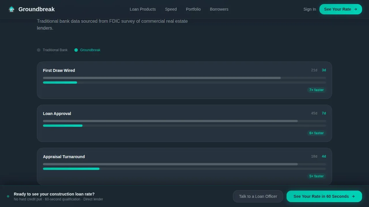
Benchmark Timeline Data Grid
Section one of the scroll benchmarks average construction loan timelines at traditional banks against this lender's draw speed. The data grid layout makes the advantage concrete and scannable. Visitors do not need to take anyone's word for it, the numbers outline the case on their own.
Geographic Project Map
A dot-density visualization maps funded projects across US cities and states. Displaying financial performance metrics like total projects funded offers quantified social proof. The map reinforces scale and coverage without requiring visitors to read a paragraph of claims.
Sticky Call-to-Action Bar
After the second scroll, a persistent bottom bar carrying the primary call-to-action appears and stays visible throughout the rest of the page. This keeps the conversion path accessible without interrupting the reading experience. The bar is a direct route to a dedicated qualification page, not a generic contact form.
Page sections overview
| Section | Purpose |
|---|---|
| Hero Stat Cluster | Animate portfolio metrics above the fold |
| Logo Ticker Strip | Scroll builder and partner logos for social proof |
| Benchmark Data Grid | Compare lender speed against traditional banks |
| Loan Product Matrix | Display fix-and-flip, ground-up, bridge-to-perm cards |
| Funded Project Map | Visualize geographic coverage with dot density |
| Testimonials Block | Surface specific outcome quotes from borrowers |
| Sticky call to action Bar | Keep rate-check call-to-action visible on scroll |
| Footer Pattern | Deliver links and secondary information cleanly |
Design & branding system
The visual identity follows a Startup Velocity theme built on the Teal Catalyst color system. The palette reads like a fintech terminal at 6 AM, dark, focused, and precise. Every bright element earns its presence because it signals that capital is moving.
- Deep command-center charcoal (#1B2631) for primary backgrounds, slate graphite (#37474F) for card surfaces, and sharp white (#F0F4F5) for all body typography
- Electric teal (#00BFA6) as the dominant accent across data points, call-to-action buttons, progress bars, and all interactive hover states
- DM Sans for data labels and interface copy; Fraunces for editorial headlines, a pairing that keeps the page readable and authoritative at every scroll depth
Mobile & speed optimization
Although this template is desktop-first by design, because the target audience reviews deals on large screens, it includes full mobile support so no visitor is left behind. Fast loading times are essential for any landing page; slow pages increase the bounce rate and push qualified traffic away before they ever see your best data.
- Scroll-triggered reveals and count-up animations are handled by client components, keeping static sections lean and quick to load
- The sticky call-to-action bar is sized and positioned to remain tappable on mobile screens without obscuring content
- The layout adapts so that data grids, logo tickers, and the project map remain legible and functional on smaller viewports
How this template helps you convert
This landing page is designed around a click-through strategy that front-loads proof so visitors arrive at the qualification form already confident. A well-optimized landing page significantly boosts conversions and lead generation when it focuses on a single objective.
- The hero section puts the primary call-to-action, "See Your Rate in 60 Seconds", inside the stat card cluster before the first scroll, capturing visitors who are ready to act immediately and reducing bounce rate on high-intent traffic.
- The loan product matrix and benchmark grid deliver the specific data that professionals need to submit a serious inquiry, turning passive visitors into active leads without requiring them to request a callback first.
- A secondary path, "Download the 2024 Construction Lending Report", captures email addresses from visitors still in research mode, giving the lender's team a second funnel to nurture and convert at a later date.
Other information about this template
This template sits in the Finance and Insurance category, specifically the Real Estate Finance subcategory for the construction loan provider niche. It is a strong fit for companies and professionals who want to generate leads through data-driven design rather than generic imagery.
- The creative direction is Industry Report, each section reads like a proprietary market brief, which aligns naturally with the way construction professionals exchange information and evaluate service providers
- The template can support connection to analytics tools such as Google Analytics so your team can track page sessions, measure engagement, and gather feedback on which sections drive the most conversions
- Personalizing the message for specific audience segments, spec builders versus commercial developers, for example, can enhance the landing page's effectiveness further; the modular layout makes it straightforward to adapt copy without rebuilding the entire site structure
- Construction budgeting landing pages designed around proven practices and integrated with Google Ads campaigns can enhance engagement and deliver measurable growth in qualified lead volume
- Keeping the qualification form to three or four essential fields helps protect completion rates; this template routes users to a dedicated page built for that purpose, keeping the primary landing page free of form clutter
- The template can store testimonials with project-specific details, which contribute to credibility in ways that generic quote blocks simply can not match for an audience of experienced contractors and developers
- Explore the complete template alongside other examples in the Real Estate Finance category to find the right fit for your current growth strategy and brand identity


Theme
Startup Velocity
Creative direction
Industry Report
Color system
Teal Catalyst
Style
Dashboard/Data Grid
Direction
Click-Through
Page Sections
Animated Hero Stat Cards
Loan Product Comparison Matrix
Scrolling Logo Ticker
Benchmark Timeline Grid
Geographic Funded Project Map
Sticky Rate-check Call to Action Bar
Related questions
Who is the primary audience for this landing page template?
Can I customize the loan product cards and rate data?
Does this template include a secondary lead capture option?
Is the template optimized for desktop and mobile users?
How does the sticky call-to-action bar work?


