Flight School Marketing Advanced Booking Website Template
Groundschool is a split-screen landing page template built for flight school seasonal promotions. It pairs a bold serif headline with a cockpit photograph, then walks visitors through three student case studies before directing them to book a discovery flight. The Plum Executive color system and case study narrative structure give the page an authoritative, logbook-warm tone that earns trust before the call to action ever appears.
by Rocket studio
Quick summary
Groundschool is a single-page, split-screen landing page template designed for flight school seasonal promotions. It uses a Case Study Narrative structure, a Plum Executive color palette, and a click-through call to action to move first-time visitors toward booking a discovery flight. The layout is confident, warm, and built to convert curious newcomers into committed students.
Who this template is for
This template is built for flight schools that run structured seasonal training programs. It speaks directly to the mix of students who walk through the hangar door each season, and it gives the school a page that matches their ambition.
- Flight schools targeting career-changers, college students, and adult learners pursuing a Private Pilot certificate or beyond
- Marketing teams promoting a seasonal intake with a discovery flight as the entry-point offer
- Flight school owners who want a polished, story-driven promotional page without building from scratch
What problem this template solves
Most flight school promotional pages lead with prices or a contact form before the visitor has any reason to trust the school. That approach loses the hesitant first-timer before the conversation even starts.
- Nervous prospects need proof before they commit, and a form-first layout gives them no reason to stay
- Seasonal promotions require urgency and narrative momentum, not just a list of course options
- Schools offering multiple training tracks struggle to show career-changer paths, hobbyist paths, and intensive paths on one coherent page
What you get with this template
You get a fully structured, section-led landing page that takes the visitor on a deliberate journey from first impression to booking click. Every layout decision is already made for you.
- A split-screen hero section with a Giant Headline Left and a cockpit photograph on the right
- Three escalating student case studies with split-screen week-one and milestone pairings, plus single-stat interstitials in transponder amber between each narrative
- A closing pricing snapshot section with a single "Reserve Your Discovery Flight" call-to-action button linked to an external booking calendar
Feature list
This section covers the core built-in capabilities that make the Groundschool template work as a seasonal promotion tool.
Split-Screen Hero Section
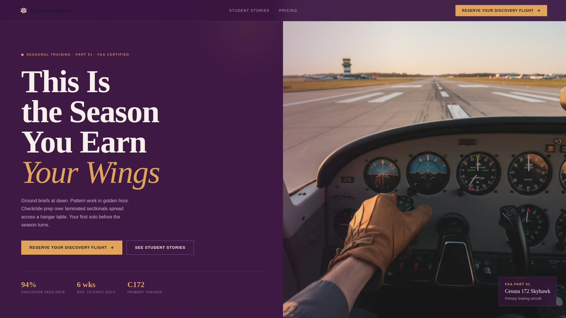
The hero divides the viewport into two equal halves. The left side carries an enormous stacked serif headline reading "This Is the Season You Earn Your Wings" against the deep cockpit plum background. The right side holds a still photograph taken from the right seat of a trainer aircraft, putting the visitor mentally in the cockpit from the first scroll position.
Case Study Narrative Structure
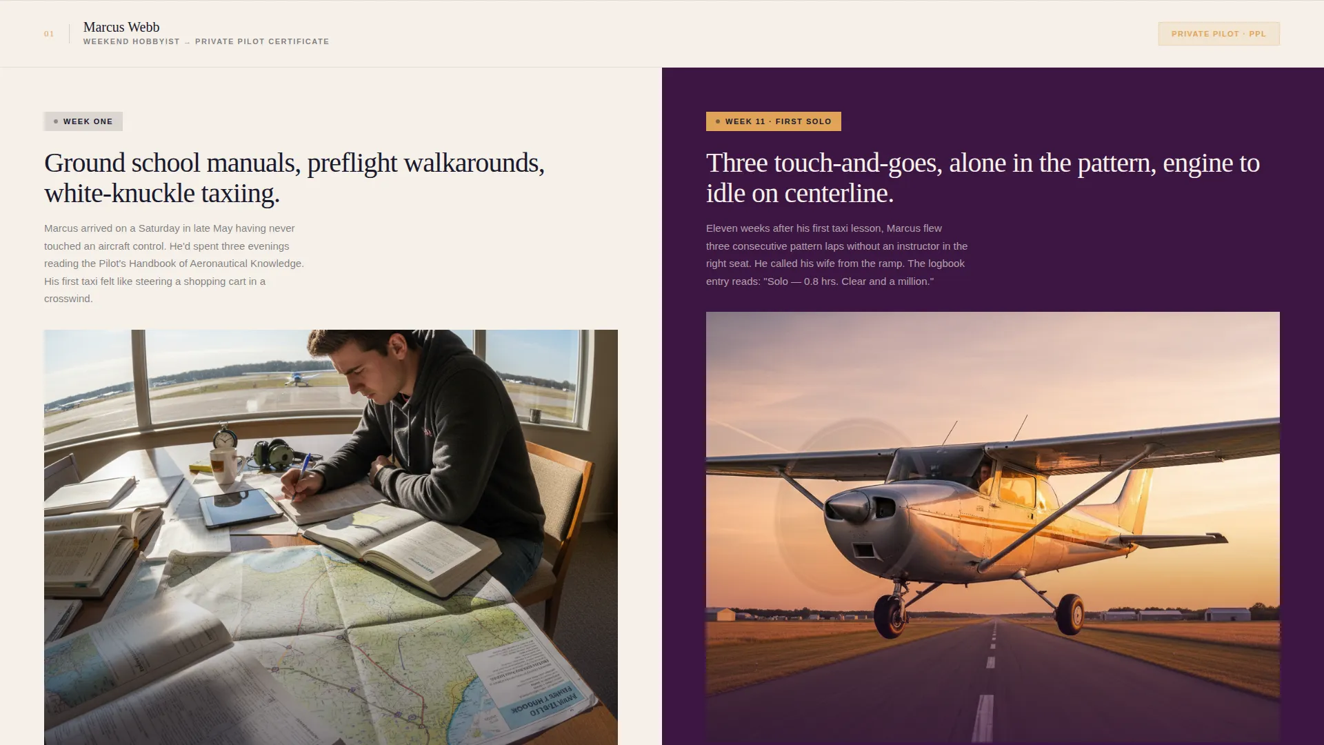
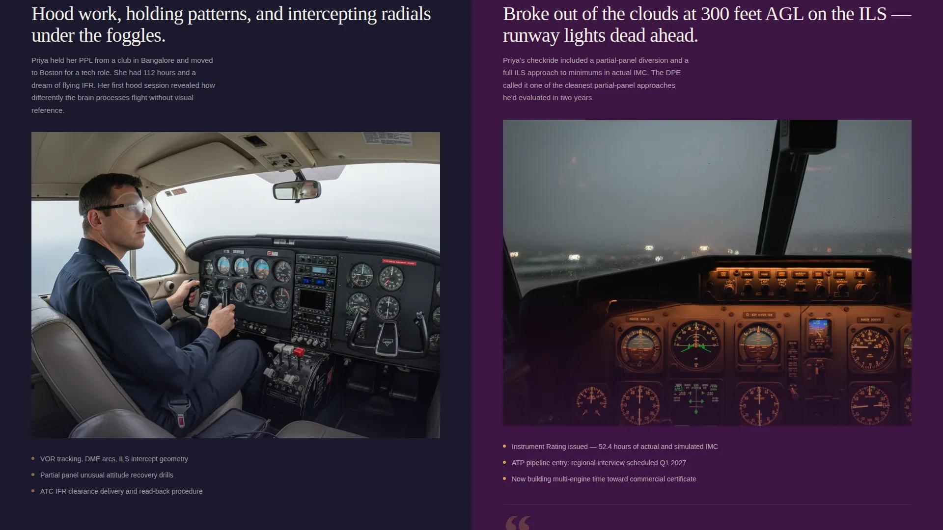
Three student stories run sequentially down the page. Each case study pairs a "week one" moment on the left with a milestone achievement on the right, using a split-screen layout. The first story covers a Private Pilot certificate, the second covers Instrument rating hours, and the third covers a zero-to-commercial intensive track.
Stat Interstitials in Transponder Amber
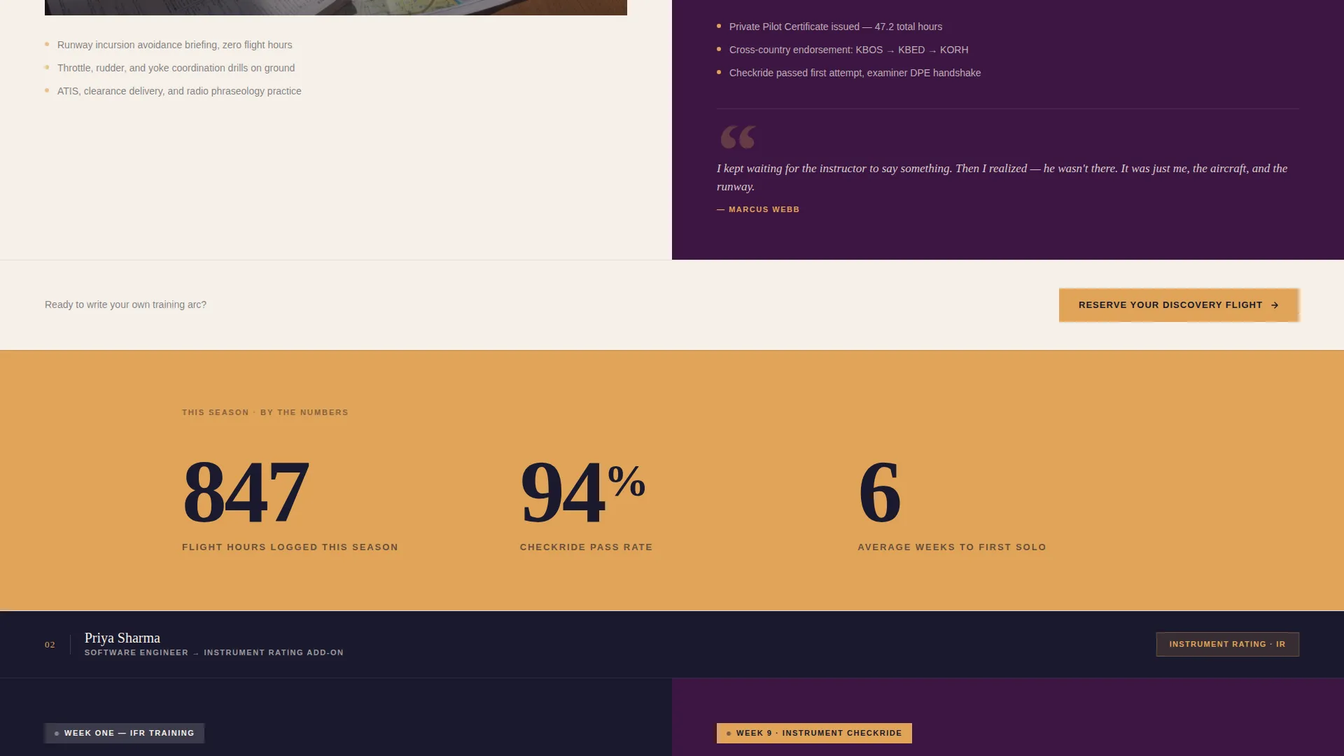
Between each case study, a single-stat interstitial breaks the scroll rhythm. These panels highlight metrics such as total flight hours logged, checkride pass rate, and average weeks to solo. The transponder amber color makes each stat stand out without interrupting the narrative flow.
Pinned and Repeated Call to Action
The "Reserve Your Discovery Flight" button appears three times: pinned in the header, repeated after each case study, and anchored in the closing section. No form is present on the page. The button click-through leads to an external booking calendar, keeping the conversion path clean and low-friction.
Seasonal Pricing Snapshot Section
The closing section pairs a transparent pricing overview with the final call-to-action button. It covers the discovery flight cost, block-rate savings, and a financing note, giving the visitor the practical detail they need to commit without leaving the page to find it.
Plum Executive Color System
The palette uses deep cockpit plum, instrument-panel charcoal, logbook cream, and transponder amber as its four core tones. Color roles are clearly assigned: plum for backgrounds, charcoal for secondary panels, cream for body text areas, and amber strictly for calls to action, progress markers, and hover states.
Page sections overview
| Section | Purpose |
|---|---|
| Split-Screen Hero | Delivers headline impact and cockpit photograph side by side |
| Case Study One | Hobbyist earning Private certificate, week-one to first solo |
| Amber Stat Interstitial | Breaks scroll rhythm with a single seasonal metric |
| Case Study Two | Career-switcher stacking Instrument rating hours |
| Amber Stat Interstitial | Highlights checkride pass rate in transponder amber |
| Case Study Three | Zero-to-commercial intensive student arc |
| Amber Stat Interstitial | Shows average weeks to solo milestone |
| Pricing Snapshot | Discovery flight cost, block-rate savings, financing note |
| Closing call to action Section | Final "Reserve Your Discovery Flight" button to booking calendar |
Design & branding system
The visual identity follows an Educational Guide theme executed through the Plum Executive color system. The result feels like cracking open a leather-bound pilot logbook under the amber dome light of a parked aircraft: authoritative, warm, and quietly ceremonial.
- Core palette: deep cockpit plum (#3C1642), instrument-panel charcoal (#1A1A2E), logbook cream (#F5F0E8), and transponder amber (#E0A458)
- Typography: enormous stacked serif type in the hero, weighted like approach plate altitude callouts, with cream body text for readability across dark panel backgrounds
- No animation or motion anywhere on the page; visual weight comes from scale, stillness, and the cockpit photograph filling the right half of the hero
Mobile & speed optimization
The split-screen layout is designed to reflow cleanly on smaller viewports. Each paired section collapses to a single-column stack without losing the week-one to milestone narrative logic.
- Split-screen panels stack vertically on mobile, keeping the case study pairings readable in sequence
- Stat interstitials retain their amber color treatment and single-stat format at all viewport sizes
- The pinned header call-to-action remains accessible at the top of the scroll on mobile, so the booking path is never buried
How this template helps you convert
The page is engineered as a click-through, meaning it builds trust through narrative before asking for any commitment. The call to action is a single button that sends the visitor to a booking calendar.
- The three case study narratives do the selling first. By the time a visitor reaches the closing section, they have seen three real training arcs from hesitation to achievement, which reduces the anxiety that typically stops first-timers from booking.
- The seasonal pricing snapshot gives practical clarity at exactly the right moment, pairing cost and financing context with the final call-to-action button so the visitor has no unanswered questions when they click.
Other information about this template
This template is categorized under Professional Services, specifically the Flight School Marketing subcategory. It is purpose-built for the Flight School Seasonal Promotion Page niche and carries an Educational Guide theme throughout.
- Template style: Split Screen (50/50) layout with a Giant Headline Left header concept
- Creative direction: Case Study Narrative, following three student journeys from first ground brief to final milestone
- The page is a Click-Through landing page; all data collection happens on the external booking calendar page, not on this template
- No embedded forms, no multi-step flows, and no animation are included in the design
Theme
Educational Guide
Creative direction
Case Study Narrative
Color system
Plum Executive
Style
Split Screen (50/50)
Direction
Click-Through
Page Sections
Split-screen Hero with Stacked Serif Headline
Three Escalating Case Study Narratives
Transponder Amber Stat Interstitials
Pinned and Repeated Click-through Call to Action
Seasonal Pricing Snapshot Section
Plum Executive Color System
Related questions
Does this template include a contact form?
Can I use this template for multiple training tracks?
Is the pricing section part of the template?
Does the template use any animations or motion effects?
Can this template work for year-round promotions, not just seasonal ones?



