Multi-Family Apartment Construction Portfolio Website Template
Groundskeep is a modular card-grid landing page built for multi-family apartment landscaping contractors. It opens with bold performance metrics, builds trust through a case study narrative, and drives action with an inline grounds health assessment. The template targets property managers, asset managers, and HOA boards looking for a contractor who treats landscaping as a property performance tool.
by Rocket studio
Quick summary
Groundskeep is a single-page, card-grid landing page template for multi-family apartment landscaping contractors. It leads with four oversized stat metrics, builds credibility through flipping case-study cards, and closes with a five-step grounds health quiz. The design uses a Fire and Earth color system to communicate precision, durability, and ground-level expertise from the first scroll.
Who this template is for
This template is built for landscaping contractors who focus on apartment complexes, multi-unit housing communities, and managed residential properties. It speaks directly to the commercial side of landscaping, the clients who care about compliance, budgets, and resident retention as much as curb appeal.
- Property managers overseeing large apartment communities with deferred maintenance backlogs
- Asset managers preparing multi-family portfolios for sale or refinancing who need documented grounds improvements
- HOA boards fielding resident complaints about drainage failures, dead turf, or deteriorating hardscape
What problem this template solves
Most landscaping contractor websites look like residential lawn care brochures. They do not speak to the operational and financial concerns of commercial property decision-makers. Groundskeep closes that gap by presenting landscaping as a property performance service, not a seasonal chore.
- Generic contractor sites fail to communicate scale, compliance experience, or measurable outcomes
- Decision-makers need proof of complex project delivery before they will commit a multi-year service contract
- Property managers and asset managers want diagnostic data, not just a quote request form
What you get with this template
You get a fully structured, ready-to-customize landing page that combines a metrics header, a portfolio case study grid, and an interactive property assessment module. Every section is purpose-built to move a skeptical commercial buyer from awareness to a booked site walk-through.
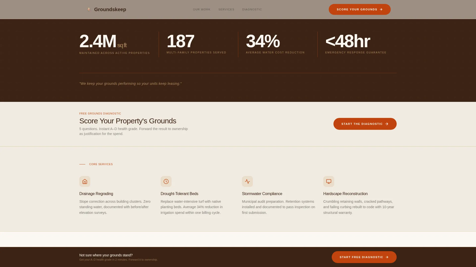
- A horizontal stats band featuring four key performance figures with oversized numerals and a terracotta rule separator
- A modular card grid where each card shows a real property scenario, flips to reveal scope and outcomes, and builds a portfolio narrative as the visitor scrolls
- An inline five-step grounds health quiz that scores the visitor's property and presents a scheduling prompt for a walk-through
Feature list
This template is built around purposeful components that serve commercial landscaping buyers. Each feature earns its place by addressing a specific concern that property and asset managers bring to the table.
Oversized Stats Header Band
Four large performance numerals sit on a deep loam background at the top of the page. Each number carries a single-line descriptor beneath it. A thin terracotta rule separates the figures, and one anchoring line of copy runs below the band. No hero image competes for attention. The numbers do the work.
Flipping Case Study Card Grid
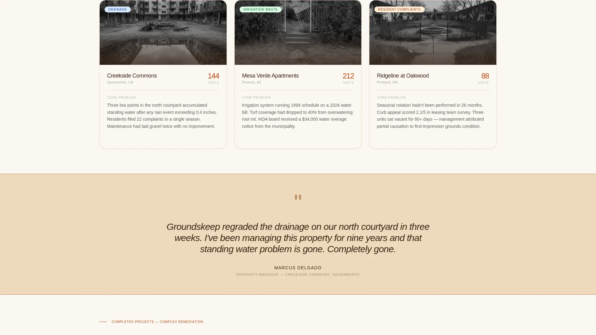
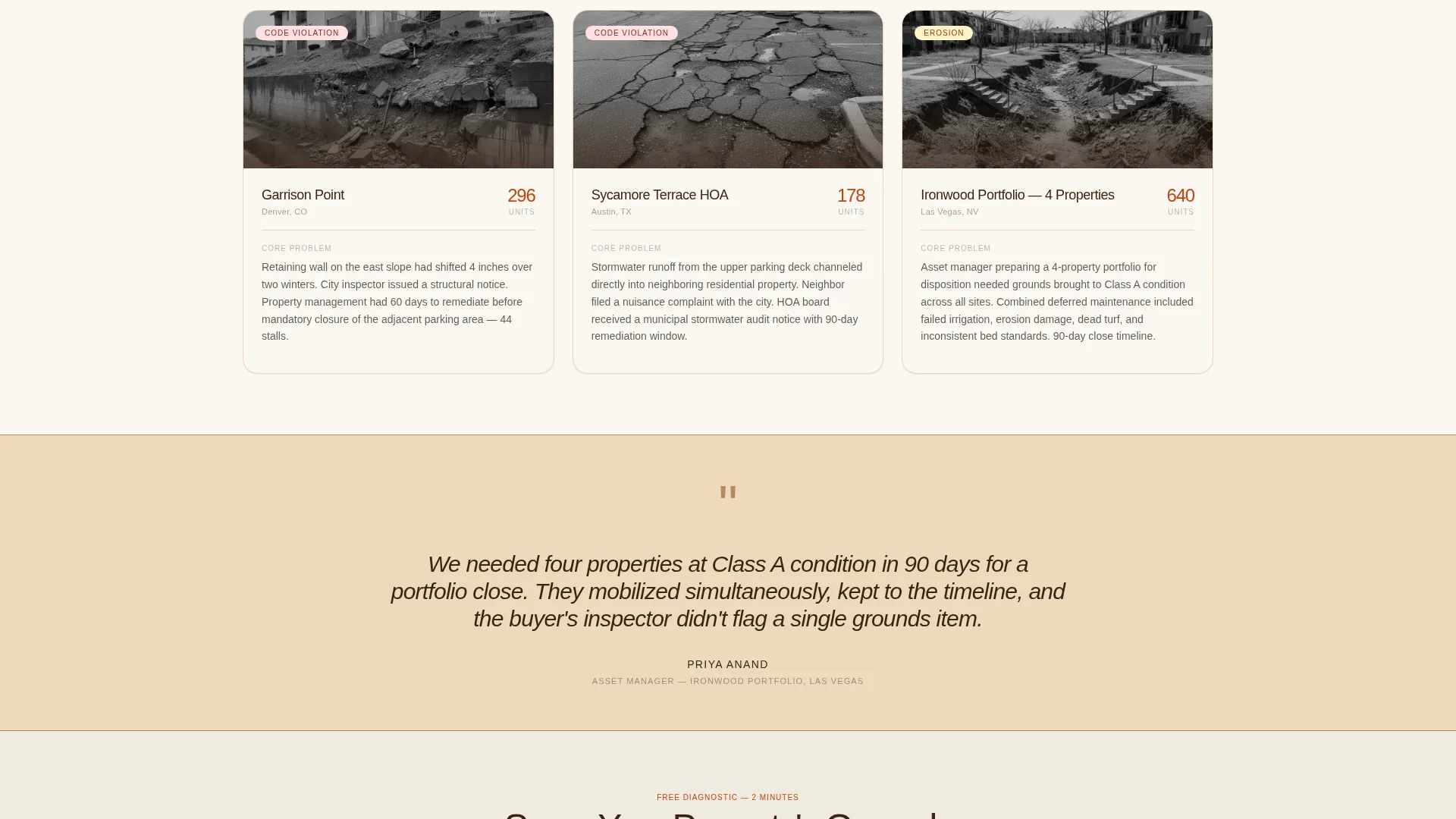
Each modular card in the grid represents one completed property project. The front face shows a before-condition thumbnail, unit count, and the core problem. On flip or scroll, the card reveals the scope of work, timeline, and one quantified outcome. The grid is structured so project complexity escalates row by row, showing the contractor's full range.
Pull-Quote Sandstone Bands
Between card rows, a single pull-quote from a property manager appears on a sandstone-toned divider band. These bands ground each tier of the portfolio in a real client voice. They break the visual rhythm of the grid and add social proof at the exact moment a visitor is weighing credibility.
Inline Grounds Health Assessment
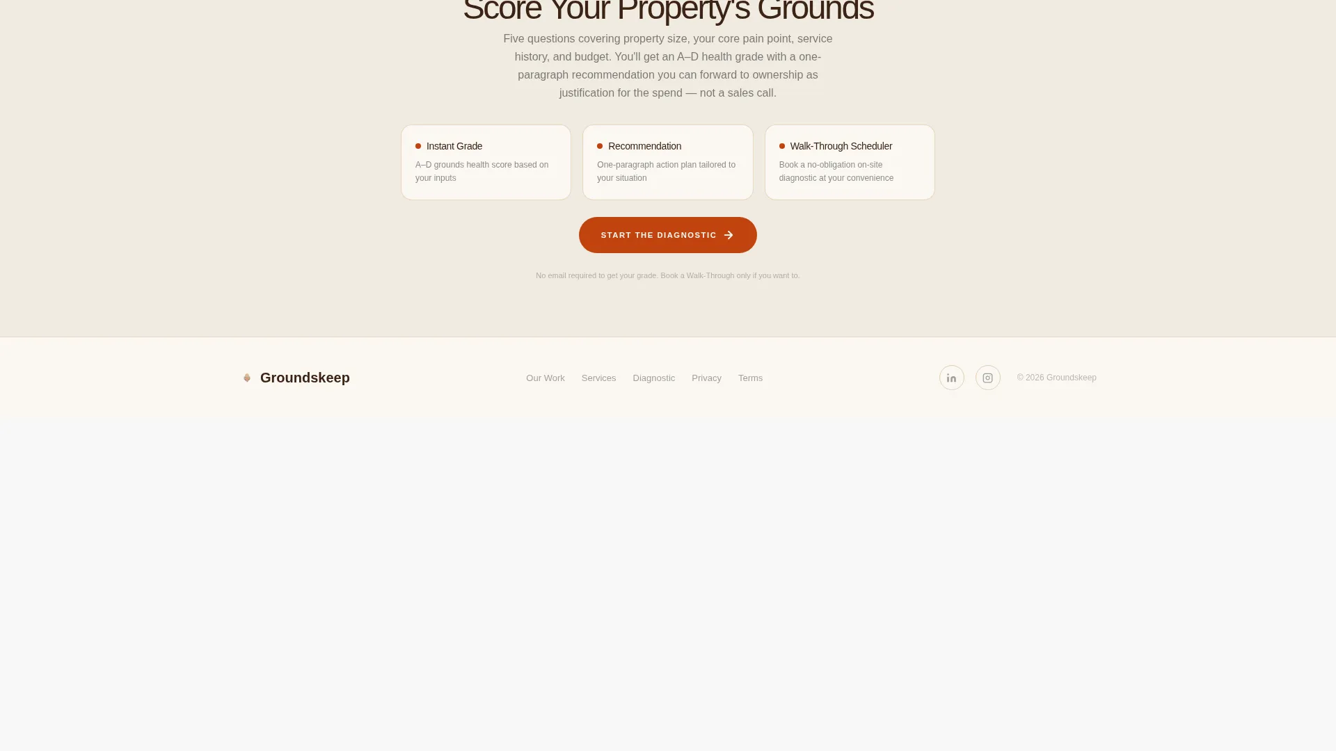
The primary call to action is a five-step assessment that opens as an inline module. It covers property size, current pain point, last service date, annual budget range, and a photo upload for the worst on-site area. The result is an A-through-D grounds health grade with a one-paragraph recommendation. A scheduling prompt labeled "Book a Walk-Through" follows the result.
Sticky Assessment Call-to-Action Bar
After the third row of case study cards, a sticky bottom bar appears with the "Score Your Property's Grounds" call to action. It persists as the visitor scrolls deeper into the portfolio. This keeps the primary conversion action visible without interrupting the case study narrative.
Corporate Precision Typography System
Headlines and card borders use deep loam brown rendered in a tight grotesque typeface. Body text runs in charcoal soil on a warm white base. The typographic system is intentionally compact and legible, suited to property professionals reading on a desktop browser during a workday review.
Page sections overview
| Section | Purpose |
|---|---|
| Stats metrics header | Establishes scale and credibility with four performance figures |
| Primary call to action band | Introduces the "Score Your Property's Grounds" assessment prompt |
| Case study row one | Showcases entry-level projects: erosion, code violations, complaints |
| Pull-quote divider one | Adds a property manager voice after the first card row |
| Case study row two | Escalates to mid-complexity drainage and irrigation scopes |
| Pull-quote divider two | Reinforces trust at the midpoint of the portfolio scroll |
| Case study row three | Presents full hardscape reconstructions and complex restorations |
| Sticky call to action bar | Keeps the assessment action persistent after row three |
| Inline assessment module | Delivers the five-step grounds health quiz and grade result |
| Book a Walk-Through prompt | Calendly-style scheduler follows the assessment result |
Design & branding system
The Fire and Earth color system gives this template a visual identity that feels grounded, functional, and built for serious commercial work. The palette references the physical environment of the job: clay, loam, dry stone, and scorched earth. It signals competence without decoration.
- Scorched terracotta (#C1440E) for primary accents, call-to-action states, and the header rule separator; deep loam brown (#3B2314) for headlines, card borders, and the stats header background
- Sunbaked sandstone (#D4A574) for card backgrounds, pull-quote bands, and section dividers; charcoal soil (#1A1A1A) for body text on a warm white (#FAF7F2) page base
- Typography uses a tight grotesque typeface for oversized numerals and headlines, keeping the layout compact and professional across all card and banner elements
Mobile & speed optimization
The card grid layout is modular, which means it adapts cleanly to narrower viewports. Cards reflow from a three-column row to a stacked single-column format without losing the flip interaction or the pull-quote dividers between rows.
- The stats header band collapses to a two-by-two grid on smaller screens, keeping the numerals large and readable without horizontal overflow
- The sticky bottom call to action bar is designed to sit above the mobile browser chrome, ensuring the assessment prompt stays visible and tappable throughout the scroll
How this template helps you convert
The conversion strategy here is diagnostic rather than promotional. Instead of asking a skeptical property manager to request a quote, the template earns the click by offering something useful: a grounds health grade they can share internally to justify a service decision.
- The stats header establishes immediate credibility, so visitors trust the contractor before reading a single case study card
- The escalating case study grid trains the visitor to recognize the contractor's range, from simple seasonal rotations to full hardscape reconstructions, before they reach the assessment
- The inline assessment module turns the call to action into a tool, the grade result and one-paragraph recommendation give the property manager a concrete deliverable to forward to ownership or an asset manager
Other information about this template
Groundskeep is designed with the multi-family apartment landscaping contractor in mind, but the layout structure works for any commercial grounds maintenance or exterior property services business that needs to demonstrate scale and project range to institutional buyers.
- The template style is Card Grid (Modular), making it straightforward to add or remove case study cards as the contractor's portfolio grows
- The quiz module is built around five logical steps, unit count, pain point, last service date, budget range, and photo upload, keeping the assessment short enough to complete on a mobile device during a property walk
- The "Score Your Property's Grounds" framing positions the assessment as a diagnostic report rather than a lead capture form, which reduces friction for property professionals who are cautious about sales outreach
Theme
Corporate Precision
Creative direction
Case Study Narrative
Color system
Fire & Earth
Style
Card Grid (Modular)
Direction
Quiz/Assessment
Page Sections
Oversized Stats Header Band
Flipping Case Study Card Grid
Pull-quote Sandstone Dividers
Inline Grounds Health Assessment
Sticky Assessment Call to Action Bar
Corporate Precision Typography
Related questions
Who is this landing page template designed for?
What makes the case study card grid different from a standard portfolio section?
How does the grounds health assessment work?
Can I customize the colors and typeface to match my brand?
Does this template work for a focused single-service contractor or a full-scope operation?



