Precision Landscaping Landing Page Template
Groundwork is a precision landscaping landing page template built for landscape design and installation firms. It uses a zigzag section layout to walk visitors through each project phase, from site analysis to aftercare. A split before-and-after header, amber call-to-action buttons, and client proof points at every stage build trust and drive clicks toward a services or pricing page.
by Rocket studio
Quick summary
Groundwork is a single-page, click-through landing page template for landscape design and installation firms. It opens with a dramatic before-and-after case study header, then guides visitors through five project phases using a zigzag alternating layout. Proof points, client quotes, and project stats appear at every turn, building trust before asking for a click.
Who this template is for
This template is built for firms that do serious landscape work, not simple lawn maintenance. It speaks directly to the clients and contractors who need to see a process before they commit.
- Landscape design and installation firms wanting to show their full project lifecycle
- Commercial property managers and general contractors evaluating a credible landscape sub
- Homeowners with significant lots who need confidence before requesting a proposal
What problem this template solves
Most landscape firm pages either look generic or lead with a contact form before earning any trust. Visitors leave without understanding what makes the firm different. Groundwork solves this by making the process the product.
- Visitors rarely convert on a landing page that skips straight to a form
- Before-and-after proof is powerful but rarely structured to guide a full scroll
- Click-through pages for high-ticket services need stacked credibility, not just pretty photos
What you get with this template
You get a fully structured, single-page layout that takes a visitor from first impression to confident click. Every section is purposeful, and nothing is filler.
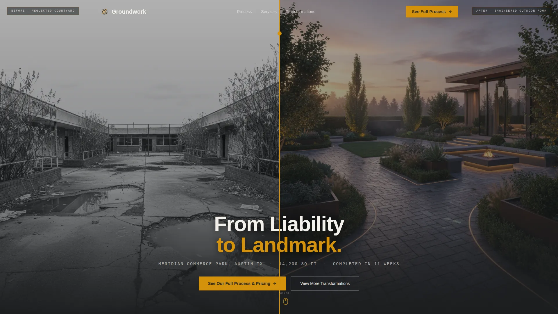
- A split viewport before-and-after header with an amber divider line and centered headline
- Five zigzag alternating content sections, each covering one project phase with a paired image and explanation
- Amber call-to-action buttons placed after the header and after every second phase section, plus a secondary call-to-action anchoring the bottom
Feature list
This template is built around a specific set of decisions that make landscape firms look credible and purposeful from the first scroll.
Split Before-and-After Header
The header divides the viewport into two photographs: a neglected space on the left and the completed transformation on the right. A thin amber line separates them, and a centered headline spans both images. Project location, square footage, and timeline appear below in monospaced type.
Zigzag Phase Sections
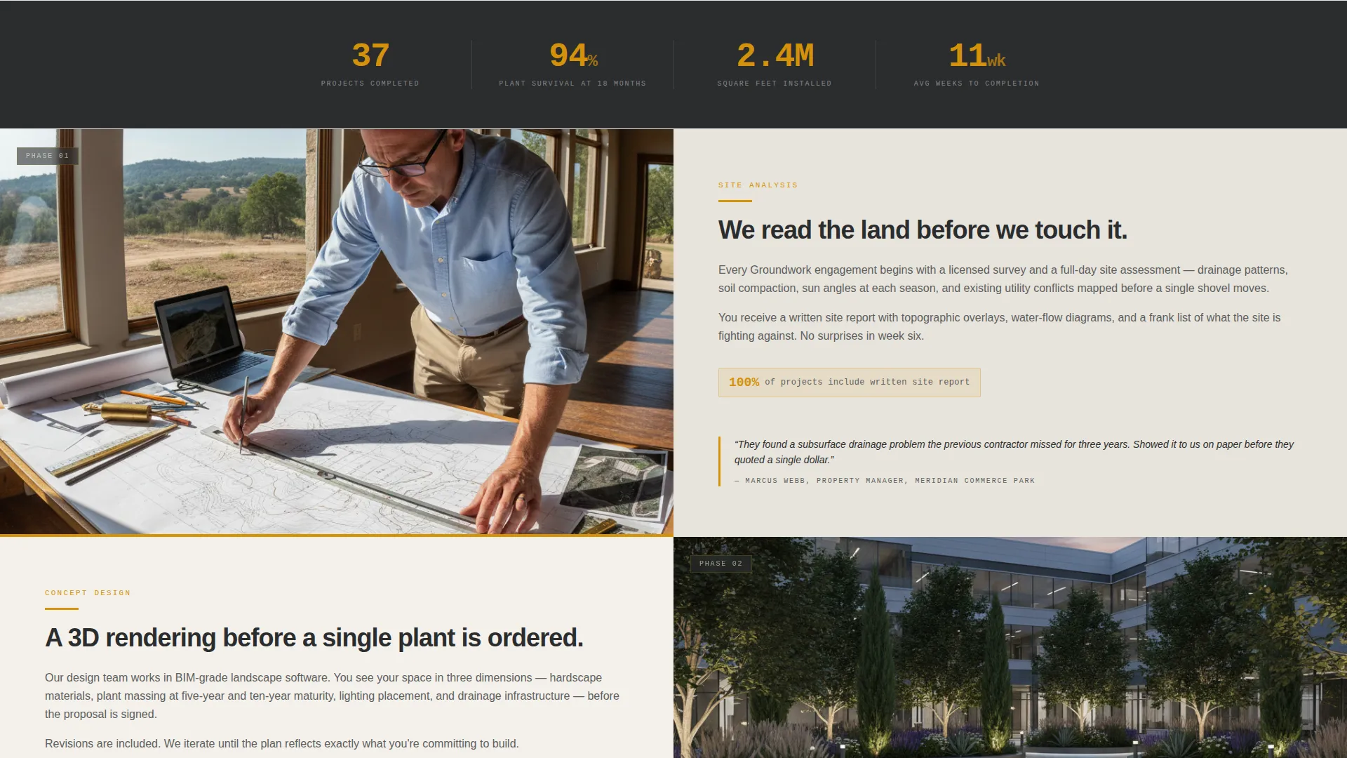
Five alternating left-right content blocks guide visitors through Site Analysis, Concept Design, Material Selection, Installation, and Aftercare. Each block pairs a phase-specific deliverable image with two to three sentences of plain explanation. The alternating layout mimics turning pages in a proposal document.
Stacked Proof Points
Every phase section ends with a single client quote and a project stat, such as square footage installed, drainage improvement percentage, or plant survival rate at 18 months. These proof points build trust progressively as the visitor scrolls.
Amber Call-to-Action Bands
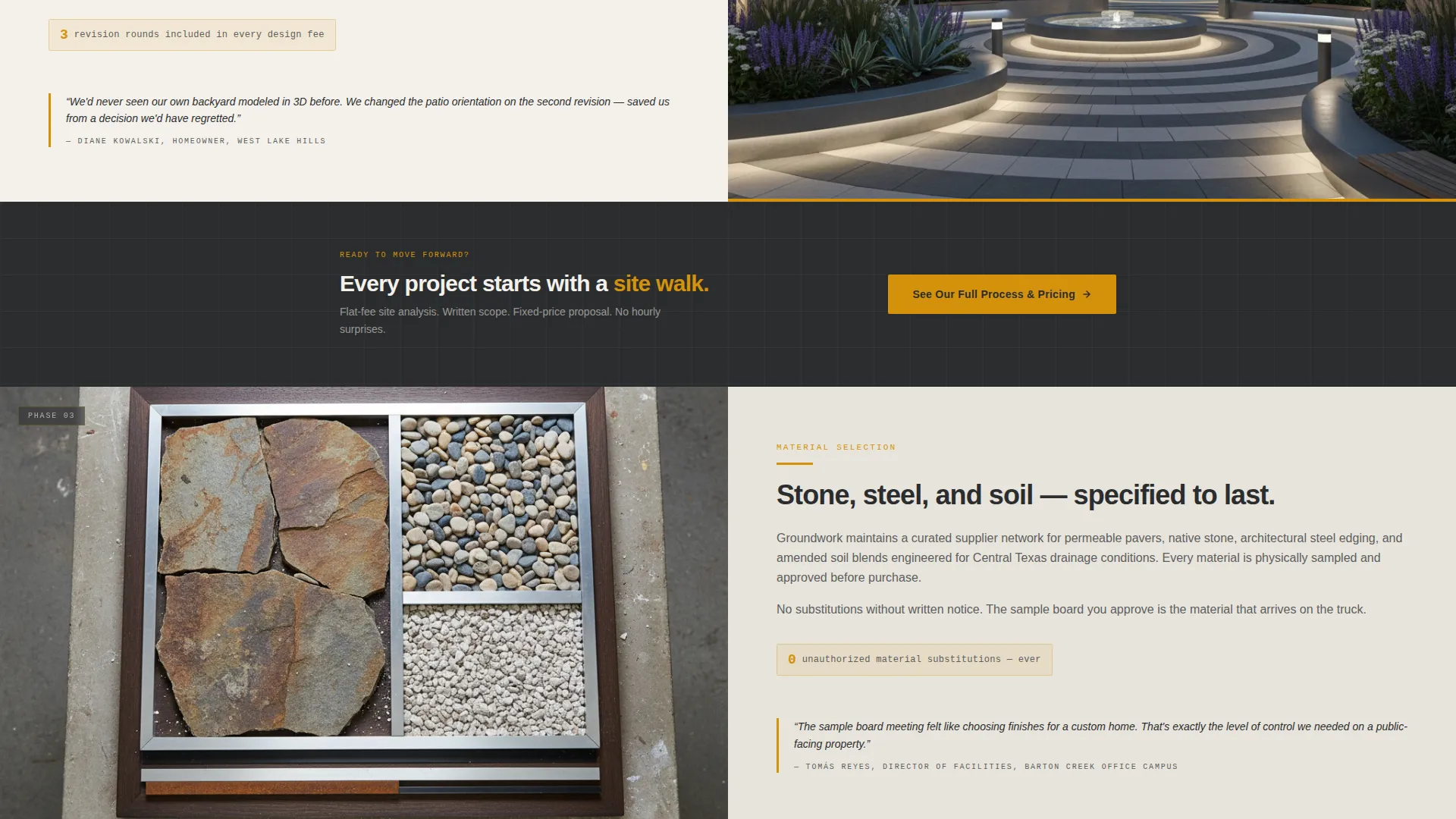
The primary call-to-action, "See Our Full Process and Pricing," appears in amber buttons against charcoal-colored bands. It repeats after the header and after every second zigzag section, keeping the click opportunity visible without being aggressive.
Secondary Portfolio Call-to-Action
A "View More Transformations" button anchors the bottom of the page. It routes visitors who are not yet ready to discuss pricing toward a portfolio gallery, giving the page two natural exit paths.
Corporate Precision Color System
The charcoal and amber palette runs consistently across every section. Deep charcoal dominates backgrounds and body type, amber marks every interactive element, and limestone white creates breathing room between sections. The result is a cohesive, architect-level visual identity.
Page sections overview
| Section | Purpose |
|---|---|
| Before and After Header | Opens with a split case study image and centered headline to establish credibility immediately |
| Primary call to action Band | Prompts the first click toward the services and pricing page right after the header |
| Site Analysis Section | Introduces the process with a topographic survey image and plain explanation |
| Concept Design Section | Shows a 3D rendering and explains how plans take shape |
| Material Selection Section | Pairs a stone sample board image with a description of material precision |
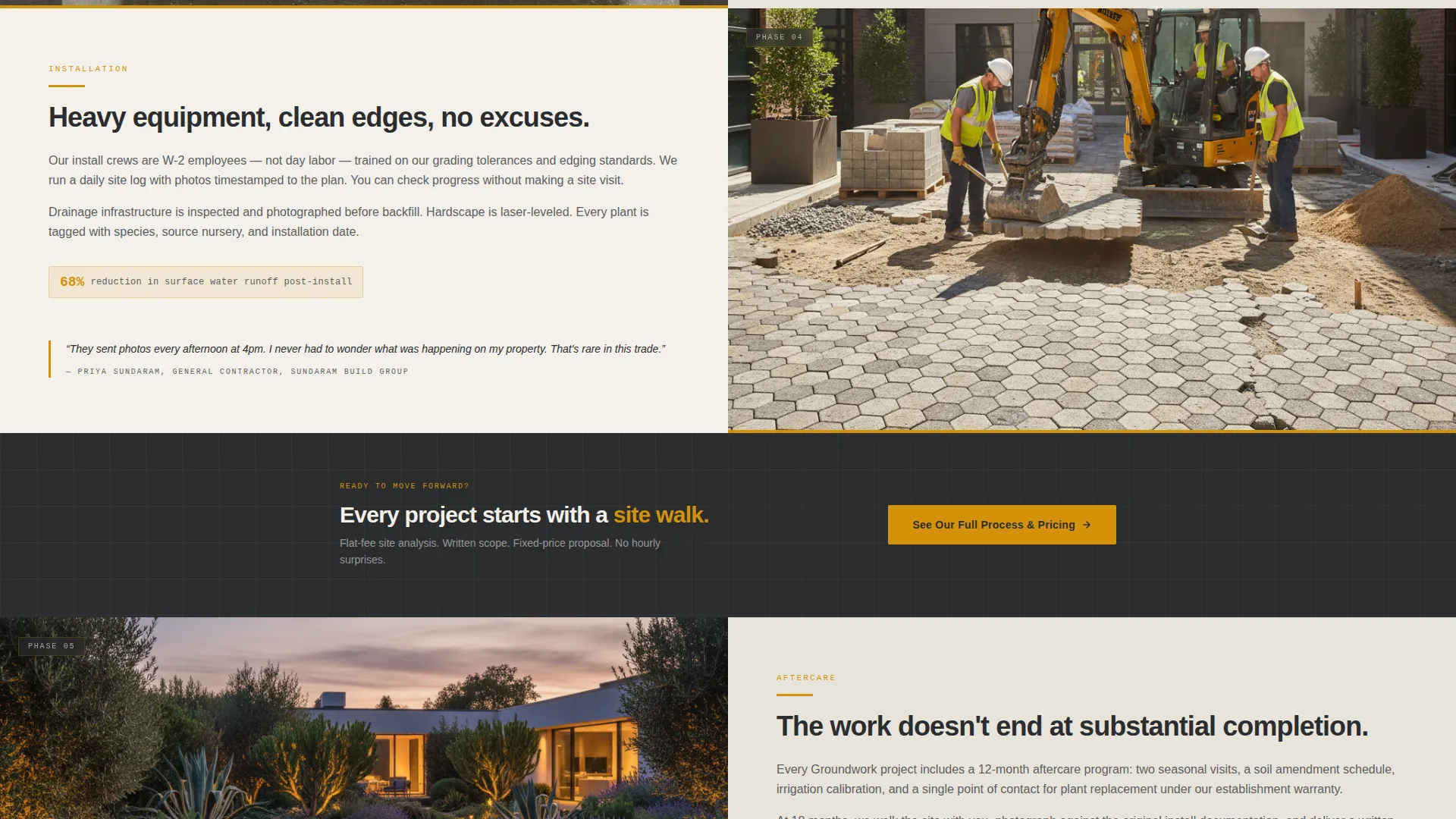
| Installation Section | Uses a crew mid-install photo to show real capacity and scale |
| Aftercare Section | Closes the process story with a one-year follow-up photo and long-term care explanation |
| Secondary call to action Band | Repeats the primary click prompt after the midpoint sections |
| Portfolio call to action Footer | Anchors the bottom with an alternate path to a transformations gallery |
Design & branding system
The template uses a Corporate Precision visual theme that feels like a landscape architect's drafting desk. Every color and type choice is deliberate and grounded in the firm's identity.
- Charcoal (#2B2D2F) and flagstone gray (#5C5E60) handle all backgrounds and primary text, giving the page weight and authority
- Polished amber (#D4920B) is reserved exclusively for buttons, accent lines, and interactive elements, making every action immediately visible
- Limestone white (#F4F1EB) creates open space between sections, keeping the page from feeling dense or heavy
Mobile & speed optimization
The zigzag layout is designed to reflow cleanly at smaller screen sizes. Each phase section stacks its image above its text block, preserving the visual storytelling sequence on any device.
- Alternating image-text columns collapse to a single vertical stack on mobile without breaking the phase-by-phase narrative
- Charcoal bands and amber button contrast remain sharp and readable at any viewport width
- The page carries no embedded forms, reducing page weight and keeping the scroll path simple and uninterrupted
How this template helps you convert
The page is optimized as a click-through that earns the visitor's trust before asking for action. Every structural choice points toward one outcome: getting the right visitor to click through to pricing or a portfolio.
- The before-and-after header delivers an immediate credibility signal, showing a real project outcome before the visitor reads a single word of copy
- Stacked client quotes and project stats after each phase section lower skepticism progressively, so by the third or fourth section, the visitor already trusts the firm's competence
- Two distinct calls-to-action serve two types of visitors: those ready to see pricing and those who need more visual proof first, reducing drop-off for both groups
Other information about this template
This template is a strong fit for landscape design and installation firms that handle commercial and residential projects at scale. It is not intended for general lawn care or maintenance-only services.
- The no-form design is intentional: the page earns the click first, then hands the visitor to a deeper page where a form or consultation booking can appear
- The five-phase structure mirrors how professional landscaping proposals are typically organized, which helps the target audience recognize a familiar process
- This template works well as a standalone campaign page or as the primary homepage for a firm that wants to lead with process credibility
- The page structure supports a landscape design and installation firm positioning against lower-quality competitors by showing planning depth and documented results
Theme
Corporate Precision
Creative direction
Step-by-Step Guide
Color system
Charcoal & Amber
Style
Zigzag/Alternating
Direction
Click-Through
Page Sections
Split Before-and-after Case Study Header
Zigzag Alternating Phase Layout
Progressive Trust-building Proof Points
Repeating Amber Call-to-action Bands
Dual Exit-path Structure
Corporate Precision Color System
Related questions
Does this template include a contact form?
Can I replace the project stats and client quotes with my own content?
What types of landscape firms fit this template best?
How many calls-to-action are included on the page?
Can this template work as a firm's main homepage?



