Teen & Youth Finance Professional Website Template
The Swipe Guarantee-Led Teen Credit Card Comparison Table landing page is built for fintech brands targeting parents of 13-to-17-year-olds. It uses a Dashboard Pro layout with a Teal Catalyst color system to present side-by-side credit card comparison data, real-time parental control mockups, and a three-field lead capture form that converts research-phase visitors into free card signups.
by Rocket studio
Quick summary
This landing page template is purpose-built for a teen credit card platform that leads every section with a bold, irrevocable guarantee before presenting proof. The page displays real-time parental dashboard mockups, side-by-side comparison tables, and a sticky freemium call-to-action. It is designed mobile-first so parents can discover, evaluate, and sign up entirely from their phone screen.
Who this template is for
This template speaks directly to anyone building a credit card landing page for the youth finance market. It works best when your product centers on parental oversight, spending limits, and teen financial education. The layout is optimized for a freemium or risk free trial conversion model, making it a strong fit for early-stage fintech brands that want to increase conversions without a heavy sales pitch.
- Fintech founders and product teams launching a teen or youth credit card
- Growth marketers who need a high-converting landing page with built-in social proof sections
- Financial advisors and youth banking brands that want a professional credit card landing page to drive traffic from paid or organic channels
What problem this template solves
Parents researching teen credit card options face a wall of fine print, conflicting card offers, and no clear way to compare what actually matters. A generic landing page fails them. They need a credit card landing page that dismantles their fears in a specific, logical order, not one that buries the details under marketing copy.
This template solves that trust gap by leading with guarantees instead of features. Each scroll section opens with a promise, then backs it up with visual data. The result is a page that builds trust before it ever asks for an email address.
- Parents cannot easily compare interest charges, overdraft policies, and parental control features across competing cards in one place
- Generic landing page designs create visual clutter that raises the bounce rate and sends research-phase visitors elsewhere
- Most credit card landing pages bury the lead capture form too early, before visitors feel confident enough to sign up
What you get with this template
You get a fully structured, single-page landing page layout with every major section pre-built and ready to customize. The template covers the entire page flow from a viewport-dominating hero headline down to a linear single-row footer. All sections are organized to guide visitors through a confidence-building journey that ends at a three-field signup form.
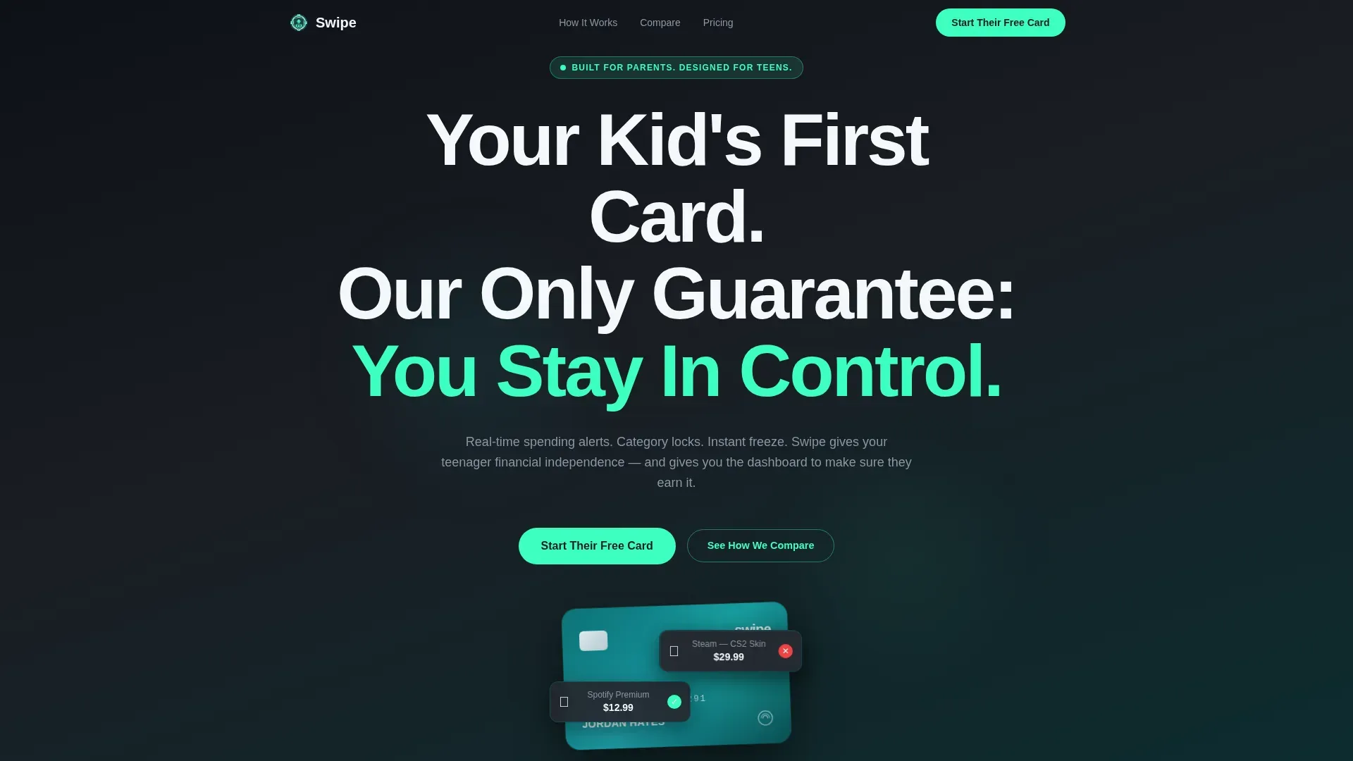
- A hero section with a giant centered headline, an animated floating card, and live spending notification bubbles that pop in like chat messages
- Three sequential guarantee sections, each opening with a bold promise and supported by a comparison table, dashboard mockup, or financial literacy module preview
- A freemium pricing and call-to-action section with a minimal lead capture form asking only for a parent's first name, teen's age, and email address
Feature list
This landing page template ships with a tightly defined set of features. Each one is grounded in the project brief and designed to serve the specific conversion goals of a teen credit card brand.
Guarantee-Led Scroll Architecture
Every scroll section on this landing page opens with a bold, specific guarantee before presenting any supporting data. The page orders those guarantees by severity, starting with overdraft protection and ending with financial literacy. This structure systematically dismantles parental fears and keeps users moving forward instead of bouncing.
Side-by-Side Credit Card Comparison Tables
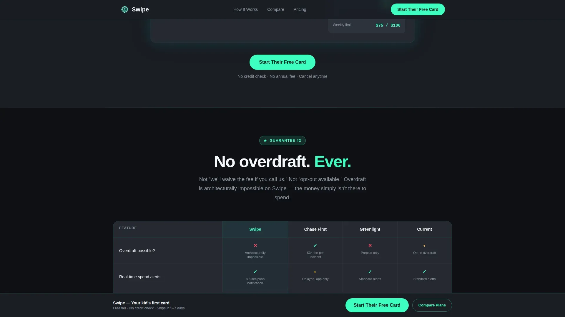
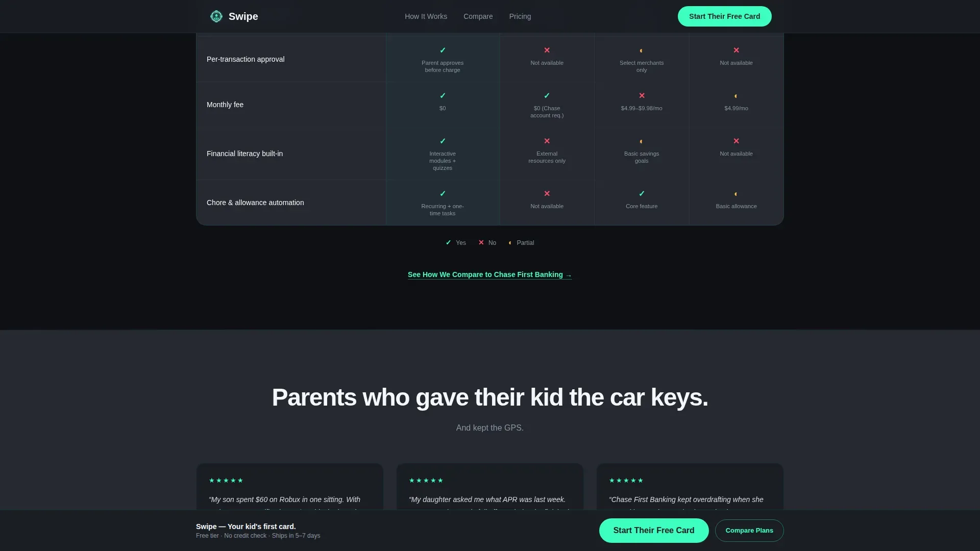
The template includes pre-structured comparison tables that place competing card offers next to each other in a clean, readable grid. Data shows that tables are significantly easier to scan than lists for complex financial products like teen credit cards. A side-by-side comparison table is the most effective format for visualizing differences in fees, benefits, and suitability at a glance.
Animated Hero with Spending Notification Bubbles
The hero section displays a floating card animation with a teen's name embossed on it. Spending notification bubbles pop in above it showing real transaction examples, each one paired with a parent approval toggle. This visual approach draws attention immediately and communicates the core value proposition without a single paragraph of explanatory text.
Real-Time Parental Dashboard Mockup
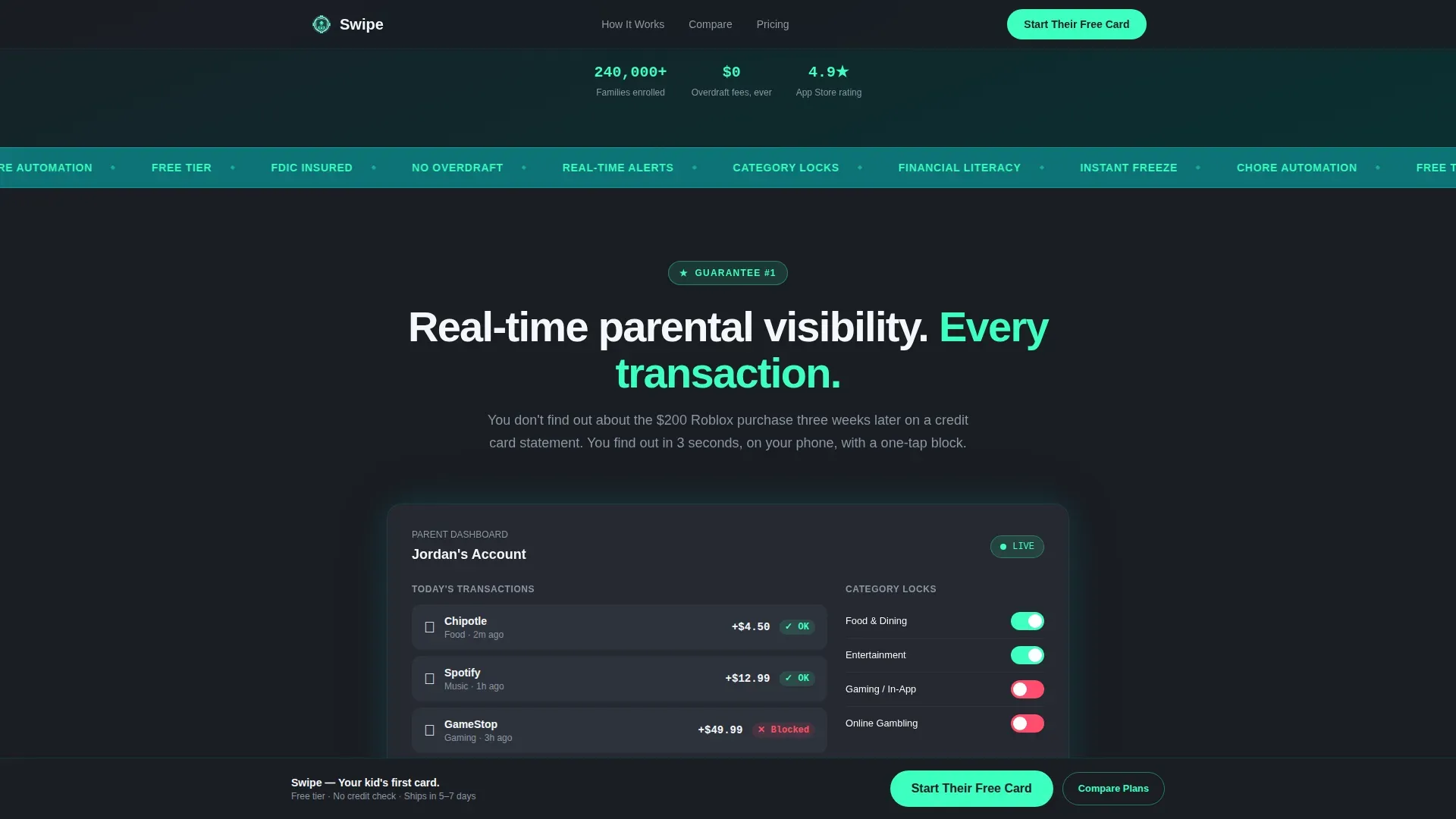
One full guarantee section displays a dashboard mockup that shows a transaction feed, category locks, and weekly spend summaries. This design element gives parents a concrete preview of the control they will have. It converts an abstract benefit into a tangible screen they can picture using every day.
Sticky Freemium Call-to-Action Bar
After the first guarantee section, the primary call-to-action pins to the bottom of the viewport and stays visible as users scroll through the entire page. The button uses a contrasting color from the electric mint palette to draw attention against the charcoal background. This keeps the conversion point easily accessible at every point in the reading journey.
Social Proof and Testimonial Sections
The template includes dedicated social proof blocks featuring metric stats, parent testimonials with specific quotes, and slots for video testimonials. Trust signals like these are essential for a credit card landing page targeting anxious parents. Strong social proof placed at the right point in the scroll reduces hesitation and helps build trust before the lead capture form appears.
Page sections overview
| Section | Purpose |
|---|---|
| Hero headline | Anchors the value proposition with a viewport-scale headline and animated card |
| Spending notification bubbles | Shows real transaction examples with parent approval toggles to demonstrate control |
| Guarantee one: parental dashboard | Displays a real-time transaction feed and category lock mockup to prove visibility |
| Comparison table one | Compares overdraft handling across competing teen card offers side by side |
| Guarantee two: no overdraft | States the no-overdraft promise clearly before the comparison table loads below it |
| Comparison table two | Visualizes parental control features and interest charges across card options |
| Guarantee three: literacy module | Previews the financial education content with an annual percentage rate (APR) explainer |
| Social proof block | Displays metric stats, parent testimonials, and slots for video testimonials |
| Pricing and call-to-action | Presents the freemium plan with a three-field lead capture form |
| Sticky call to action bar | Pins the primary signup button to the bottom of the screen throughout the page |
| Footer | Single-row linear footer with navigation links and legal details |
Design & branding system
The visual identity follows a Dashboard Pro theme using the Teal Catalyst color system. The palette feels like a banking app built by someone who respects both parents and teens. It avoids patronizing candy colors and equally avoids intimidating navy tones. Deep teal leads on headers and interactive elements, while electric mint fires on hover states, progress bars, and confirmation messages. White space on cloud-white card surfaces gives numbers and data room to breathe.
- Deep command-center teal (#0D7377) for headers, section dividers, and interactive elements; electric mint (#3DFFC0) for active states, hover effects, and the contrasting color on call to action buttons; charcoal dashboard (#1A1D23) for comparison table backgrounds and data panel sections; and soft cloud (#F4F7FA) for card surfaces and open reading areas
- Typography uses DM Sans for headings, Manrope for body and data copy, and JetBrains Mono for numbers and financial figures, creating a layered typographic system that feels data-literate without being cold
- Design elements across the page use visual cues like animated card floats, scroll-triggered section reveals, and notification pop-ins to guide attention naturally without adding visual clutter
Mobile & speed optimization
This template is built mobile-first because the primary audience, parents of teenagers, discovers and evaluates teen card offers on their phones. Every section reflows cleanly for smaller screens. The sticky call-to-action bar adapts to thumb-reach zones. The comparison tables scroll horizontally on mobile so no data column is hidden. A background image in the hero section is handled with CSS layering to keep the experience smooth as users scroll.
- Animation uses CSS transitions over JavaScript-heavy libraries wherever possible, keeping the floating card, notification pop-ins, and scroll-triggered reveals performant on mid-range mobile devices
- The lead capture form is a three-field layout that displays cleanly on small screens with no pinch-zoom required, reducing friction at the final conversion point
How this template helps you convert
This landing page template is engineered around a single conversion goal: getting a parent to start their teen's free card. Every design and copy decision points toward that one action. The page earns the click by leading with guarantees before asking for any information, making the free tier feel like the obvious, low-risk next step for any visitor who reaches it.
- The guarantee-led structure addresses the most serious parental fears first, overdraft and spending control, then escalates to education, so trust compounds with every section a visitor reads rather than stalling at a generic sales pitch
- Social proof elements, including metric stats and customer testimonials with real quotes, appear at the exact point where visitor hesitation typically peaks, just before the lead capture form, turning doubt into confidence and reducing the bounce rate before the ask
- The sticky call-to-action button and the minimal three-field form work together to lower every possible friction barrier, telling visitors that signing up costs nothing and takes seconds, which is the final push that turns a research-phase reader into a registered user
Other information about this template
This template is part of a broader ecosystem of credit card landing page formats designed for the finance and insurance category. It can support a wide range of teen and youth finance use cases beyond its default configuration. The following points cover additional context that builders and marketers will find helpful when deploying this page.
- The page type is a single-page landing page, not a multi-page website, so all navigation links and the menu button resolve to anchor sections within the same page rather than routing to separate pages
- The comparison tables are pre-structured to highlight up to four competing card offers at once, covering key parameters like monthly fees, rewards availability, interest charges, and parental control depth, which helps users evaluate the difference between options at a glance
- Credit card rewards programs vary significantly, and the template's comparison table layout is flexible enough to display cashback rates, spending rewards, and other incentive details without requiring a redesign
- The template can support blog post links in the footer or secondary navigation area, allowing brands to drive traffic from editorial content back to the landing page
- Many teen card options are secured or prepaid, meaning spending is limited to the available balance, which prevents debt accumulation and is a key point to surface in the comparison table rows
- Some teen credit card products allow teens to build credit history over time, and the template's financial literacy section is a natural place to explain how credit reporting and annual percentage rate (APR) concepts work in plain language
- Cards in this category often carry EMV chips and contactless technology, which generate a unique one-time code per transaction for added security verification, a detail that draws attention in the product feature area of the comparison table
- The template's scroll structure makes it a strong tool for financial advisors or youth banking consultants who want to present card options in a guided, educational format rather than a traditional static page
- Competitive comparison landing pages like this one focus on a single goal to minimize distractions for users, and the template reinforces that principle by using minimal copy in the hero and keeping the entire page pointed at one call-to-action
- The freemium model means the primary call-to-action functions as a risk free trial entry point, removing price as an objection for parents who are still in the research and compare phase
- Using a credit card comparison tool built into a dedicated landing page can empower users to maximize value by choosing the card that best aligns with their teen's spending habits and the parent's comfort level with financial independence
- The template is the swipe guarantee led teen credit card comparison table landing page template, and it is available as a standalone page asset that teams can customize with their own brand colors, copy, and card data without rebuilding the layout from scratch
Theme
Dashboard Pro
Creative direction
Guarantee-Led
Color system
Teal Catalyst
Style
Comparison Table
Direction
Freemium/Trial
Page Sections
Guarantee-led Scroll Section Architecture
Side-by-side Credit Card Comparison Tables
Animated Hero with Notification Bubbles
Real-time Parental Dashboard Mockup
Sticky Freemium Call-to-action Bar
Social Proof and Testimonial Blocks
Related questions
Can I customize the comparison table to show different card options?
Does the template include the animated card and notification bubbles out of the box?
How does the sticky call-to-action bar work on mobile screens?
Is the lead capture form connected to a specific email platform?
What social proof sections does this template include?



