Restaurant Discovery App Promotion Website Template
Grub is a bold, single-page restaurant discovery landing page template built for app promotion. It uses a Problem→Solution scroll flow, a dark Acid Digital color palette, and a hero product screenshot to showcase a live restaurant comparison tool. The template guides hungry, time-pressed users from frustration straight to the download button.
by Rocket studio
Quick summary
Grub is a high-impact restaurant discovery landing page template designed to promote an app that compares nearby restaurants in real time. The page opens with an electric hero screenshot, moves through a scroll-driven Problem→Solution arc, and closes on a frictionless app download flow. The design is dark, neon-lit, and built for urgency.
Who this template is for
This template is made for founders, product teams, and marketers who are launching or promoting a restaurant discovery app. If your product helps people find, compare, or choose a restaurant quickly, this page was built around that exact pitch.
- App developers and startup teams promoting a restaurant comparison tool to urban audiences
- Digital marketers running campaigns for food-tech or local discovery products
- Restaurant service platforms looking to convert curious visitors into app installs
What problem this template solves
Choosing a restaurant in a busy area is surprisingly stressful. People waste precious time standing on sidewalks scrolling through reviews, arguing over options, or walking into a spot only to find a 45-minute wait. This template addresses that friction head-on by letting the landing page itself mirror the relief the app delivers.
- No clear way to compare multiple restaurants at a glance before committing to one
- Visitors who land on generic app pages have no proof the product works for their neighborhood
- Most app landing pages ask for the download before showing the user anything useful
What you get with this template
You get a complete, single-page layout structured to promote a restaurant discovery app from first impression to final tap. Every section is intentional, every visual choice earns its place, and the conversion path is built directly into the scroll experience.
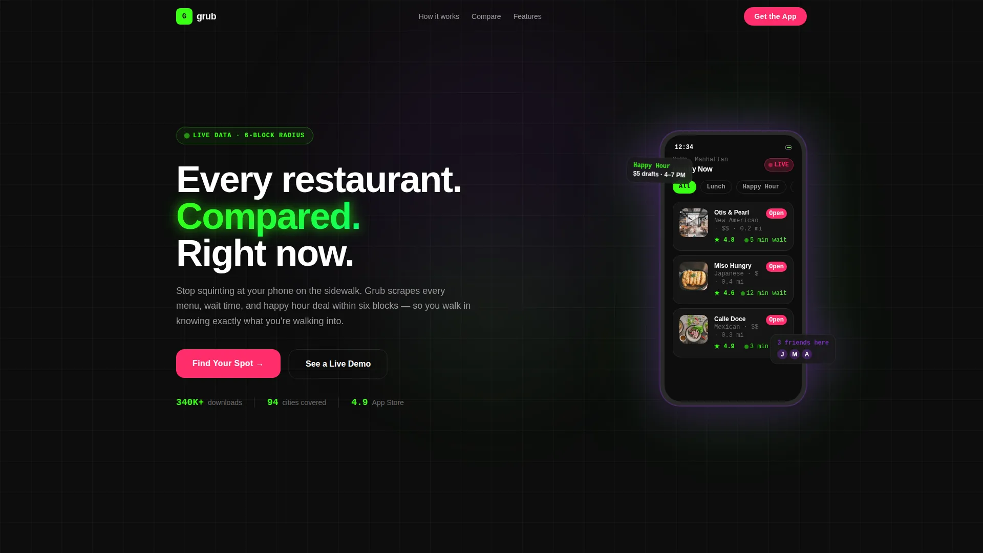
- A hero section with a floating product screenshot showing a live restaurant comparison view
- A Problem→Solution scroll arc that moves from frustration cards to sortable comparison tables
- A pinned "Find Your Spot" call-to-action with a modal for iOS, Android, QR code, and SMS download routes
Feature list
This section details the core built-in components and interaction patterns included in the template.
Hero Product Screenshot Section
The header features a phone screen at hero scale, floating on a void-black background. It displays three nearby restaurant cards stacked with green star ratings, estimated wait times, price-range indicators, and a pulsing "Open Now" badge in hot signal pink. The screen is slightly angled and casts a faint ultraviolet glow beneath it.
Problem Arc Frustration Cards
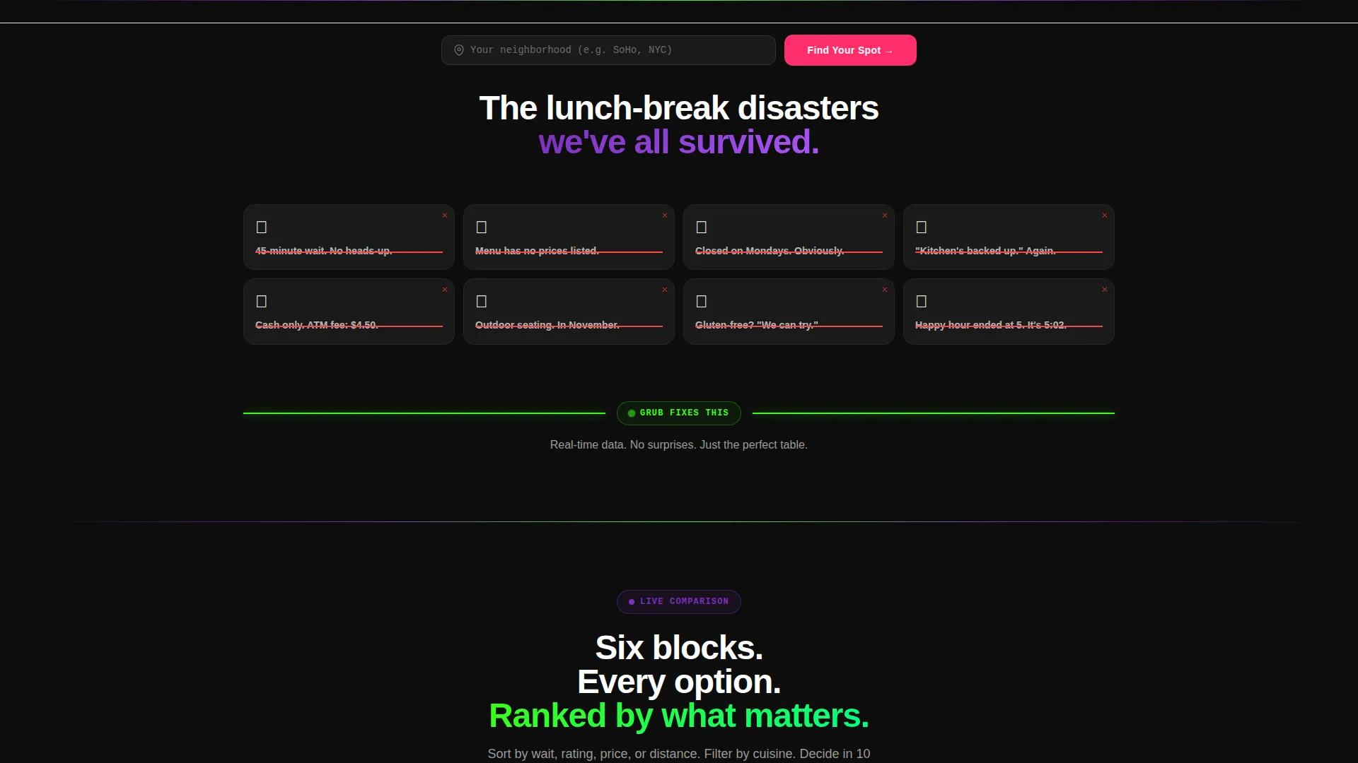
The scroll begins with a rapid-fire stack of mini-cards in smoke gray. Each card shows a common dining disaster such as a 45-minute wait or a menu with no prices, and a dim red strike-through animation activates on scroll. This sets up the emotional pivot that follows.
Full-Width Pivot Divider
A terminal-green line tears across the full width of the screen to signal the shift from problem to solution. This visual break is a deliberate design moment that separates frustration from discovery and keeps the scroll momentum moving forward.
Interactive Comparison Table
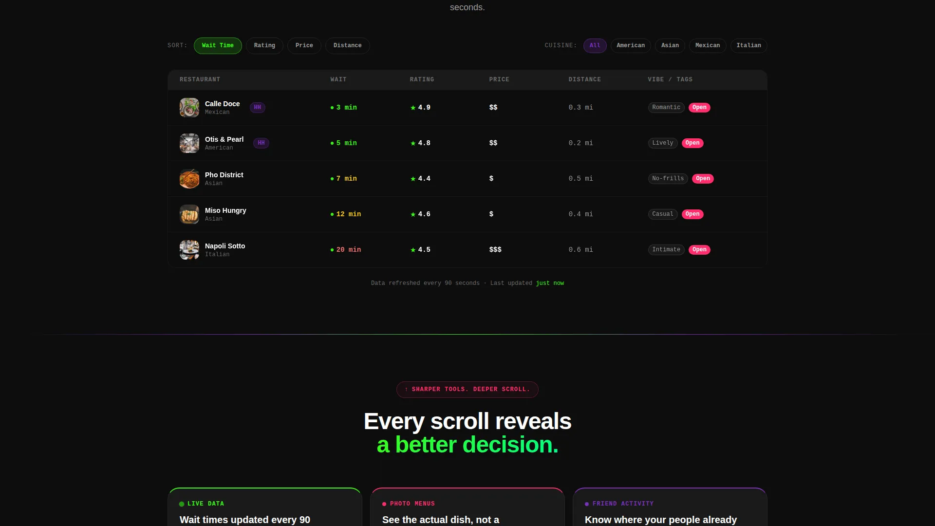
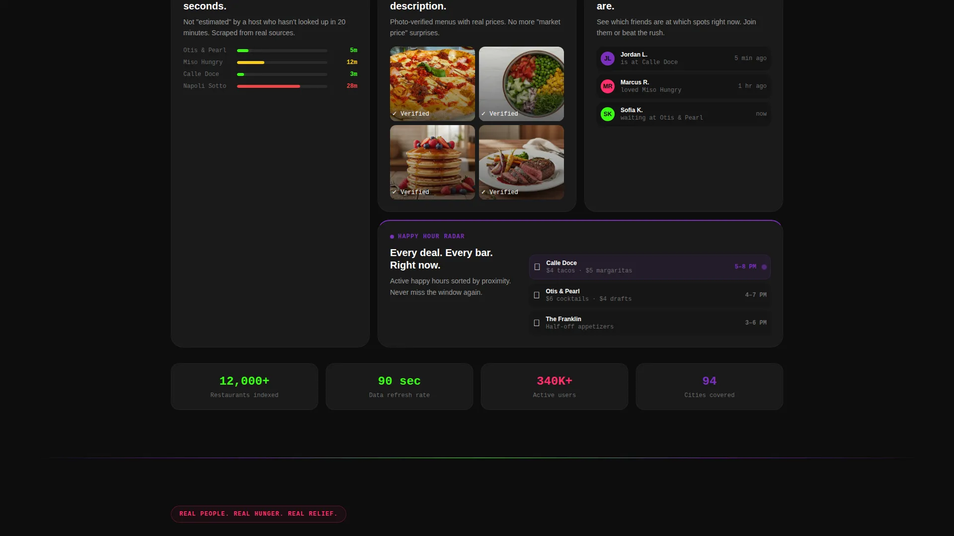
Below the pivot divider, side-by-side restaurant cards appear with filters for cuisine, distance, vibe, and budget. Each row is interactive and sortable. Live wait-time tracking, photo-verified menus, and friend-activity overlays are revealed as the user scrolls deeper.
Pinned App Download call to action
After the first scroll, a hot-signal-pink "Find Your Spot" button pins to the bottom of the viewport. Tapping it opens a quick-route modal with iOS and Android options, a phone number field for a direct download link, and a live-rendered QR code.
Neighborhood Preview Flow
A secondary conversion path lets visitors type in their current neighborhood to preview real results before committing to the download. This reduces friction by proving the product works on the user's own block before asking for the install.
Page sections overview
| Section | Purpose |
|---|---|
| Hero Screenshot Header | Establish the app visually at scale and create immediate product credibility |
| Frustration Cards Stack | Open the scroll in relatable pain and set up the emotional pivot |
| Full-Width Pivot Divider | Signal the Problem-to-Solution transition with a bold terminal-green line |
| Comparison Table View | Show side-by-side restaurant cards with interactive filters and sortable rows |
| Live Feature Reveals | Escalate value with wait-time tracking, verified menus, and friend-activity overlays |
| Neighborhood Preview Input | Let visitors test the product on their own block before downloading |
| Pinned Download call to action | Anchor the "Find Your Spot" button and open the app download modal |
Design & branding system
The visual identity follows a Directory and Discovery theme using the Acid Digital color system. The palette is intentionally dark and electric, designed to feel like a neon sign buzzing outside a speakeasy late at night. Every color has an assigned role and that discipline keeps the page readable even at high visual intensity.
- Void black (#0D0D0D) dominates all backgrounds; smoke gray (#1A1A1A) surfaces restaurant cards to keep them readable without lifting off the dark base
- Terminal green (#39FF14) pulses through data points, star ratings, live indicators, and wait-time figures to signal real-time activity
- Ultraviolet (#7B2FBE) anchors section dividers and category tags; hot signal pink (#FF2D6B) appears exclusively on calls to action and interactive tap targets
Mobile & speed optimization
The template is designed with a pinned mobile call-to-action and a modal-driven download flow that work naturally on small screens. The hero product screenshot is built to read clearly on a phone viewport, which matters since a large share of the target audience will land on this page from a mobile device.
- The pinned "Find Your Spot" button stays accessible at the bottom of the viewport throughout the scroll on mobile
- The app download modal supports three paths: iOS or Android selection, SMS link delivery, and a scannable QR code rendered live on screen
How this template helps you convert
The conversion strategy is baked into the structure of the page itself. Every scroll decision is designed to reduce hesitation and lower the barrier to the first tap.
- The neighborhood preview input lets visitors see real local results before committing, which removes the single biggest objection to downloading an untested app.
- The pinned call to action keeps the download action visible at all times without interrupting the scroll experience, so the decision to tap is always one reach away.
Other information about this template
This template sits in the Technology category under the Restaurant Website Templates subcategory, targeting the Restaurant Services Page niche. It carries an Acid Digital color identity that makes it stand out from typical food-industry templates that default to warm, earthy palettes.
- The Intersection Match Score for this template is 13, reflecting strong alignment between the Technology category, the Restaurant Website Templates subcategory, and the Restaurant Services Page niche
- The template style is Comparison Table, making it well-suited for any product that benefits from side-by-side evaluation, not just restaurant discovery apps
- The creative direction follows a Problem→Solution Arc, a proven narrative structure that works especially well for app landing pages targeting users with an immediate, felt need
Theme
Directory & Discovery
Creative direction
Problem→Solution Arc
Color system
Acid Digital
Style
Comparison Table
Direction
App Download
Page Sections
Hero Product Screenshot at Scale
Scroll-triggered Frustration Cards
Interactive Comparison Table with Filters
Escalating Feature Reveals on Scroll
Pinned App Download Modal
Neighborhood Preview Input
Related questions
Who is this landing page template built for?
Does the template include the app download modal?
What makes this template different from a standard app landing page?
Can the comparison table work for a different type of service?
Is this a single page or a multi-page template?



