Protective Teen Digital Safety Landing Page Template
Shield is a warm, conversion-focused landing page template built for teen social media safety services. It pairs a Lottie-animated hero, a Pinterest-style masonry grid with interactive flip cards and stat tiles, and a full-width booking module into one emotionally resonant page. Designed for parents, school counselors, and family therapists, it turns concern into action without ever feeling clinical or cold.
by Rocket studio
Quick summary
Shield is a single-page template crafted for digital guardianship services focused on teen social media safety. It opens with a seven-second loopable Lottie animation, flows through a masonry grid rich with stat cards, testimonials, and dashboard proof tiles, and closes with a full-width booking module. Every design choice serves one goal: helping parents feel steady enough to take the next step.
Who this template is for
This template is built for service providers in the kids and family space who need a landing page that earns trust before it asks for a commitment. It speaks directly to the adults who lie awake worrying about what their children are doing online.
- Parents of teens ages 10 to 18 who have had a stomach-drop moment finding a harmful conversation thread or explicit images on a device
- School counselors and classroom educators who field Monday-morning fallout from weekend group chats and need credible social media resources to share with families
- Family therapists seeking a monitoring partner that preserves the open communication between trusted adults and the young people in their care
What problem this template solves
Kids and teens live much of their social life on social media platforms that parents barely recognize. The gap between what parents think parental controls do and what those tools actually deliver creates real emotional distress and missed chances to intervene early.
- There is no warm, conversion-ready landing page in this niche that feels safe rather than surveillance-heavy, making it hard for guardianship services to build rapport with anxious parents
- Existing templates in the internet safety space look clinical or fear-driven, which pushes away the very families who most need guidance on social media use
- Without a clear booking path, parents who are finally ready to act lose momentum, and the service loses a conversion it worked hard to earn
What you get with this template
You get a fully designed, interaction-rich landing page that moves visitors from worry to action. The template covers every stage of a parent's decision journey, from awareness to booking, inside one cohesive scroll.
- An animated hero section, a masonry grid with flip cards and viewport-triggered bloom effects, a dual-direction testimonials marquee, a full-width booking module with an age slider and platform checkboxes, and a secondary email capture call to action
- A sunset gradient color system, Plus Jakarta Sans headings, and DM Sans body copy that together create the fierce-gentleness tone the service requires
- A linear single-row footer that keeps the close as calm as the open, so parents leave the page feeling held rather than sold
Feature list
This section walks through the six core capabilities built into the Shield template.
Lottie-Animated Hero Section
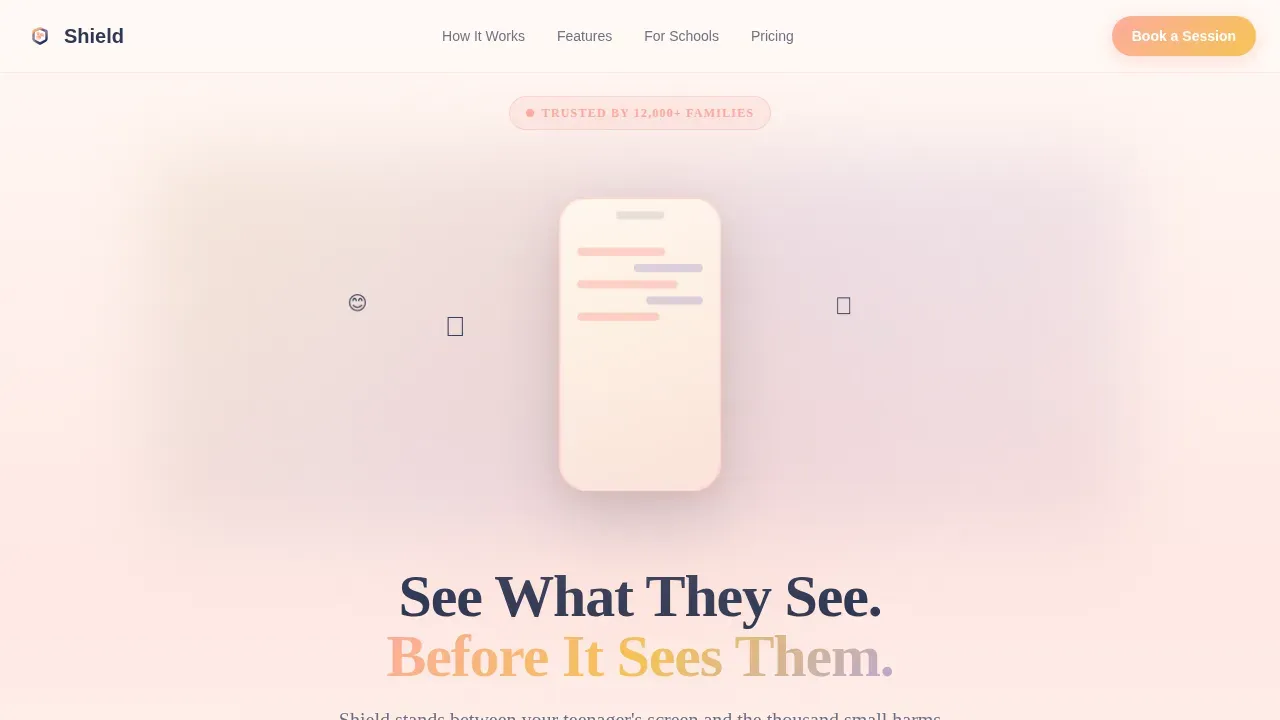
The hero opens with a seven-second, loopable vector animation. Illustrated chat bubbles, heart emojis, and notification bells float upward like lantern lights. A pair of hands gently cups around a phone as the elements soften into warm firefly dots. The headline, "See What They See. Before It Sees Them," settles into place against a peach-to-amber-to-lavender gradient that feels like it is breathing. This opening immediately signals that the service is warm and watchful, not punitive.
Masonry Grid with Surprise and Delight Interactions
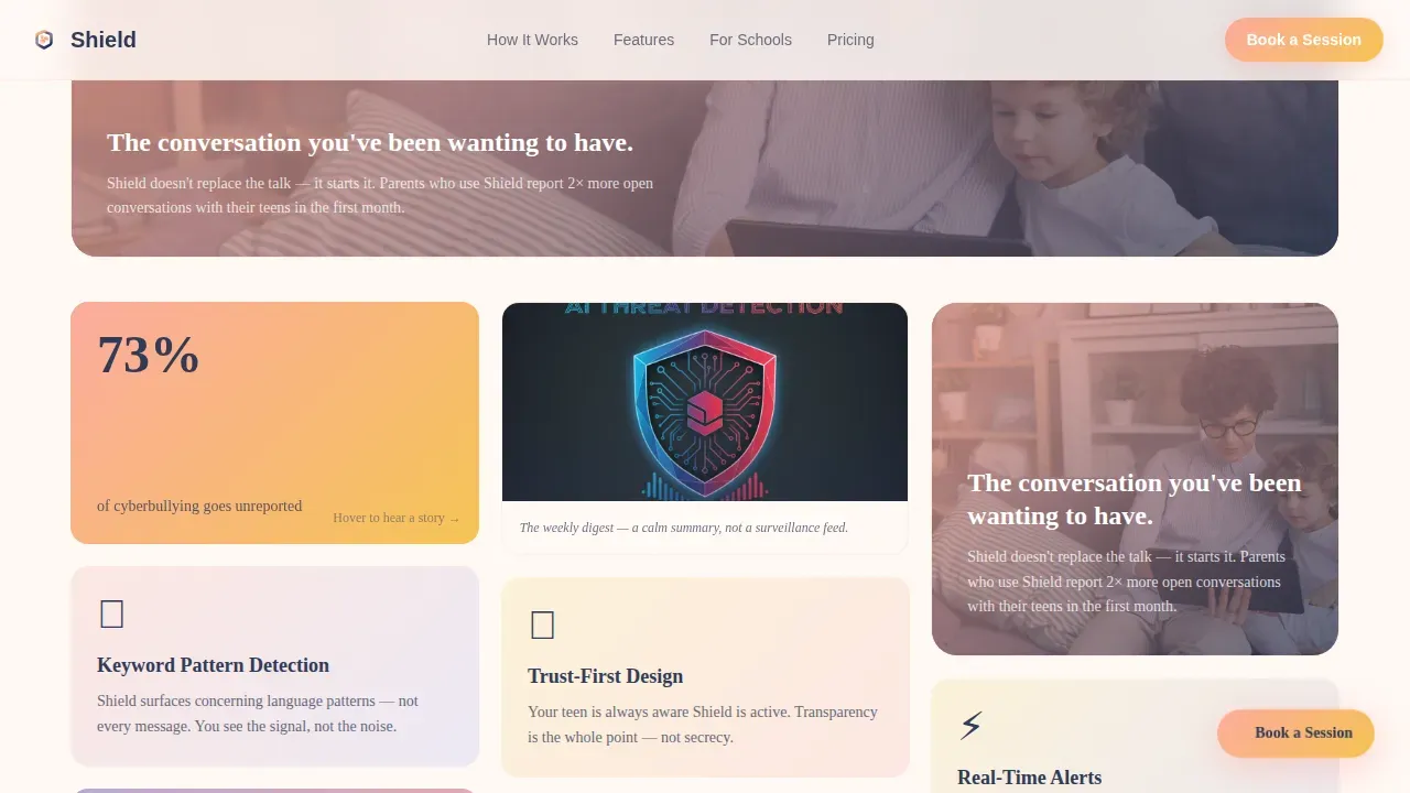
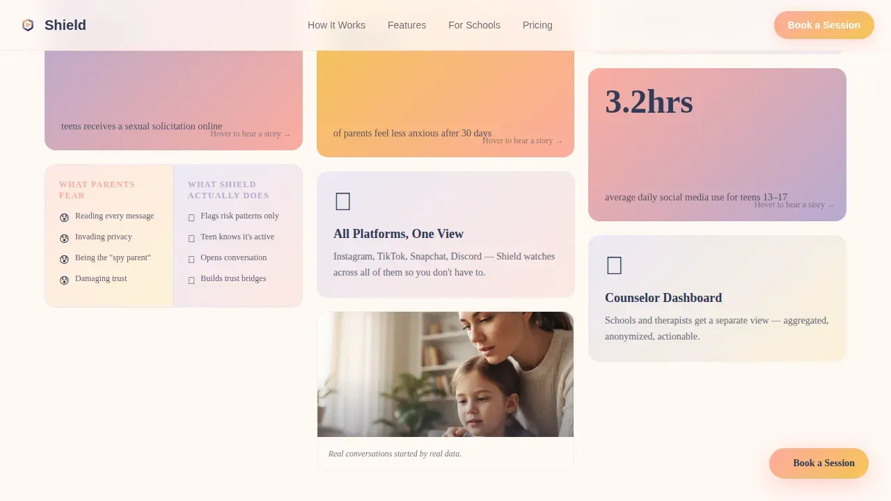
The masonry layout arranges stat cards, feature tiles, comparison cards, and illustrated full-width scene breaks in a Pinterest-style flow. Stat cards flip on hover to reveal real parent testimonials on the reverse. Feature tiles pulse gently on viewport entry, then bloom open like a notification expanding. A split-screen comparison card slides apart to show "what parents think the app does" versus "what it actually does." Every third row, a full-width illustrated scene of a parent and teen reviewing a dashboard together resets the scroll energy. This variety keeps young users and anxious parents engaged without overwhelming them.
Dashboard Proof Tiles
Real dashboard screenshots sit inside masonry tiles early in the page. Visitors see exactly how the monitoring interface looks before they ever reach the booking form. This is deliberate: proving the tool is legible and gentle, not surveillance software dressed in parental anxiety. Seeing the interface in context helps parents trust that social media posts and activity are reviewed in a way that protects, not polices.
Full-Width Booking Module
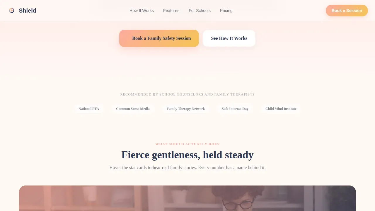
The booking module is the primary conversion destination. It includes a text field for the parent's first name, a friendly illustrated age slider covering the 10 to 18 age group, platform checkboxes styled as app icons for Instagram, TikTok, Snapchat, and Discord, plus an "I don't even know" option that triggers a reassuring micro-animation. An embedded calendar lets visitors choose a preferred 30-minute consultation slot. The call to action, "Book a Family Safety Session," appears first as a floating button after the third masonry row, then again in full width here.
Secondary Email Capture Path
Not every parent is ready to book on the first visit. The secondary call to action, "Get the Free Warning Signs Checklist," captures an email address from parents who need more time. This free resource warms them toward scheduling a session and keeps the service in their inbox as a trusted guide. It also gives the service provider a low-friction way to build a list of parents actively concerned about their children's online activity.
Dual-Direction Testimonials Marquee
A scrolling testimonials section displays quotes from parents, school counselors, and family therapists in two parallel tracks moving in opposite directions. The motion is subtle and continuous, like a living community of adults who have already made the decision to get support. Each card carries a short, specific quote that speaks to a real outcome, building social proof without manufactured enthusiasm.
Page sections overview
| Section | Purpose |
|---|---|
| Animated Hero | Introduces service and headline |
| Masonry Stats Grid | Displays data and features interactively |
| Dashboard Proof Tiles | Shows real monitoring interface |
| Testimonials Marquee | Builds trust through social proof |
| Floating Booking Button | Captures ready-to-act visitors early |
| Full-Width Booking Module | Primary conversion and scheduling form |
| Email Capture Strip | Secondary lead capture for undecided visitors |
| Linear Footer | Closes page with calm, single-row navigation |
Design & branding system
The visual identity follows a Nurture and Care theme built on a sunset gradient that feels like the last twenty minutes of golden hour. Every color choice is intentional. Nothing floats into sweetness; everything stays anchored.
- Peach dawn (#FDAB9E) and warm amber glow (#F6C453) wash across card backgrounds; dusky lavender (#B8A9D1) marks hover states and selected filters; twilight navy (#2E3854) grounds all headlines and body copy
- Plus Jakarta Sans handles headings with warmth and authority; DM Sans carries body copy with quiet legibility; white space between masonry tiles breathes like pauses in a careful conversation
- Organic shapes, soft shadows, and the full sunset gradient shifting behind vector illustrations create an editorial warmth that feels human rather than corporate
Mobile & speed optimization
Parents primarily discover services like this on their phones during commute worry-spirals. The template is designed mobile-first so that every interaction, from the masonry scroll to the age slider, feels natural on a small screen.
- Server Components handle static sections like the hero text, testimonial cards, and footer, while Client Components manage the interactive booking form, age slider, platform checkboxes, and Lottie animation separately, keeping the page responsive
- The masonry grid uses stagger-reveal animations tied to viewport entry rather than page load, so the page feels fast even when rich interactions are present
- The booking calendar and platform checkbox micro-animations are scoped to client-side rendering, preventing layout shifts that could break the scroll experience on mobile devices
How this template helps you convert
The Shield template is engineered around the emotional journey of a worried parent. Every section earns the next click rather than demanding it.
- The animated hero creates immediate emotional resonance and presents the core promise before a parent has time to bounce. The floating booking button appears after the third masonry row, catching visitors at the moment their curiosity peaks, before scroll fatigue sets in.
- Dashboard proof tiles and flip-card testimonials remove the two biggest objections: "Is this tool too invasive?" and "Has it actually helped families like mine?" Seeing real social media posts reviewed inside a legible, calm interface answers the first question. Hearing from other parents answers the second.
- The dual booking path, one for parents ready to schedule and one for those who need a free resource first, means no warm lead leaves the page empty-handed. The "Get the Free Warning Signs Checklist" capture keeps the door open for parents who are still building courage to have a difficult conversation with their teen.
Other information about this template
This template is a strong fit for any service provider building in the teen and family wellness space who needs social media resources that convert. It is especially useful for those who want to link their service to broader online safety conversations already happening in schools, therapy offices, and parent communities.
- The booking form's platform checkboxes cover the social media platforms most associated with harm for young people: Instagram, TikTok, Snapchat, and Discord. The "I don't even know" option is a deliberate nod to parents who feel out of their depth, and the micro-animation that follows is designed to reassure rather than shame.
- The stat card "73% of cyberbullying goes unreported" is pre-positioned on a flip card. When a parent hovers and reads a real testimonial on the reverse, the emotional and factual case for the service lands together. Key findings like this one are most powerful when paired with a human voice.
- Children and adolescents who spend more than three hours a day on social media face double the risk of mental health problems. The template's stat tiles are designed to surface data like this in a way that informs rather than alarms, linking awareness to action rather than to fear.
- The secondary email capture offers free resources, which serves parents who are not yet ready to book. This low-stakes entry point mirrors the guidance model recommended by organizations like Common Sense Media, which offers strategies for families at every stage of digital literacy awareness.
- The federal trade commission has published guidance on children's online privacy. Parents who are already aware of online privacy rules respond well to services that acknowledge the regulatory landscape. The template's tone positions the service as a knowledgeable partner, not just a monitoring app.
- The Pledge2Protect campaign is a global call to action to safeguard kids and teens from online exploitation and abuse. Teachers, students, and families are encouraged to share a commitment to internet safety across social media, creating a ripple effect of awareness in the digital world. The Shield template's community-oriented testimonials section and secondary email capture are well-suited to support campaigns like Pledge2Protect by giving families a trusted next step after they take a pledge online.
- Common Sense Media provides age appropriate videos, guides, and social media resources that parents, educators, and youth workers use daily. The Shield template's warm editorial tone and practical booking flow complement the kind of guidance these resources provide, making it easy for counselors to recommend the service inside a classroom setting or a parent workshop.
Theme
Nurture & Care
Creative direction
Surprise & Delight
Color system
Sunset Gradient
Style
Masonry/Pinterest
Direction
Booking/Scheduling
Page Sections
Lottie-animated Hero with Gradient Breathing Effect
Masonry Grid with Flip Cards and Viewport Bloom
Dashboard Proof Tiles Inside Masonry
Full-width Booking Module with Age Slider
Secondary Email Capture for Undecided Parents
Dual-direction Testimonials Marquee
Related questions
Who is the Shield template designed for?
What sections are included in this template?
Can the booking form be customized for different social media platforms?
Does the template support a secondary conversion path for undecided visitors?
How does the template handle social proof?