Proven Mission Driven Nonprofit Landing Page Template
Steward is a split-screen landing page template built for nonprofit operations consultants. It pairs a testimonial-led header with a transparent, phase-by-phase process reveal that shows visitors exactly how disorder becomes order. The design uses a warm Ink and Paper palette, authoritative serif typography, and a click-through call to action flow that earns trust before asking for time.
by Rocket studio
Quick summary
Steward is a single-page template for nonprofit back-office consultants. It opens with an oversized testimonial card, then walks visitors through each phase of the consulting process using a 50/50 split-screen layout. Every section shows the problem alongside the solution, building confidence steadily until "Book a Diagnostic Call" feels like the obvious next step.
Who this template is for
This template is built for consultants who fix what's broken inside nonprofit organizations. If your work involves untangling compliance issues, rebuilding financial reporting, or installing controls that hold up under scrutiny, Steward gives that work a credible front door.
- Nonprofit operations and back-office consultants
- Grant compliance and financial controls advisors
- Board governance and audit-readiness specialists
What problem this template solves
Most consulting pages tell visitors what the consultant does. Steward shows them. The typical nonprofit operations site relies on generic claims and a contact form buried at the bottom. Potential clients leave before they trust the process.
- Visitors can't tell if a consultant truly understands their specific pain points
- Generic service pages fail to differentiate one consultant from another
- A contact form asks for commitment before the consultant has earned it
What you get with this template
Steward delivers a complete, conversion-focused landing page layout. Every section has a defined job: build credibility, reveal the process, and guide the visitor toward a low-friction next step.
- A 50/50 split-screen layout with a testimonial card header and phase-by-phase process sections
- A primary "Book a Diagnostic Call" call-to-action that repeats after each process phase
- A secondary "Download Our Audit-Readiness Checklist" text link as a mid-scroll, low-commitment touchpoint
Feature list
This section covers the core design and structural capabilities built into the Steward template.
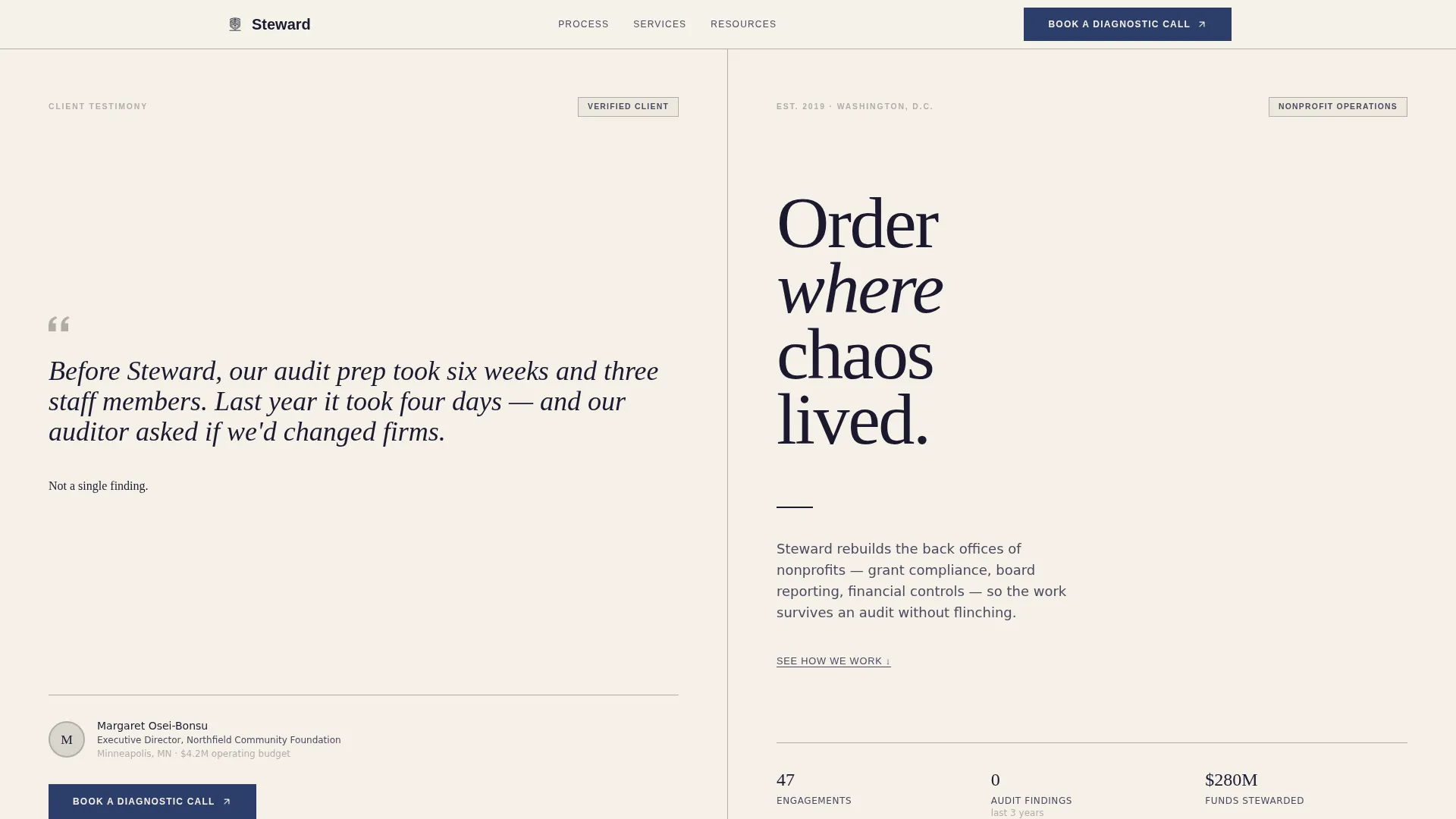
Testimonial-Led Split-Screen Header
The header divides the screen equally. The left panel holds an oversized quote card in elegant serif type, attributed to a named executive director with title, organization, and a small circular portrait. The right panel carries a clean typographic headline and a single-line consultancy descriptor. No stock photography, no abstract graphics.
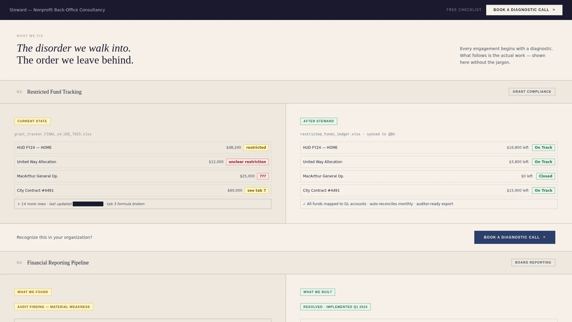
Transparent Process Reveal Layout
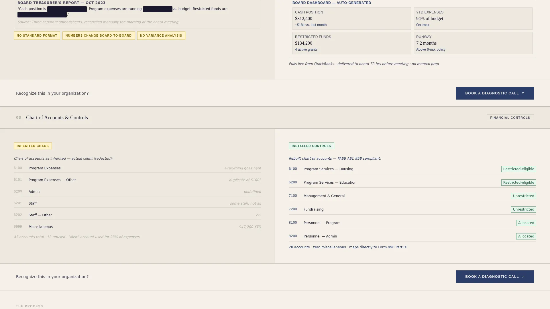
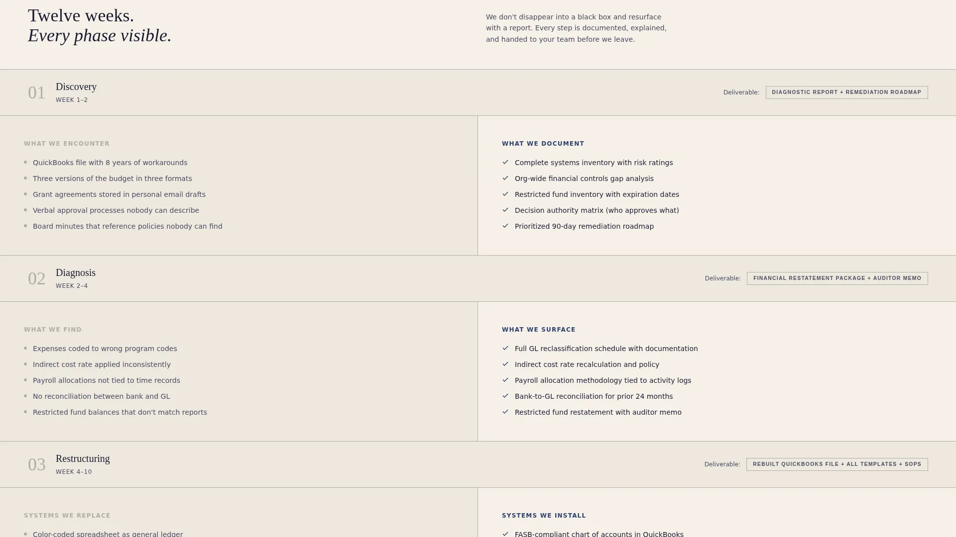
Each subsequent section splits the screen between the messy reality on the left and the resolved output on the right. The scroll reveals the consulting methodology phase by phase: discovery, diagnosis, restructuring, and handoff. Visitors watch disorder become order before they ever speak to the consultant.
Repeating Click-Through Call-to-Action
The primary "Book a Diagnostic Call" button appears first beneath the testimonial card and then again after each process phase. It clicks through to an external scheduling page. There is no form on this page, which removes friction at the moment of decision.
Low-Commitment Secondary Touchpoint
A secondary text link, "Download Our Audit-Readiness Checklist," appears mid-scroll. It gives visitors who are not yet ready to book a call a useful, low-stakes reason to stay engaged with the consultant's work.
Ink and Paper Color System
The palette uses deep documentary black for headlines and body copy, warm archival cream for backgrounds, ruled-line gray for structural dividers, and notary-seal navy exclusively on buttons and interactive accents. Every color carries a specific job on the page.
Authoritative Serif Typography
Headlines and pull quotes are set in an elegant serif typeface that reads like a signed engagement letter. The type scale is large enough to command attention. Body copy remains clear and readable at any scroll depth.
Page sections overview
| Section | Purpose |
|---|---|
| Testimonial Card Header | Opens with a named client quote to establish immediate credibility |
| Headline and Descriptor | Names the consultancy and states its focus in one clear line |
| Discovery Phase Split | Shows a tangled pain point on the left, the discovery output on the right |
| Diagnosis Phase Split | Contrasts flagged audit findings with a clear diagnostic report |
| Restructuring Phase Split | Displays inconsistent reporting formats alongside compliant templates |
| Handoff Phase Split | Reveals the final clean deliverable against the original disorder |
| Mid-Scroll Checklist Link | Offers a secondary, low-commitment resource to capture hesitant visitors |
| Closing Call-to-Action | Repeats the primary booking button as a final, confident prompt |
Design & branding system
The Steward template uses an Ink and Paper color system that feels like a freshly signed engagement letter on heavyweight cotton stock. It is authoritative without being corporate and warm without being casual.
- Deep documentary black (#1A1A2E) for all headlines and body copy, warm archival cream (#F5F0E8) dominating all backgrounds, and ruled-line gray (#B0ADA6) on structural dividers and section lines
- Notary-seal navy (#2C3E6B) reserved exclusively for buttons and interactive accents, making every clickable element instantly recognizable
- Elegant serif typography throughout, with an oversized type scale in the header and a clean, readable body size in all process sections
Mobile & speed optimization
The split-screen layout is designed to adapt cleanly across screen sizes. On smaller screens, each 50/50 panel stacks vertically so the problem and solution remain clearly paired without crowding the viewport.
- Each split-screen section collapses to a single-column stack on mobile, preserving the before-and-after reading order
- The repeating call-to-action button remains visible and tappable at every scroll depth on touch devices
- Typography scales proportionally, keeping headlines commanding and body copy legible without manual adjustment
How this template helps you convert
Steward is built around the idea that competence shown is more persuasive than competence claimed. Every layout decision moves the visitor closer to booking a call.
- The testimonial card in the header provides immediate third-party validation, so visitors arrive with trust already forming before they read a single service claim.
- The phase-by-phase process reveal makes the consultant's thinking visible, turning the scroll into a demonstration of expertise rather than a list of services.
- The repeating "Book a Diagnostic Call" button placed after each phase catches visitors at the exact moment their confidence peaks, while the mid-scroll checklist link retains those who need one more touchpoint before committing.
Other information about this template
Steward is categorized under Professional Services and is specifically designed for the nonprofit consulting niche, including nonprofit compliance consulting and back-office advisory work. It suits consultants whose clients include executive directors, board treasurers, and program managers navigating restricted fund tracking and grant compliance requirements.
- The template uses a single-page, section-led flow with no internal navigation links, keeping all visitor attention on the scroll and the call-to-action
- The creative direction is Transparent Process, a deliberate choice that positions the consultant as methodical and trustworthy rather than simply experienced
- The Executive Suite theme and Ink and Paper palette make this template suitable for independent consultants and boutique firms that serve institutional nonprofit clients
Theme
Editorial Magazine
Creative direction
Team & People
Color system
Monochrome Steel
Style
Single Column Flow
Direction
Lead Generation
Page Sections
Testimonial-led Split-screen Header
Transparent Process Reveal Sections
Repeating Click-through Call-to-action
Mid-scroll Checklist Touchpoint
Ink and Paper Color System
Related questions
Does this template include a contact form?
Can I adapt this template for consulting services beyond audit readiness?
Is the testimonial card component customizable?
Who is this landing page template designed for?
Does the secondary checklist link require a separate page to be built?


