Reliable Childcare Provider Landing Page Template
Sitter is a split-screen babysitting service landing page built for B2B partnership conversion. It leads with live-styled dashboard metrics, walks prospects through FAQ-driven objection handling, and closes with a short partnership inquiry form. The Slate and Sky color system keeps the page calm and credible. Ideal for pediatric offices, coworking spaces, boutique hotels, and event venues.
by Rocket studio
Quick summary
Sitter is a single-page, split-screen landing page template designed for a neighborhood babysitting service pursuing B2B referral partnerships. The page opens with animated partner metrics, moves through FAQ-style objection blocks, and closes with a focused partnership form. Every section is built to earn trust from busy, skeptical business contacts, not parents browsing at home.
Who this template is for
This template is built for babysitting services that want to grow through business partnerships rather than direct consumer advertising. It speaks directly to organizations that already serve families and want to add childcare as a value-add.
- Pediatric offices looking to refer a vetted childcare partner to patients
- Coworking spaces, boutique hotels, and event venues adding family-friendly services
- Babysitting service owners running Facebook ads targeting B2B decision-makers
What problem this template solves
Most babysitting service pages are built for parents, not partners. When a hotel events manager or a pediatric practice coordinator lands on a generic childcare page, nothing speaks to their specific concerns about liability, reliability, or co-branding.
- Partner prospects bounce because the page never addresses their operational questions
- There is no clear path for a business contact to take action without committing too early
- The service's credibility and demand data stay hidden instead of leading the conversation
What you get with this template
You get a complete, ready-to-customize landing page layout that prioritizes B2B partnership trust from the very first scroll. The structure is deliberate and conversion-focused throughout.
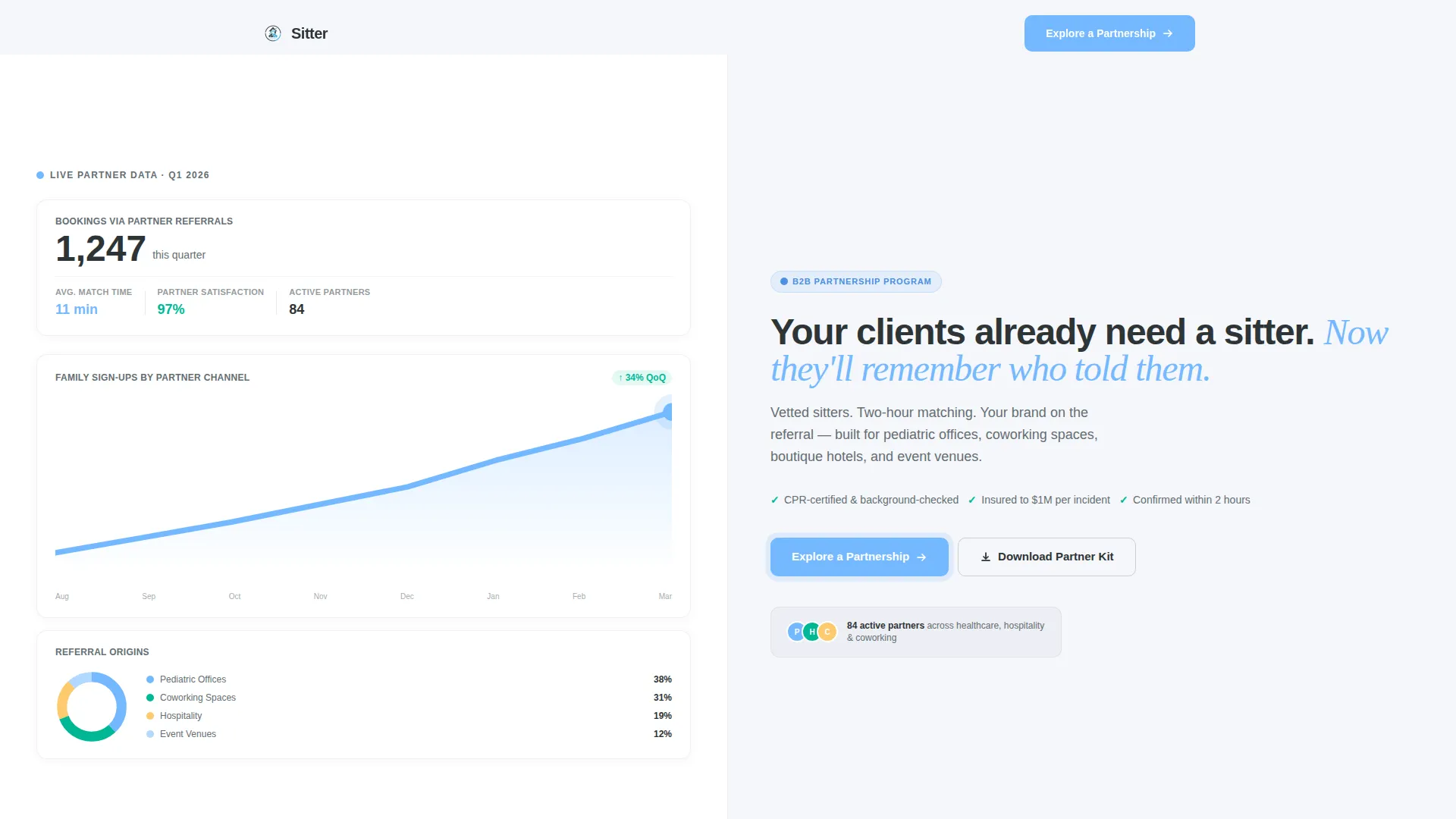
- A split-screen header with a live-styled metrics dashboard on the left and a sharp partner headline on the right
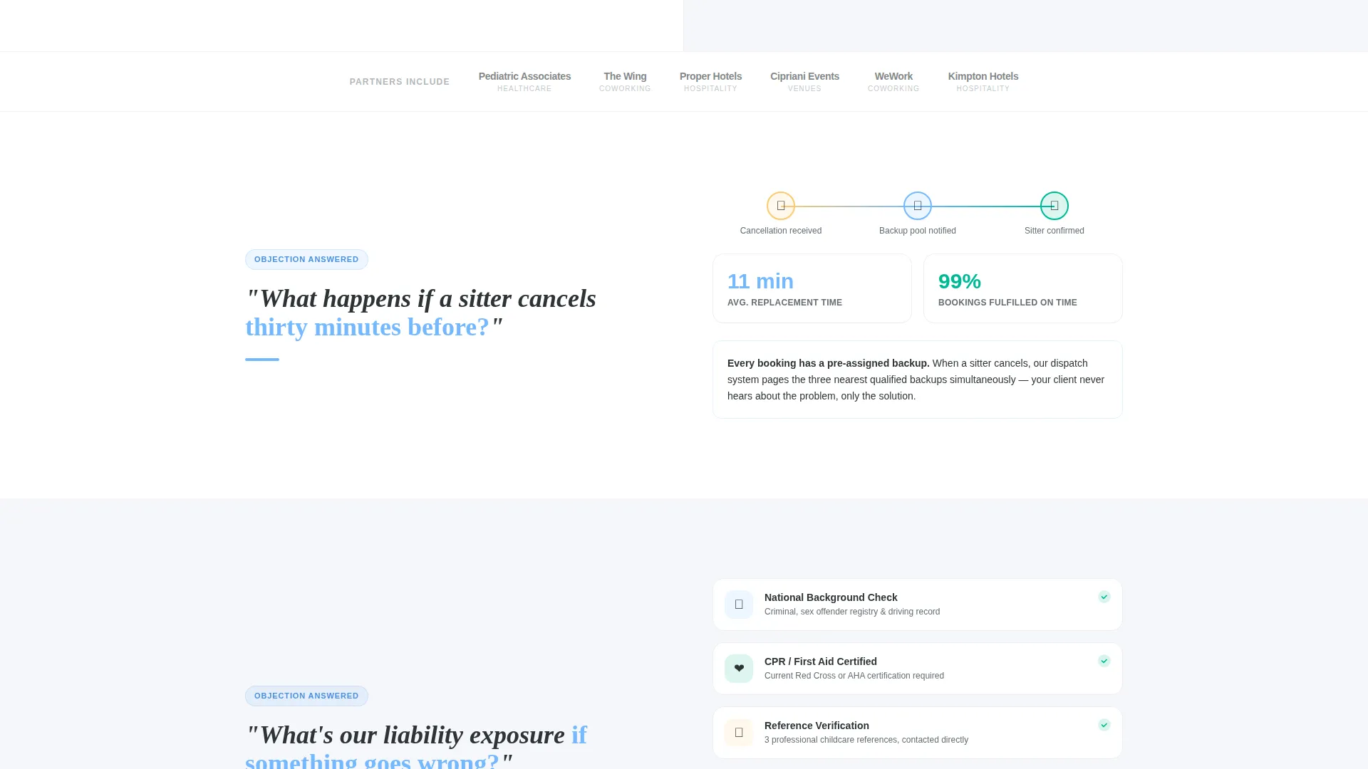
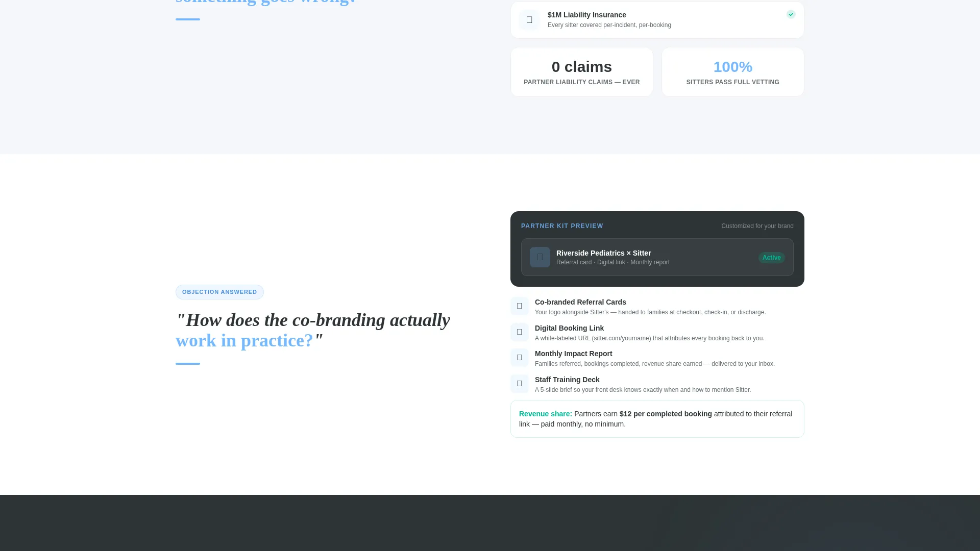
- Four FAQ-driven scroll sections that tackle real objections with process diagrams and stat cards
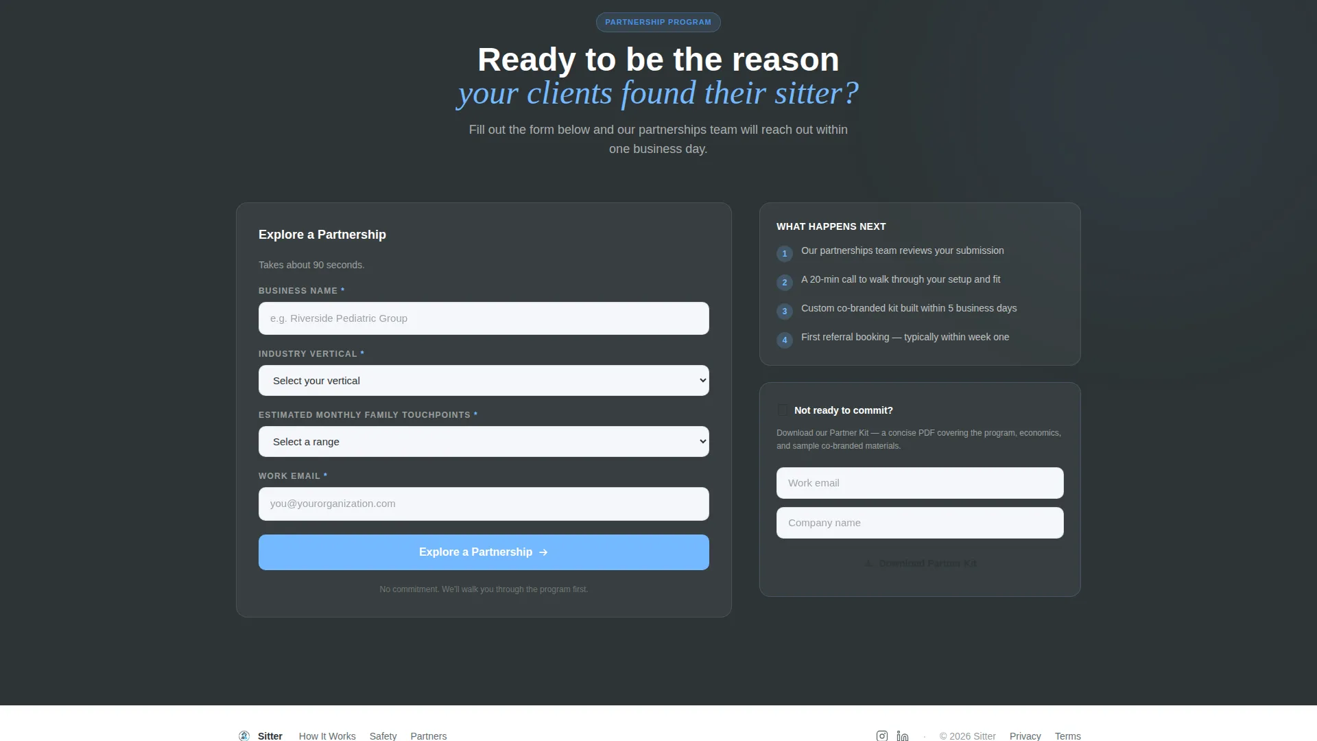
- Two conversion paths: a primary partnership inquiry form and a secondary gated "Download the Partner Kit" email capture
Feature list
This template includes six core design and content features drawn directly from the source brief.
Animated Partnership Metrics Dashboard
The left panel of the header displays a live-styled dashboard with three data points: a bookings counter, a rising monthly sign-up line graph, and a donut chart splitting referral sources. Numbers animate upward on scroll-in, immediately signaling proven demand to any business prospect who lands on the page.
FAQ-Driven Objection Scroll
Each section below the header poses a bold partner objection on the left and answers it on the right using a concise process diagram or stat card. Topics escalate from logistics and liability through co-branding to revenue share, dismantling hesitation at every stage.
Dual Conversion Path Layout
The page supports two distinct calls to action. The primary path, labeled "Explore a Partnership," leads to a short form with four fields. The secondary path offers a gated PDF download called "Download the Partner Kit," capturing just an email and company name for prospects who are not yet ready to commit.
Pinned Primary Call to Action
The "Explore a Partnership" button is pinned after the third FAQ block. This placement ensures the call to action appears exactly when a prospect has moved past the most common objections and is most likely to act.
Slate and Sky Color System
The template uses a four-color palette: deep charcoal slate for primary text, soft graphite for secondary copy, open-sky blue for buttons and data highlights, and clean cloud white for backgrounds. The combination feels organized and professional without being cold or clinical.
Short Partnership Inquiry Form
The primary form asks for four fields only: business name, industry vertical (with a dropdown covering healthcare, hospitality, coworking, events, and other), estimated monthly family touchpoints, and a work email. Keeping the form short reduces friction for time-pressed business contacts.
Page sections overview
| Section | Purpose |
|---|---|
| Split-Screen Header | Opens with dashboard metrics on the left and the partner value headline on the right |
| Objection Block One | Addresses sitter cancellation logistics with a backup-sitter stat card |
| Objection Block Two | Covers liability and insurance concerns with a process diagram |
| Objection Block Three | Explains co-branding options available to referral partners |
| Pinned call to action Block | Presents the "Explore a Partnership" form after the third objection block |
| Revenue Share Section | Breaks down the partner revenue share model as the final objection answer |
| Partner Kit Download | Secondary email capture for prospects wanting the gated PDF before committing |
Design & branding system
The visual identity follows a Service Utility theme that communicates reliability without austerity. Every color choice is intentional and tied to a specific content role on the page.
- Deep charcoal slate (#2D3436) anchors primary text and section headers; soft graphite (#636E72) handles secondary copy and supporting labels
- Open-sky blue (#74B9FF) drives all interactive elements including buttons, counter highlights, and graph accents
- Clean cloud white (#F5F6FA) fills section backgrounds, keeping the layout open and easy to scan
Mobile & speed optimization
The split-screen layout is structured to reflow cleanly for smaller screens. Each 50/50 panel stacks vertically on mobile so the dashboard and headline both remain fully readable without horizontal scrolling.
- The FAQ scroll sections are designed as self-contained blocks, making them easy to read one at a time on a phone screen
- The short partnership form uses a minimal four-field structure that works well on touchscreen devices without overwhelming the viewport
How this template helps you convert
The page is engineered around one insight: a business partner's biggest barrier is unresolved doubt, not lack of interest. Every layout decision addresses that directly.
- The animated metrics dashboard leads with third-party-style demand proof, so the prospect sees evidence of value before reading a single claim.
- The FAQ objection scroll moves the reader through the most common hesitations in a logical order, ending with revenue share so the financial upside lands last and lingers.
- The dual call to action structure meets prospects where they are, offering a low-commitment PDF download for early-stage interest and a four-field form for those ready to explore a real partnership.
Other information about this template
This template is built specifically for babysitting service Facebook ads landing pages where the traffic is warm but the audience is a business decision-maker, not a parent. A few additional details worth knowing before you customize it.
- The template style is a 50/50 split screen throughout, meaning left and right panels carry equal visual weight on desktop
- The header concept is Data Storytelling, using animated counters and chart visuals to frame demand before the pitch begins
- The creative direction is FAQ-Driven, which makes the page structure naturally scannable for busy professionals who skim before they read
- The landing page direction is Partnership and B2B, so the copy tone and form fields are calibrated for organizational contacts, not individual consumers
- The template sits within the Professional Services category under Babysitting Service Marketing, making it relevant for any local or regional childcare brand scaling through referral channels
Theme
Service Utility
Creative direction
FAQ-Driven
Color system
Slate & Sky
Style
Split Screen (50/50)
Direction
Partnership/B2B
Page Sections
Animated Partnership Metrics Dashboard
Faq-driven Objection Scroll
Dual Conversion Path Layout
Pinned Primary Call to Action
Short Four-field Inquiry Form
Slate and Sky Color System
Related questions
Can I use this template to target both parents and business partners?
What fields does the partnership inquiry form include?
How does the Download the Partner Kit path work?
Is the split-screen layout readable on mobile devices?
Can I update the metrics shown in the dashboard panel?



