Health Insurance & TPA Booking Website Template
A consultative landing page built for employee benefits brokers. It pairs a fixed sidebar table of contents with a scrolling FAQ-driven layout that answers real renewal questions HR directors ask. The design uses calm authority over carrier clutter, guiding mid-market HR leaders and CFOs from confusion to a booked renewal review.
by Rocket studio
Quick summary
This is a sidebar companion landing page designed for employee benefits brokers serving mid-market companies. It uses a calm, FAQ-driven scroll experience to answer the questions HR directors ask during a first broker meeting. A fixed left sidebar keeps visitors oriented. Two lead capture paths convert both ready buyers and early-stage prospects.
Who this template is for
This template is built for benefits brokers who serve mid-market employers navigating annual renewals. It speaks directly to the people managing those decisions, not just the brokers themselves.
- HR directors at companies with 150 to 2,000 employees facing October renewals with little runway to shop properly
- CFOs and operations managers at manufacturing firms, scaling tech companies, or regional healthcare groups who suspect they are overpaying but cannot pinpoint where
- People-ops leads who need a broker that explains the difference between level-funded and fully insured plans in plain language
What problem this template solves
Benefits brokers often lose mid-market leads because their websites look like carrier brochures. They rely on logo walls and stock photos of smiling families instead of answering the questions buyers actually have. This template solves that.
- HR directors arrive at renewal season overwhelmed. They need a resource that feels like a trusted second opinion, not another sales pitch.
- Buyers want transparency on broker compensation, plan structure, and what switching actually involves. Most brokerage sites never answer those questions.
- The open enrollment process is notoriously time-heavy for HR teams while employees spend only minutes choosing. This page names that tension directly in the header and builds credibility from the first scroll.
What you get with this template
You get a fully structured single-page layout with five distinct sections, two lead generation paths, and a fixed sidebar navigation system. Every component is designed to feel consultative and calm.
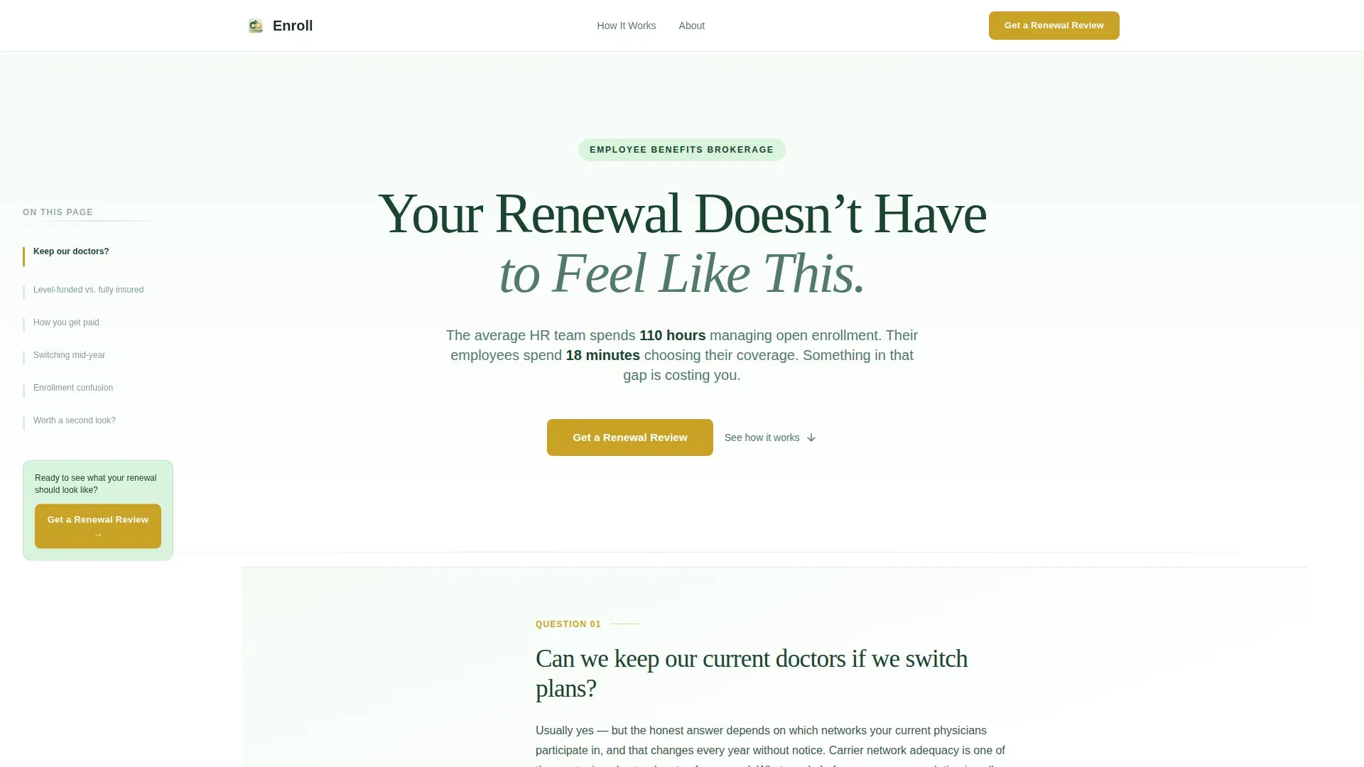
- A giant headline hero with massive white space and a data-led subline that names the enrollment time imbalance
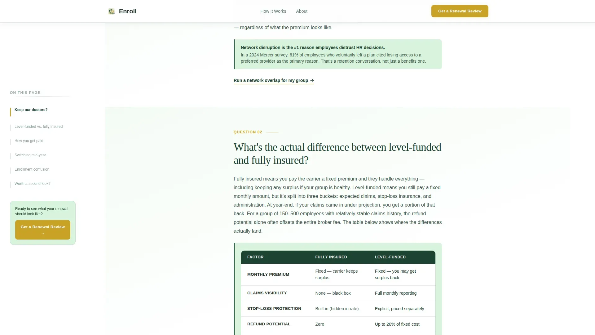
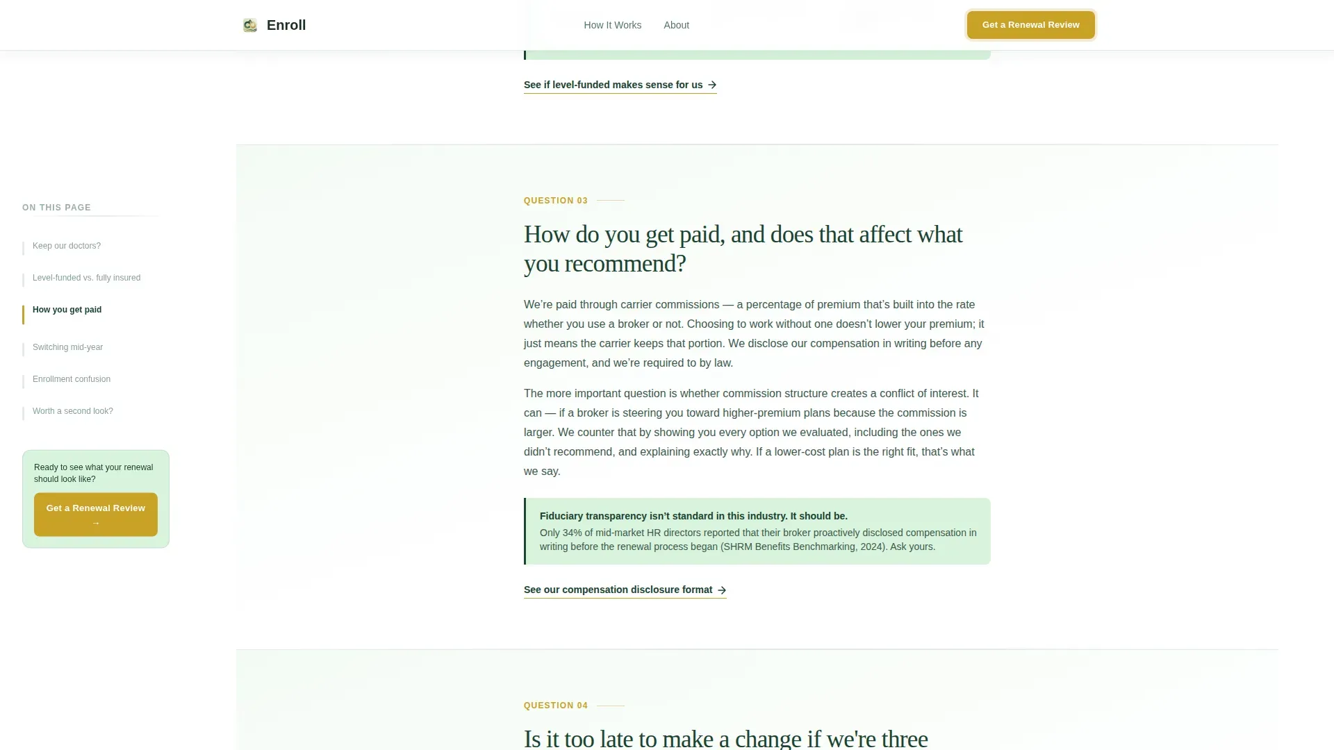
- A scrolling FAQ section with six conversation-style panels, each containing a plain-language answer, a supporting data point or comparison table, and a micro call-to-action
- A primary renewal review form with a company name field, an employee count slider from 50 to 2,000 plus, a renewal month field, and one open text field asking what frustrates the prospect most right now
- A secondary lead capture section offering a downloadable open enrollment timeline checklist gated behind only an email address
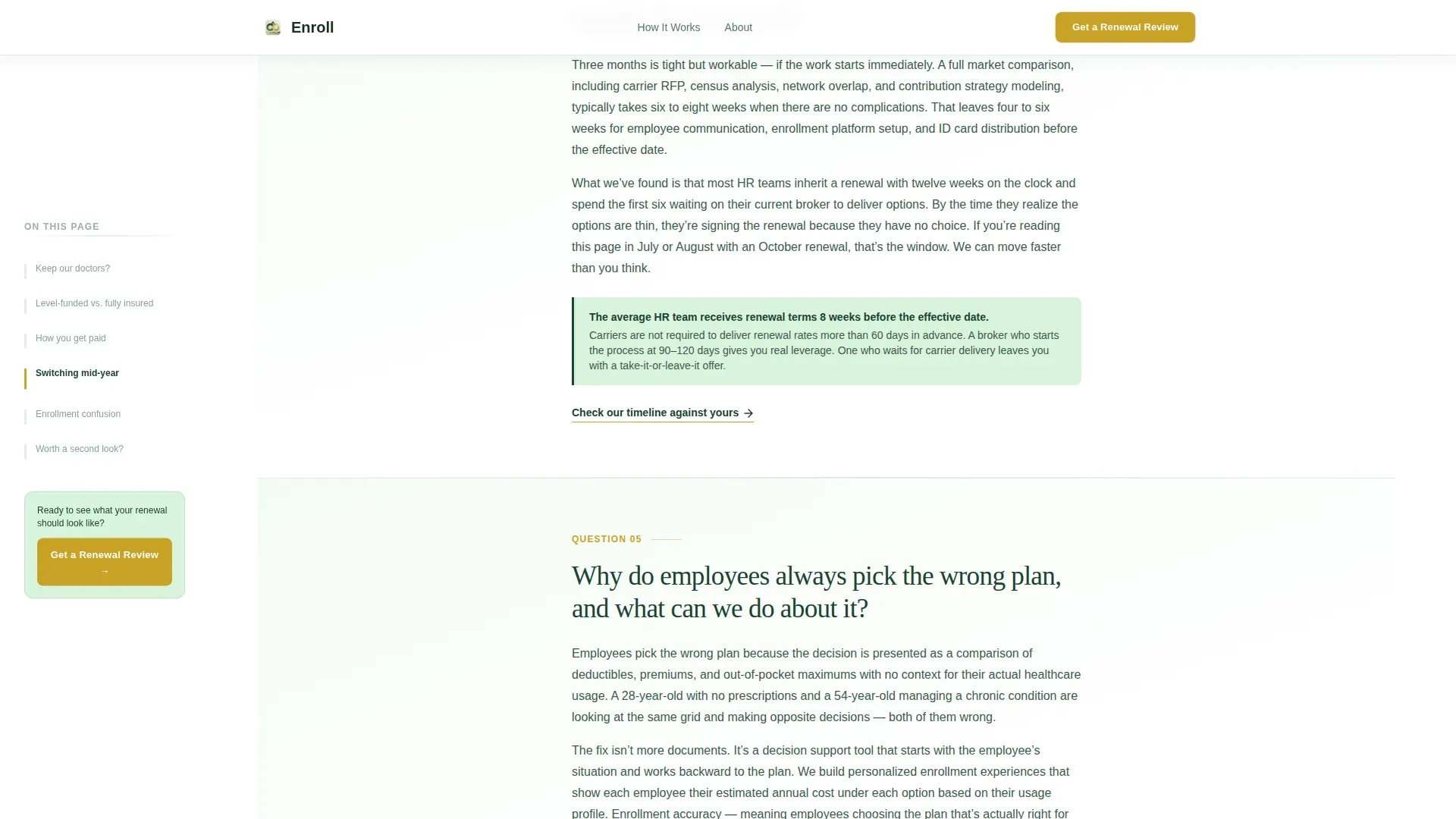
- A fixed left sidebar that functions as a live table of contents, highlights the active question as the user scrolls, and surfaces the persistent primary call-to-action
Feature list
This template ships with a set of focused, purposeful components. Each one is tied directly to the consultative sales experience this niche demands.
Fixed Sidebar Table of Contents
A persistent left-side navigation panel tracks the visitor's scroll position. It highlights the current FAQ section in real time and lets visitors jump to any question instantly. The primary "Get a Renewal Review" call-to-action lives here permanently.
FAQ-Driven Scroll Layout
Six scrollable question panels replace traditional service sections. Each panel opens with a real question an HR director asks during a first broker call, delivers one clear answer paragraph, includes a data point or comparison table for credibility, and closes with a focused micro call-to-action.
Soft Gradient Panel System
Each FAQ answer unfolds on a gradient panel that transitions from pale lichen to white. The visual rhythm creates a calm, consultative feel. It signals authority without the visual noise common in the insurance category.
Renewal Review Lead Form
The primary conversion form collects four inputs: company name, employee count via a slider, current renewal month, and a freeform frustration field. The gold submit button uses a gentle pulse animation to draw attention without interrupting the reading experience.
Checklist Download Gate
A secondary conversion path offers an open enrollment timeline checklist in exchange for an email address only. This captures earlier-stage leads who are not yet ready to share a census file but want proof the broker thinks in systems.
GSAP Scroll Animations
The sidebar highlight sync, smooth scroll behavior, and gold button pulse are powered by GSAP ScrollTrigger. Animations run at a medium intensity to support the calm authority tone without feeling distracting.
Page sections overview
| Section | Purpose |
|---|---|
| Hero Headline | Opens with a single evergreen headline and a moss-colored subline naming the enrollment time imbalance |
| FAQ Sidebar Companion | Fixed left sidebar TOC synced to six scrollable Q&A panels with gradient backgrounds |
| Renewal Review Form | Primary lead capture with employee slider, renewal month, and open frustration field |
| Checklist Download | Secondary email-only gate offering a downloadable open enrollment timeline checklist |
| Footer | Single linear row with essential links |
Design & branding system
The visual identity is built on the Forest Trust color system. It channels the calm of old-growth canopy light rather than the noise of a carrier trade show booth.
- Deep evergreen (#1B4332) anchors the sidebar background and all major section headers; warm moss (#52796F) handles secondary text and divider lines; pale lichen (#D8F3DC) washes across FAQ panel backgrounds
- Quiet gold (#C9A227) is reserved exclusively for calls-to-action and interactive highlights, including the pulsing submit button and sidebar action link
- Typography pairs Fraunces serif headings with DM Sans body text, creating a combination that reads as both trustworthy and modern
Mobile & speed optimization
The template is built desktop-first, matching where HR directors and CFOs do this kind of research. A responsive mobile fallback is included for all sections.
- The fixed sidebar collapses gracefully on smaller screens so the FAQ content remains fully readable without layout conflicts
- Static sections use server components to keep initial load light; the interactive sidebar and lead form use client components only where interactivity is required
- The employee count slider and smooth scroll behavior are designed to function cleanly across device sizes without degrading the consultative experience
How this template helps you convert
This template converts by mimicking the structure of a real consultative broker meeting. Each section earns a small amount of trust before asking for more commitment.
- The hero frame creates immediate credibility by naming the exact pain (renewal season overload) with calm confidence rather than promotional urgency, making the right visitor feel immediately understood.
- Each answered FAQ question lowers a specific objection and closes with a micro call-to-action, building conversion momentum question by question before the visitor reaches the primary form.
- Two lead capture paths address two buyer stages: the renewal review form converts ready buyers, while the checklist download converts earlier-stage prospects with just an email address, widening the total lead funnel.
Other information about this template
This template is designed for the United States market. Dates use MM/DD/YYYY format and all financial references use USD. The page is localized for domestic employee benefits brokerage practices, including references to October renewal cycles, stop-loss thresholds, and level-funded versus fully insured plan structures.
- The template style is Sidebar Companion, a layout format where a fixed panel and a scrolling main content area work together as one unified experience
- The creative direction is FAQ-Driven, meaning the scroll architecture replaces traditional hero-to-features-to-call to action flow with a question-and-answer consultation rhythm
- The header concept is Giant Headline Centered, using maximum white space and a single large serif line to create calm authority rather than visual complexity
- The theme is Soft Gradient, applied consistently across FAQ panels to signal a warm, approachable tone while maintaining the seriousness a CFO-level buyer expects
Theme
Soft Gradient
Creative direction
FAQ-Driven
Color system
Forest Trust
Style
Sidebar Companion
Direction
Lead Generation
Page Sections
Fixed Sidebar Table of Contents
Faq-driven Scroll Layout
Soft Gradient Panel System
Renewal Review Lead Form
Checklist Download Gate
GSAP Scroll Animations
Related questions
What kind of business is this landing page built for?
How does the sidebar navigation work on this page?
What are the two lead generation paths included?
What animations are included in this template?
Is this template designed for a specific renewal season or market?



