Middle Eastern Specialty Retail Blog Website Template
A masonry-grid landing page built for certified halal beauty retailers. It pairs product discovery with visible trust signals, certification badges, scholar endorsement cards, and ingredient flip cards, guiding visitors from broad category browsing to confident, informed click-through. The warm Ink & Paper palette and editorial header create a shopping experience that feels considered, not commercial.
by Rocket studio
Quick summary
This landing page template is designed for halal-certified beauty stores. It combines a masonry product grid with a trust-first scroll journey, moving visitors from editorial first impressions through ingredient transparency to a confident handoff at the storefront. The layout earns the click before it asks for it.
Who this template is for
This template suits sellers and creators who need more than a generic product grid. It is built for beauty businesses where certification and ingredient integrity are genuine selling points, not afterthoughts.
- Halal cosmetics retailers selling lipsticks, serums, foundations, and related products
- Independent beauty brands seeking to communicate certification credibility to faith-conscious shoppers
- Beauty creators or community-led stores serving hijabi audiences, new mothers, and values-driven buyers
What problem this template solves
Most e-commerce landing pages treat trust as a footer footnote. For halal beauty shoppers, ingredient transparency and certification legitimacy are the primary purchase decision. This template solves the gap between a shopper's need to verify and a retailer's need to convert.
- Unlabeled ingredient concerns and animal-derived or alcohol-based formulas create real hesitation at checkout
- Shoppers with faith-based or health-based standards need visible proof before they feel confident enough to buy
- Generic store templates offer no structured place to show certification documents, scholar endorsements, or sourcing detail
What you get with this template
You get a complete, single-page layout built around the halal beauty shopping journey from first impression to storefront handoff. Every section serves a specific role in the trust-to-click sequence.
- A masonry product grid that tightens progressively from broad category browsing to curated staff-picks bundles
- An editorial device mockup header, a certification document break section, and ingredient flip cards with sourcing origins
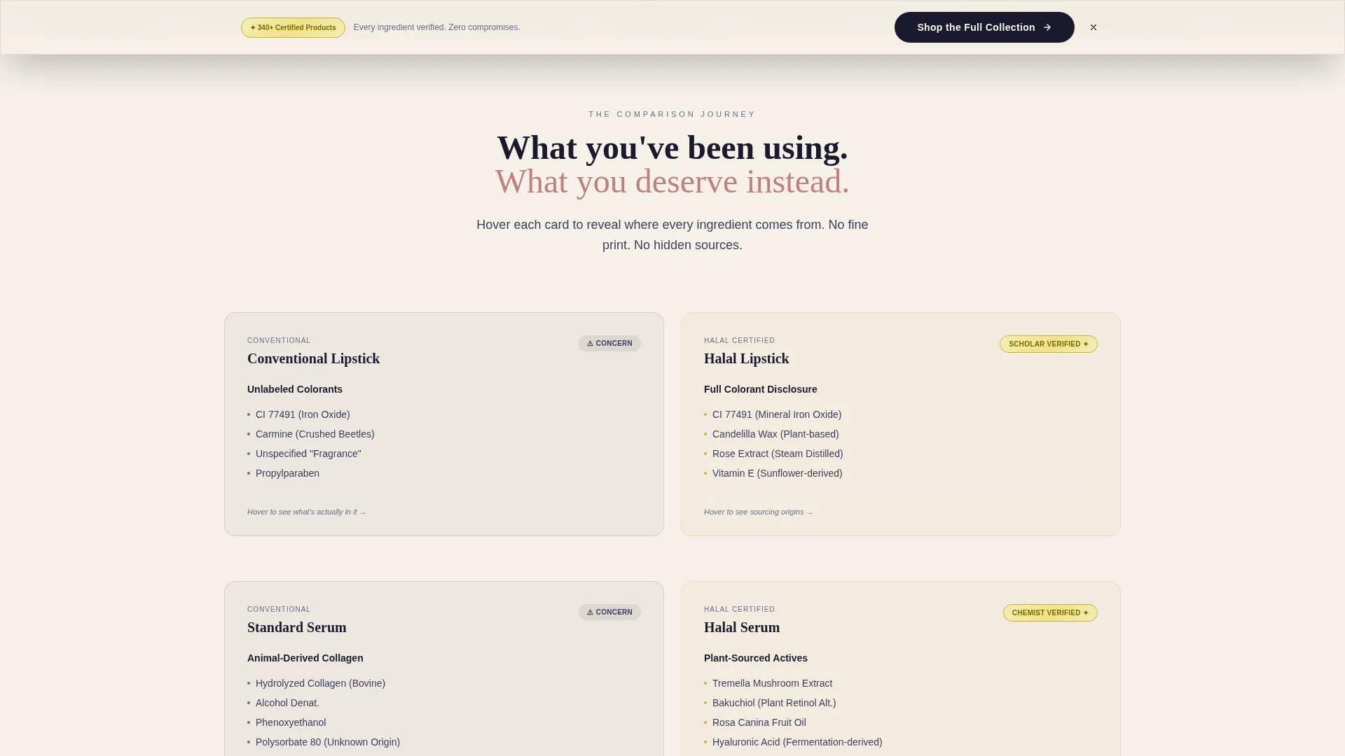
- A sticky "Shop the Full Collection" call-to-action bar that appears only after the visitor passes the certification section
Feature list
A paragraph introducing the features: Each component in this template has a defined job. Nothing is decorative without purpose. The features below reflect exactly what the brief specifies, so you know what you are building with.
Editorial Device Mockup Header
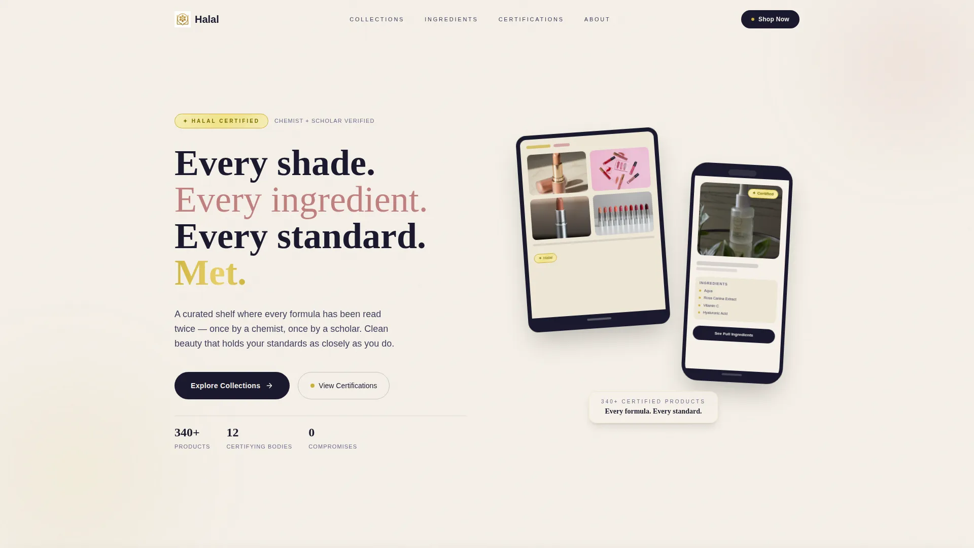
The header floats an iPhone and iPad at a slight angle against a warm parchment background. One screen displays a lipstick shade range; the other shows a serum product page with a visible halal certification badge and a full ingredient breakdown. The headline reads: "Every shade. Every ingredient. Every standard. Met."
Progressive Masonry Product Grid
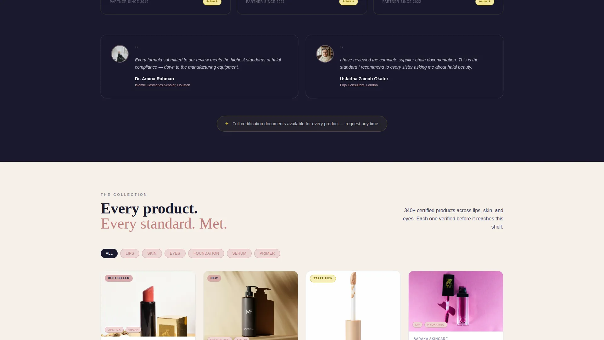
The masonry grid opens wide for category exploration at the top and narrows toward curated staff-picks bundles at the bottom. This scroll-driven tightening builds specificity and shopper confidence simultaneously, guiding visitors from browsing to intent without friction.
Ingredient Flip Cards
Each product card in the grid carries an ingredient flip interaction. The front shows the product; the back reveals sourcing origins. This gives faith-conscious and health-conscious shoppers the ingredient transparency they need without leaving the landing page.
Certification and Endorsement Break Section
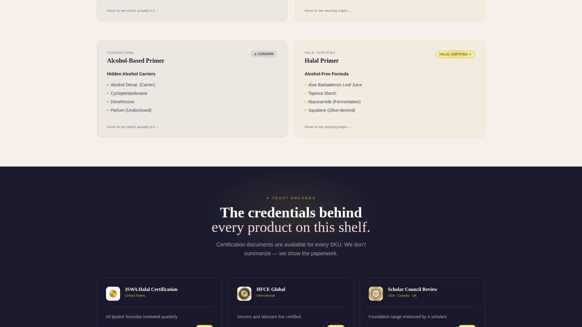
A horizontal trust break interrupts the product scroll midway. It surfaces real certification documents and scholar endorsement cards, pausing the shopping rhythm just long enough to anchor credibility before the next wave of product tiles continues.
Sticky call to action Bar with Earned Timing
The primary call-to-action, "Shop the Full Collection," is anchored as a sticky bottom bar. It does not appear immediately. It activates only after the visitor scrolls past the certification section, so the click is earned through trust, not demanded on arrival.
Per-Card Secondary call to action
Every product card carries a secondary call-to-action labeled "See Full Ingredients." This links through to the store's product detail page. There is no cart on the landing page itself; the design focuses entirely on a confident, informed handoff to the storefront.
Page sections overview
| Section | Purpose |
|---|---|
| Device Mockup Header | Introduces the brand with an editorial device composition and the core headline |
| Comparison Journey Start | Pairs conventional cosmetic concerns against certified halal alternatives side by side |
| Ingredient Flip Cards | Lets shoppers reveal sourcing origins for each product without leaving the page |
| Certification Document Break | Surfaces real certification files and scholar endorsement cards to anchor trust midpage |
| Masonry Category Grid | Broad product exploration organized by category with individual ingredient calls to action |
| Staff Picks Bundles | Tightly curated selection at the bottom of the grid for high-intent visitors |
| Sticky call to action Bar | Persistent "Shop the Full Collection" bar that activates post-certification scroll |
Design & branding system
The visual identity follows an Ink & Paper color system. The palette feels like a handwritten letter on heavy cotton stock: unhurried, intentional, and warm. Every color has a defined role, and none appears casually.
- Warm parchment (#F5F0E8) dominates the background so products breathe clearly inside their cards; calligrapher's ink (#1A1A2E) anchors all typography with quiet authority
- Soft blush (#D4A5A5) activates on hover states and category tags, warming every interaction without overpowering the layout
- Muted gold (#C9B037) appears sparingly and only on certification badges and trust seals, reserving its weight for moments where trust is actively being earned
Mobile & speed optimization
The masonry grid and flip-card interactions are designed with a scroll-reveal progression that works cleanly across screen sizes. The layout adapts from the wide editorial header on desktop to a focused, card-led flow on smaller devices.
- The device mockup header scales responsively, keeping the iPhone and iPad composition readable on mobile without cropping key interface details
- Product cards in the masonry grid restack into a clean single or double column on smaller screens, preserving the tightening browse-to-bundle journey
- The sticky call to action bar remains functional and visible on mobile, holding its position at the bottom of the viewport throughout the scroll
How this template helps you convert
This template is engineered around one idea: earn the click before asking for it. Every structural decision supports a shopper moving from curiosity to confidence.
- The comparison journey pairs conventional concerns with certified answers early in the scroll, addressing objections before they become reasons to leave
- The certification break and endorsement cards interrupt browsing at the exact moment credibility matters most, converting passive scrollers into engaged, ready-to-buy visitors
- The sticky call to action bar appears only after trust has been built, so when it surfaces, the shopper has already been given every reason to click through with zero hesitation
Other information about this template
This template sits within the Retail and E-Commerce category with a focus on Middle Eastern Specialty Retail. It is a strong fit for any halal-certified beauty store that needs a purpose-built landing page rather than a repurposed general storefront template.
- The template style follows a Scroll Reveal progressive approach, meaning sections and components animate into view as the visitor scrolls, keeping the experience active and editorial
- The Marketplace Grid theme and Neo-Retro design language give the layout a curated, handcrafted aesthetic that feels distinct from standard beauty e-commerce
- The landing page direction is built for direct sales click-through, not on-page purchasing; the design intentionally channels all purchase intent toward the linked storefront
Theme
Neo-Retro
Creative direction
Curated Collection
Color system
Ink & Paper
Style
Scroll Reveal (Progressive)
Direction
Direct Sales
Page Sections
Editorial Device Mockup Header
Progressive Masonry Product Grid
Ingredient Flip Cards
Certification and Scholar Endorsement Break
Earned Sticky Call to Action Bar
Per-card Ingredient Call to Action
Related questions
Does this template include a shopping cart or checkout feature?
Can I use this template for a beauty brand without formal halal certification?
How does the ingredient flip card work for shoppers?
When does the sticky call to action bar appear on the page?
Who is the target shopper this landing page is designed for?



