Fine Dining Restaurant Landing Page Template
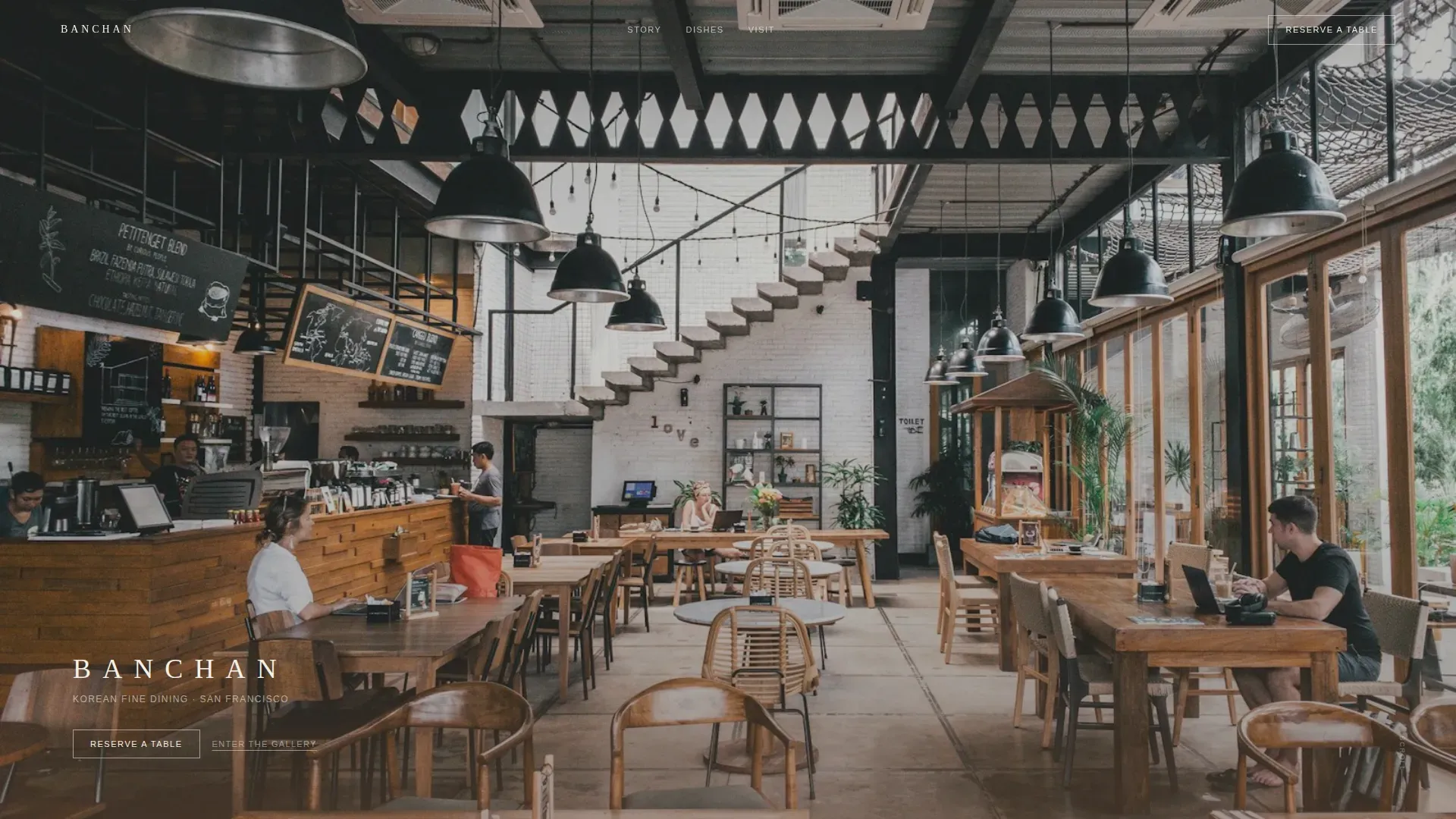
Banchan is a hero-dominant fine dining landing page designed for Korean fine dining restaurants that want to earn every reservation through atmosphere, not advertising. A slow full-screen video loop, gallery-walk dish frames, and poetic provenance lines guide visitors from contemplation to commitment. The design is pastoral, unhurried, and built entirely around one action: reserving a table.
by Rocket studio
Quick summary
Banchan is a single-page restaurant landing page designed for Korean fine dining establishments. It uses a meditative gallery-walk structure, a full-screen video hero, and a Sunset Mesa color palette to move food-literate visitors toward one clear action: making a reservation. Every section is crafted to show, not sell.
Who this template is for
This restaurant landing page is designed for operators who understand that a fine dining experience begins long before the first course arrives. The template suits restaurant teams who want their website to reflect the same care they put into the food.
- Korean fine dining restaurants seeking a gallery-quality web presence
- Independent restaurant owners who want an elegant, modern landing page without hiring a full development team
- Food and hospitality brands that serve anniversary couples, food editors, and culturally informed diners
What problem this template solves
Most restaurant website pages try to do too much. They crowd the screen with menus, pop-ups, and competing calls-to-action. Fine dining guests arrive with high expectations and abandon pages that feel cluttered or generic. A poorly structured restaurant landing page misaligns visitor expectations and drives up acquisition costs without improving reservation results.
- Visitors lose confidence when a fine dining website feels rushed or visually inconsistent
- Restaurant owners struggle to showcase exquisite cuisine in a way that feels authentic and editorial
- A generic homepage fails to communicate the atmosphere, sourcing philosophy, or cultural depth that sets a fine dining restaurant apart
What you get with this template
This landing page is a complete, single-page restaurant website designed around one dominant action. Every section is structured to build desire gradually, so the reservation click feels like the natural conclusion of a beautiful experience rather than a sales push.
- A full-screen video hero with a 12-second gimbal loop, ambient sound design, and a lower-third name reveal after the garden shot
- A gallery-walk scroll structure with large dish frames, poetic provenance lines, and atmospheric interstitials every third frame
- A primary "Reserve a Table" call-to-action in the fixed navigation and a full-width warm clay button at the page close, plus a secondary "View the Full Menu" text link
Feature list
This restaurant landing page is designed with specific, prompt-backed components. Each feature serves the fine dining visitor experience directly.
Full-Screen Video Hero
The header is designed around a slow 12-second gimbal loop filmed at restaurant pace. The camera travels through a corridor, past a stone water basin, and into the dining room before the garden is revealed and the restaurant name appears in thin serif type at the lower third. No music plays; only ambient sound fills the frame.
Gallery Walk Dish Frames
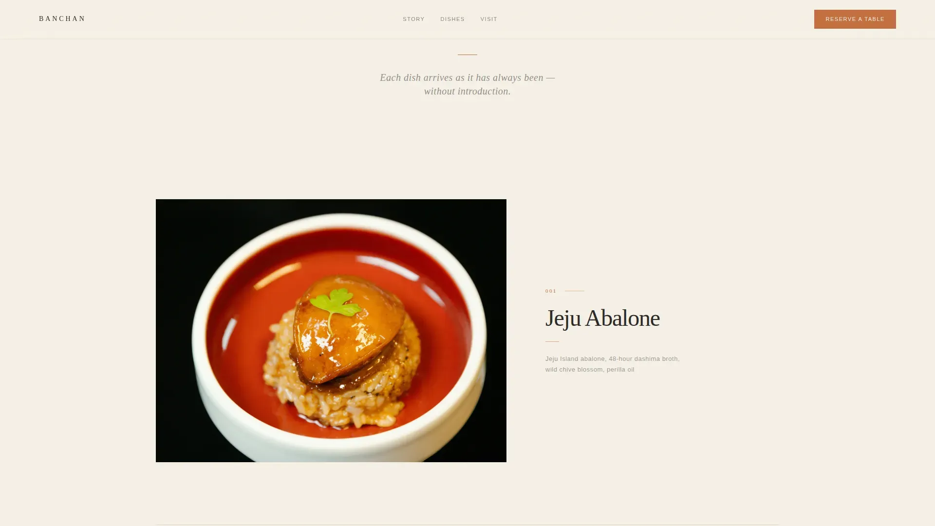
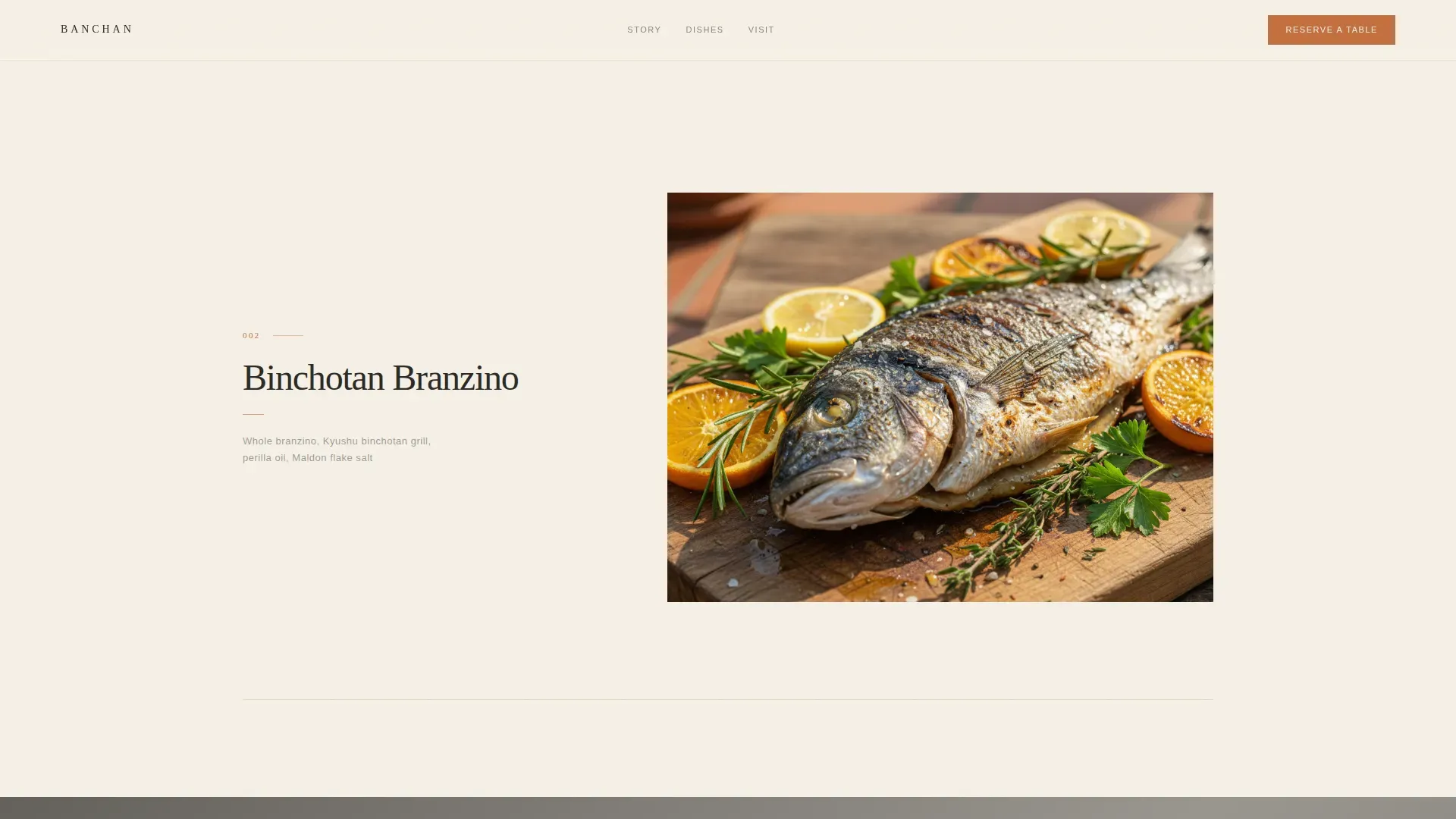
Each dish is presented as a single framed artwork against wide negative space. A short provenance line, not a menu description, accompanies every image. This structure slows visitors down deliberately and frames each course as an editorial moment. High-quality, atmospheric imagery is essential on fine dining restaurant pages, and these frames deliver exactly that.
Atmospheric Interstitials
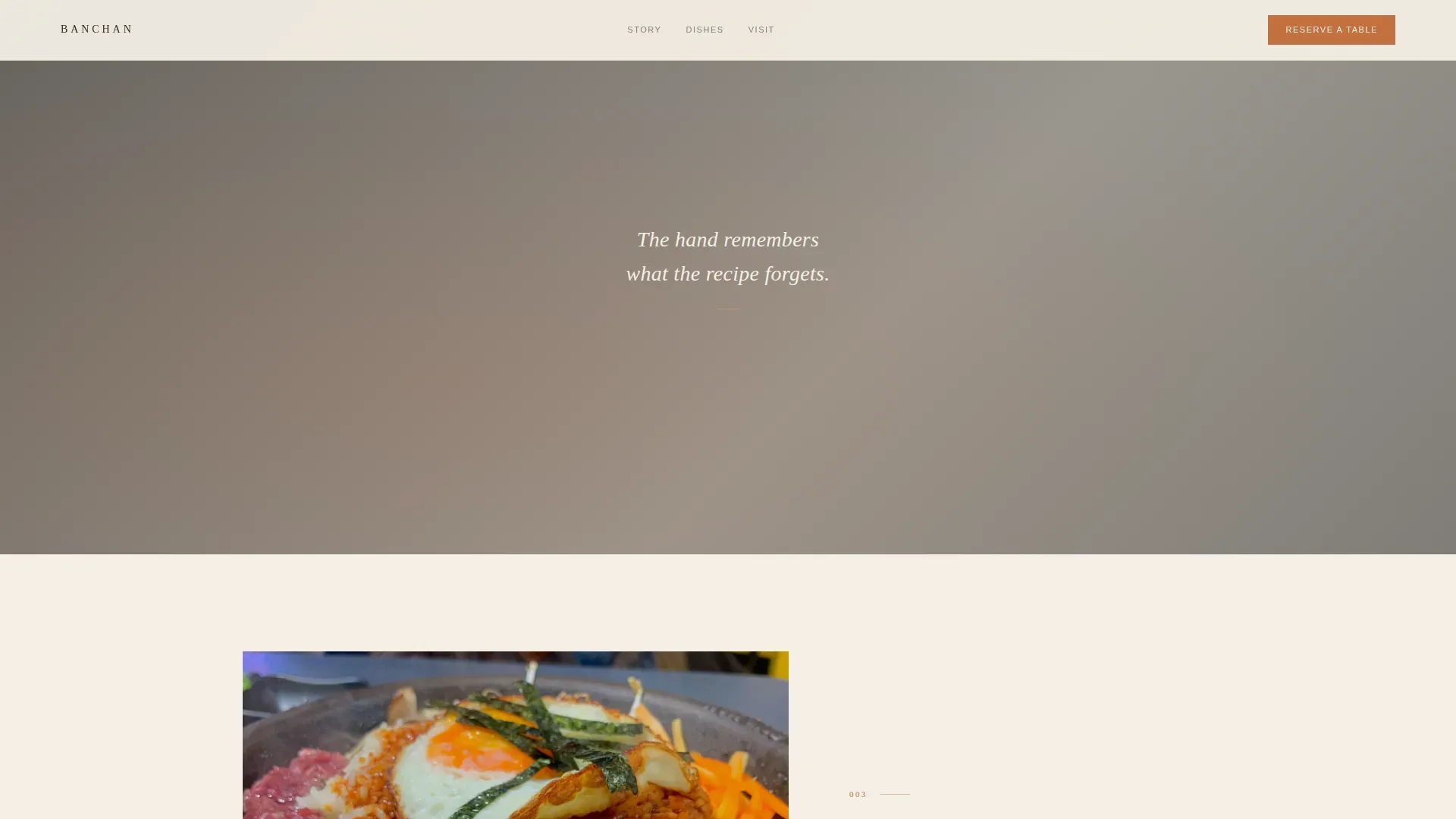
Every third dish frame is replaced by a cinematic interstitial: hands shaping rice, steam lifting from a ttukbaegi, a chef's knife resting on a wet board. These designed breaks prevent scroll fatigue and give the page the rhythm of a curated gallery exhibition.
Dual Call-to-Action Architecture
The primary "Reserve a Table" action is designed as a fixed element in the top navigation and repeated as a full-width warm clay button after the final dish frame. A secondary "View the Full Menu" link sits beneath it for visitors who need more before they commit. This structure keeps one dominant action and one optional secondary path, reducing decision fatigue.
Sunset Mesa Color System
The palette is designed around hanji cream as the dominant background, hanok charcoal for all body text and navigation, and sun-baked clay and dried barley gold reserved for hover states, divider lines, and the reservation button. Color changes are deliberate and sparse, making every warm accent feel intentional.
Fraunces and DM Sans Typography
Headlines and dish names are set in Fraunces, a variable serif with warmth and editorial weight. Navigation and provenance lines use DM Sans for clean, legible contrast. The pairing is designed to feel unhurried and authoritative without being stiff.
Page sections overview
| Section | Purpose |
|---|---|
| Full-Screen Hero | Introduces the restaurant through a slow video loop and name reveal |
| Gallery Walk Dishes | Presents individual dishes as framed artworks with provenance lines |
| Atmospheric Interstitials | Breaks dish-frame rhythm with cinematic kitchen and hands imagery |
| Reservation Call-to-Action | Converts visitor desire into a click through to the reservation platform |
| Minimal Footer | Displays social icons and copyright with no visual clutter |
Design & branding system
The visual identity follows a Pastoral Calm theme. Every design decision is made to feel like a Korean countryside at dusk: warm, quiet, and deeply considered. The restaurant website is designed to display the cuisine as art, not inventory.
- Hanji cream (#F5F0E6) carries every background; hanok charcoal (#2B2926) sets all body text and navigation; clay (#C4703F) and barley gold (#D4A952) appear only on hover states, dividers, and the reservation button
- Fraunces serif for headlines and dish names; DM Sans for navigation and provenance lines
- Wide margins, generous negative space, and scroll-linked reveals create a pace that mirrors the fine dining experience itself
Mobile & speed optimization
This restaurant landing page is designed to perform gracefully across devices. Fine dining visitors often evaluate a restaurant on a phone before committing. Mobile optimization is required to ensure those visitors do not abandon before they reach the reservation call-to-action.
- The video hero includes a poster-image fallback so the page loads with visual impact even when autoplay is restricted on mobile
- Lazy-loaded images and an IntersectionObserver-based reveal system are designed to keep the page responsive as visitors scroll through dish frames
- The gallery-walk layout adapts from a desktop-first structure to a clean, single-column mobile view without losing its editorial character
How this template helps you convert
A focused landing page reduces ambiguity and guides visitors to one practical next step. This restaurant landing page is designed to connect atmosphere, proof, and action into a flow that feels inevitable rather than forced.
- The hero confirms relevance in the first screen. Visitors understand immediately that this is a fine dining restaurant with a specific, considered identity, reducing early drop-off.
- The gallery-walk structure distributes trust across the page. Each dish frame and interstitial deepens confidence and desire before the reservation button appears, so the call-to-action arrives at exactly the right moment.
Other information about this template
This template is built for restaurant teams who want a professional, gallery-quality restaurant website without weeks of custom development. No-code tools make it possible to build and manage these pages without extensive technical skills, and this template is designed with that in mind. Restaurant owners can make straightforward changes to imagery, provenance lines, and call-to-action links without needing to hire a developer.
- The reservation button is designed to pass visitors to an external platform (such as Tock or Resy) with date and party-size pre-selection, integrating a user-friendly path that allows guests to select date, time, and party size with minimal clicks
- The footer is designed to display social icons and the copyright year, keeping the page clean while supporting essential restaurant website items like contact source information, address, and operating hours in a persistent location
- The template can support a section dedicated to the chef's background story, short diners quotes, and sensory-rich dish descriptions that label dietary accommodations clearly, all of which are standard items on successful fine dining restaurant pages
- Prominent trust items, such as mentions from respected food publications or editorial accolades, can be added to strengthen the page as a traffic source for high-intent visitors within weeks of launch
- The Banchan pastoral fine dining restaurant landing page template is designed to protect the brand's editorial identity while making reservation-focused metrics visible and actionable from day one
Theme
Pastoral Calm
Creative direction
Gallery Walk
Color system
Sunset Mesa
Style
Hero-Dominant (90/10)
Direction
Click-Through
Page Sections
Full-screen Video Hero with Ambient Sound
Gallery Walk Dish Frame Structure
Cinematic Atmospheric Interstitials
Dual Call-to-action with Secondary Path
Sunset Mesa Color and Typography System
Scroll-linked Reveal Animations
Related questions
Does this template include an on-page reservation form?
Can I add allergen and dietary information to the dish descriptions?
Is this template suitable for a restaurant website with multiple pages?
How do I update the video and dish images after launch?
Can I add a chef biography or diner quotes to this template?



