Trade Job Board Landing Page Template
Grit is a single-page landing page template built for blue-collar trade job boards. It connects skilled tradespeople with contractors and shop owners through a structured comparison table, trade-specific profile features, a regional job map, and testimonial social proof. The design speaks the language of the trades: direct, warm, and built for people who answer calls, not emails.
by Rocket studio
Quick summary
Grit is a lead generation landing page template designed for blue-collar trade job boards. It uses a Hero's Journey scroll flow to walk visitors from the problem straight to the solution. A corkboard-style testimonial card opens the page, a side-by-side comparison table makes the case, and two short forms close the deal. Every section earns the next click.
Who this template is for
This template is built for the people and businesses that make trades work. It serves both sides of the hiring relationship at the same time.
- Journeymen, apprentices, and union tradespeople looking for work in welding, HVAC, pipefitting, diesel mechanics, and more
- Shop owners and contractors who need reliable, verified talent on a job site by Monday morning
- Developers and designers building a blue-collar trade job board platform from a professional, structured starting point
What problem this template solves
Generic job boards waste everyone's time. A welder is not a "technician." A boilermaker is not "construction." Tradespeople scroll past irrelevant listings, and employers wade through unqualified applicants with no certs and no experience. This template solves that disconnect head-on.
- The comparison table shows, row by row, what trade-specific boards offer that generic platforms do not
- Industry-specific filters for certifications, trade skills, and equipment proficiency are built into the profile section layout
- The dual-mode call-to-action form separates job seekers from hiring managers at the point of contact, saving everyone time
What you get with this template
You get a fully structured, single-page layout with five clearly defined sections and two conversion forms. Every section is thoughtfully arranged for efficient workflow and straightforward customization.
- A pinned testimonial hero, a side-by-side comparison table, a profile feature breakdown, a regional job density map, and a testimonial stack
- Two lead forms: a three-field "Post Your Trade" form and a two-field "Hire a Tradesperson" form, each targeting a different audience
- A sticky amber call-to-action bar for mobile, repeated amber buttons after each major section, and a linear single-row footer
Feature list
This template comes with a focused set of components built specifically for the blue-collar hiring context. Highlighting key platform features is essential for drawing the right users in from the first scroll.
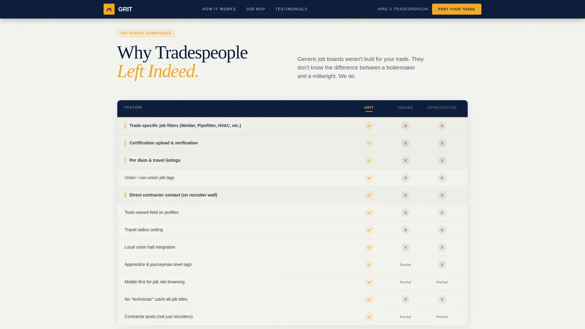
Side-by-Side Comparison Table
The core of the page is a structured table comparing this board against generic platforms across eight trade-specific criteria. Rows cover cert verification, per diem listings, union and non-union tags, trade-specific filters, and direct contractor contact. Amber checkmarks and charcoal X-marks make the differences impossible to miss. Optimizing job board landing pages around this kind of clear visual hierarchy can significantly improve user engagement and conversion rates.
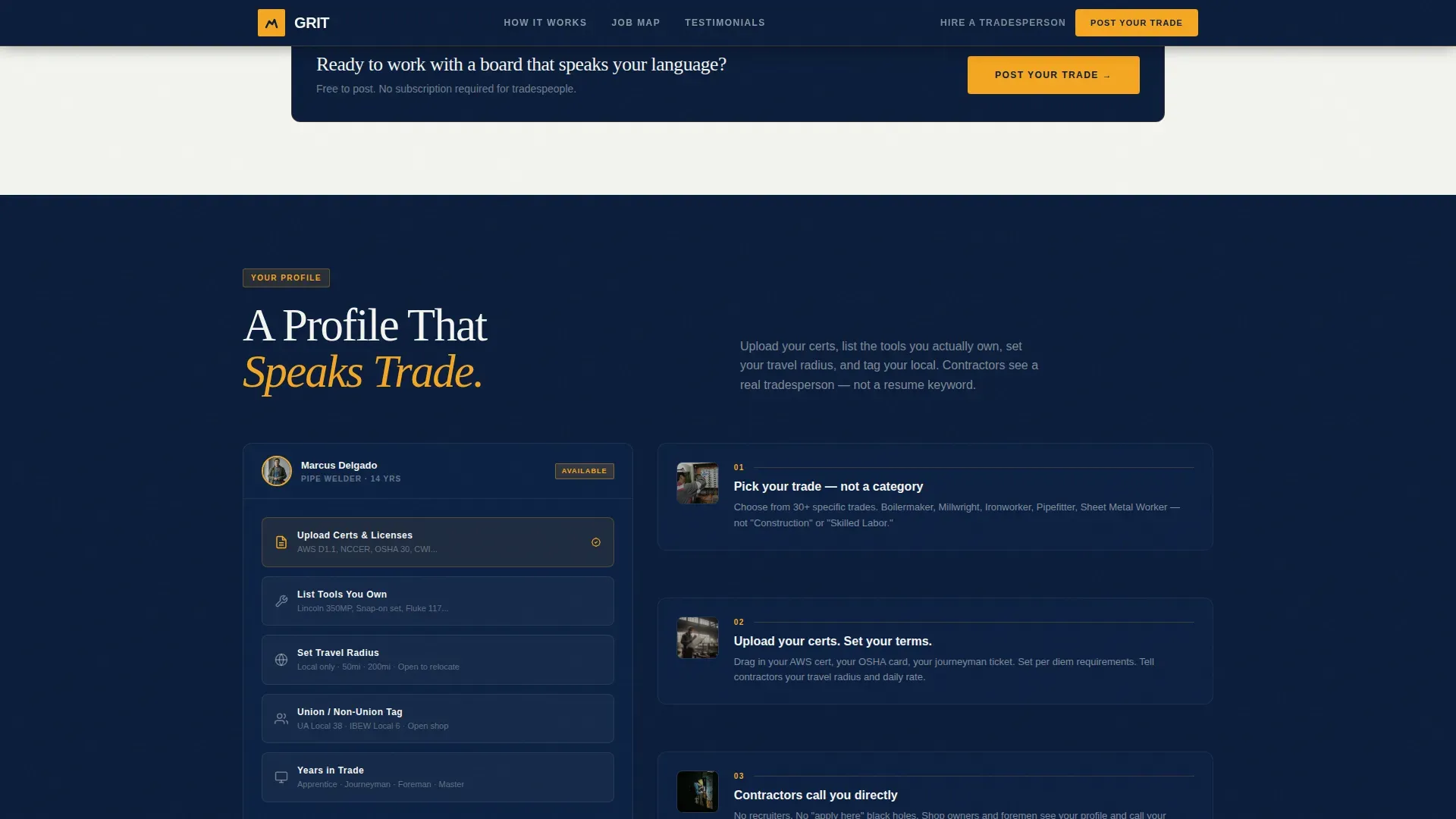
Trade-Specific Profile Section
The profile breakdown section explains how tradespeople can upload certifications, list tools they own, set a travel radius, and add union or non-union tags. This structured layout guides users toward signing up and building a complete profile. Career growth from apprentice to journeyman to foreman can be shown clearly here, giving candidates a sense of long-term possibility.
Dual-Mode Lead Generation Forms
The "Post Your Trade" form uses three fields: trade dropdown with 30-plus specific trade categories, zip code, and phone number. The "Hire a Tradesperson" form uses two fields: trade needed and job site zip. Both forms are designed around how trades people actually communicate. These folks answer calls. They do not wait on emails.
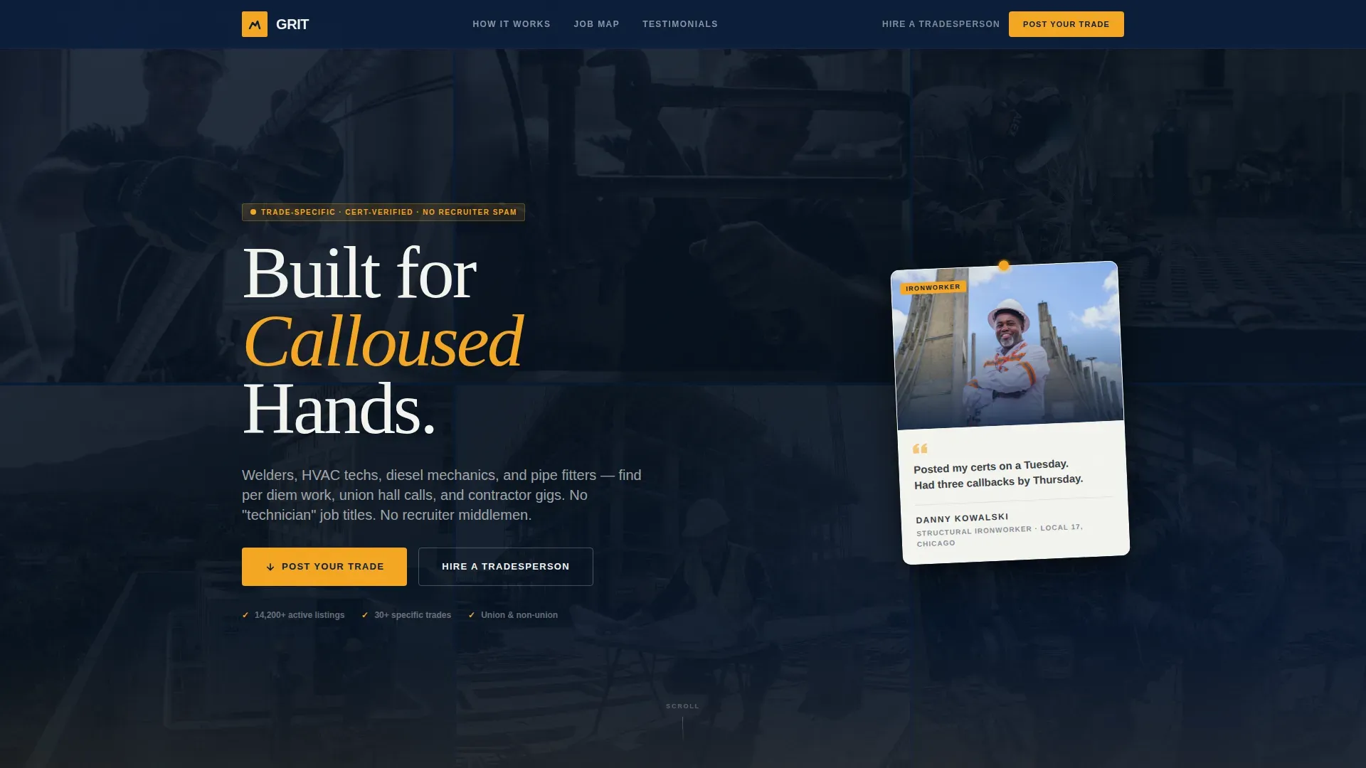
Corkboard Testimonial Hero
The header is a single oversized testimonial card, slightly rotated like it was pinned by hand. It features a real-looking photo of an ironworker with a plain-spoken two-line quote, name, trade, and local number. A soft-focus photo mosaic of other trades sits behind it. Incorporating testimonials at the very top builds trust and credibility before a single scroll happens.
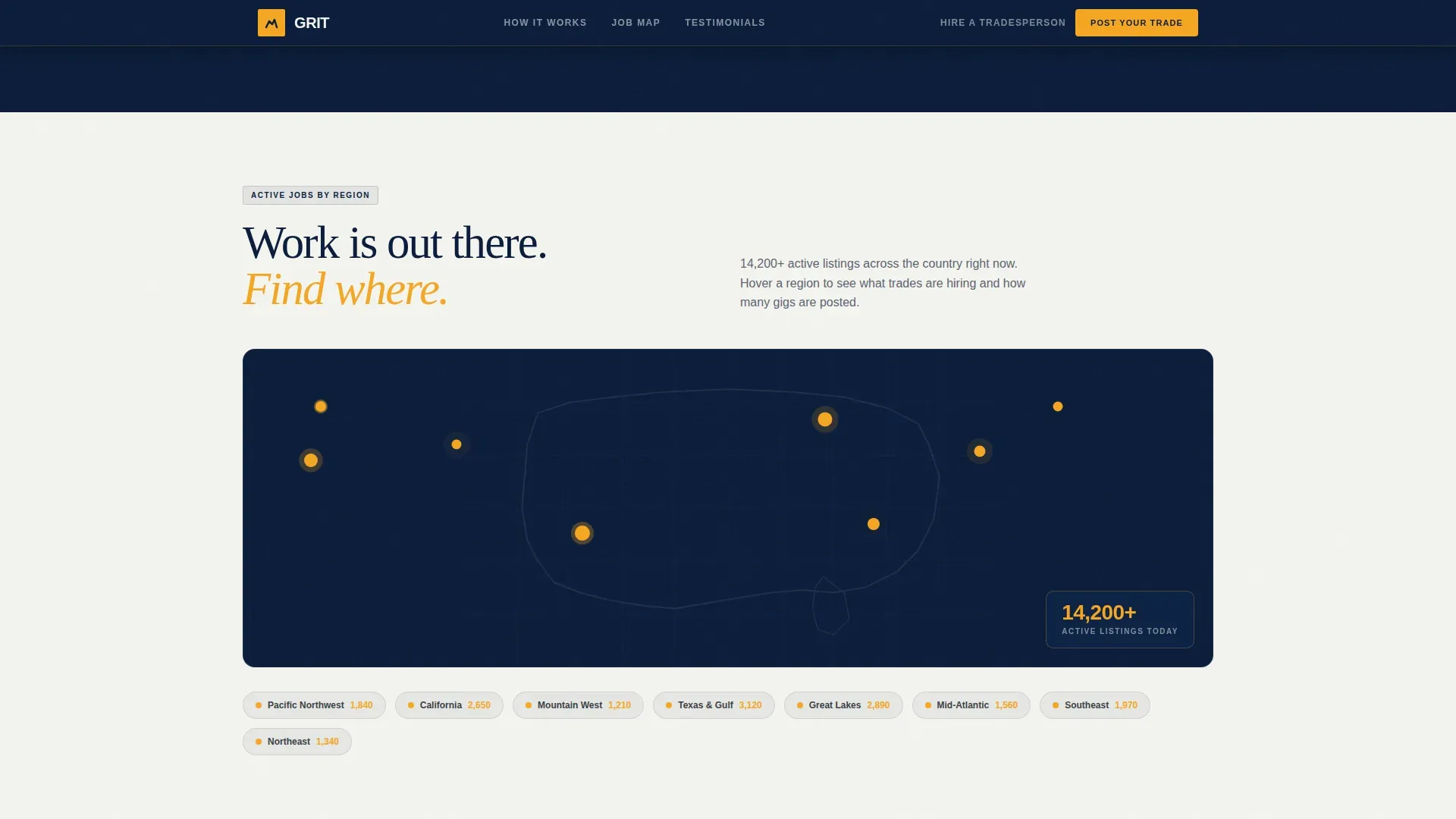
Regional Job Density Map
A visual map of the United States shows active job counts by region. This gives both tradespeople and employers a sense of real activity. It builds confidence that the board is live and worth their time. Realistic job previews that highlight where work is actually happening build trust with candidates in ways that text alone cannot.
Testimonial Card Stack
Three testimonial cards follow the map, one for a pipefitter, one for an HVAC tech, and one for a diesel mechanic. Each card tells a chapter of a real career move, from finding a gig to relocating for a foreman position. Showcasing testimonials from successful placements is one of the most effective ways to build credibility on a trade job board.
Page sections overview
| Section | Purpose |
|---|---|
| Hero Testimonial Card | Opens page with social proof and trade identity |
| Comparison Table | Shows platform advantages over generic job boards |
| Profile Features | Explains cert upload, tools, radius, and union tags |
| Regional Job Map | Displays active job density across US regions |
| Testimonial Card Stack | Builds trust through three real trade career stories |
| Footer Bar | Closes page with a clean single-row linear layout |
Design & branding system
The visual identity follows a Community Hearth theme. The palette feels like a lit shopfront on a dark industrial road. A rugged, high-contrast aesthetic keeps the focus on stability and authentic craftsmanship throughout.
- Colors: deep watch-cap navy (#0B1D3A) for headers and backgrounds, steel-toe charcoal (#3B3F45) for body text, safety-vest amber (#F5A623) on every button and badge, and chalk-line white (#F4F4F0) for open breathing room
- Typography: DM Serif Display for headlines and Plus Jakarta Sans for body and user interface text, giving the page both authority and readability
- Visuals use authentic imagery of tradespeople at work rather than generic stock photos, because real imagery on job boards builds immediate trust
Mobile & speed optimization
Most blue-collar professionals check job boards on their phones while on a job site or during a break. This template is built mobile-first from the ground up, so the experience holds up wherever someone opens it.
- A sticky amber call-to-action bar anchors the bottom of the screen on mobile, keeping the primary action visible at all times
- GPU-accelerated transforms and GSAP ScrollTrigger animations are used for smooth reveals and staggered card entrances without heavy load
- Dark navy backgrounds with high-contrast amber buttons keep call-to-action elements visible even in bright outdoor light
How this template helps you convert
User-friendly designs on job board landing pages are essential for attracting and retaining the right users. This template uses structured layout decisions to move both job seekers and employers toward action.
- The comparison table does the convincing early. By the time a visitor reaches the first call-to-action button, they already understand why this board is different from the generic platforms they stopped trusting.
- The dual-mode form separates two audiences without confusion. Tradespeople tap "Post Your Trade" and fill three fields in under a minute. Employers tap "Hire a Tradesperson" and get a two-field form tailored to their need. Both paths feel built for them, not adapted from something else.
Other information about this template
This template is a strong foundation for anyone building a blue-collar job board from scratch or refreshing an existing platform. Structured layouts like this one guide users toward signing up or posting vacancies, which is exactly what effective job boards need to do.
- An effective color palette for blue-collar job boards includes earth and steel tones like deep charcoals and high-vis yellows, all of which are present in this template's Navy Authority system
- AI-powered job board solutions can enhance the efficiency of listings and applications over time; this template's structured profile section is built to support that kind of expansion as the platform grows
- AI tools can improve user experience by personalizing job recommendations based on user profiles, and the travel radius and trade dropdown fields in this template create exactly the data structure needed for that
- Jobring is a modern and professional job board website landing page user interface kit designed for recruitment platforms; like Jobring, this template emphasizes clarity, accessibility, and structured layouts designed to increase registrations and job applications
- Jobring provides a strong foundation for building a reliable and high-converting job board website, and the Grit blue collar trade job board landing page template follows the same principle with a niche-specific lens
- Bold, heavy display fonts combined with strong color contrast suggest a "get it done" attitude that resonates with the trades audience this template is built to serve
Theme
Community Hearth
Creative direction
Hero's Journey
Color system
Navy Authority
Style
Comparison Table
Direction
Lead Generation
Page Sections
Side-by-side Comparison Table
Dual-mode Lead Generation Forms
Corkboard Testimonial Hero
Trade-specific Profile Section
Regional Job Density Map
Testimonial Card Stack
Related questions
Can I customize the trade categories in the dropdown form?
Is this template designed for both job seekers and employers?
How does the comparison table communicate platform differences?
Does the template include real testimonial photos?
Can this template support a growing talent pool over time?


