Artisan Farmstead Landing Page Template
Harvest is a layered, overlap-scroll landing page template built for senior-founded farm and food collectives. It introduces each artisan producer one section at a time, building appetite and trust with every scroll. A honey-gold upgrade path, tier comparison layer, and sticky add-on button work together to move visitors from a basic subscription toward a fuller, richer box experience.
by Rocket studio
Quick summary
Harvest is a single-page landing page template designed for artisan farm and food producer collectives. It uses a layered, overlap scroll structure that literally unpacks producers one by one. Warm, muted tones and handcrafted visual cues set the mood. Every section is built to deepen trust and push visitors toward a meaningful subscription upgrade.
Who this template is for
This template is made for collectives and curated marketplaces where the story behind the product matters as much as the product itself. It suits any group of makers who want to sell not just what they produce, but decades of expertise poured into a jar or a bag.
- Senior-founded farm and food producer collectives selling subscription boxes
- Curated gift-box brands where each item comes with a maker's origin story
- Artisan food marketplaces targeting subscription devotees, thoughtful gift-givers, and home cooks
What problem this template solves
Most subscription box landing pages look like inventory lists. They show products but skip the people. Visitors who arrive from an ad for a basic plan see nothing that makes upgrading feel worthwhile. Harvest solves all of this by pairing each product with its maker, building emotional investment scroll by scroll.
- Flat product grids give no reason to upgrade; this template reveals makers one at a time to build desire
- Generic e-commerce layouts strip out the handmade feeling that artisan brands depend on to justify their price
- Visitors leave without upgrading because the value difference between tiers is never made visceral or visual
What you get with this template
You get a complete, ready-to-customize landing page that tells a layered story from the first scroll to the final call to action. The layout is structured around an unboxing experience, so every section feels like pulling the next wrapped item from beneath the tissue.
- A full overlap-scroll producer reveal sequence, from single jar to full spread
- A floating tier comparison layer showing three subscription plans stacked like cutting boards
- A sticky secondary button for à la carte add-ons, plus a single-step upgrade form with monthly and quarterly toggle
Feature list
A paragraph introducing features: Every built-in component in Harvest was chosen to serve one goal: make the upgrade feel inevitable. The features below reflect what the template delivers directly, based on its brief.
Layered Overlap Scroll Reveal
Each producer section slides up and slightly overlaps the previous one, mimicking the physical sensation of pulling a wrapped item from a box. The rhythm builds from one product to two side by side, then a full spread, accelerating appetite as the page progresses.
Still-Life Header Scene
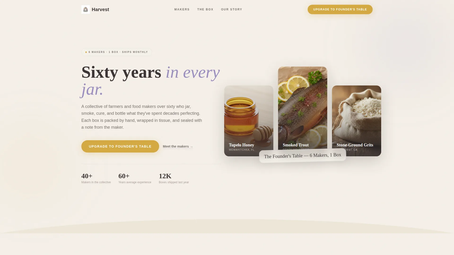
The header presents a Bundle Deal as an overhead still-life: an open subscription box, tissue paper fanned out, five or six half-unwrapped artisan products overlapping naturally. A calligraphic tag reading "The Founder's Table, 6 Makers, 1 Box" is tucked into the tissue, setting tone immediately without any sterile grid layout.
Producer Portrait and Story Layer
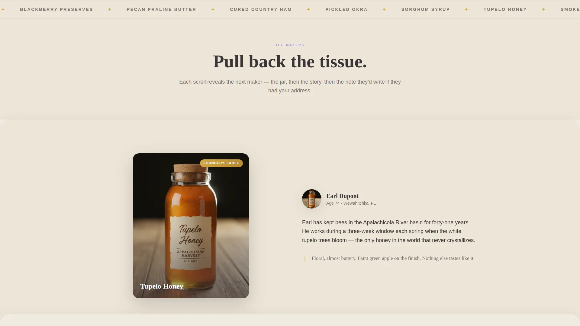
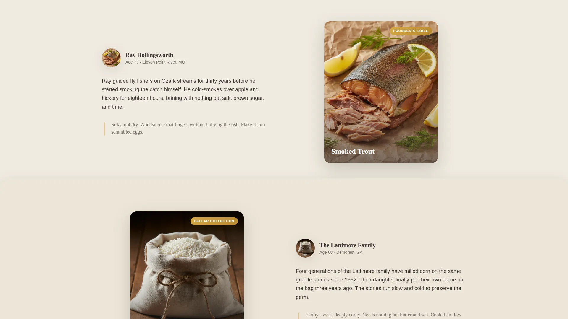
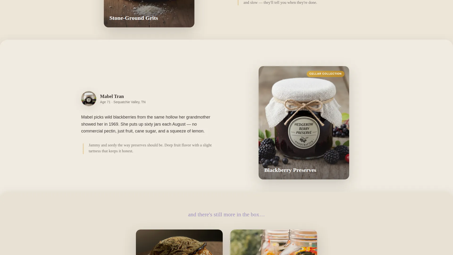
As visitors scroll past each product jar, a label-peel effect reveals the maker's portrait alongside a two-sentence origin story. A tasting note appears in the margin in a handwritten style, grounding every product in a real person with a real history.
Floating Tier Comparison Module
Midway through the page, a comparison layer floats above the scroll. The three subscription tiers, Porch Box, Founder's Table, and Cellar Collection, are presented overlapping like stacked cutting boards, making the value difference between plans immediately visible and tangible.
Single-Step Upgrade Form
The upgrade form shows the visitor's current plan and the upgraded plan side by side. Additional products are visually fanned out to the right. A cadence toggle lets visitors switch between monthly and quarterly billing without leaving the form or navigating away.
Sticky Add-a-Maker Button
A persistent secondary button labeled "Add a Maker" stays visible throughout the scroll. It lets returning subscribers bolt on individual producers à la carte, keeping the upsell path open even for visitors who are not ready to jump a full tier.
Page sections overview
| Section | Purpose |
|---|---|
| Header Still Life | Introduce the box and set an artisan, handcrafted tone |
| First Producer Reveal | Open the unboxing sequence with a single jar and maker label |
| Dual Producer Spread | Present two makers side by side to build momentum |
| Full Spread Section | Show the complete box contents and widen appetite |
| Tier Comparison Layer | Float three subscription plans for a direct side-by-side upgrade view |
| Upgrade Form | Capture the plan swap with a single-step, toggle-enabled form |
| Final Producer Reveal | Close the maker sequence and reinforce what the basic box misses |
| Primary call to action Block | Drive the "Upgrade to the Founder's Table" action in honey gold |
Design & branding system
The visual identity follows a Directory and Discovery theme expressed through a Lavender Dream color palette. Every color choice was made to feel quiet and earned, like a French country kitchen at dusk, not a promotional banner demanding attention.
- Core palette: dried-bloom purple (#9B8EC1), linen cream (#F5F0E8), farmhouse charcoal (#3B3536), and wildflower honey gold (#D4A843) used for pricing badges and upgrade buttons
- Typography leans calligraphic for tags and handwritten margin notes, with clean body text that stays readable against the cream background
- Photography direction is warm and slightly overhead, with soft shadows layering product over product to reinforce the overlap template structure
Mobile & speed optimization
The layered scroll experience is designed to carry its visual weight without overwhelming smaller screens. The overlap animations and stacked sections translate to mobile with the same sense of deliberate reveal, scaled to fit a hand-held viewing context.
- Overlap sections reflow gracefully so each producer reveal remains legible on narrow viewports
- The sticky "Add a Maker" button and the primary upgrade call to action remain accessible throughout the full mobile scroll
- The tier comparison module stacks vertically on smaller screens so plan differences remain clear without horizontal scrolling
How this template helps you convert
Harvest is built around a single persuasion arc: make the basic box feel like a sample, and make the upgrade feel like the real experience. Every layout decision supports that goal.
- The producer reveal sequence creates progressive desire. Each new maker revealed is another reason the visitor regrets not having the fuller box, pushing them naturally toward the upgrade call to action.
- The floating tier comparison appears at the moment of peak appetite, midway through the scroll, so visitors compare plans when emotional investment is highest rather than before they have seen anything worth wanting.
- The single-step upgrade form removes friction at the moment of decision. Current plan and upgraded plan appear side by side, the additional products are visible, and a single toggle handles billing cadence without sending the visitor elsewhere.
Other information about this template
Harvest is a purpose-built template for the artisan food and farm collective market. It suits any senior-founded business where the depth of experience behind a product is the core selling point. The layout style suits gift-box brands, farmstead collectives, and curated subscription marketplaces equally well.
- The template is categorized under Retail and E-Commerce, with a specific orientation toward senior-founded businesses and handcrafted food producers
- The Gallery and Detail template style means each maker gets a dedicated visual moment rather than being buried in a grid
- The unboxing creative direction and overlap scroll structure are the defining structural features; they distinguish this template from standard e-commerce or product-catalog layouts
Theme
Directory & Discovery
Creative direction
Unboxing Experience
Color system
Dopamine Pop
Style
Gallery + Detail
Direction
Marketplace/Multi
Page Sections
Layered Overlap Scroll Reveal
Still-life Header Scene
Producer Portrait and Story Layer
Floating Tier Comparison Module
Single-step Upgrade Form
Sticky Add-a-maker Button
Related questions
Can I use this template for a single producer rather than a collective?
Does the template include the upgrade form and tier comparison out of the box?
Is the sticky add-on button included in the template?
How customizable is the color palette?
Who is the primary audience this landing page is designed to reach?



