Fresh Farm Market Landing Page Template
Harvest is a scroll-reveal landing page template built for local farm markets and fresh food subscription boxes. It pairs a warm sunset gradient visual identity with persuasive scarcity-driven sections, a price-comparison header, countdown timer, vendor spotlights, and a tiered upgrade path. The result is a page that feels as alive and urgent as a Saturday morning market stand.
by Rocket studio
Quick summary
Harvest is a single-page, scroll-reveal landing page template designed for farm markets and local food subscription services. It opens with a side-by-side price comparison that reframes local food as an obvious choice. As visitors scroll, scarcity cues, vendor portraits, and a premium tier upgrade guide them from first look to committed purchase.
Who this template is for
This template is built for anyone selling fresh, local, or seasonal food directly to consumers. It works equally well for weekend market vendors moving online and subscription box operators looking to grow their subscriber base.
- Farm market operators who want an online presence that reflects the energy of their in-person stall
- Local food subscription businesses offering weekly or seasonal box tiers
- Home-cook communities and food co-ops promoting curated produce drops
What problem this template solves
Most local food sellers lose potential customers because their online presence looks generic. A page built on the wrong tone feels no different from a chain supermarket website, and the warmth that drives the in-person sale disappears completely.
- Visitors do not feel the freshness, urgency, or seasonal scarcity that makes local food worth seeking out
- Standard templates do not support tiered offers or upgrade flows suited to subscription box models
- Price comparisons that could convert skeptics are never shown, leaving the value story untold
What you get with this template
You get a fully structured, scroll-animated landing page with distinct sections covering the price hook, seasonal availability, vendor stories, and a premium upgrade path. Every element is designed to carry the warmth and time-sensitivity of a real farm market into a digital space.
- A price-anchored header section with a two-basket comparison and animated headline
- Scarcity-driven reveal sections including a countdown timer, vendor portraits, and stock callouts
- An upsell tier card, a subscription toggle, and a sticky upgrade call-to-action bar
Feature list
This template ships with a focused set of purpose-built components that work together to tell a compelling, conversion-ready story about fresh local food.
Price-Anchored Comparison Header
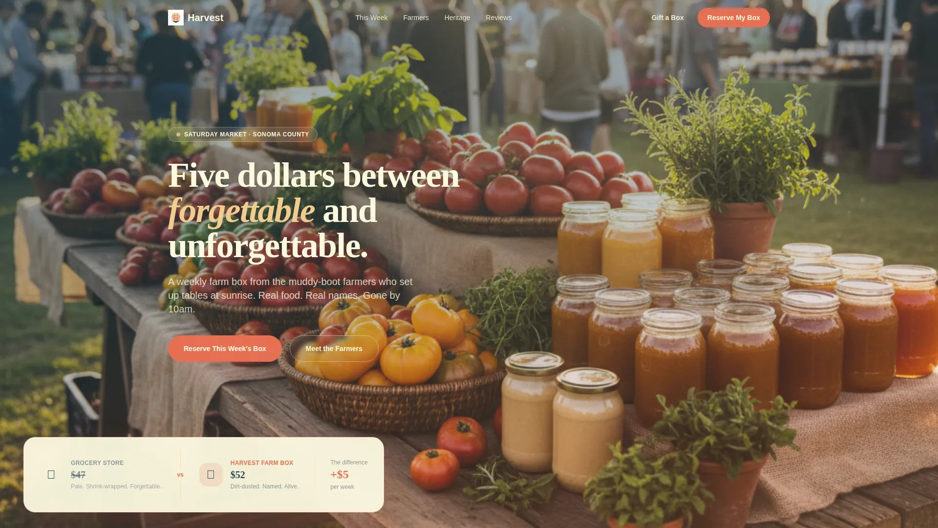
The page opens with two produce baskets shown side by side. A grocery store haul is priced at $47 and a curated farm box is priced at $52. The five-dollar gap becomes the headline: "Five dollars between forgettable and unforgettable." This reframe turns the price objection into the reason to buy.
Scroll-Reveal Progressive Animations
Each section fades upward into view as the visitor scrolls. The progressive reveal creates a sense of discovery that mirrors walking through a market stall by stall. Scarcity tightens with each section to build natural momentum toward the call to action.
Live Countdown Timer Section
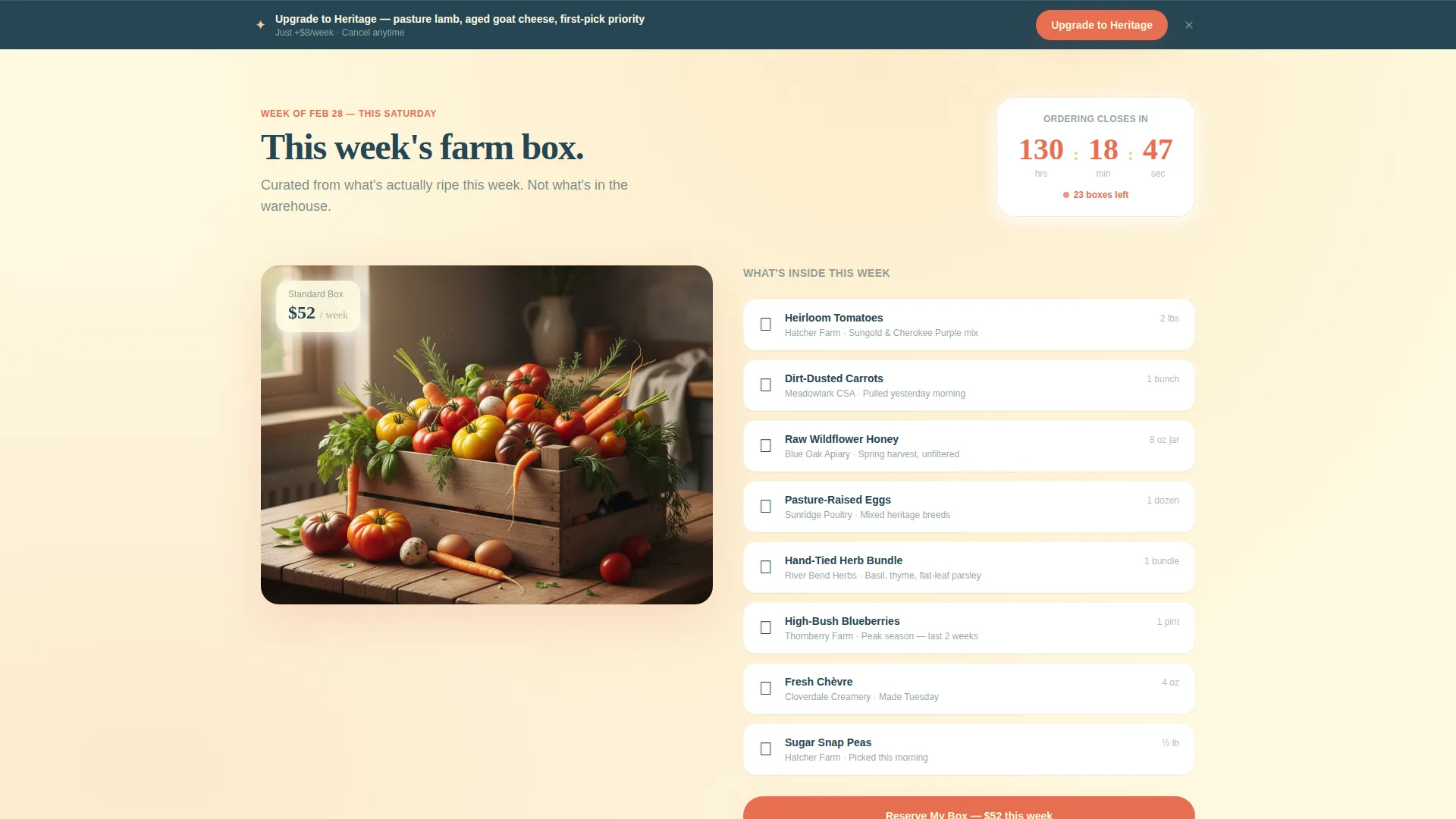
The first scroll reveal shows the current week's seasonal box contents alongside a countdown timer displaying hours until ordering closes. This creates genuine time pressure without feeling aggressive, keeping the page tone warm rather than pushy.
Vendor Portrait Cards
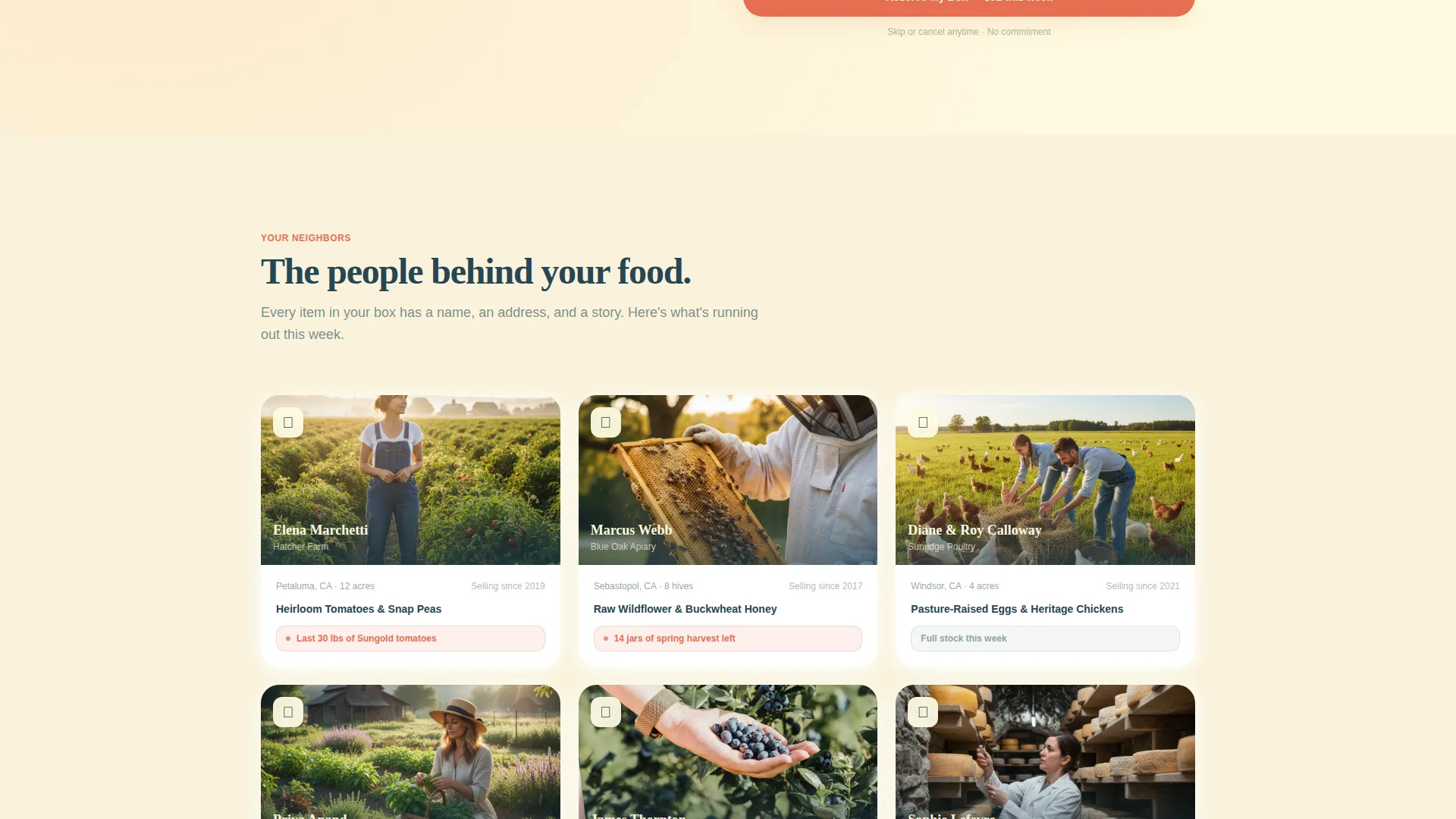
A dedicated section surfaces vendor portraits alongside their farm's acre count and a specific stock callout, such as "Last 30 lbs of Sungold tomatoes from Hatcher Farm." These details make the food feel real, traceable, and personal.
Heritage Tier Upgrade Card
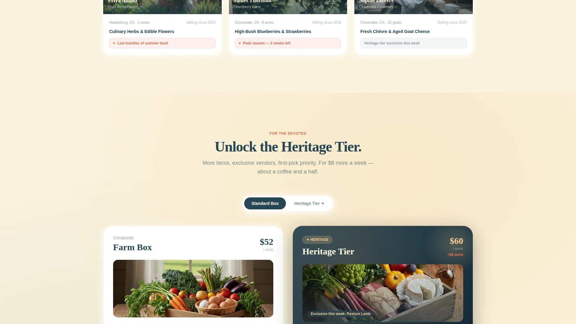
A premium box reveal appears as a glowing card featuring pasture lamb, aged goat cheese, and exclusive vendor items. A toggle lets visitors compare the standard box and the Heritage Tier side by side, with the price difference displayed as a weekly figure to keep it approachable.
Sticky Upgrade Call-to-Action Bar
Once a visitor scrolls past the comparison section, a sticky bottom bar appears with the primary call to action: "Upgrade to Heritage." A secondary option, "Gift a Box," runs alongside it for visitors not yet ready to commit personally. The bar stays visible without interrupting the scroll experience.
Page sections overview
| Section | Purpose |
|---|---|
| Price Comparison Header | Opens with two baskets and a five-dollar headline to reframe local food value |
| Seasonal Box Reveal | Shows this week's contents with a countdown timer to close ordering |
| Vendor Portrait Cards | Highlights farmers, acre counts, and running-low stock callouts |
| Heritage Tier Card | Presents the premium upgrade as an exclusive, glowing product reveal |
| Subscription Toggle | Lets visitors compare standard and Heritage tiers with weekly price difference |
| Sticky call to action Bar | Persists upgrade and gift options after the comparison section is passed |
Design & branding system
The visual identity uses a Soft Gradient theme built around a Sunset Gradient color system. The palette moves from warm amber tones at the top of the page to deeper, cooler earth tones at the bottom, mimicking the light shift from dawn to dusk as the visitor scrolls.
- Core colors: early dawn blush (#F4A261), ripe apricot (#E76F51), warm honey (#F2CC8F), and deep loam brown (#264653) for grounding text
- Backgrounds use soft radial gradients, and product cards float on creamy white (#FEFAE0) for a clean, airy feel
- Call-to-action buttons use ripe apricot fills with loam-brown type, and cards cast subtle shadows that give the layout a layered, tactile quality
Mobile & speed optimization
The layout is structured for a smooth single-column experience on smaller screens without losing the layered visual richness of the desktop version. Scroll-reveal animations are lightweight by design and do not depend on heavy asset loads to function.
- The sticky call-to-action bar is positioned for easy thumb access on mobile viewports
- Card-based sections reflow naturally into vertical stacks, keeping vendor portraits and tier comparisons readable at any screen width
How this template helps you convert
Every design and copy decision in this template is aimed at reducing hesitation and increasing the perceived value of fresh local food. The page earns the upgrade before it asks for it.
- The price-comparison header neutralizes the "local food is expensive" objection within the first few seconds of arrival, turning five dollars into the reason to choose the farm box over the grocery store.
- The countdown timer and vendor stock callouts create real scarcity signals that shorten the decision window without relying on fake urgency tactics.
- The Heritage Tier toggle and weekly price framing make the premium upgrade feel like a small, rational step rather than a luxury splurge, which lowers resistance right before the call to action.
Other information about this template
This template fits comfortably within the Retail and E-Commerce category, specifically the Marketplace and Multi-Vendor subcategory. It is built as a single scroll-reveal landing page, not a multi-page site, which keeps the visitor focused and the conversion path uninterrupted.
- The template's Card Grid layout style makes it straightforward to swap in your own vendor photos, box contents, and pricing figures without restructuring the page
- The "Gift a Box" secondary call to action broadens the audience beyond subscribers, capturing gift buyers and first-time visitors who are not ready to commit to a recurring order
- The page tone is designed to feel like arriving at a market just after sunrise: warm, slightly urgent, and deeply sensory, giving a local food brand a digital presence that actually matches the in-person experience
Theme
Neo-Retro
Creative direction
Seasonal/Moment
Color system
Obsidian & Gold
Style
Card Grid (Modular)
Direction
Click-Through
Page Sections
Price-anchored Comparison Header
Scroll-reveal Progressive Animations
Countdown Timer for Order Windows
Vendor Portrait and Stock Callout Cards
Heritage Tier Upgrade Card and Toggle
Sticky Upgrade and Gift Call-to-action Bar
Related questions
Can I use this template for a recurring subscription box business?
Do I need to update the pricing figures in the comparison header?
Can I edit the vendor portraits and stock callout text each week?
When does the sticky call-to-action bar appear on the page?
What type of food businesses is this template best suited for?



