Gluten-Free Meals | Free Website Template | Rocket
Harvest is a masonry-style gluten free meal delivery landing page built for artisan food businesses that cook from the soil up. The page layers cinematic overhead food photography, editorial meal descriptions, and a persistent call-to-action bar into a scroll that makes visitors hungry before they reach the bottom. No forms, no friction, just desire building toward a single click.
by Rocket studio
Quick summary
Harvest is a single-page food delivery landing page template designed for artisan gluten free meal delivery services. It uses a masonry grid layout, cinematic food photography, and sensory-driven copy to turn casual browsers into eager subscribers. Every section of the page earns the final click by building appetite one meal card at a time.
Who this template is for
This landing page is built for food business owners who want to sell a gluten free meal delivery service without burying the product under clunky forms or cluttered layouts. It is the right fit for operators who understand that beautiful food photography does the selling, and that the right page structure turns browsing into purchasing.
- Gluten free meal delivery brands serving newly diagnosed celiacs, busy gluten-free households, or autoimmune-diet communities
- Artisan food businesses sourcing fresh produce and ancient grains from regional farmers markets, ready to display their story at scale
- Health-focused direct-to-consumer delivery operators who want a mobile-first landing page that earns every order click through accumulated desire
What problem this template solves
Gluten free food delivery services face a specific challenge: visitors arrive skeptical that food made without wheat can actually taste good. A generic food delivery landing page does nothing to solve that. Harvest is built to overcome that skepticism visually and emotionally, making the food so present and so specific that the question shifts from "is this any good?" to "which meal do I want first?"
- Most food delivery landing page designs rely on bullet points and ingredient lists, which drain desire rather than build it
- Visitors with food allergies or celiac disease need reassurance about food handling, sourcing, and safety before they will commit to an order
- Without a sensory-led scroll, gluten free meal delivery pages struggle to communicate joy rather than restriction
What you get with this template
You get a fully structured, single-page food delivery landing page that is designed to convert through visual accumulation rather than form pressure. Every section is intentional. Every meal card is a selling moment. The layout is ready to receive your food photography, your recipes, and your weekly delivery story.
- A full-viewport hero section, two staggered masonry grid clusters, a trust bar, a "How It Works" section with pricing signal, and a persistent bottom call-to-action bar are all included in the page
- Scroll-reveal animations, parallax hero behavior, and hover-lift interactions on meal cards are set up and ready to populate with your food imagery
- A "Taste Quiz" intercept appears after the third masonry cluster to support visitors who feel overwhelmed by the options available, funneling them toward a personalized plan
Feature list
This landing page template is built with a focused set of features. Each one is grounded in the brief and designed to serve a real moment in the food delivery conversion journey.
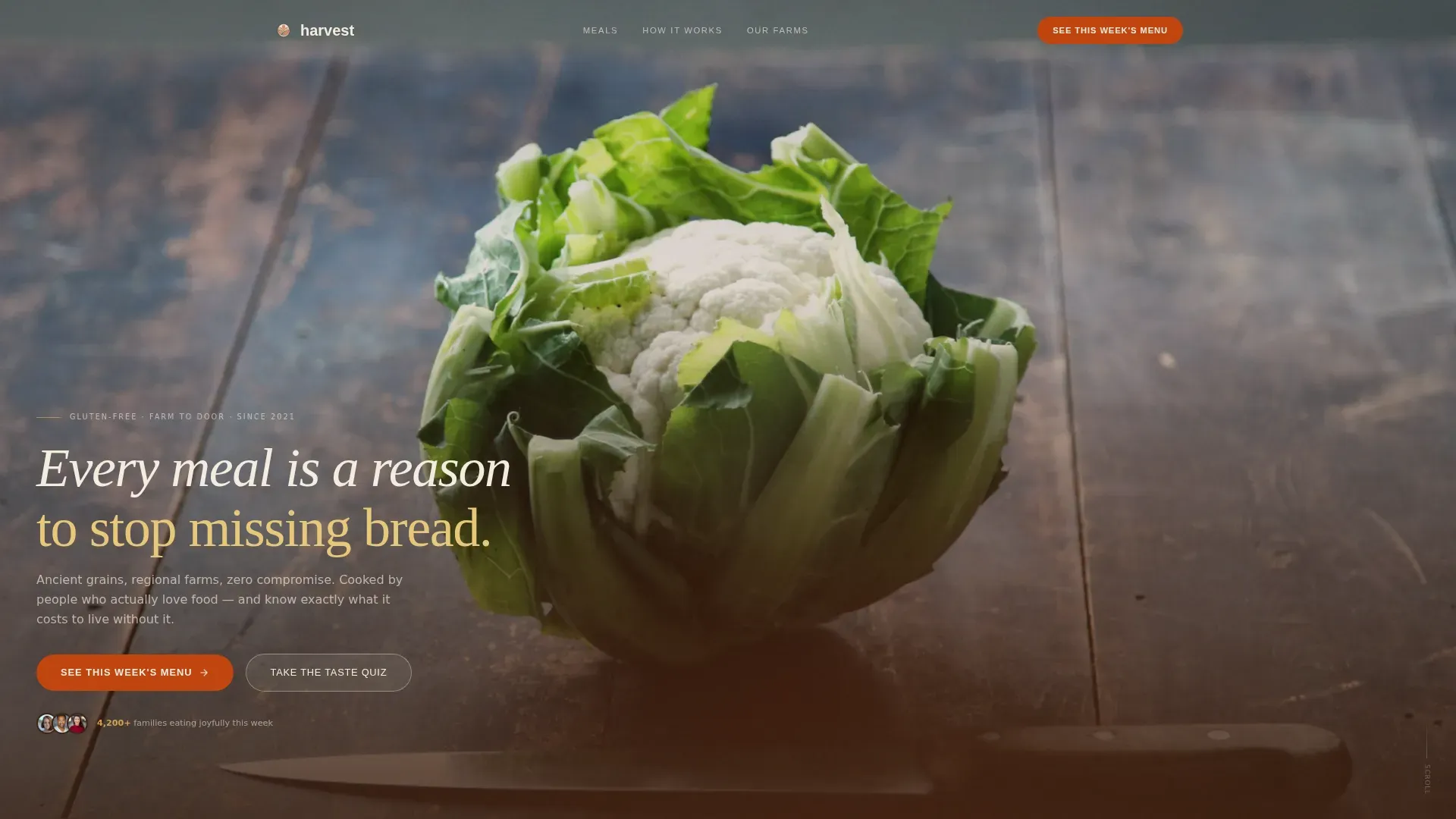
Full-Viewport Cinematic Hero
The hero section fills the entire screen with an overhead lifestyle shot of a weathered oak table crowded with open meal containers, fresh baked goods, and farmhouse props. The headline sits in soil-brown serif type at the bottom of the frame. A persistent call-to-action bar anchored to the bottom of the page keeps the "See This Week's Menu" button visible at all times while visitors scroll, making it easy to enter the ordering flow from any point on the page.
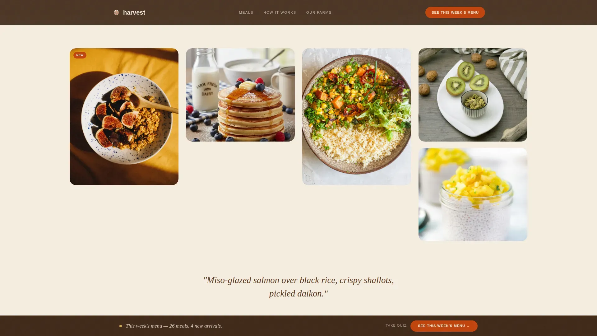
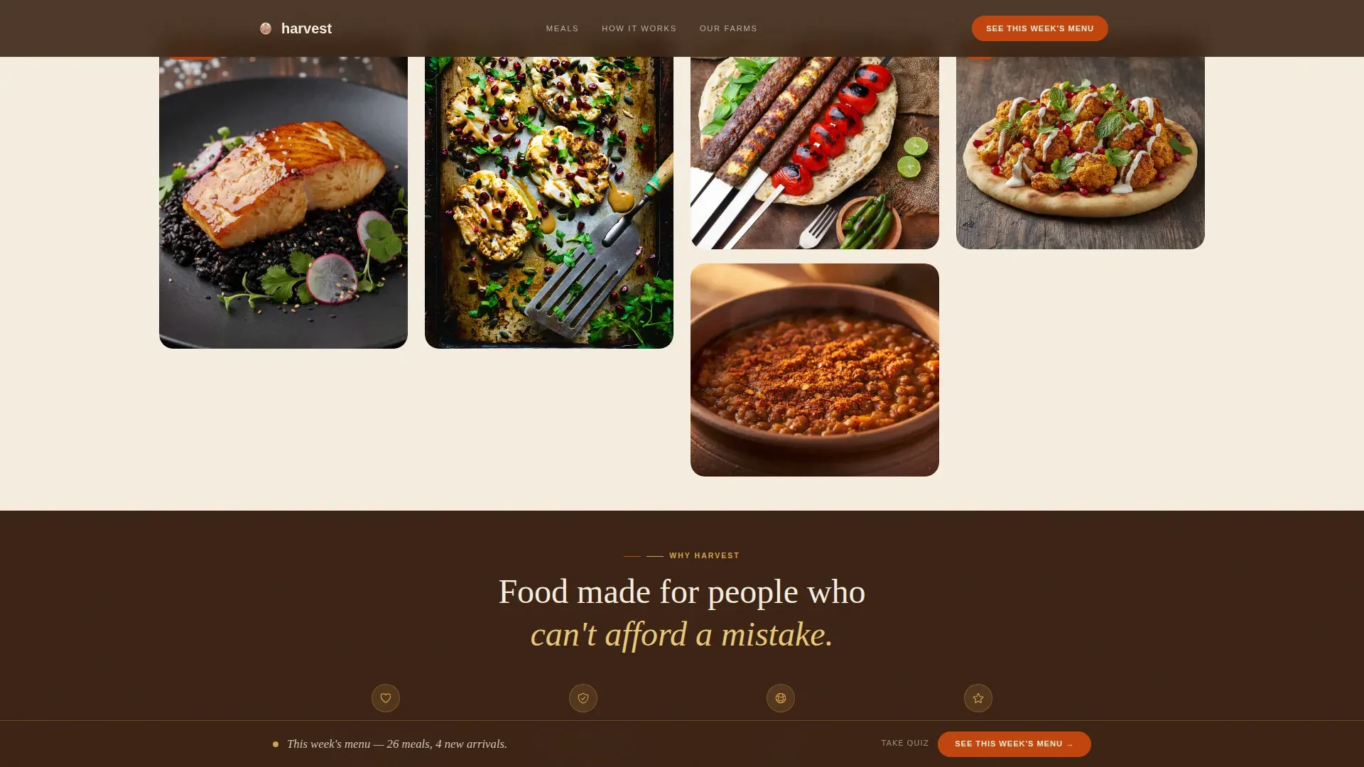
Staggered Masonry Grid with Editorial Meal Cards
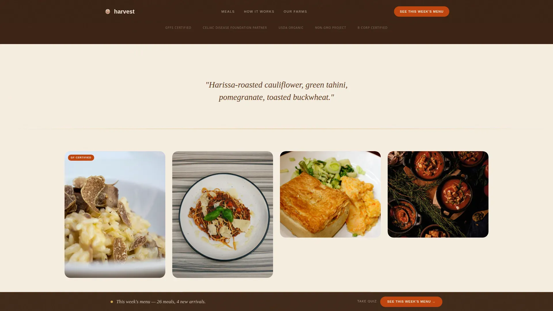
Two masonry grid clusters anchor the scroll. The first covers breakfast and weeknight meal categories. The second covers comfort and date-night meals. Cards display at varying scales: tight macro shots of caramelized edges and seed-crusted tops sit beside wide lifestyle scenes of families eating together. Single-line editorial descriptions appear between grid clusters, reading like menu copy: "Miso-glazed salmon over black rice, crispy shallots, pickled daikon." Each card links to the subscription selection page, making every item a direct food delivery landing page conversion point.
Taste Quiz Intercept
After the third masonry cluster, a secondary call-to-action path invites visitors to "Take the Taste Quiz." This intercept helps customers who feel overwhelmed by the variety of available meals. Rather than losing them to choice paralysis, the page routes them toward a personalized plan. This feature is especially useful for first-time gluten free meal delivery shoppers who are still learning to understand their own dietary needs and preferences.
Trust Bar with Sourcing and Safety Credentials
A dedicated trust bar sits between the two masonry grid clusters. It is designed to display certifications, farm sourcing information, and celiac-safe credentials. Describing food handling procedures explicitly helps alleviate concerns for customers with celiac disease regarding cross-contamination. Displaying certifications from recognized organizations builds instant credibility. This section is where you communicate the commercial kitchen standards, responsible sourcing commitments, and safety transparency that customers with food allergies require before they will place an order.
Social Proof Layer
The template includes space for specific customer quotes with names, star ratings, and a live-counter aesthetic showing meals delivered this week. Including social proof like reviews and testimonials builds trust with potential customers in a way that ingredient lists simply cannot. The quotes are positioned to reinforce the emotional tone set by the masonry grid, keeping the page feeling human and warm rather than transactional.
"How It Works" Section with Pricing Signal
A three-step visual section near the bottom of the page explains the delivery process in plain language. A pricing signal is woven into this section so visitors can understand cost before they click through to the subscription page. A progress-bar style layout illustrates the simplicity of the order process. This section closes the page's persuasion arc before the final call-to-action pushes the visitor to act.
Page sections overview
| Section | Purpose |
|---|---|
| Hero full-viewport | Cinematic overhead shot with serif headline and persistent call to action bar |
| Masonry Grid One | Breakfast and weeknight meal clusters with editorial descriptions |
| Trust and sourcing bar | Certifications, farm sourcing, and celiac-safe credentials |
| Masonry Grid Two | Comfort and date-night clusters with Taste Quiz intercept |
| How It Works | Three-step visual, pricing signal, and final call to action |
| Footer horizontal flow | Contact, navigation, and brand footer links |
Design & branding system
The Harvest template uses an Agrarian Root visual identity built on a Fire and Earth color system. The palette is warm, grounded, and edible. It feels like a hand-thrown ceramic bowl filled with roasted root vegetables. Linen (#F5EDE0) carries the page background. Soil (#3B2314) anchors all typography. Terracotta (#C1440E) fires up buttons and price callouts. Wheat (#D4A24E) gilds card edges and divider lines like fresh-baked crust on a loaf of sourdough. Typography uses Fraunces for serif headings and DM Sans for body text, a pairing that reads as both editorial and approachable.
- Color system: scorched terracotta (#C1440E), sun-warmed wheat (#D4A24E), deep tilled soil (#3B2314), raw linen (#F5EDE0)
- Typography: Fraunces serif headings for warmth and authority, DM Sans body for clean legibility across all screen sizes
- Visual style: farmhouse editorial with hand-crafted texture, agrarian warmth, no stock-photography sterility, crumbs on the table, a glass of wine half-drunk, a jar of chili oil with a handwritten label
Mobile & speed optimization
Meal browsing is an impulse behavior. It happens on phones, in kitchens, on commutes. The Harvest landing page is built mobile-first, meaning the masonry grid, the persistent call to action bar, and the full-viewport hero all render for small screens first. Lazy loading is set as critical for this image-heavy page. Server Components are used for static sections to keep the page responsive even when delivering a high volume of food photography assets.
- Mobile-first masonry layout ensures meal cards stack and reflow cleanly on every screen size, preserving the visual rhythm of the food delivery landing page
- Lazy loading is configured for image-heavy grid sections, so the page remains responsive while delivering large quantities of fresh food photography
- Static sections use Server Components, reducing load strain without sacrificing the scroll-reveal and parallax animations that define the page's sensory atmosphere
How this template helps you convert
The Harvest food delivery landing page converts by accumulating desire rather than demanding a decision. There is no form on the page. The click is earned. Each section moves the visitor one step closer to feeling certain that they want to order, and the persistent call to action bar makes sure the action is always one tap away.
- The masonry grid turns passive scrolling into active craving. Every meal card is a selling moment. High-quality food photography that emphasizes delicious, fresh food helps overcome negative perceptions of gluten free meals, and the editorial meal descriptions make each dish feel specific and real. By the time a visitor reaches the trust bar, they are already deciding which meals they want, not whether to order at all.
- The Taste Quiz intercept and the "How It Works" section resolve the two biggest objections: choice overwhelm and process uncertainty. Visitors who feel paralyzed by too many options get a personalized path. Visitors who are unsure about shipping, delivery areas, or the ordering process get a clear three-step answer. Both paths lead to the same destination: the subscription selection page.
Other information about this template
The Harvest artisan gluten free meal delivery landing page template is built specifically for the food and beverage market, with a focus on the gluten free food and dining subcategory. It covers everything a food delivery business needs to present its offer clearly, warmly, and with enough sensory detail to make the sale.
- The template is set up to accommodate a wide range of delivery service models, including weekly box subscriptions, seasonal menu rotations, and county-level or city-specific delivery areas
- Meal delivery service templates like this one help streamline the ordering process for customers by organizing information clearly and making the next step obvious at every point on the page
- The page is designed to support businesses that source ingredients from farmers markets, work within a commercial kitchen environment, and want to communicate that story as part of their selling proposition
- Food businesses can use this template to display detailed information about their recipes, fresh produce sourcing, baked goods, meats, butter-based preparations, and any other items relevant to their weekly menu
- The page structure makes it straightforward to switch out meal photography and editorial descriptions each week, keeping the food delivery landing page fresh and seasonally relevant without requiring design changes
- Customers found browsing from their home on mobile are the primary audience, and the page is built to meet them where they live, on a small screen, with a thumb hovering near the "See This Week's Menu" button
- The template can also accommodate additional trust signals such as a delivery radius map, helping visitors in specific areas or counties confirm that the service is available where they live before they commit to purchasing
- Clear, action-oriented buttons set throughout the page, including the persistent bottom bar and individual meal card links, are all open and ready for your call-to-action text and destination URLs
- For businesses that love their story as much as their food, the farmhouse editorial aesthetic gives the brand a place to live on screen that feels as responsible and craft-driven as the meals themselves
Theme
Agrarian Root
Creative direction
Sensory Appeal
Color system
Fire & Earth
Style
Masonry/Pinterest
Direction
Click-Through
Page Sections
Full-viewport Cinematic Hero Section
Staggered Masonry Grid with Meal Cards
Taste Quiz Conversion Intercept
Trust Bar with Safety and Sourcing Credentials
Social Proof and Live Counter Display
How It Works Section with Pricing Signal
Related questions
Does this template include a menu browsing feature?
Can I update the meal cards each week without redesigning the page?
How does the template handle celiac safety and food allergy communication?
Is the template suitable for a city-specific or county-limited delivery service?
What calls to action are included in the template?


