Food Bank Editorial Landing Page Template
Harvest is an editorial landing page template built for community food banks. It opens with a documentary-style testimonial, then guides visitors through a visual supply chain, anonymized community profiles, and a concrete impact breakdown. The result is a page that educates donors, welcomes neighbors in need, and moves both toward action with quiet confidence.
by Rocket studio
Quick summary
Harvest is a single-page, editorial-style template designed for community food banks and hunger relief organizations. It blends magazine-quality storytelling with measurable impact data, walking every visitor from first impression to confident action. The layout teaches before it asks, making the donation decision feel natural rather than pressured.
Who this template is for
This template is built for food banks and hunger relief nonprofits that want their digital presence to match the quality of their real-world operations. It speaks clearly to three distinct visitor types and meets each one where they are.
- First-time individual donors wanting proof that their contribution reaches real families
- Corporate sponsors and grant reviewers evaluating operational credibility and impact
- Neighbors within the service area who may qualify for food assistance and need a welcoming entry point
What problem this template solves
Most nonprofit landing pages ask for money before they earn trust. Visitors arrive with real skepticism: Where does the money go? Is this organization competent? Do I even qualify for help? Harvest is built specifically to answer those questions before the call to action ever appears.
- Donors leave without giving because the page offers no traceable evidence of impact
- Corporate partners move on when they cannot quickly find operational proof or data
- Community members in need feel unwelcome or confused about eligibility and next steps
What you get with this template
Harvest delivers a complete, ready-to-customize editorial landing page structured around five content sections. Every section has a defined purpose, a distinct visual rhythm, and a clear audience intent it serves.
- A hero section with a testimonial card, candid documentary photograph, live impact stat, and primary call to action
- A visual supply chain diagram, anonymized community profile cards, and a photographed impact breakdown showing what a donation buys
- An operations proof section with volunteer pull quotes, efficiency stats, a dark call to action banner, and a linear single-row footer
Feature list
This template ships with six purpose-built features drawn directly from its editorial brief. Each one serves a specific conversion or trust-building goal.
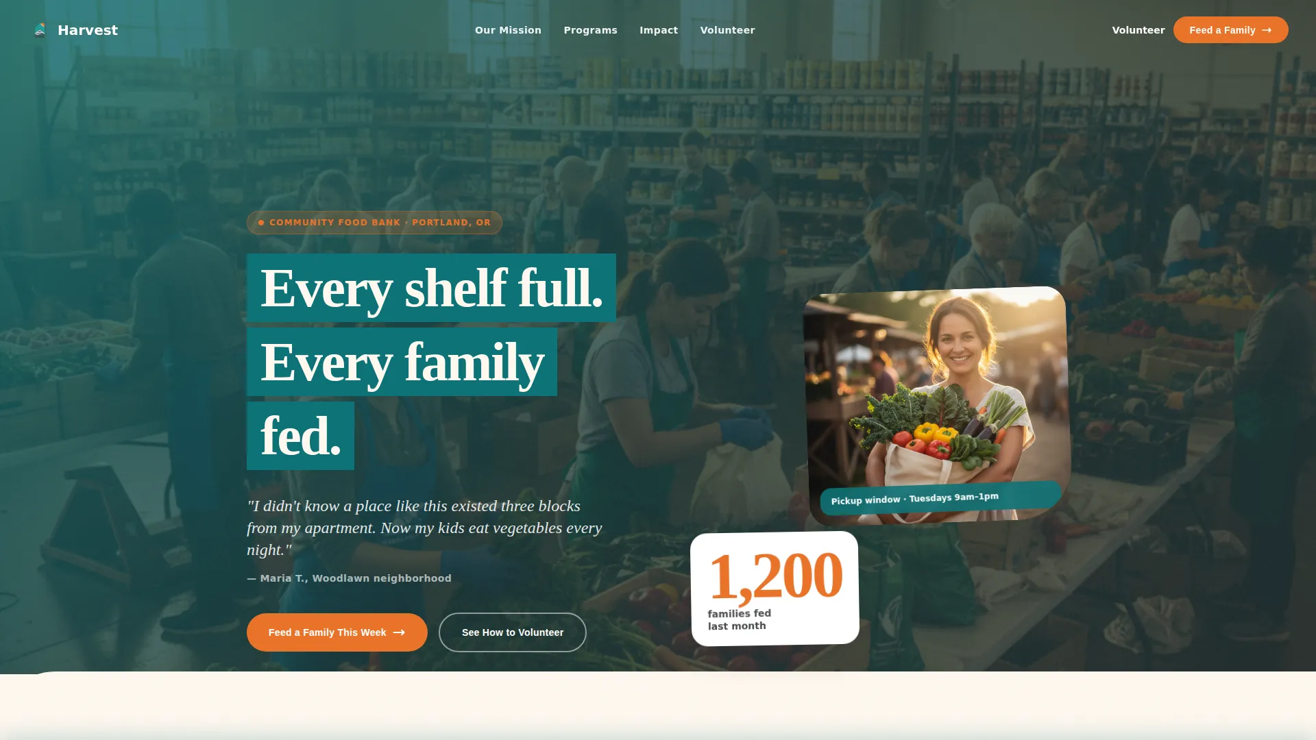
Cinematic Hero Testimonial Card
The header opens with a large serif quote from a real recipient, first name and neighborhood only, set against pantry cream. A candid documentary photograph sits beside the quote, showing golden-hour warmth and grain that signals authenticity over stock imagery. An orange impact stat anchors the section before the primary call to action appears.
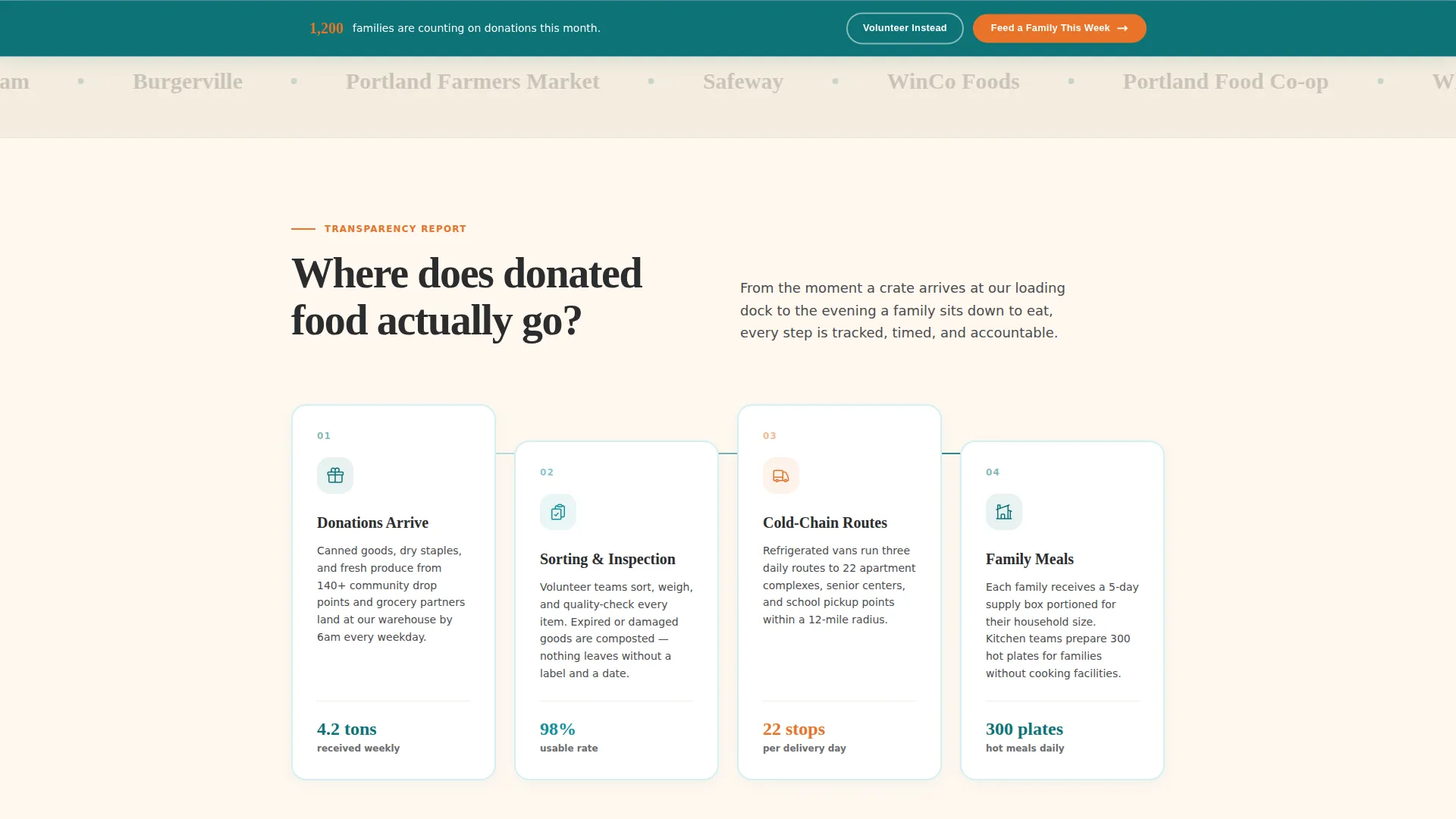
Visual Supply Chain Diagram
A dedicated section answers the question "Where does donated food actually go?" with an animated, interactive flow diagram. The warehouse-to-route-to-table sequence makes the organization's logistics visible and trustworthy without requiring a single paragraph of explanation.
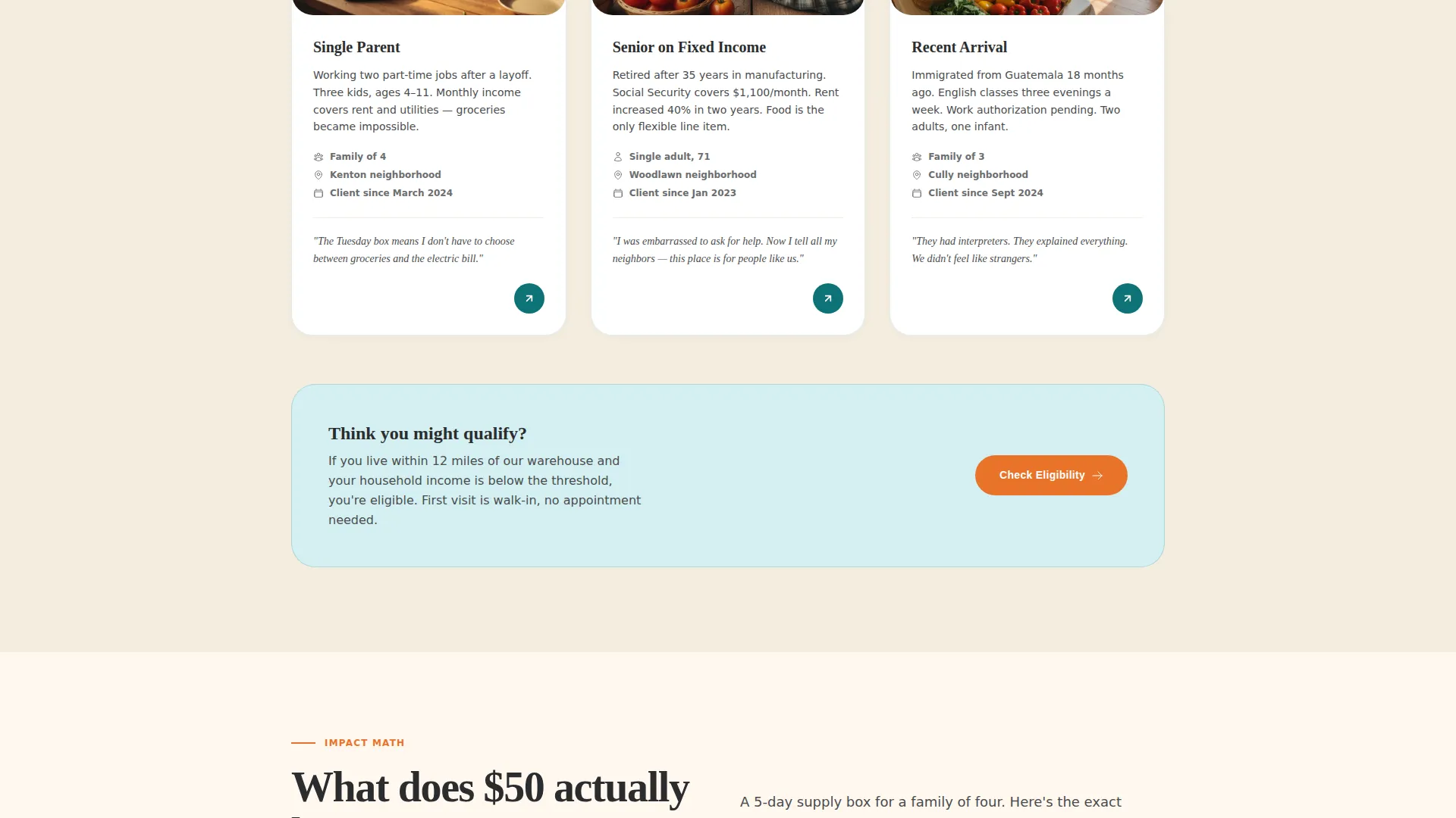
Anonymized Community Profile Cards
Household profile cards present real need without exposing identities. Each card is designed to help donors and corporate partners understand who their contribution reaches, replacing abstract statistics with recognizable human situations.
Photographed Impact Math Section
A full-spread layout shows exactly what a fifty-dollar donation buys for a family of four. A photographed grocery layout sits alongside an itemized breakdown, giving donors a concrete mental image of their contribution before they click.
Sticky Call to Action Bar
After the second scroll, a persistent bar carrying the primary call to action stays in view throughout the rest of the page. This keeps the donation path accessible without interrupting the editorial reading experience.
GSAP ScrollTrigger Animation System
Section reveals, staggered content entries, and parallax effects are built on GSAP ScrollTrigger. The medium-intensity animation layer adds editorial polish without overwhelming visitors on slower mobile connections.
Page sections overview
| Section | Purpose |
|---|---|
| Hero Testimonial Card | Opens with recipient quote, documentary photo, impact stat, and primary call to action |
| Supply Chain Diagram | Visualizes the warehouse-to-table food journey with an animated flow diagram |
| Community Profile Cards | Presents anonymized household stories to humanize the need |
| Impact Math Spread | Shows a photographed grocery breakdown of what a fifty-dollar donation buys |
| Operations Proof Banner | Combines volunteer quotes, efficiency data, and a dark-background call to action |
| Single-Row Footer | Closes the page with a clean linear footer pattern |
Design & branding system
Harvest uses the Teal Catalyst color system, pairing deep mission teal with warm pantry cream, volunteer-vest orange, and grounding charcoal. The palette was chosen to feel trustworthy enough for grant reviewers and warm enough for a first-time visitor on their phone. Fraunces serif handles all headlines and pull quotes, while Manrope covers body text and interface elements for clean legibility at every size.
- Teal (#0D7377) leads section headers and data callouts; cream (#FFF8F0) stretches across reading backgrounds for a warm, inviting feel
- Orange (#E8732A) fires on buttons, impact numbers, and key calls to action to draw the eye without overwhelming the composition
- Charcoal (#2B2D2E) keeps long-form paragraphs readable without the clinical coldness of pure black
Mobile & speed optimization
The template is built mobile-first, with the primary design decisions made for a grandmother bookmarking the page on her phone or a donor reading during a commute. Native CSS scroll behavior and server-rendered static components keep the experience responsive across devices.
- Sticky call to action bar and hover states are touch-friendly and reflow cleanly on small screens
- Images are optimized and animation intensity is calibrated to remain smooth without taxing mobile hardware
How this template helps you convert
Harvest is a click-through landing page designed to move visitors to a donation portal only after they have absorbed full context. The conversion strategy is built into the scroll sequence itself.
- The hero testimonial and impact stat establish emotional trust in the first viewport, so the primary "Feed a Family This Week" call to action lands with immediate credibility
- The supply chain diagram and impact math sections answer the two most common donor objections before they form, removing hesitation by the time the sticky call to action bar appears
- A secondary "See How to Volunteer" path captures visitors whose contribution is time rather than money, ensuring no motivated visitor leaves without a clear next step
Other information about this template
Harvest was designed with the editorial discipline of a nonprofit annual report and the warmth of a neighborhood institution. It suits any hunger relief or food pantry organization that wants a digital presence as credible as its on-the-ground operation.
- The template supports both individual donor conversion and corporate sponsorship storytelling within a single page flow
- Typography and color choices were made to support long-form reading at a comfortable pace, not to rush visitors toward a decision
- The educational scroll sequence is intentional: each section answers one question and earns the next, making the call to action feel like a logical conclusion rather than a sales pitch

Theme
Educational Guide
Creative direction
Vision & Mission
Color system
Teal Catalyst
Style
Editorial/Magazine
Direction
Click-Through
Page Sections
Cinematic Hero Testimonial Card
Animated Supply Chain Diagram
Anonymized Community Profile Cards
Photographed Impact Math Layout
Sticky Donation Call to Action Bar
GSAP Scrolltrigger Animation System
Related questions
Can this template be used for a food pantry or hunger relief organization beyond a full food bank?
Does the template include the photography and infographic content shown in the preview?
How does the sticky call to action bar work?
Is this template suitable for corporate sponsors and grant reviewers, not just individual donors?
Can I update the color system or typography to match my organization's brand?


