Luxe Minimal Vegetarian Meal Delivery Landing Page Template
Harvest is a single-column, immersive-scroll landing page template built for a premium vegetarian meal delivery service. It uses a Luxe Minimal aesthetic with a Fire and Earth color system, cinematic food photography direction, an inline meal-box selector, and a sticky call-to-action that appears only after the visitor is already hungry. The result is a page that earns the sale before it asks for it.
by Rocket studio
Quick summary
Harvest is a single-column flow landing page template crafted for a premium vegetarian meal delivery brand. It combines editorial food photography, a warm Fire and Earth color palette, and a scroll experience that mimics the rhythm of sitting down to eat. Visitors move through starter, main, and dessert before a meal-box selector invites them to build their week.
Who this template is for
This template is built for founders, food entrepreneurs, and creative teams who want their vegetarian meal delivery landing page to feel less like a store and more like a restaurant worth trusting. It suits brands where food quality is the product and visual storytelling is the strategy.
- Design-conscious food brands serving urban professionals aged 28 to 45 who cook on weekends but need great weeknight dinners without the worry of planning.
- Gift-box operators and specialty food businesses who want a secondary "Send a Box" gifting path alongside the main purchase flow.
- Freelance designers and no-code builders who need a premium, fully structured starting point for a high-intent vegetarian food website.
What problem this template solves
Most vegetarian meal delivery landing pages lead with a price table or a subscription grid before the visitor is hungry. The food arrives on the page before the feeling does. Harvest reverses that order deliberately.
- Visitors scroll through full-viewport dish photography before they ever see a price, letting the food do the selling the way a restaurant lets the smell greet you at the door.
- Without a structured immersive layout, brands resort to card grids and feature lists that flatten the sensory experience and reduce food to a product spec rather than a meal worth craving.
- The inline meal selector and sticky call-to-action solve the conversion drop-off that happens when a visitor is hungry but cannot find a fast, intuitive way to act on that feeling.
What you get with this template
Harvest is a fully designed, single-column landing page layout ready to receive your brand's photography and copy. Every section is pre-structured so you spend time on your food story, not on layout decisions.
- A full-viewport macro hero section with a single serif type line that rises from the bottom of the frame, setting the editorial tone before any navigation or headline competes for attention.
- An immersive dish-progression scroll flow covering starter, main, and dessert, each filling the viewport at a different camera angle with ingredient origin notes appearing on open negative space between courses.
- An inline meal-box selector supporting 3-night, 5-night, and 7-night box configurations, plus a separate gifting path with a recipient address field and optional handwritten note toggle.
Feature list
This section walks through the core capabilities built into the Harvest template. Each feature is grounded directly in the brief so you know exactly what you are getting.
Full-Viewport Macro Hero Section
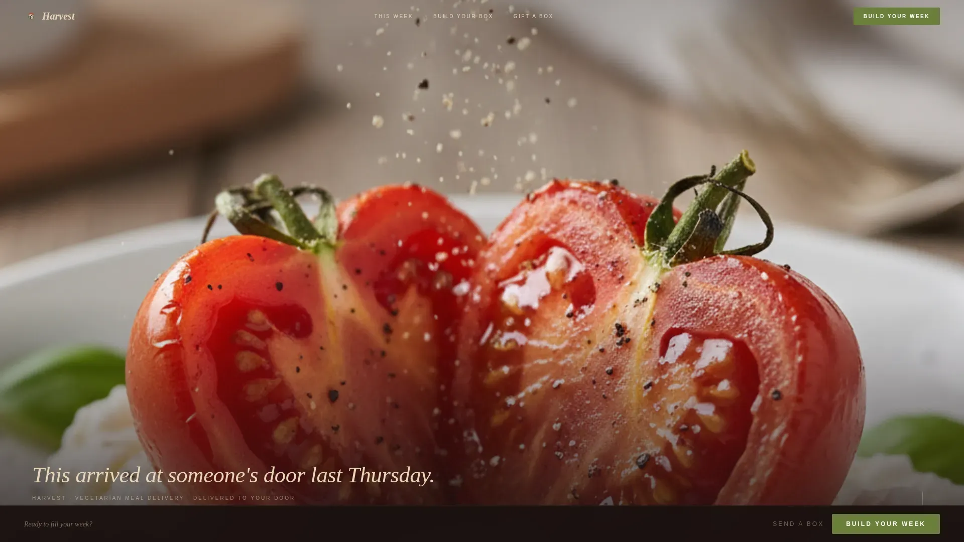
The hero section occupies the entire screen with a hyper-detailed food photograph designed to elicit an immediate emotional response. The recommended image is at least 1000 pixels wide and shot at near-microscopic distance, so details like olive oil pooling in the crevices of a roasted heirloom tomato or a crack of salt frozen mid-fall become the hook. A single line of Fraunces serif type rises from the bottom of the frame. No navigation bar competes. No headline crowds the image. The stillness is the message.
Immersive Dish-Progression Scroll
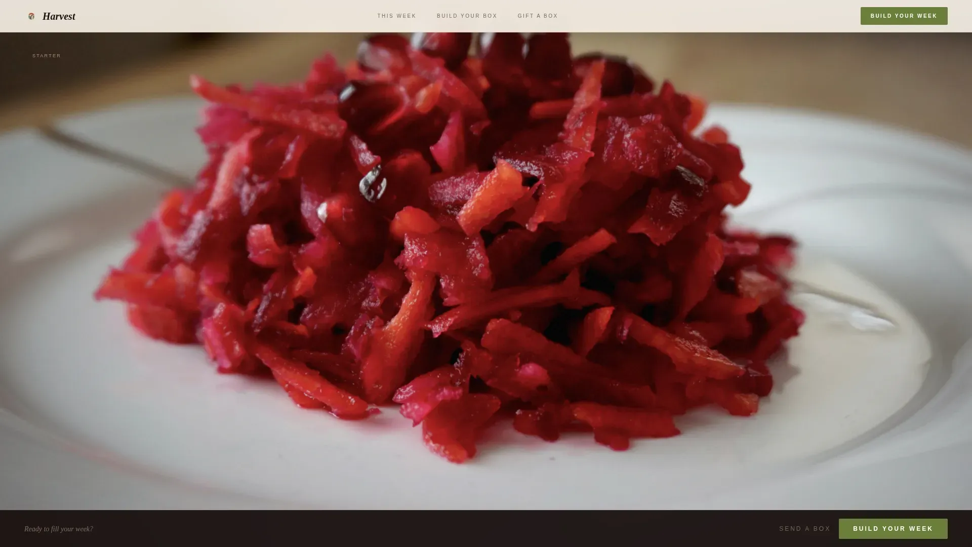
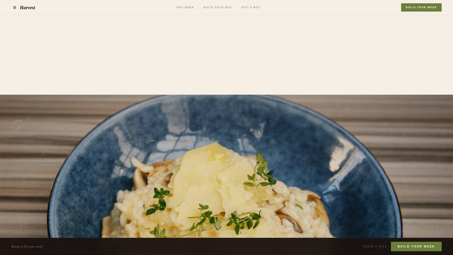
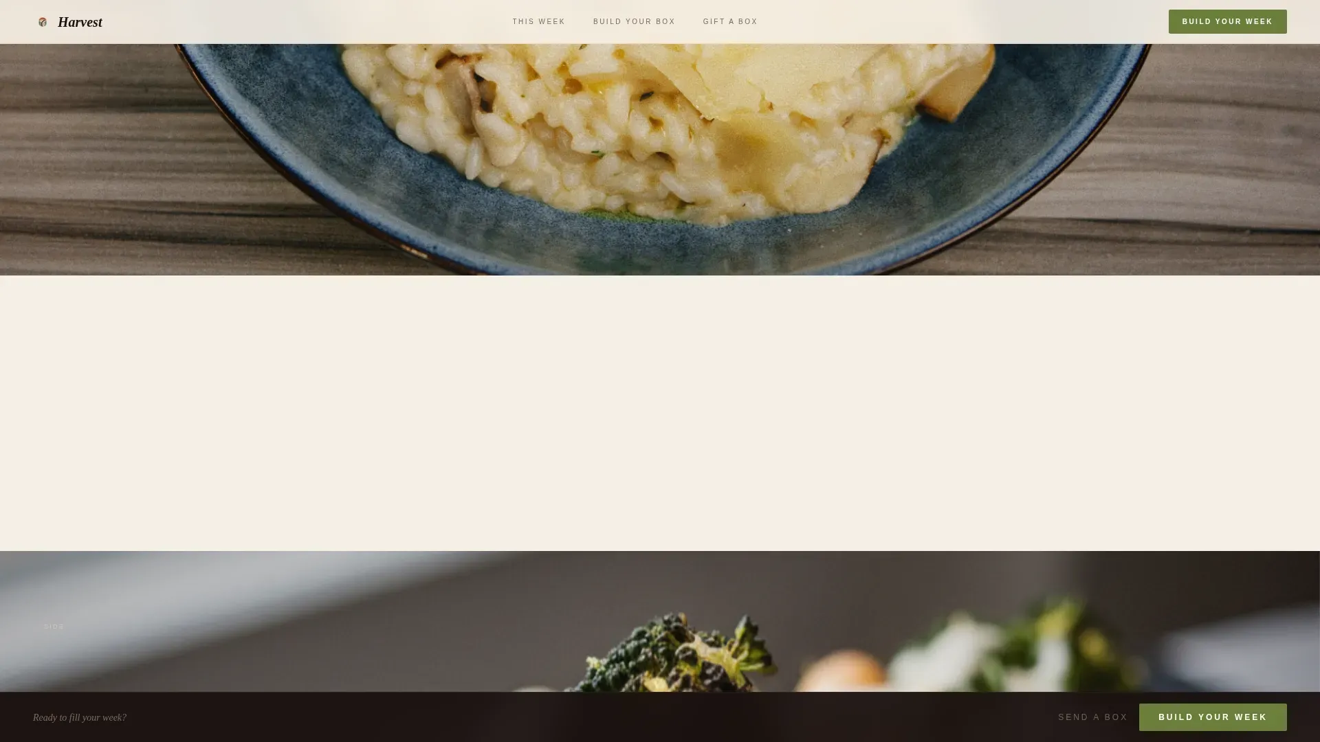
The scroll experience is structured as a meal. Each section after the hero is a single dish filling the full viewport, progressing from starter to main to dessert as the visitor moves down the page. Camera angles shift: overhead for the starter, table-level for the main, mid-bite for the dessert course. Between dishes, a single line of copy appears on open negative space, carrying an ingredient origin note, a cook time, or a tasting note. No card grids. No photo thumbnails stacked in rows. Just one generous image after another, breathing in white space, letting the food and flavor carry the conversation.
Inline Meal-Box Selector
After the third dish section, an inline meal selector opens on the page. Visitors tap dishes to fill a box of 3, 5, or 7 nights. Each dish in the selector shows its macro close-up thumbnail alongside a single-line description of ingredients and taste. Pricing appears at this point in herb green so the cost lands after desire is already active. The selector is the moment the visitor stops browsing and starts choosing which plates to include, not whether to buy at all.
Sticky Call-to-Action Bar
From the moment the meal selector first appears, a sticky "Build Your Week" button is gently pinned to the bottom of the screen. It uses the living herb green accent color to contrast against the warm soil-black and sun-dried wheat backgrounds. The button stays visible as visitors continue scrolling without interrupting the reading rhythm. It disappears before the hero and reappears only after the visitor has moved through enough of the food story to feel ready.
Gifting Path with Address Toggle
A secondary conversion path labeled "Send a Box" sits alongside the primary selector. It targets gift-givers with a recipient address field and an optional handwritten note input. The gifting path shares the same visual language as the main flow, so it does not feel like a separate page or a form dropped in from another design system. It is a natural second door for visitors who arrive knowing they want to give great food rather than eat it themselves.
Single Full-Bleed Testimonial Block
A social proof moment is built into the scroll flow as a single full-bleed quote on negative space. No star ratings. No review cards. Just one well-chosen line of customer feedback set in open white space that reads like punctuation between courses. User testimonials placed this way enhance credibility and trust without breaking the editorial pace the rest of the page has established.
Page sections overview
| Section | Purpose |
|---|---|
| Macro Hero Frame | Holds the full viewport with a single editorial food photograph and one serif type line |
| Starter Dish View | Overhead viewport-filling dish shot with ingredient origin note on negative space |
| Main Dish View | Table-level viewport-filling shot with a tasting note between dishes |
| Dessert Dish View | Mid-bite shot that triggers sticky call-to-action appearance |
| Testimonial Block | Single full-bleed customer quote on negative space for trust |
| Meal Box Selector | Inline 3, 5, or 7-night box builder with dish thumbnails and pricing |
| Gifting Path Toggle | Recipient address field and optional handwritten note for gift orders |
| Linear Footer Row | Single-row footer with essential links and brand mark |
Design & branding system
Harvest uses a Fire and Earth color system that feels like a clay pot pulled from a wood-fired oven. The palette is specific and intentional: scorched terracotta at hex code #C1440E, volcanic soil black at #1A1110, sun-dried wheat at #E8D5B7, and a living herb green at #6B7F3B reserved exclusively for calls-to-action and price tags. The design should utilize ample white space, high-resolution imagery, and this refined color palette to convey premium quality at a glance.
- Typography pairs Fraunces, a serif editorial face, for headings and the hero type line, with DM Sans, a clean sans-serif, for body text, interface labels, and description copy. Serif fonts for headings convey a sense of luxury. Clean, readable sans-serif fonts for body text keep the interface approachable and fast to scan.
- The Luxe Minimal visual style draws from editorial food magazine layouts: no decorative borders, no drop shadows, no background patterns. Every element earns its position through proportion, negative space, and the quality of the food photography it frames.
- Animations use GSAP ScrollTrigger parallax movement, clip-path reveals on dish sections, and a fade-in entrance for the sticky call-to-action bar. These motion choices support the sensory pacing of the scroll without distracting from the food itself.
Mobile & speed optimization
Harvest is designed desktop-first, with mobile graceful degradation built into the layout logic. Full-viewport sections reflow cleanly to portrait orientation. The sticky call-to-action bar remains accessible on smaller screens without overlapping critical content.
- Images are prioritized at the top of the load order and lazy-loaded below the fold so the hero photograph appears immediately while the rest of the page catches up behind it.
- A non-responsive, slow-loading page is a major barrier to conversion for high-intent mobile users, so Harvest keeps the layout lean by avoiding decorative assets that add weight without adding meaning.
- The meal-box selector tap interface is built for touch, making it practical for visitors who discover the page on a phone and want to build a box without pinching or zooming.
How this template helps you convert
Harvest is structured around one insight: visitors who are hungry buy faster than visitors who are informed. The page earns the purchase before it asks for it.
- The immersive dish scroll makes visitors feel the food before they see the price. By the time the inline meal selector appears after the dessert section, they are not deciding whether to buy but which plates to choose. Vibrant, appetizing images of food attract customers and move them toward action faster than feature lists alone.
- The sticky "Build Your Week" call-to-action in contrasting herb green stays present from the moment it first appears, removing the friction of scrolling back up to find a button. A prominent call-to-action using a contrasting, elegant color is one of the clearest conversion principles in food website design, and this template applies it without interrupting the editorial reading flow.
- The separate gifting path broadens the addressable audience beyond personal subscribers. Gift-givers who land on the page have a clear route to a recipient address, a note field, and a completed order, all within the same visual experience. This second path can meaningfully increase total order volume without requiring a separate page or additional design work.
Other information about this template
Harvest sits at the intersection of immersive visual storytelling and direct sales conversion. It is worth understanding a few more details before you decide it is the right template for your project.
- The template is designed for a single-page, section-led landing page flow, not a multi-page website. All content lives in one continuous scroll, which keeps the visitor focused and reduces the navigation decisions that can bleed attention away from the food story.
- The color system is fixed in the design and reflects the Fire and Earth identity: scorched terracotta, volcanic soil black, sun-dried wheat, and herb green. Brands with very different existing palettes may need to adapt the color variables throughout the template before publishing.
- Dish photography is not included. The template is built around placeholder frame sizes matched to the brief's camera-angle direction: overhead, table-level, and mid-bite. Sourcing or commissioning high-quality food photography is the single most important step after customizing the layout.
- The localization setup in the template targets a United States audience, using United States Dollar pricing, and date formatting in the month/day/year pattern. Buyers outside the United States will want to update currency symbols and date displays accordingly.
- The template works naturally for vegetarian food brands that want to highlight ingredient origins and production transparency. The negative-space copy lines between dish sections are specifically designed to carry short ingredient origin notes, cook times, or sourcing statements that build authority with design-conscious buyers.
- The meal-box selector supports 3-night, 5-night, and 7-night box configurations. Brands that prefer a subscription model can adapt the selector to frame these as recurring weekly options rather than one-time orders, which appeals to customers looking for convenience in their meal planning.
- The gifting path with its recipient address field and handwritten note option makes Harvest a strong fit for seasonal campaigns. A summer box of garden-fresh food or a winter warmth delivery of rich, oven-roasted comfort food for the holidays can both be served by the same "Send a Box" flow with minimal copy changes.
- The template is built with GSAP ScrollTrigger for parallax movement and clip-path section reveals. Builders who are not comfortable working with JavaScript animation libraries should plan for a developer review before final launch.
- Minimalistic and luxurious design elements like these are consistently among the most requested styles for premium food brands. The Harvest template delivers that aesthetic as a ready-made starting point rather than a custom build from scratch.
- Users can create professional one-page designs for meal delivery websites using templates available on platforms like TemplateMonster, where the Harvest template is listed. Buyers can download, customize, and deploy without needing to commission a full design project.
- The Harvest luxe minimal vegetarian meal delivery landing page template is categorized under Food and Beverage, Vegetarian Food and Dining, and Vegetarian Meal Delivery Service niches, making it straightforward to find when searching for templates in this category.
- No-code tools like Rocket.new offer an AI-powered platform that allows users to create custom landing pages for meal delivery services using natural language prompts. If you need deeper customization or want to generate variations of a meal delivery page quickly, tools like Rocket.new can complement a template like Harvest by letting you iterate without traditional programming skills.
- The template's single-column flow naturally guides visitors from the top of the page to the meal selector without any horizontal navigation or sidebar distractions. This focused structure is especially effective for high-intent buyers who arrive already interested in a premium vegetarian food delivery option.
- Subscription flexibility is an important consideration for meal delivery businesses. The 3, 5, and 7-night box tiers in the selector give you a built-in pricing ladder that can support both occasional buyers and regular weekly subscribers within the same interface.
- Ingredient quality justification is built into the design logic. The negative-space copy areas between dish sections are the natural home for notes about locally sourced carrots, garden-grown tomatoes, freshly picked garlic, or hand-harvested herbs that tell the story of where the food comes from before the box selector asks for a payment.
- Customer feedback matters to buyers who are spending premium prices on delivered food. The full-bleed testimonial block is a dedicated space for one powerful line of real customer feedback, placed precisely where the visitor needs reassurance before committing to a box.
- The template supports a clear benefit-focused message at every section. Headlines focus on the sensory experience of the food, not just the logistics of delivery, which keeps the brand voice consistent with the editorial aesthetic throughout the scroll.
Theme
Luxe Minimal
Creative direction
Immersive Visual
Color system
Fire & Earth
Style
Single Column Flow
Direction
Direct Sales
Page Sections
Full-viewport Macro Hero Section
Immersive Dish-progression Scroll
Inline Meal-box Selector
Sticky Call-to-action Bar
Gifting Path with Address Toggle
Single Full-bleed Testimonial Block
Related questions
Can I use Harvest if I do not have professional food photography?
Does the meal-box selector support subscription pricing?
Is Harvest suitable for a non-vegetarian food brand?
How many pages does Harvest include?
Can the gifting path be removed if I only want direct sales?