Grocery & Food Store Specialist Professional Website Template
Harvest is a scroll-reveal organic grocery landing page built for health-focused food stores. It pairs a striking Obsidian and Gold visual identity with progressive before-and-after product reveals, a basket upgrade flow, and a personalized wellness box quiz. The result is a landing page that turns casual browsers into committed buyers by making the organic choice feel obvious.
by Rocket studio
Quick summary
Harvest is a single-page organic grocery landing page template built around progressive scroll reveals, a conversion-first upsell flow, and a Neo-Retro visual identity. It guides visitors from a centered search header through escalating product comparisons to two clear conversion paths: a basket upgrade offer and a personalized monthly subscription box builder.
Who this template is for
This template is designed for organic grocery stores, health food shops, and bulk pantry retailers who want a landing page that sells with restraint and earns trust before asking for the click.
- Independent organic grocery stores and corner health food shops
- Bulk and zero-waste food retailers launching a new product line or subscription offer
- Wellness-focused food brands promoting curated bundles or pantry upgrades
What problem this template solves
Most grocery store landing pages look like digital flyers: crowded, price-led, and forgettable. Harvest solves the problem of communicating quality and trust when your products cost more than the supermarket shelf alternative.
- Shoppers need to feel the difference before they spend more on organic goods
- Standard templates cannot stage a visual contrast between conventional and organic products
- Generic layouts miss the storytelling moment that turns a hesitant visitor into a loyal subscriber
What you get with this template
You get a fully structured, scroll-driven landing page with a distinct visual system and two built-in conversion paths. Every section is designed to build desire progressively, so the purchase feels earned rather than pushed.
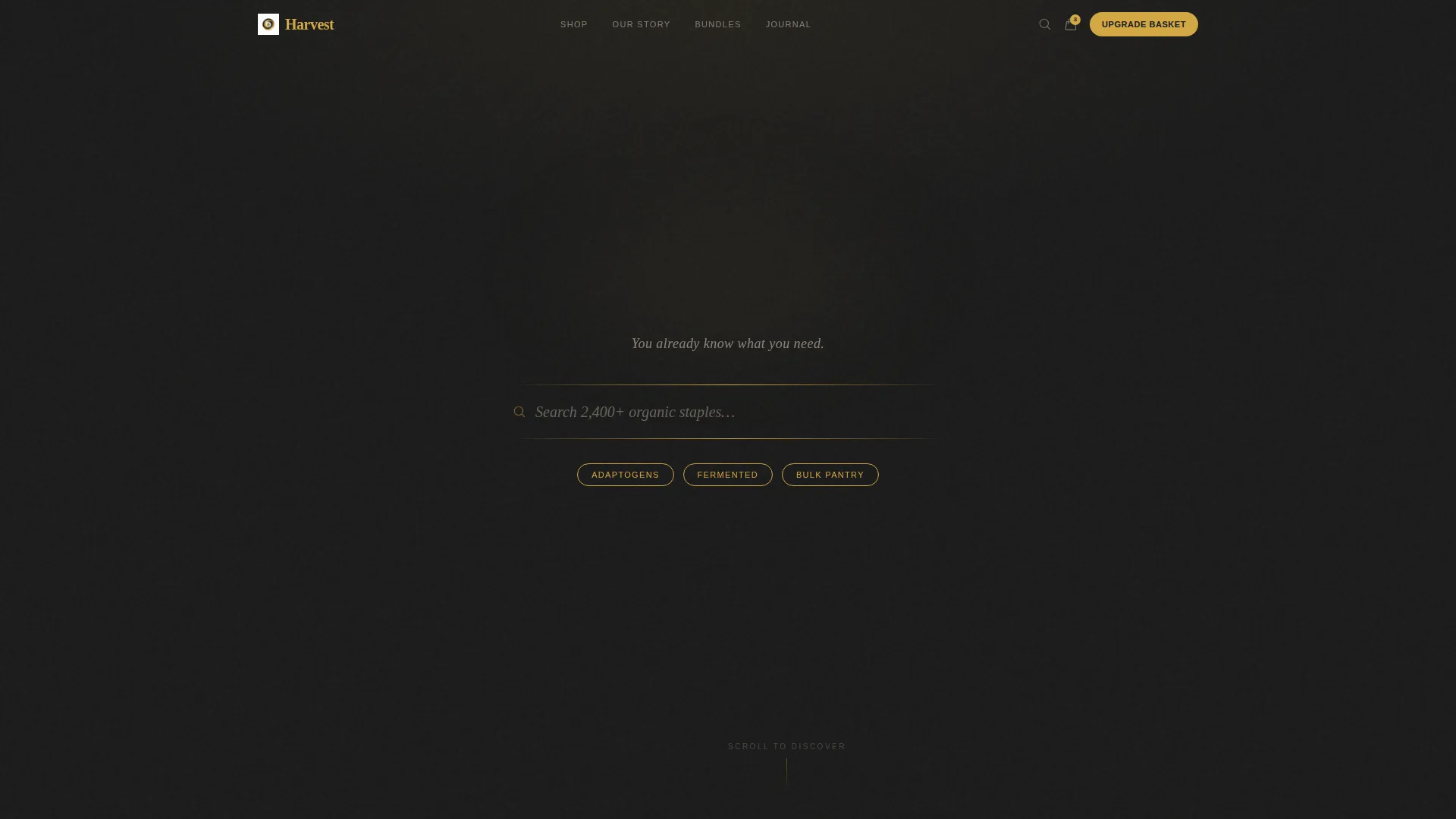
- A centered search header with capsule tag navigation and a gold-ruled input field
- A multi-stage before-and-after product reveal sequence triggered by scroll depth
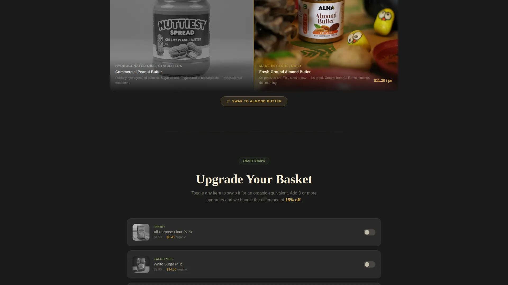
- An "Upgrade Your Basket" upsell section with a sticky savings tracker bar
- A three-step "Build a Wellness Box" subscription quiz covering dietary goal, household size, and flavor preferences
Feature list
This template ships with a focused set of purpose-built components. Each one serves the escalating narrative from first impression to final conversion.
Scroll-Triggered Before and After Reveals
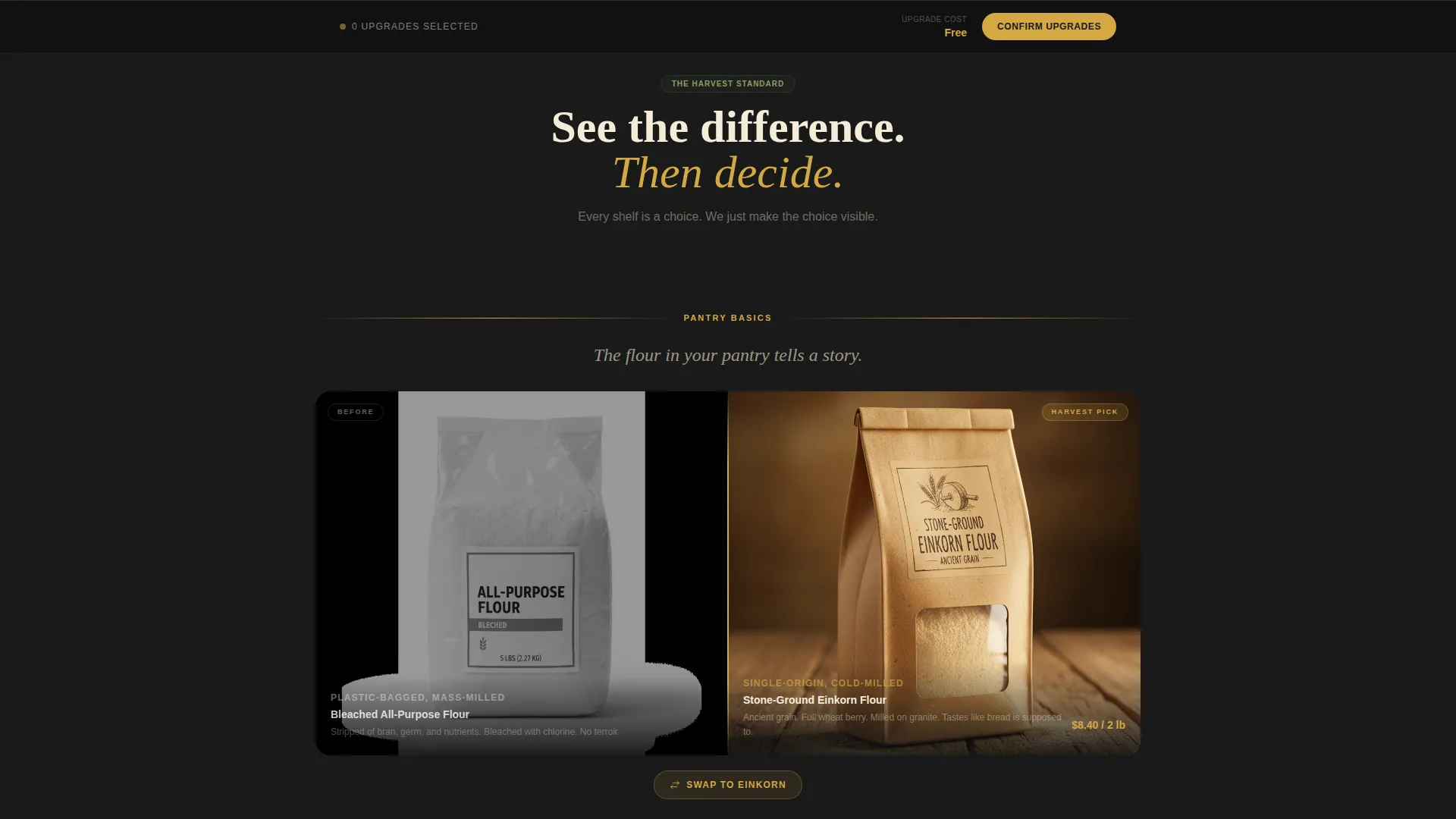
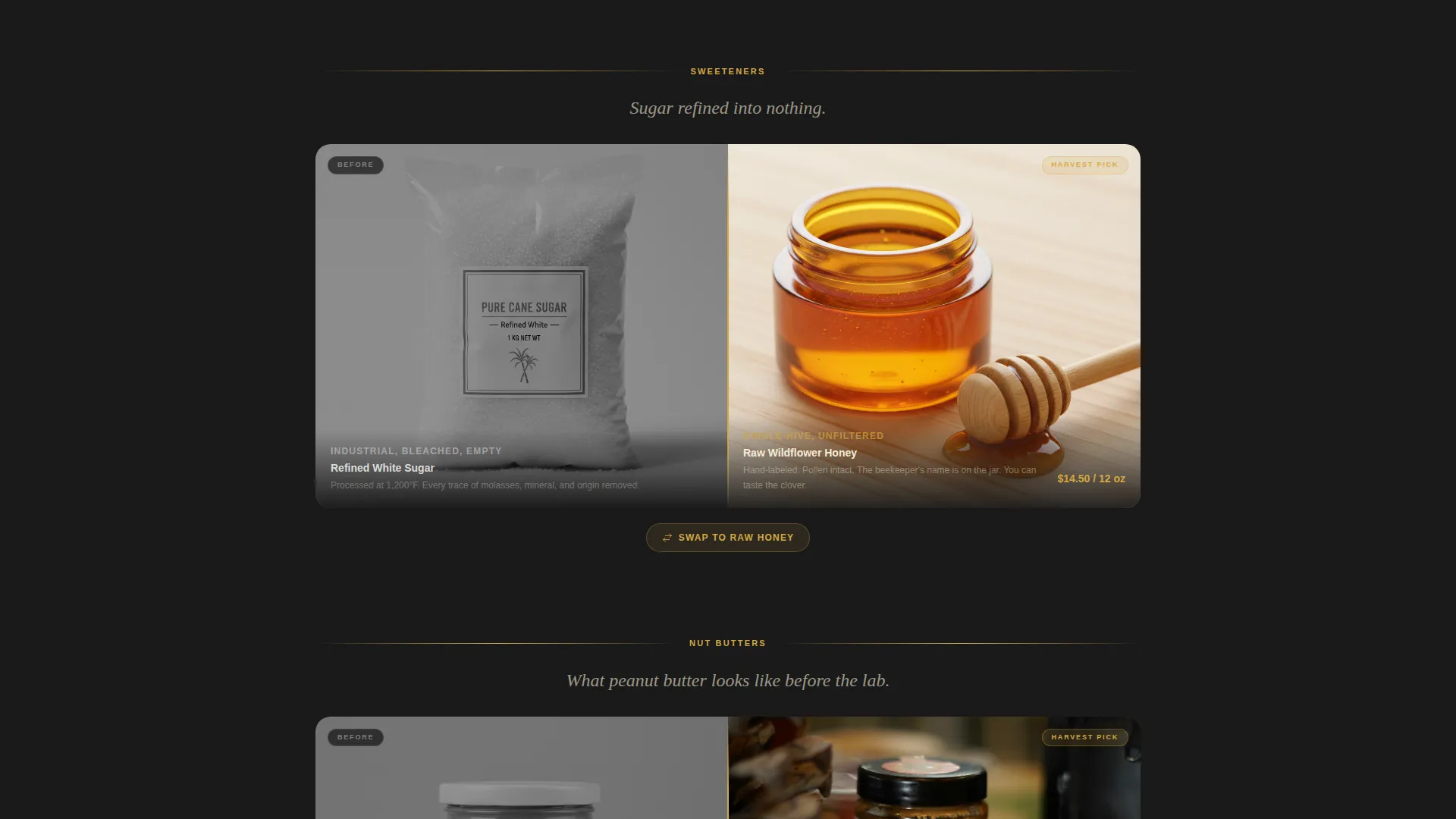
Each scroll milestone unlocks a split-panel comparison. The left side shows a conventional grocery product in desaturated, flat photography. The right side reveals the organic alternative in warm-lit, textured detail. The contrast sharpens progressively across three product tiers: pantry basics, premium supplements, and curated wellness bundles.
Centered Search Header with Capsule Tags
The header opens on a deep charcoal field with a gold-ruled search box. Placeholder text reads "Search 2,400+ organic staples..." in warm serif italic. Three gold-outlined capsule tags below the field pulse gently on hover, giving visitors an immediate way to navigate by category without a cluttered menu.
Upsell Basket Upgrade Flow
After the third reveal, a primary call to action labeled "Upgrade Your Basket" invites visitors to swap existing order items for organic equivalents at a bundled discount. The framing positions the upgrade as clarity rather than expense.
Sticky Savings Tracker Bar
A fixed bottom bar tracks potential savings in real time as visitors toggle organic upgrades on and off. It keeps the value proposition visible throughout the entire scroll journey without interrupting the narrative.
Three-Step Wellness Box Quiz
The secondary conversion path walks visitors through three questions covering dietary goal, household size, and flavor preferences. The output is a personalized monthly subscription box recommendation, turning a single visit into a recurring relationship.
Neo-Retro Visual Identity System
The Obsidian and Gold color system uses deep charcoal black for backgrounds, warm raw honey gold for accents, aged parchment cream for text panels, and muted olive for secondary badges. Heritage serif typography meets modern minimalism throughout.
Page sections overview
| Section | Purpose |
|---|---|
| Search Header | Entry point with centered gold-ruled search input and capsule tag navigation |
| Reveal Panel One | First before-and-after comparison focused on pantry basics |
| Reveal Panel Two | Second comparison escalating to premium supplements |
| Reveal Panel Three | Third comparison featuring curated wellness bundles |
| Upgrade Your Basket | Primary upsell call to action with bundled discount framing |
| Sticky Savings Bar | Real-time savings tracker fixed to the bottom of the viewport |
| Build a Wellness Box | Three-step subscription quiz generating a personalized box |
Design & branding system
The visual system is built on a Neo-Retro theme that references 1940s apothecary label design printed on matte black stock. Every element balances heritage warmth with modern restraint.
- Deep charcoal black (#1A1A1A) as the primary background, raw honey gold (#D4A843) for accents and interactive highlights, aged parchment cream (#F5ECD7) for text panels and card surfaces, and muted olive (#6B7C4E) for secondary badges and trust markers
- Heritage serif italic typography in cream for primary messaging, gold-outlined capsule tags for navigation, and thin gold rules as structural dividers
- Photography treatment uses desaturated flat tones for conventional products and warm-lit, high-texture close-ups for organic alternatives to make the contrast unmissable
Mobile & speed optimization
The landing page layout is structured for a progressive scroll experience that works comfortably on smaller screens. The single-column reveal sequence is naturally suited to mobile viewing.
- Scroll-triggered reveals are built on a vertical single-column flow that translates cleanly to phone and tablet viewports
- The sticky savings bar remains accessible at the bottom of the screen without covering primary content on mobile devices
- The three-step quiz uses a simple step-by-step layout that avoids complex multi-column forms on narrow screens
How this template helps you convert
The page is engineered around escalating intent. Each stage moves the visitor closer to a decision by making the organic choice feel more obvious than the alternative.
- The before-and-after reveal sequence makes the quality gap between conventional and organic products visible and physical, so the upgrade feels like recognition rather than persuasion.
- The sticky savings tracker keeps the financial benefit of upgrading visible throughout the entire page, removing the hesitation that comes from not knowing what the swap will cost.
- The wellness box quiz converts visitors who are not ready for a one-time purchase into subscription prospects by making the recommendation feel personal and specific to their household.
Other information about this template
This template is positioned within the Retail and E-Commerce category, specifically designed for the Grocery and Food Store subcategory with alignment to bulk and zero-waste store retail contexts. It uses a Luxe Minimal theme combined with a Curated Collection creative direction and a Masonry and Pinterest-influenced layout rhythm for its reveal panels.
- The header concept follows a price-anchored structure, foregrounding value and specificity from the first visible element
- The landing page direction is click-through, meaning every section is designed to move the visitor toward one of two defined action points rather than provide passive information
- This template suits stores that carry adaptogen powders, fermented foods, bulk pantry staples, cold-pressed juices, raw honey, and similar products where sourcing story and ingredient transparency are core selling points
Theme
Luxe Minimal
Creative direction
Curated Collection
Color system
Obsidian & Gold
Style
Masonry/Pinterest
Direction
Click-Through
Page Sections
Scroll-triggered Before and After Reveals
Centered Search Header with Capsule Tags
Upgrade Your Basket Upsell Flow
Sticky Real-time Savings Tracker
Three-step Wellness Box Quiz
Neo-retro Obsidian and Gold Identity
Related questions
Who is this landing page template best suited for?
How does the before-and-after reveal sequence work?
Can I use this template to promote a subscription box?
What are the two main conversion paths in this template?
Can the color palette and typography be changed?



