Cannabis Industry Services Privacy Policy & Terms Website Template
The Cultivar craft cannabis packaging studio landing page template is built for B2B design studios serving craft growers, dispensary operators, and multi-state cannabis brands. It features a zigzag alternating layout, a Pastoral Calm visual identity, state-specific compliance narratives, a gated checklist lead magnet, and a contact form designed to convert serious packaging inquiries into client relationships.
by Rocket studio
Quick summary
This template gives a cannabis packaging design studio everything it needs to attract serious clients and earn their trust before the first call. The page walks visitors through real compliance challenges, close-up craft details, and a clear path to commission work. It is built around a Partnership/B2B conversion goal, with two "Let's Design Your Line" call-to-action placements and a downloadable checklist for operators still planning.
Who this template is for
This template is a strong choice for any packaging design company that serves the craft cannabis market. Whether you are a solo design team or a full studio, this page gives your work the platform it deserves.
- Cannabis packaging studios working with craft growers, dispensary operators, and multi-state brands
- Design professionals who need to demonstrate regulatory fluency alongside creative ability
- B2B creative services companies ready to develop a polished client-facing website presence
What problem this template solves
Most cannabis packaging studios struggle to show two things at once: that their work is beautiful and that it clears every state regulatory desk. Prospects who land on a generic portfolio page have no way to judge whether the design team understands California Bureau of Cannabis Control symbol placement or Colorado THC milligram disclosure rules. Trust stalls, and the inquiry never arrives.
- Operators cannot tell if a design studio actually understands the compliance challenge or just makes things look good
- Craft brands launching their first dispensary line need proof that packaging will pass state review, not just attract consumers
- Studios without a structured lead capture system lose operators who are still in the planning stage and not yet ready to commission
What you get with this template
You get a fully structured single-page layout that moves visitors from curiosity to contact through a deliberate scroll rhythm. Each section earns the next click by proving competence before asking for commitment.
- A nine-section zigzag landing page with alternating image and narrative blocks, two call-to-action placements, and a gated lead magnet
- A Pastoral Calm design system using the Sunset Mesa color palette, Fraunces serif headings, and DM Sans body type
- A contact form scoped for cannabis packaging inquiries, plus an email-gated PDF checklist to capture early-stage operators
Feature list
This page is packed with purposeful design decisions. Every feature serves the goal of converting a skeptical operator into a confident client.
Zigzag Compliance Narrative Layout
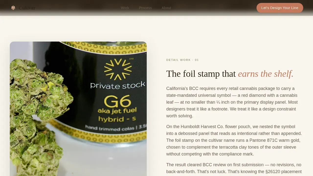
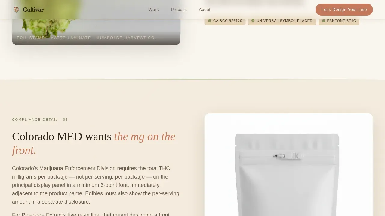
The template alternates close-up detail photography with compliance-focused copy in a series of five zigzag sections. Each pair covers a real regulatory point, from California Bureau of Cannabis Control symbol placement to Colorado THC milligram disclosure, so visitors trust the studio's fluency before they ever fill out a form. The rhythm feels like a conversation at a worktable, not a sales deck.
"Let's Design Your Line" Contact Form
The primary call-to-action form appears after the third zigzag section and again at the closing block. It asks for brand name, product type (flower, edibles, concentrates, topicals), number of SKUs, and operating state. This structure lets the studio assess compliance scope and produce an accurate quote without unnecessary back-and-forth.
Gated PDF Lead Magnet
A secondary conversion path offers "The Craft Brand Packaging Checklist" as a downloadable PDF, gated behind just an email address. This catches operators who are still in the planning stage. It keeps the studio present in their mind as they develop their brand strategy, so when they are ready to commission, the studio is already their first choice.
Pastoral Calm Hero Section
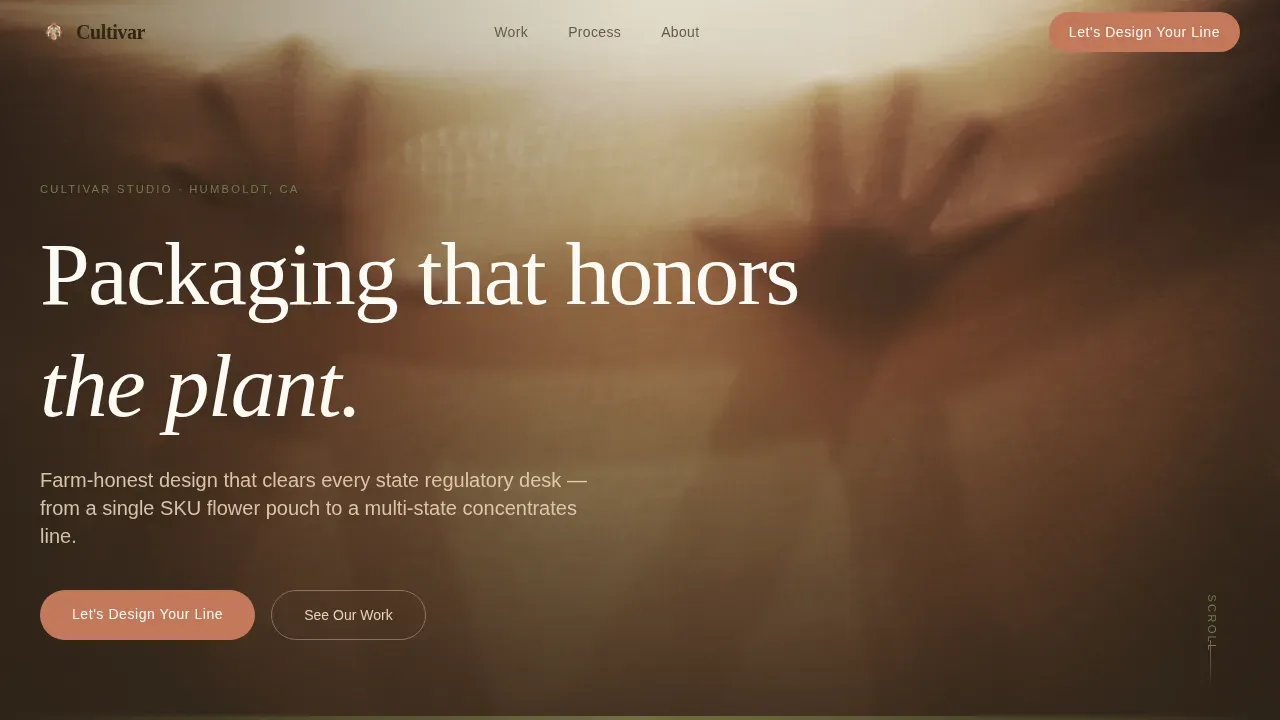
The hero opens with a behind-the-scenes workshop photograph: a designer's hands pressing a debossed label onto a matte-finish mylar pouch, natural window light, and Pantone swatches fanned beside a living cannabis plant. A single headline fades in over the image: "Packaging that honors the plant." The section uses subtle parallax and scroll-reveal animation to set an unhurried, honest tone.
Sunset Mesa Color System
Terracotta (#C4785B) activates buttons and hover states. Dried sage green (#8A9A5B) marks section transitions. Warm sandstone (#E8D5B7) carries every background. Deep loam (#2E2418) grounds all body text. Together, these tones produce a palette that feels fresh and earthy without competing with product photography.
Scroll-Reveal Section Animations
Each zigzag block uses scroll-reveal animation to bring alternating image and text columns into view as the visitor moves down the page. This pacing rewards attention and keeps visitors engaged through the full compliance-to-creative story arc, ultimately guiding them to the call-to-action form with context already built.
Page sections overview
| Section | Purpose |
|---|---|
| Hero Workshop Shot | Opens with "Packaging that honors the plant." fade-in headline and primary call-to-action button |
| Zigzag One: Foil Stamp | Detail shot paired with California compliance narrative covering symbol placement on labels |
| Zigzag Two: CR Closure | Child-resistant closure close-up paired with Colorado THC milligram disclosure copy |
| Zigzag Three: Micro-Type | Compliance panel detail paired with studio process narrative showing design workflow |
| Primary call to action Block | "Let's Design Your Line" contact form with brand name, product type, SKU count, and operating state fields |
| Zigzag Four: Brand Identity | Brand identity and logo system detail paired with craft community narrative |
| Zigzag Five: Product Lineup | Finished dispensary packaging lineup paired with multi-state market narrative |
| Checklist Lead Magnet | Email-gated PDF download for operators in planning stage |
| Closing call to action Block | Final "Let's Design Your Line" anchor with supporting summary copy |
| Footer | Linear single-row footer pattern |
Design & branding system
The visual identity follows a Pastoral Calm theme that feels like stepping onto a sun-warmed porch at golden hour. Every design choice is quiet, confident, and grounded in craft. The typography pairing of Fraunces serif headings and DM Sans body copy gives the page a warm editorial structure that aligns with the studio's farm-honest brand values.
- Sunset Mesa color palette: terracotta for buttons, sage for accents, sandstone for backgrounds, loam for text
- Fraunces serif headings paired with DM Sans body copy for an editorial, craft-forward typographic system
- Photography direction featuring shallow depth-of-field workshop shots, Pantone swatches, and living cannabis plants in clay pots
Mobile & speed optimization
The template is built desktop-first to serve B2B operators working at workstations, while remaining fully responsive for mobile browsing. Server Components handle all static sections, keeping the page lean, while Client Components are scoped only to the contact form and email-gated checklist interaction.
- Desktop-first responsive layout with mobile-friendly reflow for all zigzag sections and form fields
- Server Components for static content blocks and Client Components for interactive form and download elements
- Scroll-reveal animations and subtle hero parallax calibrated to medium intensity so they enhance without slowing the experience
How this template helps you convert
The page is structured to earn trust before it asks for anything. Compliance fluency comes first; creative beauty shots follow as proof of skill, not decoration. This sequence mirrors how a craft cannabis operator actually makes a vendor decision.
- The compliance-led zigzag sections build credibility by naming real regulatory requirements for cannabis products, so operators know the studio understands what is at stake before a logo is drawn or a box is printed.
- The "Let's Design Your Line" form, placed after the third zigzag and again at the close, captures operators who are ready to commission, while the email-gated checklist captures those who are still planning, allowing the studio to build its lead list from both groups.
Other information about this template
This template is a strong starting point for any cannabis packaging company that wants its website to stand out in a crowded market. The page structure supports a wide variety of use cases beyond the primary studio pitch.
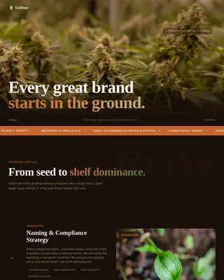
- The Cultivar craft cannabis packaging studio landing page template is suited for studios covering flower, edibles, concentrates, and topicals across multiple product strains and SKU series
- The zigzag layout can display a variety of packaging styles including structural design options, unique box formats, and tactile print finishes like foil stamps and debossed labels
- Studios can use the checklist lead magnet to educate early-stage operators about compliance requirements, sustainable packaging choices, and brand strategy fundamentals before a first conversation
- The page can cover dispensary shelves context effectively by showcasing how finished packaging is displayed, helping consumers and buyers understand the product's visual presence at the point of sale
- Effective cannabis packaging must balance aesthetics with functionality; the template gives the studio space to demonstrate that balance through real case photography and compliance-specific copy
- Successful packaging studio pages referenced in the industry, such as those following the approaches of studios focused on education-forward packaging like Fairwinds Manufacturing or child-resistant system design like Zenpack's Zenlock system, show that combining compliance proof with visual craft attracts the best clients; those brand-name references apply to the broader context this template supports
- Innovative packaging designs, including those resembling an origami box format like Wyld's or using vibrant specialized printing like Aura Cannabis, show how unique structural choices help products earn top spots on dispensary shelves across the country
- The template is also suitable for studios developing geo-targeted pages to attract visitors from specific regions, such as Humboldt and the Emerald Triangle, or for companies that want strain pages, location pages, and brand and product pages built around a cohesive identity system
- Additionally, the page can support a brand strategy that unifies sub-brands and extends across a full product line, helping multi-state operators align their packaging with consistent company values at every sale point
Theme
Pastoral Calm
Creative direction
Local & Neighborhood
Color system
Sunset Mesa
Direction
Partnership/B2B
Page Sections
Zigzag Compliance Narrative Layout
Let's Design Your Line Contact Form
Gated PDF Lead Magnet
Pastoral Calm Hero with Fade-in Headline
Sunset Mesa Design System
Scroll-reveal Section Animations
Related questions
Does this template include a working contact form?
Can I use this template if I offer packaging for edibles and concentrates as well as flower?
What is the gated checklist and how does it work?
Is the page suitable for a studio working with dispensary clients in multiple states?
Can I adapt the colors and typography to match my own studio brand?