Harvest — Wholefood Grocery Delivery Landing Page Template
The Nourish anti-inflammatory grocery delivery landing page template is a hero-dominant, single-page design built for food-first wellness brands. It leads with cinematic overhead food photography, scrolls through ingredient stories and curated protocol boxes, and drives visitors toward one clear action: building their first box. Warm artisan design meets editorial precision in every section.
by Rocket studio
Quick summary
This food landing page template is built for anti-inflammatory grocery delivery services that want to convert through atmosphere and trust. A full-viewport hero, gallery-walk scroll rhythm, and protocol-specific box grid do the heavy lifting. The page design steers clear of clutter, keeping every section focused on fresh, clean food and a single call to action.
Who this template is for
This landing page fits founders and brand teams running a healthy food delivery service with a specific wellness angle. It is especially well-suited for businesses whose products align with condition-specific eating plans.
- Women's wellness and autoimmune health food brands
- Functional medicine adjacent grocery delivery services
- Anti-inflammatory meal and ingredient box companies
What problem this template solves
Most healthy food website designs try to say too much at once. They stack navigation menus, scatter calls to action, and bury the actual food under walls of text. This template strips all of that away.
- No external links or unnecessary menus to distract visitors from the primary action
- No guesswork about which products fit which eating protocol
- No long forms asking for more information than a visitor is ready to share
What you get with this template
You get a fully structured, single-page food landing page ready to showcase your healthy food delivery services from hero to footer. Every section has a defined role, and every design choice is intentional.
- A cinematic hero section with a benefit-driven headline and a sage-green call-to-action button placed above the fold
- An ingredient story gallery, a six-protocol box grid, an unboxing section, and a client testimonials section
- A sticky bottom call-to-action bar, a secondary quiz link, and a footer in a split layout
Feature list
A paragraph introducing the features: this landing page template is built around a small set of high-impact design features. Each one is grounded in what the source brief specifies, and each one serves the core goal of making healthy food products feel irresistible and safe to buy.
Full-Viewport Hero with Sticky Call-to-Action Bar
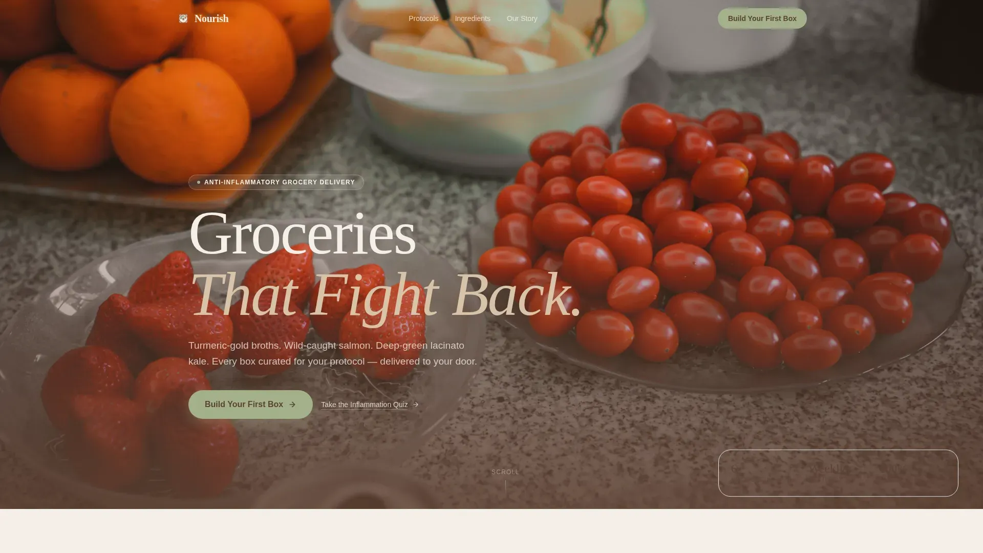
The hero fills ninety percent of the viewport with overhead food photography styled like a Dutch still life. A compelling headline in crushed walnut type floats near the bottom third. A sage-green "Build Your First Box" button sits above the fold, using a contrasting color to ensure it stands out. After the second scroll frame, a sticky bottom bar repeats the same call to action so visitors never lose sight of the next step.
Gallery-Walk Ingredient Story Section
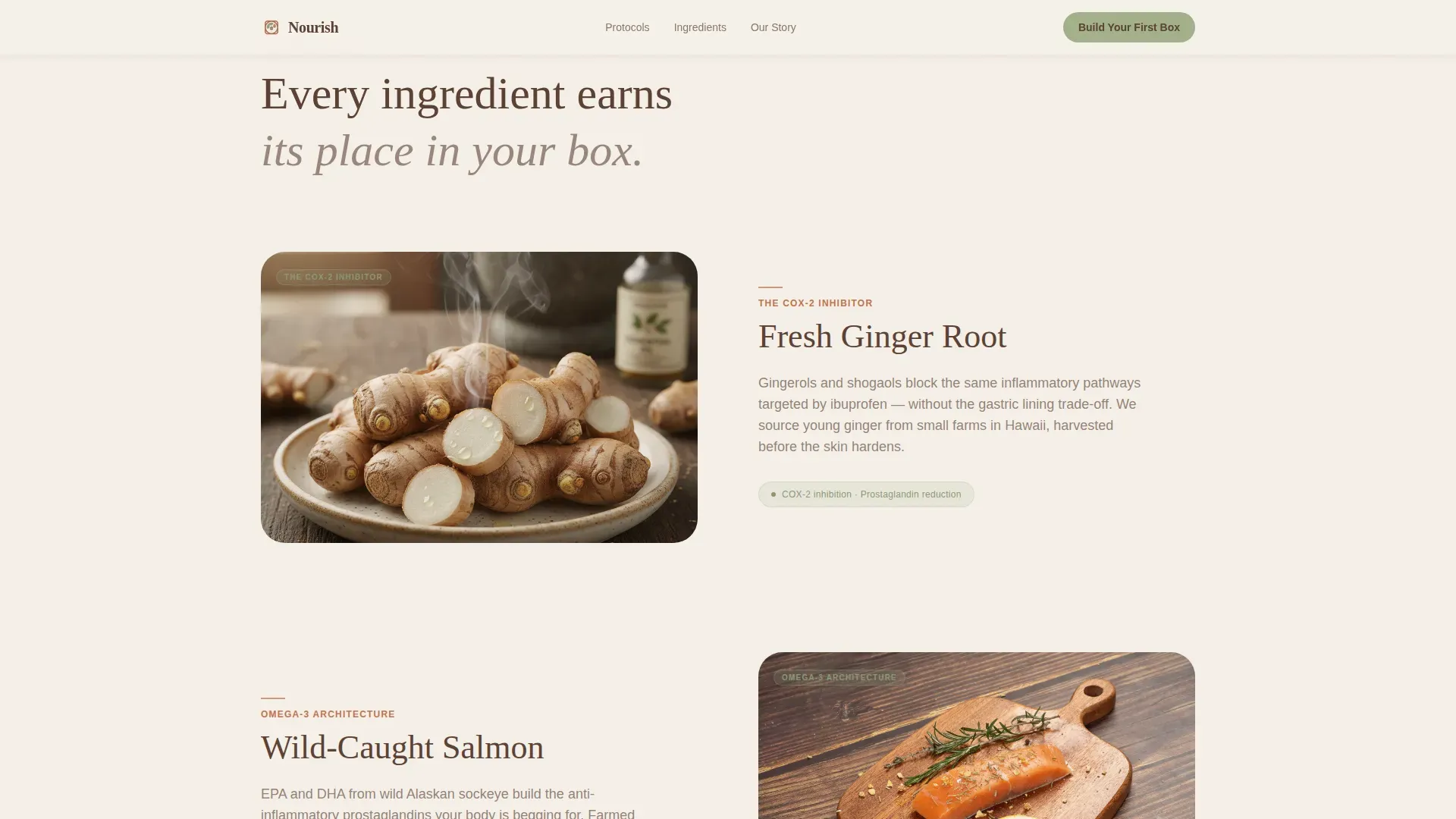
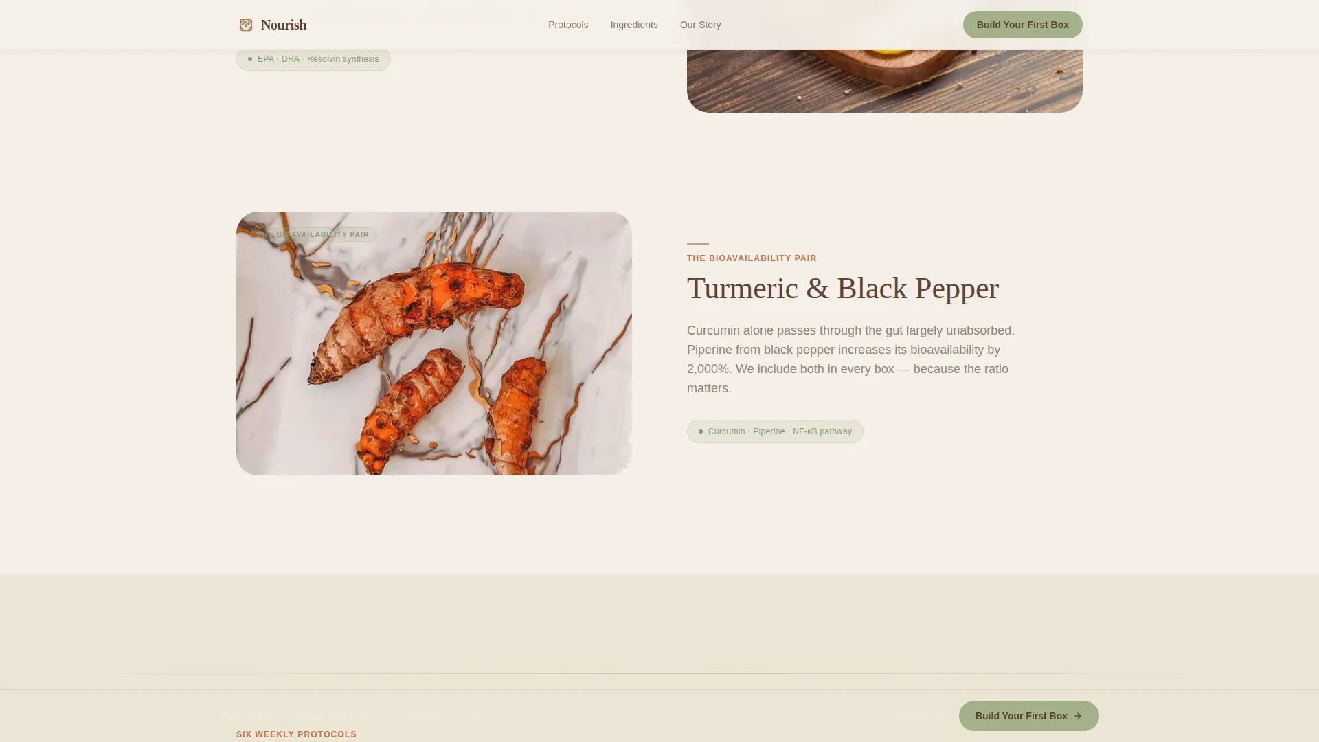
Each ingredient gets its own close-up frame with a short science caption. The design description for this section references ginger's COX-2 inhibition and wild salmon's omega-3 content. Foods rich in omega-3 fatty acids, spices like turmeric and ginger, and leafy greens like kale are all shown in alternating editorial layouts that feel more like a cookbook than a store.
Six-Protocol Box Grid
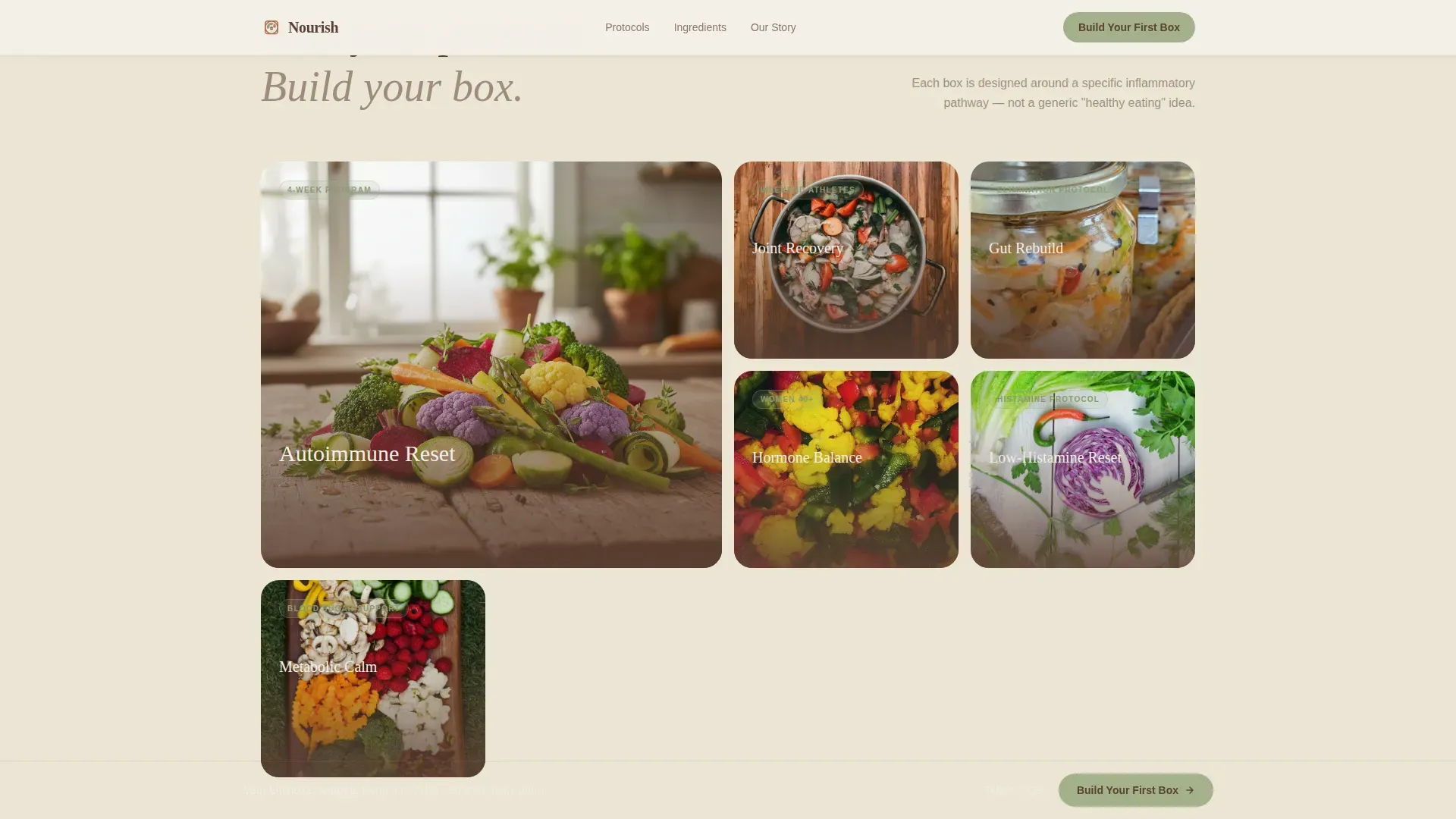
Six weekly boxes are photographed like cookbook covers and arranged in an asymmetric bento grid. Each box is named for its health protocol: Autoimmune Reset, Joint Recovery, Gut Rebuild, and three others. This section makes it easy for visitors to find the box that fits their specific dietary preferences without reading dense product descriptions.
Client Testimonials Section
Three named testimonials appear with specific health outcomes, not generic praise. Highlighting real customer feedback builds trust on a healthy food landing page in a way that product photography alone cannot. Social proof tied to real results is one of the most important trust signals on any food landing page.
Inflammation Quiz Secondary Link
A text link invites visitors who are not ready to add to cart to take a short quiz. The quiz trades a personalized protocol recommendation for an email address. This means the page captures interested users at two different stages of readiness, making the landing page effective even for visitors who need more time before buying.
Warm Artisan Page Design System
The page design uses Fraunces serif for headlines and DM Sans for body text. Section dividers carry faint terracotta lines, and every interactive element pulses in sage green. The overall design feel is editorial and clean, making fresh food products look trustworthy and premium without being cold.
Page sections overview
| Section | Purpose |
|---|---|
| Hero Viewport | Lead with food photography and primary call to action above the fold |
| Ingredient Story Gallery | Show close-up food images with brief science captions for each key item |
| Six Protocol Grid | Display six curated box options by health protocol in a bento-style grid |
| Unboxing Section | Full-bleed delivery photo with sourcing trust callouts for each product |
| Client Testimonials | Three named review cards with specific health outcomes for social proof |
| Footer Split | Logo and tagline left, navigation links right, clean two-column layout |
Design & branding system
The design draws from a Warm Stone color system that feels grounded, editorial, and safe. Every color choice supports the healthy food brand story without leaning on generic green palettes.
- Background in sun-bleached linen (#F5F0E8), body text in crushed walnut (#5C4033), and terracotta (#C4724B) for section dividers
- Sage green (#A3B18A) for all buttons and callouts, evoking freshness and health across every interactive touch point
- Fraunces serif headlines for warmth and editorial authority; DM Sans body text for clean, easy reading
Mobile & speed optimization
The page design is built mobile-first, which matters because many grocery searches start on a phone. Women browsing during health appointments or after a functional medicine visit need a landing page that loads fast and reads well on a small screen.
- Staggered scroll reveals and scroll-linked opacity keep the gallery-walk rhythm intact on mobile without heavy overhead
- Static server components handle all fixed sections; client components are used only for the sticky bar and scroll observer
- The sticky call-to-action bar keeps the primary button reachable at all times, saving users from scrolling back to the top
How this template helps you convert
This food landing page earns its click through sensory persuasion rather than pressure tactics. By the time a visitor reaches the footer, they have browsed enough golden light and split fruit to feel hungry and ready.
- The hero places a high-quality image of fresh, anti-inflammatory foods above the fold alongside a benefit-driven headline, building appetite and trust before a single word is read.
- The ingredient and protocol sections provide educational content on anti-inflammatory eating, from omega-3-rich fish to antioxidant berries and leafy greens, giving visitors enough information to feel confident choosing a box.
- Named testimonials with real health outcomes and sourcing trust callouts on the unboxing section deliver the social proof that moves a browser into a buyer.
Other information about this template
This template is designed to complement the broader workflow of creating and managing a healthy food delivery brand. A few additional details are worth keeping in mind before you start building.
- The page design intentionally removes cart complexity. There is no checkout on this landing page; the click carries visitors into a separate box customization flow, keeping the landing experience clean and distraction-free.
- A well-organized grocery list is central to the service story this template tells. Reviewing your fridge before each order, keeping your grocery list aligned with your dietary preferences, and sticking to a protocol-matched list are ideas the template's protocol grid reinforces visually.
- The Nourish anti-inflammatory grocery delivery landing page template is referenced in the template library under the Food and Beverage category, making it easy to find alongside other healthy food website designs.
- Users can add their own photography, update protocol names, and adjust color values to fit their specific brand identity.
- The template supports a secondary "Take the Inflammation Quiz" text link that helps services capture leads from visitors who want to learn more before committing to a box.
Theme
Warm Artisan
Creative direction
Gallery Walk
Color system
Warm Stone
Style
Hero-Dominant (90/10)
Direction
Click-Through
Page Sections
Full-viewport Hero with Sticky Call-to-action
Gallery-walk Ingredient Story Section
Six-protocol Box Grid
Named Client Testimonials Section
Inflammation Quiz Secondary Conversion Path
Warm Artisan Design System
Related questions
Can I use this template without professional food photography?
Does this landing page include a checkout or sign-up form?
Who is this template best suited for?
Can I change the protocol box names and descriptions?
Is this template mobile-friendly?



