Harvest - Wholesome Mealdelivery Landing Page Template
Harvest is a single-column organic meal delivery landing page built around an immersive ink-wash illustration style and a Japanese Zen color palette. It guides visitors through a sensory scroll journey, aroma, texture, taste, before leading them to register for a free virtual tasting event. Designed for postpartum mothers, autoimmune patients, and clean-eating households.
by Rocket studio
Quick summary
Harvest is a beautifully crafted landing page for an artisan organic meal delivery brand. It uses custom ink-wash illustrations and a warm agrarian color system to slow visitors down and build appetite before presenting a clear call to action: reserve a free tasting box through a virtual tasting event registration form.
Who this template is for
This template is built for food brands that sell on feeling as much as function. It suits artisan kitchens, health-focused meal services, and direct-to-consumer food businesses whose story deserves more than a product grid.
- Postpartum meal delivery services and recovery-focused food brands
- Organic meal delivery businesses serving autoimmune or elimination-diet clients
- Clean-eating meal prep services targeting busy professional households
What problem this template solves
Organic meal delivery brands struggle to communicate quality through standard templates. Generic layouts flatten the story of sourcing, preparation, and care into bullet points that no one trusts. Visitors leave before they feel anything.
- Most food landing pages look like grocery apps, not kitchens
- Health-conscious buyers need emotional reassurance before they commit
- Standard forms feel transactional when the product is intimate and personal
What you get with this template
You get a full single-column landing page flow that moves visitors through a deliberate sensory journey. Every section is designed to earn a pause before the next scroll, building hunger and trust in layers.
- A full-viewport hero with a custom ink-wash illustration and headline
- Five content sections covering aroma, texture, seasonal menu, and event registration
- A tasting event form with a one-question dietary preference ritual and a secondary email-capture path
Feature list
This template includes purpose-built sections and design choices that serve a specific kind of food brand. Each feature is grounded in the source brief and visible in the layout.
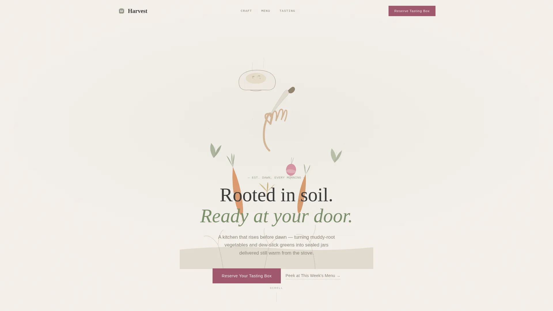
Full-Viewport Ink-Wash Hero
The hero fills the entire screen with a hand-drawn cross-section illustration: roots rising from soil through a knife into a steaming bowl. The headline "Rooted in soil. Ready at your door." sits over the bowl in a handset serif, setting tone immediately.
Sensory Scroll Journey
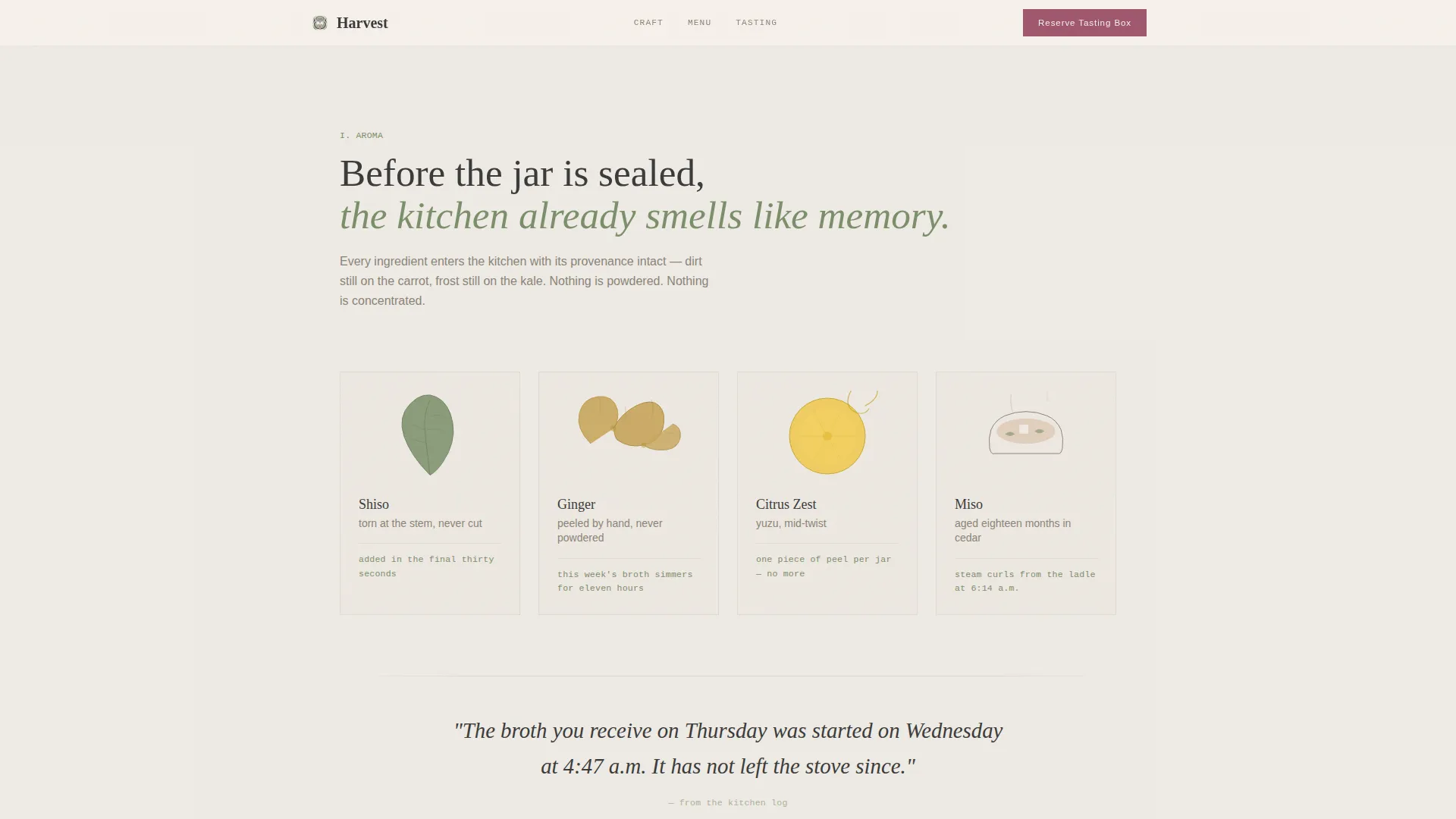
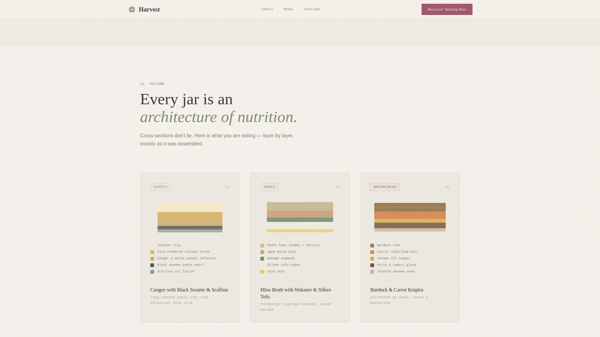
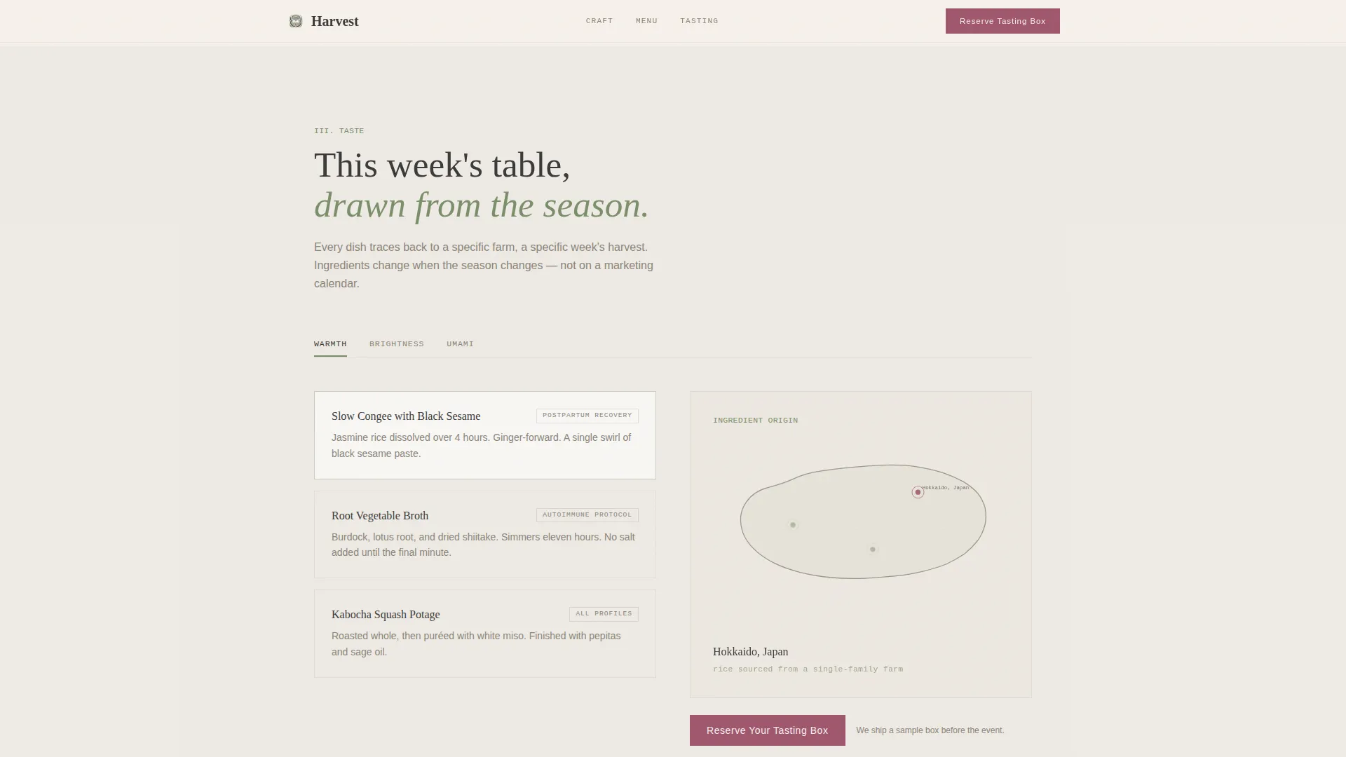
Each section past the hero reveals a new sensory layer. Aroma comes first with herb illustration and recipe marginalia micro-copy. Texture follows with cross-section meal architecture. Taste arrives through a rotating seasonal menu with illustrated ingredient origin maps.
Rotating Seasonal Menu with Origin Maps
The seasonal menu section uses tabbed navigation to display rotating dishes. Each dish is paired with an ingredient origin map drawn in the same ink-wash style, communicating sourcing specificity without a word of corporate language.
Tasting Event Registration Form
The primary call to action is a free virtual tasting event sign-up. The form asks for name, delivery address, and a single intimate question: "Which speaks to you: warmth, brightness, or umami?" This replaces a cold dietary preference dropdown with a personal ritual.
Fixed Call-to-Action Bar
After a visitor scrolls seventy percent of the page, a gentle fixed bar appears at the bottom. It holds the "Reserve Your Tasting Box" button in pickled plum on ceramic white, keeping the primary action available without interrupting the reading experience.
Secondary Email Capture Path
A "Peek at This Week's Menu" link offers a lower-commitment entry point. Visitors who are not ready to register can exchange their email for a PDF menu illustrated in the same woodblock-print style as the rest of the page.
Page sections overview
| Section | Purpose |
|---|---|
| Hero Illustration | Anchors brand tone and headline |
| Aroma and Herbs | Builds sensory appetite through micro-copy |
| Texture Cross-Sections | Communicates meal quality and nutritional depth |
| Seasonal Menu Tabs | Showcases rotating dishes with origin maps |
| Tasting Event Form | Converts visitors into tasting event registrants |
| Footer Flow | Closes page with horizontal brand pattern |
Design & branding system
The visual identity follows an Agrarian Root theme expressed through a Japanese Zen color system. Nothing shouts. Every element breathes, and the plum accent appears only where a finger should tap.
- Color palette: unglazed ceramic white (#F5F0EB), wet stone charcoal (#3A3A3A), matcha-steeped green (#7B8F6A), and pickled plum (#A0576E) reserved for buttons and interactive moments
- Typography: Fraunces serif for headlines, DM Sans for body text, and JetBrains Mono for marginalia labels and sourcing notes
- Backgrounds alternate between warm ceramic white and a five-percent matcha green wash across sections
Mobile & speed optimization
The template is built mobile-first because the primary user is a new mother scrolling one-handed. Layout decisions, tap target sizing, and scroll pacing all reflect that context.
- Single-column flow requires no horizontal navigation or grid adjustment on small screens
- Server Components handle static sections to keep JavaScript payload minimal
- Scroll-reveal animations use staggered fades and parallax layers without blocking page interaction
How this template helps you convert
The page is designed to move a skeptical first-time visitor toward a low-friction event registration by building desire through illustration and copy before asking for anything.
- The sensory scroll journey creates genuine appetite and brand trust before any call to action appears, reducing resistance at the form.
- The one-question tasting form replaces a clinical dietary intake with a personal moment, making sign-up feel like the start of a relationship rather than a transaction.
- The secondary "Peek at This Week's Menu" path captures emails from visitors who need more time, giving the brand a follow-up channel without losing the lead.
Other information about this template
This template is well suited to any direct-to-consumer food brand that relies on storytelling and illustration rather than photography. It can support a range of health-focused meal delivery niches beyond postpartum and autoimmune audiences.
- Template style: Single Column Flow with scroll-reveal animation and SVG illustration support
- Animation level: Medium, using staggered fade, parallax layers, and SVG illustration animation
- Footer uses Pattern 3 (Vercel Horizontal Flow) for a clean brand close
- Localization defaults: USA, USD currency, and MM/DD/YYYY date format
- The fixed call-to-action bar activates at seventy percent scroll depth and stays visible through the remainder of the page
Theme
Agrarian Root
Creative direction
Sensory Appeal
Color system
Japanese Zen
Style
Single Column Flow
Direction
Event Registration
Page Sections
Full-viewport Ink-wash Hero
Sensory Scroll Journey
Rotating Seasonal Menu with Origin Maps
Tasting Event Registration Form
Fixed Call-to-action Bar
Secondary Email Capture Path
Related questions
Who is this template designed for?
What is the primary conversion goal of this landing page?
Can visitors engage without committing to the tasting event?
What illustration style does this template use?
How does the template handle dietary preference collection?



