Halloween Gift Store Landing Page Template
Haunt is a masonry-grid Halloween landing page template built for spooky gift stores. It combines a countdown-timer header, curated comparison card sections, and a five-question visual gift-finder quiz. The obsidian-and-gold visual identity sets a candlelit market atmosphere that guides shoppers from first glance to a personalized bundle and a single-click cart action.
by Rocket studio
Quick summary
Haunt is a single-page Halloween storefront template with a masonry product grid, a flickering countdown-timer header, and a persona-driven comparison journey. A sticky "Find Their Fright" quiz bar ties the experience together, returning a curated gift bundle matched to the shopper's taste, budget, and delivery timeline.
Who this template is for
This template is built for Halloween gift retailers who sell curated, character-driven products rather than generic party supplies. It suits shop owners who want their online storefront to feel as considered and atmospheric as a well-dressed market stall.
- Indie Halloween gift store owners launching a seasonal sales page
- Small retail brands selling themed products such as candles, jewelry, spirit boards, or specialty confectionery
- Event organizers or office managers sourcing unique Halloween prizes and gifts at range of price points
What problem this template solves
Most seasonal retail pages feel flat and interchangeable. Shoppers land, scroll a grid of unrelated products, and leave without a clear path to purchase. Haunt solves this by giving every visitor a guided journey from curiosity to conviction.
- Visitors with no specific product in mind get routed to a personalized bundle through the quiz
- Shoppers who already know their vibe can self-sort using the comparison card sections
- The countdown timer creates genuine purchase urgency without relying on generic sale banners
What you get with this template
You get a fully structured single-page layout with every section pre-built and ready to fill with your products and copy. The visual framework, interaction patterns, and content flow are all included.
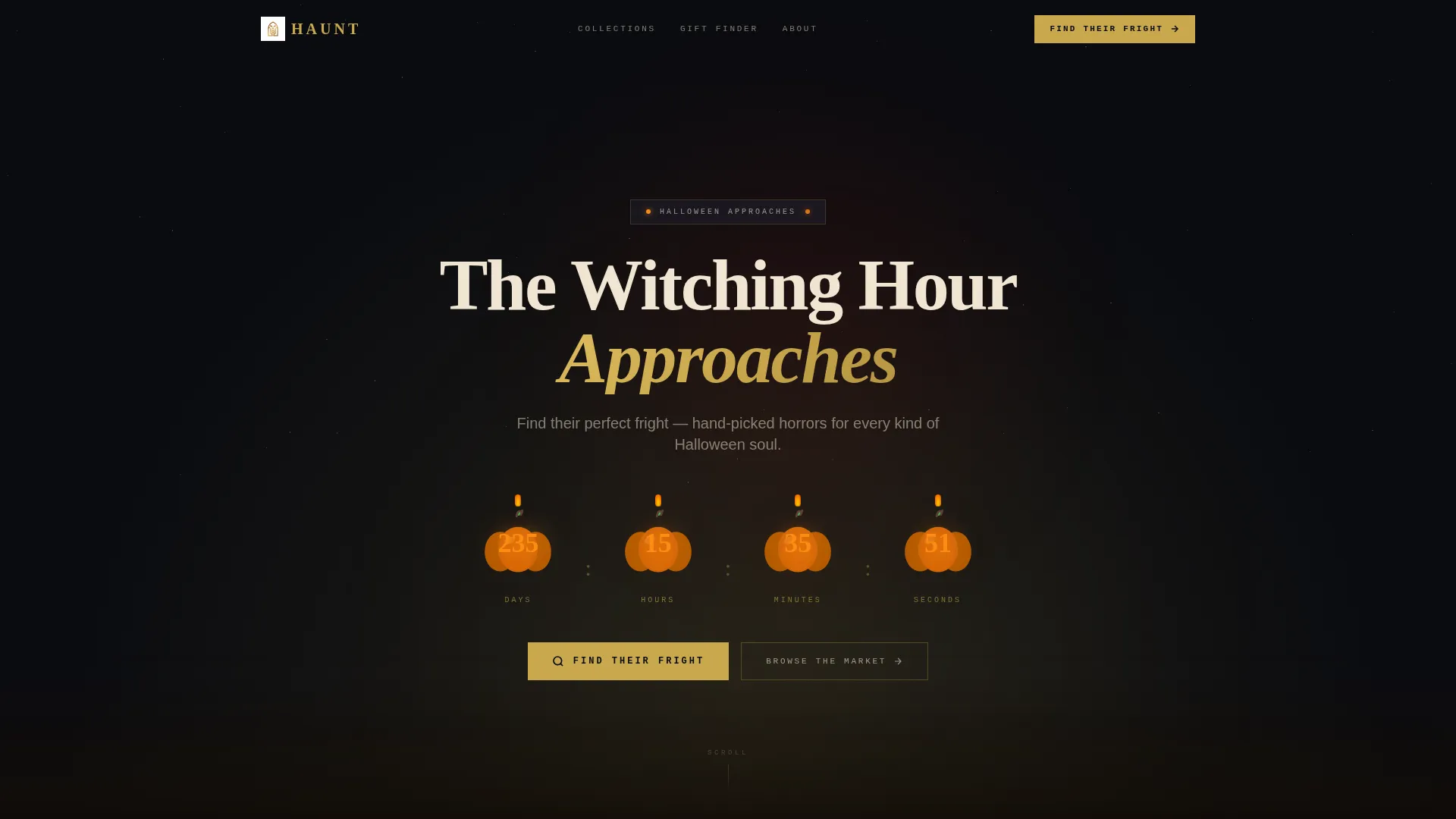
- A full-width atmospheric header with a carved countdown timer and hand-lettered headline
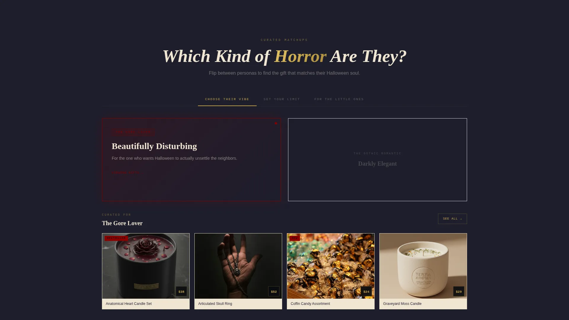
- A comparison journey section with flippable masonry card pairs organized by persona and price
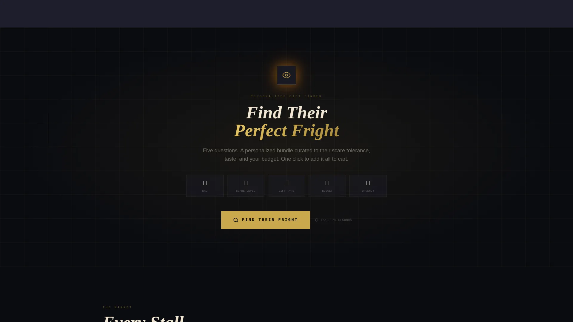
- A sticky quiz bar with a five-question visual assessment and a one-click bundle result
Feature list
This template delivers a cohesive set of purpose-built components. Each one is designed to move a Halloween gift shopper from browsing to buying.
Countdown Timer Header
The header opens with a full-width scene of a flickering jack-o'-lantern row receding into fog. The countdown numerals are carved into the pumpkins themselves and glow amber from inside, casting warm light onto a cobblestone surface below. A hand-lettered headline sits above the scene, setting the tone before the visitor scrolls a single pixel.
Comparison Journey Card Sections
The scroll experience is structured as a series of curated matchups. Each pair such as "For the Gore Lover versus. the Gothic Romantic" or "Under $25 versus. Worth the Splurge" presents two masonry card grids that the visitor can flip between. This lets shoppers self-sort by personality and budget before they ever reach a product detail page.
Sticky Quiz Call-to-Action Bar
After the first comparison section, a tarnished-gold sticky bar locks to the viewport with the prompt "Find Their Fright." It remains visible as the visitor continues scrolling, providing a persistent entry point to the gift-finder quiz without interrupting the browsing flow.
Five-Question Visual Gift Finder
The quiz covers five dimensions: recipient type using icon selectors, scare tolerance using a slider from "Cute Spooky" to "Actual Nightmares," preferred gift category, budget range, and delivery urgency relative to the Halloween countdown. Each question uses visual inputs rather than plain radio buttons to keep the experience immersive.
Personalized Bundle Result
Quiz results return a curated gift bundle matched to the visitor's answers. The result screen includes a prominent "Add Bundle to Cart" action and a secondary "Browse All Gifts" link for shoppers who prefer to explore the full masonry grid independently.
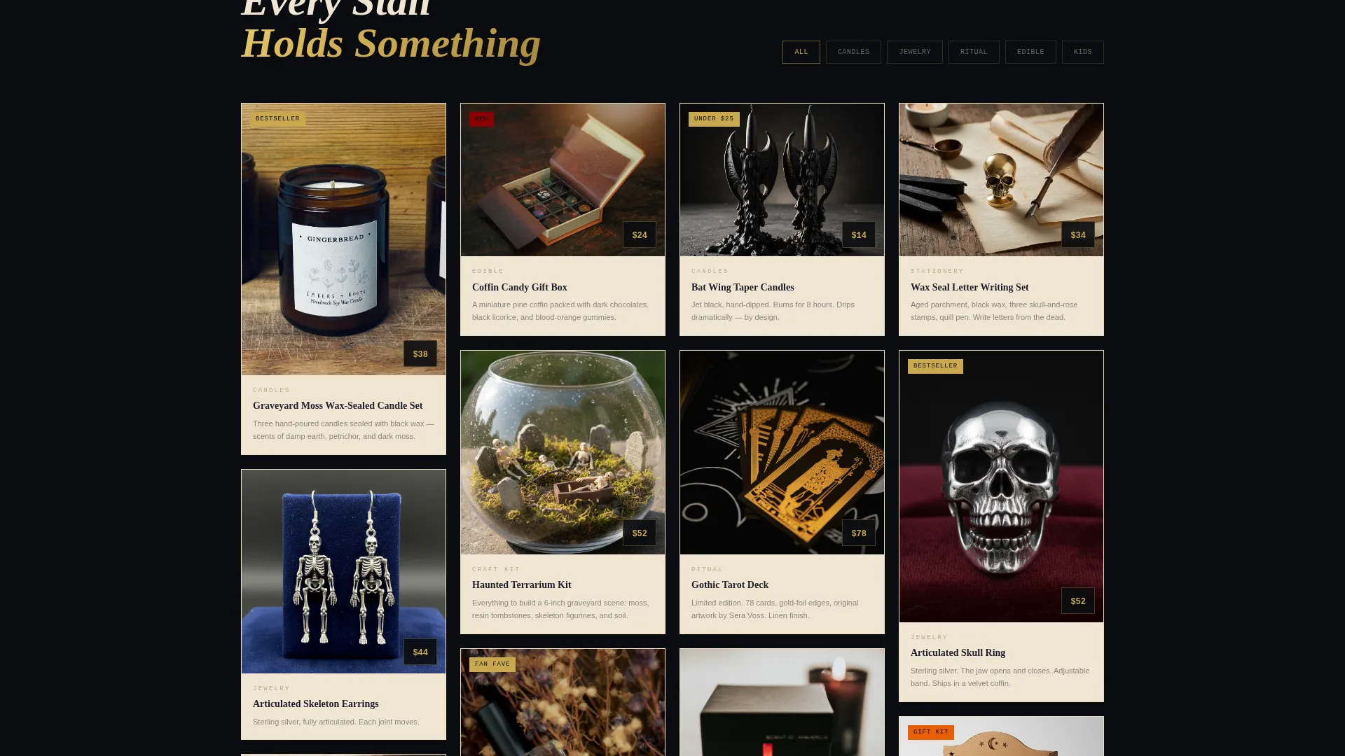
Masonry Product Grid Layout
Product cards are arranged in a Pinterest-style masonry layout throughout the page. Cards sit on bone ivory surfaces, charcoal tones divide the gutters, and tarnished gold appears on every hover state, price tag, and interactive element to maintain visual consistency across the grid.
Page sections overview
| Section | Purpose |
|---|---|
| Countdown Timer Header | Opens with urgency and atmospheric scene-setting |
| Hand-Lettered Headline | Frames the Halloween gift occasion immediately |
| Comparison Card Pairs | Guides visitors to products by persona and budget |
| Sticky Quiz Bar | Persistent entry point to the gift-finder quiz |
| Visual Gift Quiz | Collects five inputs to generate a personalized bundle |
| Bundle Result Screen | Delivers a matched bundle with a one-click cart action |
| Browse All Gifts Link | Secondary path for independent product exploration |
| Masonry Product Grid | Displays curated products in a Pinterest-style layout |
| Page Footer | Anchors the layout in deep obsidian with final navigation |
Design & branding system
The visual identity uses an obsidian-and-gold palette that feels like opening an antique jewelry box lined in dark silk. Every color decision serves both atmosphere and readability, so the page stays beautiful without sacrificing clarity.
- Core palette: deep obsidian black (#0B0C10) for header and footer, coffin-wood charcoal (#1E1E2C) for grid gutters, tarnished gold leaf (#C9A84C) for hover states and price tags, and bone ivory (#F0E6D3) for card surfaces and body text
- Typography uses hand-lettered display type for headlines and clean readable body fonts for product copy, reflecting the hand-staged, candlelit market aesthetic described in the creative brief
- Interactive gold accents on every hover state and call-to-action element create a consistent visual reward that reinforces the premium feel of the storefront
Mobile & speed optimization
The masonry grid and quiz components are structured to reflow cleanly at smaller screen sizes. The layout prioritizes the most critical conversion elements first on narrow viewports.
- The sticky quiz bar remains accessible on mobile screens without blocking product card content
- Comparison card pairs stack vertically on small screens so the flip interaction remains usable with a thumb tap
- The countdown timer header scales proportionally, keeping the carved numeral effect legible at phone screen dimensions
How this template helps you convert
Haunt is built around the reality that Halloween gift shoppers often do not know exactly what they want. The page architecture moves them from ambient browsing to a confident purchase decision.
- The countdown timer creates a real, visible deadline tied to Halloween night, giving shoppers a concrete reason to act now rather than return later
- The comparison journey lets visitors self-identify their gift recipient and budget before they hit the product grid, reducing decision fatigue and increasing the relevance of what they see
- The personalized bundle result removes the final barrier to purchase by presenting a single curated recommendation with one clear action, rather than asking the visitor to assemble a cart from scratch
Other information about this template
Haunt fits naturally within the broader Retail and E-Commerce category and is purpose-built for the Halloween Business subcategory. It is particularly well-suited to brands operating in the Halloween gift and specialty retail space.
- The template style follows a Card Grid modular structure, making it straightforward to swap in your own product images and copy without redesigning the layout
- The Marketplace Grid theme means the page reads like a curated market experience rather than a standard e-commerce catalogue
- The Comparison Journey creative direction is an intentional scroll narrative, not a passive grid dump, so the page does the selling work before the visitor reaches the cart
- This template is designed as a single landing page flow, not a multi-page site, and works best when paired with an existing product catalogue or checkout system
Theme
Marketplace Grid
Creative direction
Comparison Journey
Color system
Lavender Dream
Style
Card Grid (Modular)
Direction
Click-Through
Page Sections
Countdown Timer Header
Comparison Journey Card Sections
Sticky Gift-finder Quiz Bar
Five-question Visual Gift Quiz
Personalized Bundle Result Screen
Masonry Product Grid Layout
Related questions
Can I use this template without a full e-commerce platform behind it?
How does the Find Their Fright quiz work for shoppers?
Is the countdown timer tied to a specific date?
Can I add more comparison card pairs beyond the default sections?
Does the masonry grid work for stores with many product categories?



