Halloween Travel Landing Page Template
Haunt is a Halloween travel landing page template built for companies selling spine-tingling seasonal itineraries. It combines an overlap card grid layout with surprise-driven micro-interactions, a dual conversion surface, and a Victorian apothecary color palette. Friend groups, couples, and corporate teams can browse and claim ghost-tour packages in just a few taps.
by Rocket studio
Quick summary
Haunt is a single-page Halloween travel template designed to sell packaged ghost-tour itineraries. It uses layered, overlapping destination cards, a live-shuffling Mystery Package component, and two conversion paths to move browsers into bookings. The Victorian apothecary palette and scroll-triggered reveals make every section feel like a new discovery.
Who this template is for
This template is built for Halloween travel brands that offer curated, bookable experiences rather than standard sightseeing tours. It works best when the product is atmospheric, limited in availability, and priced for groups.
- Friend groups and couples looking for a bookable Halloween weekend with a real story behind it
- Corporate culture teams replacing the standard office party with a group travel experience
- Travel operators selling turnkey seasonal packages across multiple haunted destinations
What problem this template solves
Most travel landing pages flatten every destination into the same grid and the same tone. For a Halloween travel brand, that sameness kills the mood before the visitor even reads a package title. Haunt fixes this by treating the page itself as part of the experience.
- Visitors lose interest quickly when a page feels generic and emotionally flat
- Standard booking forms buried below the fold create friction before trust is established
- Group travel buyers need party-size options and weekend pickers upfront, not after clicking away
What you get with this template
You get a fully designed, single-page landing layout with all the visual and structural components needed to launch a Halloween travel marketplace. Every section is purpose-built for the seasonal, group-booking context.
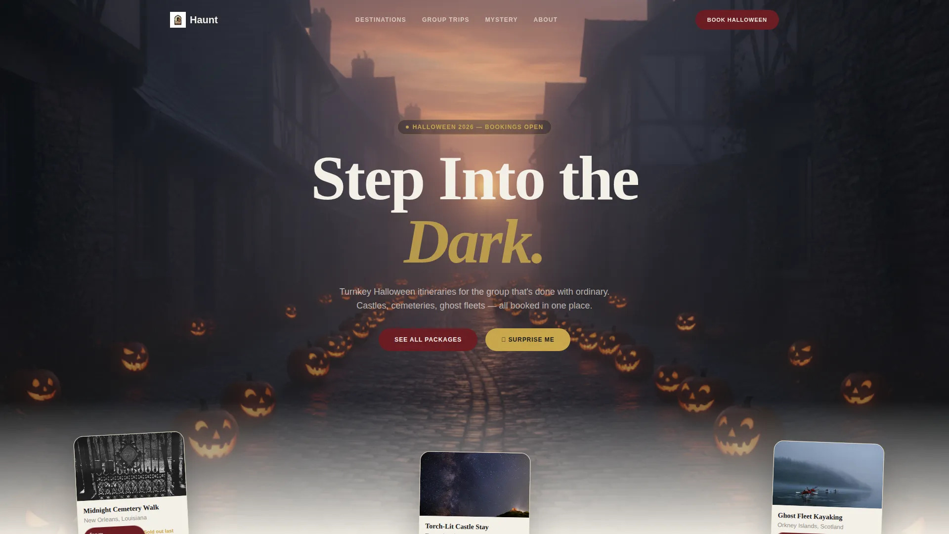
- A full-bleed dusk header with three pre-visible, slightly askew package cards that invite scrolling
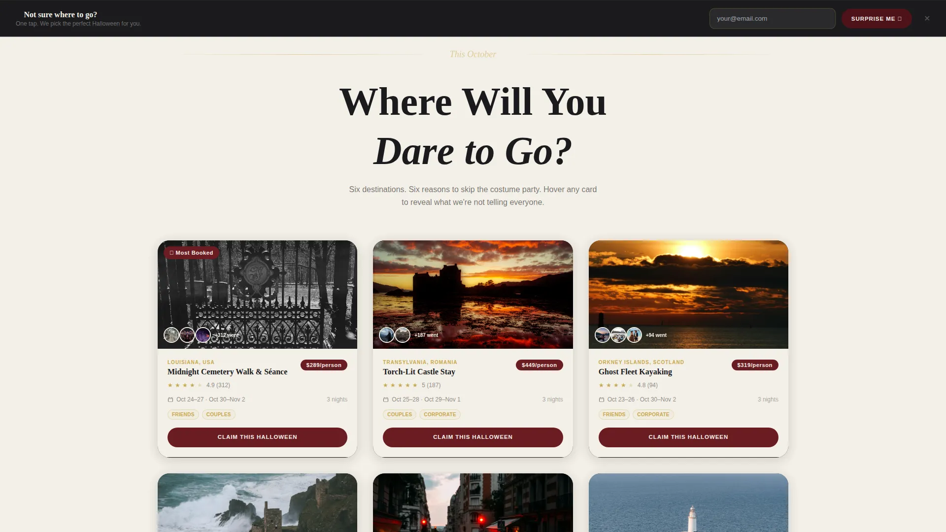
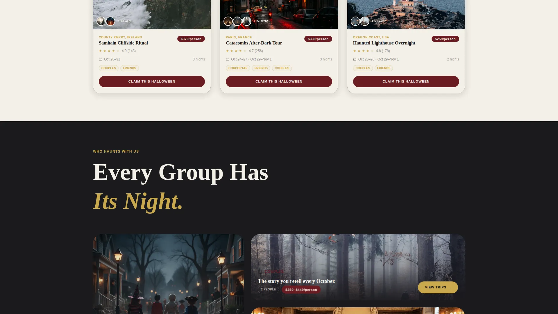
- A tarot-card-style destination grid with hover-reveal hidden details on each package card
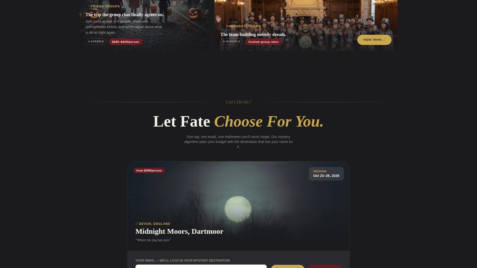
- Two conversion surfaces: an inline card booking form and a sticky "Surprise Me" bottom bar
Feature list
This template ships as a complete, conversion-focused layout. Every feature below is present in the design as described in the source brief.
Overlap Card Grid with Hover Reveals
Each destination card sits in a dealt-tarot layout, tilting on hover to surface a hidden detail. That detail might be a secret excursion, a complimentary costume, or a locals-only dinner. The interaction rewards curiosity and keeps the visitor engaged.
Live Mystery Package Shuffler
A full-width card midway down the page randomizes destination and date in real time as the visitor watches. It creates a moment of delight that resets attention and nudges the visitor toward the spontaneous "Surprise Me" path.
Dual Conversion Surface
Every package card carries its own inline booking form with a party-size selector (2, 4, 6, or 8-plus guests), a preferred weekend picker, and a single email field. A sticky bottom bar offers a parallel path: one tap, one email, mystery destination assigned.
Social Proof on Every Card
Real guest photo thumbnails showing costumed visitors at each destination appear directly on the package cards. This collapses the trust gap before the visitor reaches any form.
Scroll-Triggered Unwrap Animations
Scrolling does not simply reveal sections. Each scroll depth introduces a new sensory surprise, including flickering castle windows on hover and a pumpkin icon that reveals a limited-time discount on tap. The sequence is designed to reset engagement at every stage.
Victorian Apothecary Visual System
The palette and card shadow system are built around a strict visual hierarchy. Parchment dominates backgrounds, hollow black frames the layered cards, candle gold highlights ratings and dates, and burgundy appears only on price badges and call-to-action pulses.
Page sections overview
| Section | Purpose |
|---|---|
| Full-Bleed Header | Sets atmosphere, surfaces three package cards above the fold |
| Destination Card Grid | Browses all available haunted packages in tarot-card layout |
| Mystery Package Shuffler | Live randomizer drives spontaneous booking decisions |
| Package Booking Forms | Inline forms with party-size and date selector per card |
| Guest Photo Proof | Costumed visitor thumbnails build trust on each card |
| Sticky Booking Bar | Persistent "Surprise Me" path captures impulsive conversions |
Design & branding system
The visual identity is built around a Victorian apothecary aesthetic: cream parchment labels, dark wood drawer tones, and brass pulls catching gaslight. Every color has a strict role so the eye always knows where to move next.
- Misted parchment (#F4F0E8) covers backgrounds; deep hollow black (#1A1A1D) frames layered cards with soft drop shadows; tallow candle gold (#C9A84C) marks ratings, dates, and highlights
- Dried-blood burgundy (#6B1C23) is reserved exclusively for price badges and call-to-action pulses, training the visitor's eye toward the booking moment
- Cards are stacked and slightly offset like scattered postcards, casting layered shadows that create physical depth without a single photograph needing to carry the whole mood
Mobile & speed optimization
The layout is designed to translate the layered card experience cleanly across screen sizes. Overlapping elements and hover states are adapted so touch interactions feel just as rewarding as cursor interactions on desktop.
- Card tilt and hover-reveal interactions are adapted to tap events on mobile so no detail is hidden from touch users
- The sticky bottom bar is sized and positioned for thumb-reach on smaller screens, keeping the "Surprise Me" path accessible without scrolling back up
- Full-bleed header imagery and card shadows are composed to remain visually clear at reduced viewport widths
How this template helps you convert
The page is structured to shorten the distance between first impression and booking decision. Every design choice serves a specific conversion role.
- The three visible package cards in the header create immediate desire before a single word is read, removing the cold-start problem that kills bounce rates on travel pages.
- Social proof thumbnails placed directly on each card answer the trust question at the exact moment the visitor is considering a specific package, not after they have already scrolled past.
- Two conversion paths, one deliberate and one spontaneous, mean the page captures both the planner who wants to choose a destination and the adventurer who just wants to go somewhere wild.
Other information about this template
Haunt is categorized under Retail and E-Commerce, specifically within the Halloween Business subcategory. It is designed as a single-page overlay and grid layout, not a multi-page website, making it fast to publish and easy to maintain for a seasonal campaign.
- The template style follows a Card Grid (Modular) structure aligned with a Marketplace Grid theme, giving operators flexibility to add or remove destination cards without breaking the layout
- The creative direction is Surprise and Delight, meaning the interaction sequence is intentionally designed to reward scroll depth rather than front-load all information above the fold
- The header concept uses a full-bleed lifestyle-quality photograph: a fog-wrapped European village at dusk with jack-o-lanterns lining a cobblestone lane, a single lit window glowing in candle gold tones
Theme
Marketplace Grid
Creative direction
Comparison Journey
Color system
Lavender Dream
Style
Card Grid (Modular)
Direction
Click-Through
Page Sections
Overlap Card Grid with Hover Reveals
Live Mystery Package Shuffler
Dual Conversion Surface
Social Proof Thumbnails on Cards
Scroll-triggered Unwrap Animations
Victorian Apothecary Visual System
Related questions
Can I add more destination cards to the grid?
Does the Mystery Package shuffler need a developer to configure?
How does the sticky 'Surprise Me' bar work for visitors?
Is this template suitable for a small travel operator or only larger agencies?
Can I remap the color palette to match a different brand identity?



