Halloween Marketing Landing Page Template Kit
Haunt is a modular Halloween marketing landing page built for speed-obsessed marketing teams. It delivers a full campaign kit in card grid format, covering email headers, social carousels, ad creatives, and landing page sections. The Citrus Burst palette, countdown urgency bar, and before-and-after comparison journey help DTC brands and agency social managers launch a Halloween campaign before October hits.
by Rocket studio
Quick summary
Haunt is a single-page Halloween marketing campaign kit delivered as a modular card grid landing page. It gives marketing teams every creative asset they need for October, from email headers and social posts to paid ad creatives, all styled in a bold Citrus Burst color system with urgency features built right in.
Who this template is for
This template is built for fast-moving marketing professionals who cannot afford to start October from a blank canvas. It speaks directly to people running seasonal campaigns under real deadline pressure.
- In-house marketers at direct-to-consumer brands racing a September campaign deadline
- Social media managers at agencies juggling multiple client calendars at once
- Shopify store owners who want a themed product drop to lift weekly conversion
What problem this template solves
Halloween campaigns fail not from lack of effort but from lack of ready-made, on-brand creative assets. Building themed email headers, ad creatives, and social carousels from scratch eats the weeks that should go to strategy and testing.
- Teams waste time starting every asset from zero each October
- Unthemed, generic marketing visuals get ignored during peak seasonal scroll
- No single resource bundles all campaign formats into one cohesive, usable kit
What you get with this template
The template delivers a complete modular landing page that showcases an entire Halloween campaign kit. Every section is designed to move a visitor from browsing to clicking the checkout or bundle selection page.
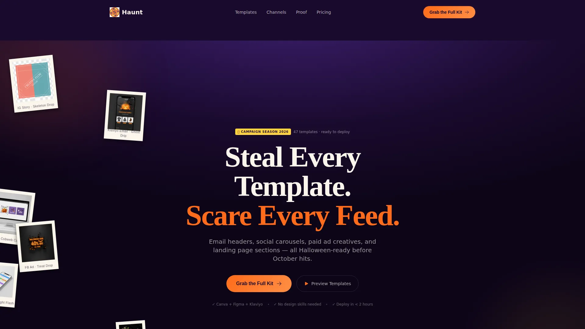
- A masonry-grid photo wall header with real in-the-wild template screenshots
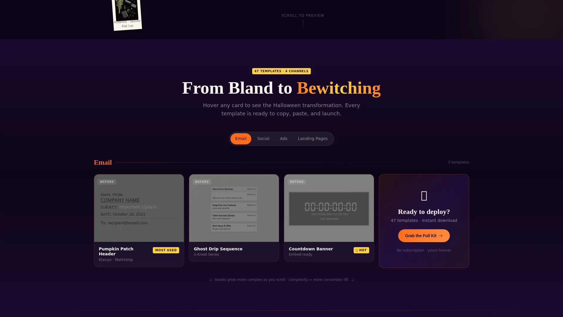
- A scrolling before-and-after comparison journey across four creative format rows
- A sticky urgency bar with a live countdown and a persistent call-to-action button
Feature list
This landing page is built from purposeful, campaign-ready components. Each feature serves a specific conversion or trust function for the visitor.
Masonry UGC Photo Wall Header
The header uses a masonry grid of tilted, shadowed screenshots showing the templates in real use contexts. Images are styled like Polaroids pinned to a wall, and a self-typing headline reads "Steal Every Template. Scare Every Feed." across the center.
Before-and-After Comparison Journey
As the visitor scrolls, each card grid row pairs a grayscale unthemed asset with its Halloween-ified full-color version. The four rows cover email headers, social carousels, paid ad creatives, and landing page sections, building stakes with each row.
Sticky Urgency Bar with Live Countdown
A persistent bar runs across the top of the page. It shows a live countdown labeled "Campaign Season Starts In" counting to October 1, a running tally of previewed templates, and the primary "Grab the Full Kit" call-to-action button in pumpkin orange.
Modular Card Grid Layout
The page is built as a card grid where each asset type lives in its own card. Cards use phantom white surfaces against a plum background, making each template easy to scan like a product on a shelf.
Social Proof Brand Logo Row
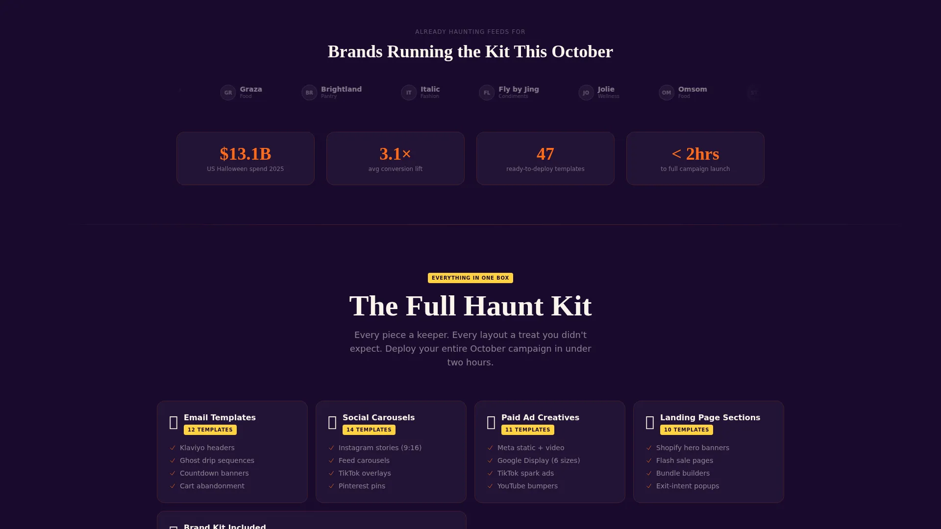
A dedicated row of brand logos shows companies already using the kit. This row appears before the primary call-to-action, giving the visitor proof that the templates perform before asking for the click.
Click-Through to Bundle Selection
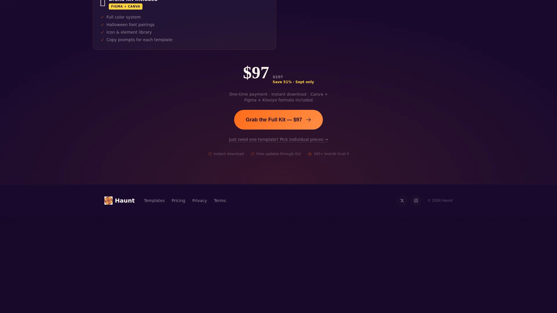
There are no form fields on this page. Every call-to-action, including the "Grab the Full Kit" button repeated on every fourth card, carries the visitor directly to a plan picker with a single-template option and an all-access bundle.
Page sections overview
| Section | Purpose |
|---|---|
| UGC Photo Wall | Hooks visitors with real template screenshots and a bold typed headline |
| Email Header Row | Compares bland grayscale email headers to Halloween-styled versions |
| Social Carousel Row | Shows before-and-after for themed social carousel assets |
| Paid Ad Row | Contrasts unthemed ad creatives with full Citrus Burst ad designs |
| Landing Page Row | Demonstrates Halloween-ified landing page section templates |
| Brand Logo Row | Builds trust with social proof before the main call-to-action |
| Sticky Urgency Bar | Holds the countdown timer and persistent call-to-action at all times |
Design & branding system
The visual identity uses the Citrus Burst color system, built to feel like biting into a clementine at a bonfire. Every color has a specific role, keeping the page focused and high-contrast throughout.
- Midnight pumpkin orange (#FF6B1A) fires up all call-to-action buttons and hover states
- Candy-corn yellow (#FFD23F) highlights badges, sale tags, and accent details
- Pitch-dark plum (#1A0A2E) dominates page backgrounds for dramatic contrast
- Phantom white (#F9F5EB) gives each template card a clean, breathable surface
Mobile & speed optimization
The card grid layout is modular by design, which keeps the page structure clean and load-friendly across screen sizes. Each section is self-contained, so the page scales well whether viewed on a laptop or a phone mid-scroll.
- Modular card structure adapts naturally to smaller screens without layout breakage
- Click-through flow removes form friction, reducing drop-off on mobile devices
How this template helps you convert
Every layout decision on this page is pointed toward one outcome: getting the visitor to click through to the bundle selection page with confidence and urgency.
- The before-and-after comparison journey makes the value of the kit immediately visible, showing the gap between a bland asset and a Halloween-ready creative in a single scroll row.
- The sticky urgency bar keeps the countdown and call-to-action in view at all times, so a visitor who is ready to act never has to scroll back to find the button.
- The brand logo social proof row appears just before the primary call-to-action, confirming that real teams use and trust the kit before the visitor is asked to buy.
Other information about this template
This template is a strong fit for retail and e-commerce brands running Halloween business campaigns. It is especially useful for businesses in food, beverage, and seasonal product categories who need ready-made October creative assets fast.
- The template style is a card grid (modular), which makes it easy to browse and compare assets
- The creative direction follows a comparison journey, a format proven to highlight upgrade value clearly
- The header concept is a UGC-style photo wall, giving the page an authentic, community-driven first impression
- The landing page direction is click-through, removing all form friction and shortening the path to purchase
- The Marketplace Grid theme makes the kit feel like a curated product catalog rather than a generic promotional page
Theme
Marketplace Grid
Creative direction
Comparison Journey
Color system
Lavender Dream
Style
Card Grid (Modular)
Direction
Click-Through
Page Sections
Masonry UGC Photo Wall Header
Before-and-after Comparison Journey
Sticky Urgency Bar with Countdown
Modular Card Grid Layout
Social Proof Brand Logo Row
Frictionless Click-through Flow
Related questions
What types of marketing assets are included in this kit?
Is there a form to fill out before accessing the templates?
How does the before-and-after comparison work on this page?
Who is this template best suited for?
What creates the urgency on this landing page?



