Senior Living Management Landing Page Template
Haven is a single-page landing page template built for senior living management companies that transform underperforming assisted living properties. It pairs cinematic before-and-after photography in a zigzag layout with a five-question property assessment tool, warm editorial design, and a conversion path that moves property owners and adult caregivers from curiosity to a booked walkthrough.
by Rocket studio
Quick summary
Haven is a visually rich, single-page landing page template designed for a senior living management company. It uses alternating before-and-after property reveals, a guided property assessment quiz, and resident testimonials to build trust with property owners, adult children, and regional operators. The design feels editorial, warm, and deliberately far from institutional.
Who this template is for
This template is built for companies in the senior living space that actively reposition and renovate assisted living properties. It speaks to the people who own those buildings and the families who choose them.
- Property owners and investors sitting on aging or underperforming assisted living assets
- Adult children researching dignified care options for an elderly parent
- Regional senior living operators whose occupancy rates are lagging behind a recently renovated competitor
What problem this template solves
Senior living management companies often struggle to communicate transformation through generic marketing pages. Prospective clients cannot picture what a renovation actually feels like, and property owners cannot quickly assess whether their asset is ready for change.
- Most templates in this category look as institutional as the buildings they describe, undermining trust before a word is read
- Property owners need a fast, personalized way to gauge whether their asset qualifies, without committing to a call too early
- Families researching care options respond to warmth and specificity, not bullet-point amenity lists
What you get with this template
You get a fully structured single-page layout that guides three distinct visitor types through a coherent, emotionally resonant journey. Every section is designed to do a specific job.
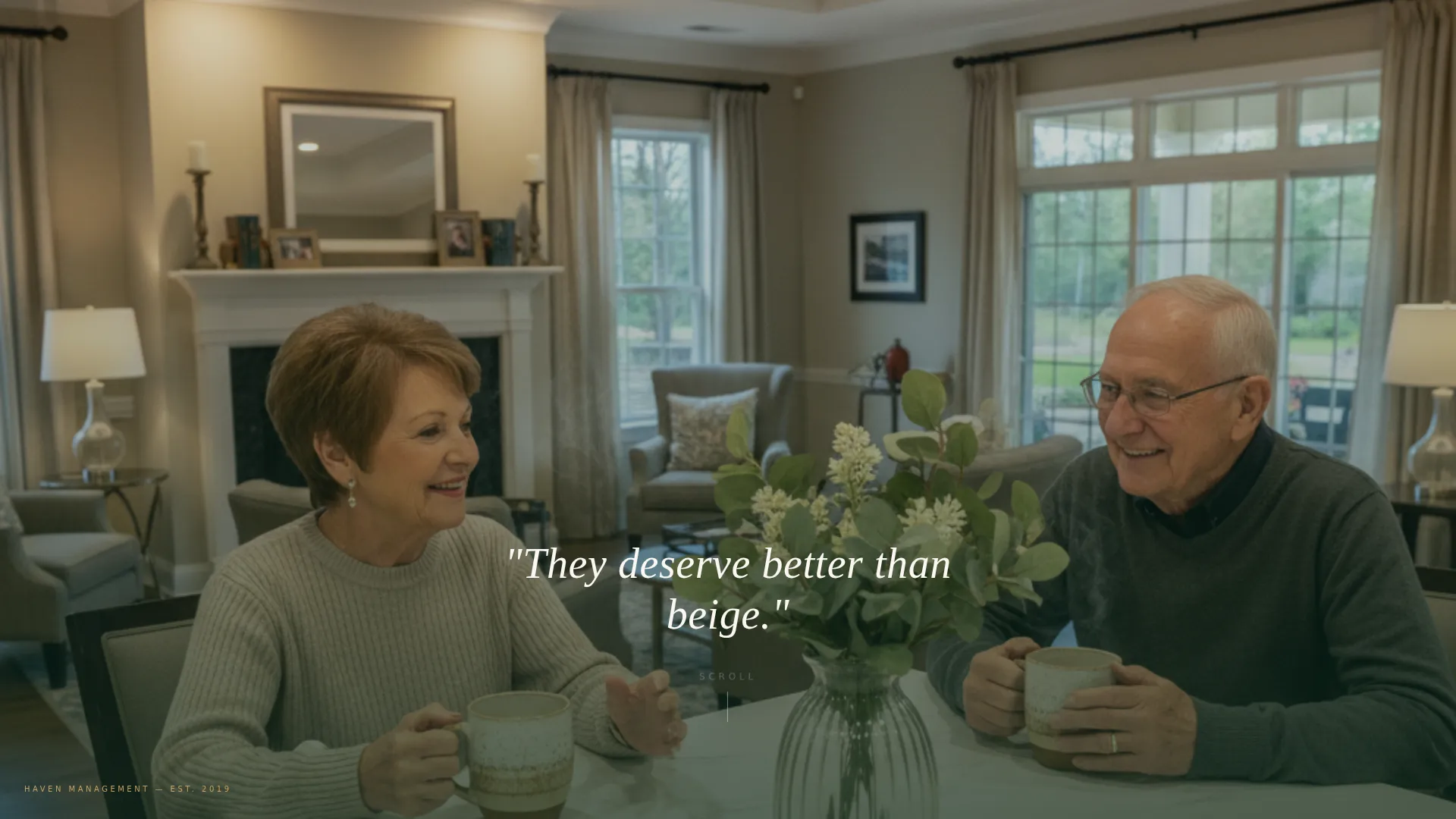
- A full-bleed editorial hero section with a single line of headline copy and a cinematic residential photograph
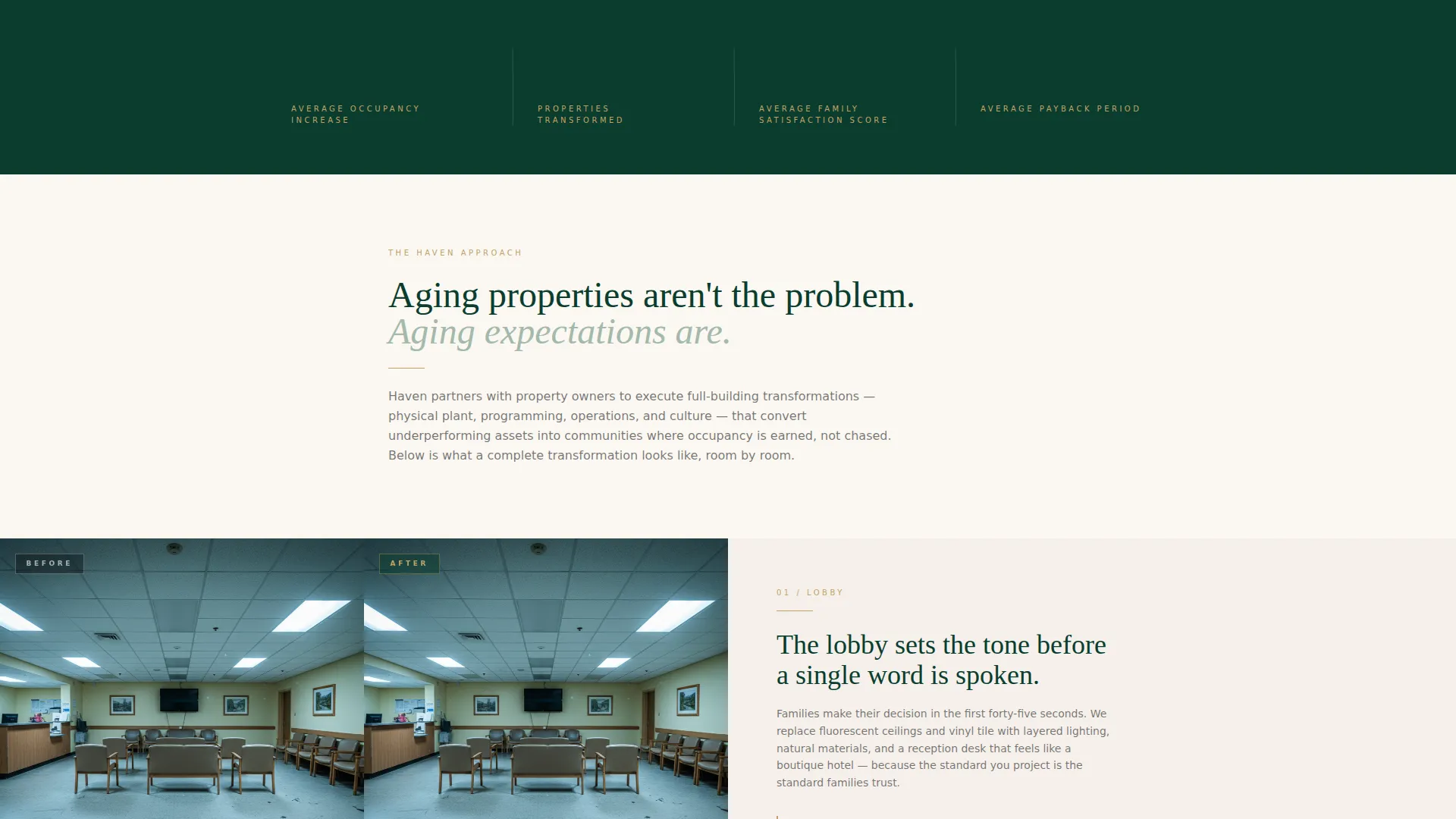
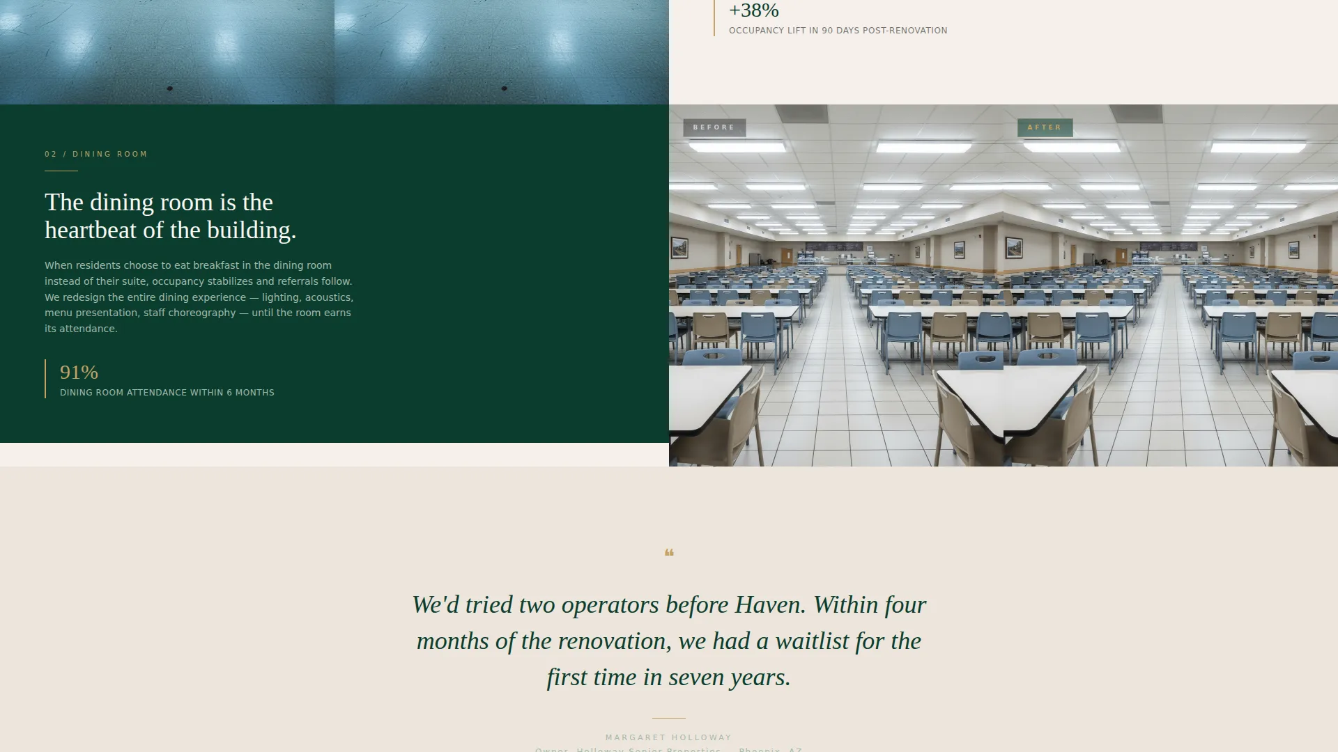
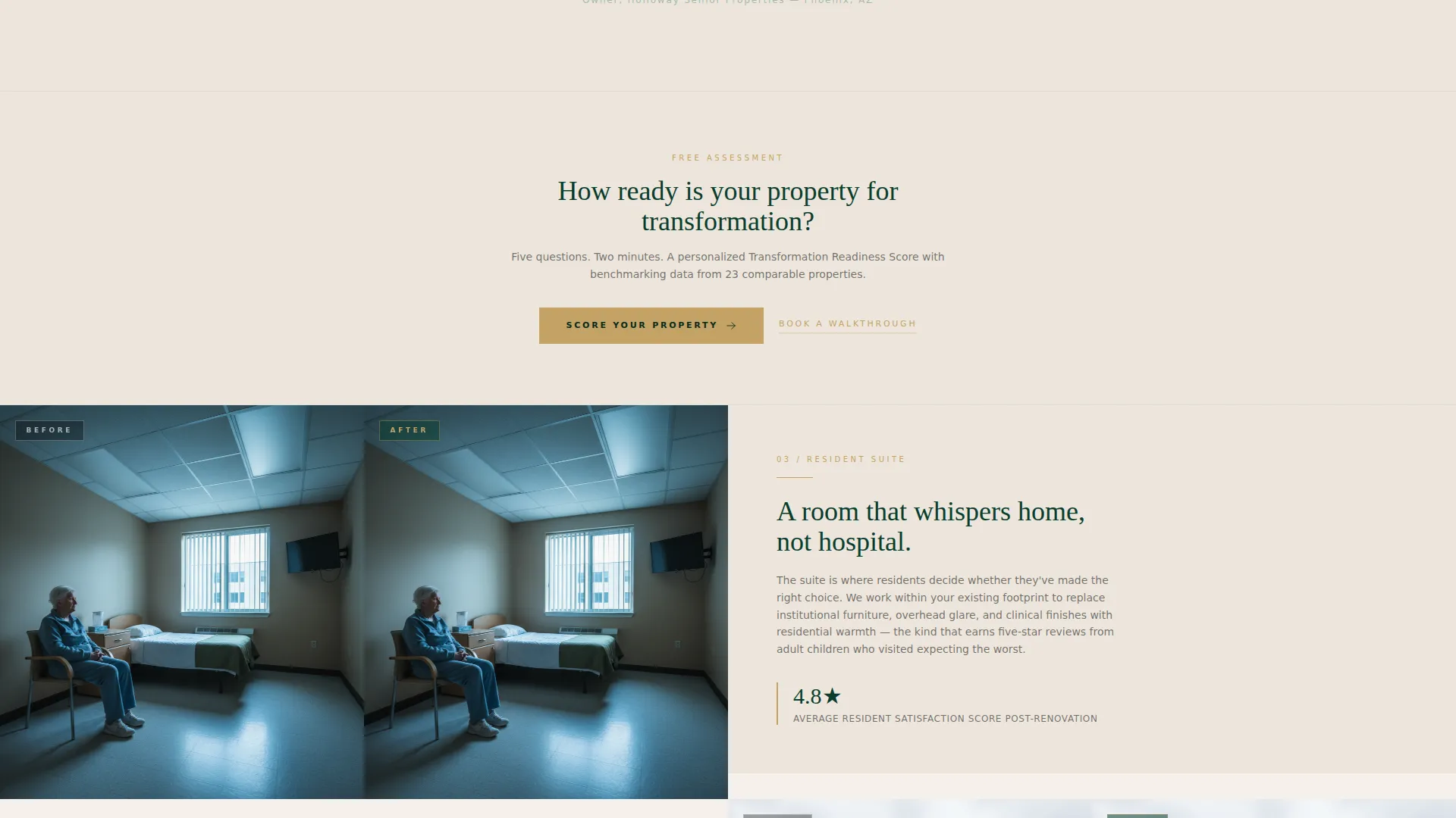
- A zigzag before-and-after photo layout covering four property spaces: lobby, dining room, resident suite, and outdoor courtyard
- A five-question progressive property assessment with a personalized Transformation Readiness Score and a secondary "Book a Walkthrough" path
Feature list
This template includes a focused set of built-in components, each designed around a specific conversion moment in the senior living management sales process.
Full-Bleed Editorial Hero
The opening viewport fills the screen with an interior photograph of a reimagined senior living common area. Afternoon light, ceramic mugs, fresh eucalyptus, and a marble coffee bar set the editorial tone before a single line of copy appears. The tagline fades in over the image in ivory type.
Zigzag Before-and-After Layout
Four property spaces are presented in alternating left-right panels. Each pair shows the same room angle before and after transformation, using natural materials, residential lighting, and curated art to tell the story visually. The eye moves across the page like reading a narrative, building emotional momentum with every section.
Resident Testimonial Breaks
Short testimonials in a handwritten-style typeface appear between property reveal pairs. These slow the scroll pace, add warmth, and provide social proof without interrupting the visual story.
Five-Question Property Assessment Quiz
The primary call to action, "Score Your Property," opens a progressive five-question assessment. Questions cover property type, number of units, current occupancy percentage, year of last renovation, and a visual card picker for the operator's biggest frustration. No email is required until the results screen.
Personalized Readiness Score Screen
The final quiz screen delivers a color-coded Transformation Readiness Score on a gauge graphic. The visitor is then invited to enter their name, email, and phone number to unlock the full benchmarking report. This gate is placed at the point of highest interest.
Dual Conversion Path
Below the quiz and anchored at the page bottom, two conversion options sit side by side. The primary path is the "Score Your Property" assessment. The secondary path is a plain "Book a Walkthrough" text link for owners who already know what they want.
Page sections overview
| Section | Purpose |
|---|---|
| Full-Bleed Hero | Sets editorial tone and emotional hook |
| Lobby Before/After | Opens the transformation story visually |
| Dining Room Reveal | Escalates the before-and-after narrative |
| Resident Testimonial | Adds warmth and social proof between reveals |
| Suite Before/After | Deepens personal connection for families |
| Outdoor Space Reveal | Completes the four-space transformation tour |
| Score Your Property call to action | First appearance of the primary conversion prompt |
| Five-Question Quiz | Progressive assessment with no early email gate |
| Readiness Score Screen | Delivers personalized result and collects lead |
| Book a Walkthrough | Secondary path for high-intent property owners |
| Bottom call to action Anchor | Repeats primary and secondary conversion options |
Design & branding system
The visual identity follows a Luxe Minimal theme. The palette feels like a private members' lounge inside a botanical conservatory: the green is composed and authoritative, the gold is restrained, and the white space carries more weight than any ornament.
- Deep evergreen (#0B3D2E) anchors headers and section backgrounds; muted sage (#A3B9AA) softens secondary panels; warm alabaster (#F5F0EB) breathes across open space
- Brushed gold (#C4A265) is used exclusively for buttons, divider lines, and interactive states, keeping the accent rare and intentional
- Typography uses a handwritten-style face for testimonials to contrast the editorial photography, while body copy stays clean and legible at every size
Mobile & speed optimization
The template is structured so that the alternating layout adapts gracefully to narrower screens. The before-and-after panels stack vertically on mobile without losing the sequential storytelling effect.
- The five-question quiz is designed as a step-by-step progressive flow, which works naturally on touch screens without requiring horizontal scrolling
- Photography-heavy sections use contained image areas so the layout does not collapse or crowd text on smaller viewports
How this template helps you convert
The page is designed around a single insight: high-value buyers in senior living need to feel something before they fill out a form. The layout earns trust visually, then asks for commitment progressively.
- The before-and-after zigzag layout builds emotional proof across four property spaces before any call to action appears, so the visitor arrives at "Score Your Property" already persuaded by what they have seen.
- The no-email-until-results quiz structure reduces friction at the point of engagement. The visitor invests five answers before the lead gate appears, which means the people who reach the results screen are genuinely interested.
Other information about this template
Haven is suited to companies operating at the intersection of property management and senior housing repositioning. The template supports a sales process where the buyer needs to visualize transformation, not just read about it.
- The template is designed as a single landing page, not a multi-page website, which keeps the conversion funnel tight and undistracted
- The "Score Your Property" quiz doubles as a qualifying tool: the answers to the five questions give the management company useful intake data before the first conversation
- The page is built for a Luxe Minimal theme, meaning the visual system is intentionally restrained so the photography does the heavy lifting rather than the layout competing with it
- The secondary "Book a Walkthrough" text link provides an exit ramp for high-intent visitors who do not need the full assessment experience
Theme
Luxe Minimal
Creative direction
Calculator/Tool First
Color system
Cloud Canvas
Style
Asymmetric Grid (60/40)
Direction
Click-Through
Page Sections
Full-bleed Editorial Hero Section
Zigzag Before-and-after Photo Layout
Resident Testimonial Breaks
Five-question Progressive Assessment Quiz
Personalized Transformation Readiness Score
Dual Conversion Path Design
Related questions
Who is this landing page template designed for?
What is the Score Your Property quiz and how does it work?
Can a visitor skip the quiz and book directly?
What does the before-and-after section show?
Is this template suitable for memory care or independent living operators?



