Singaporean Restaurant Landing Page Template
Hawker is a masonry-style landing page template built for artisan Singaporean restaurants. It combines a full-screen video hero, a Pinterest-style menu grid with hover reveals and tap-to-order tiles, an inline reservation widget, and a marquee testimonial strip. The Fire and Earth color palette and cinematic food photography give every scroll the atmosphere of a Singapore hawker stall at golden hour.
by Rocket studio
Quick summary
Hawker is a single-page restaurant template rooted in Singapore food culture. It pairs immersive kitchen video with a masonry menu grid that lets visitors browse dishes, read provenance stories, see prices, and place orders without leaving the page. The design draws visual inspiration from shophouse kitchens and hawker centres, translated into a warm, editorial layout that drives table reservations and pickup orders simultaneously.
Who this template is for
This template is built for restaurant owners and food business operators who want a landing page that earns trust before a single word is read. It suits anyone selling the experience of authentic Singapore cuisine to a digitally active dining audience.
- Fine-casual Singaporean restaurant owners seeking Saturday-night reservation traffic
- Food business operators offering pickup orders alongside dine-in service
- Designers and developers building a site for a Singapore hawker-inspired brand who need a production-ready starting board
What problem this template solves
Most restaurant websites separate the menu from the booking flow. Visitors lose interest navigating between pages. This template keeps every decision on one scrollable surface, so the food sells itself before the user even reaches the call-to-action.
- The masonry menu grid and sticky order footer reduce the steps between discovery and purchase, making it easy for visitors to act fast
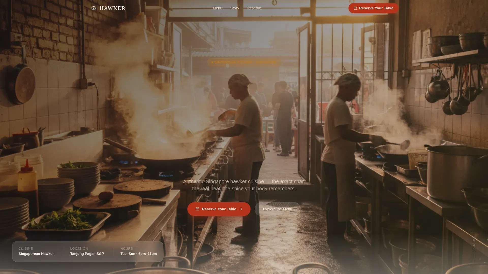
- The full-screen video hero communicates craft and atmosphere in seconds, replacing a lot of copy that most visitors skip
- The inline reservation widget removes friction by asking only for date, party size, and seating preference, so the sign-up path stays clean and direct
What you get with this template
The template delivers a fully structured, single-page layout with high interactivity and a cinematic visual identity drawn from Singapore hawker culture. Everything is organized to move visitors from appetite to action.
- A full-screen video hero section with a floating headline, followed by a masonry menu grid with hover-reveal dish details and tap-to-order tiles
- An inline reservation widget, atmospheric full-bleed interruption sections, a marquee testimonials strip, and a split-footer with logo and essential links
- A complete Fire and Earth color system, Fraunces serif display typography, and DM Sans body type, all pre-applied across every section
Feature list
The Hawker template packages several purpose-built components that work together to turn food photography into revenue. Each feature below is drawn directly from the template brief.
Full-Screen Video Hero
A slow, close-range kitchen video plays behind the headline "Fire. Spice. Soul." Warm-graded footage with shallow depth of field and low ambient audio sets the mood immediately, illustrating the craft behind each dish before the visitor scrolls.
Masonry Menu Grid with Hover Reveals
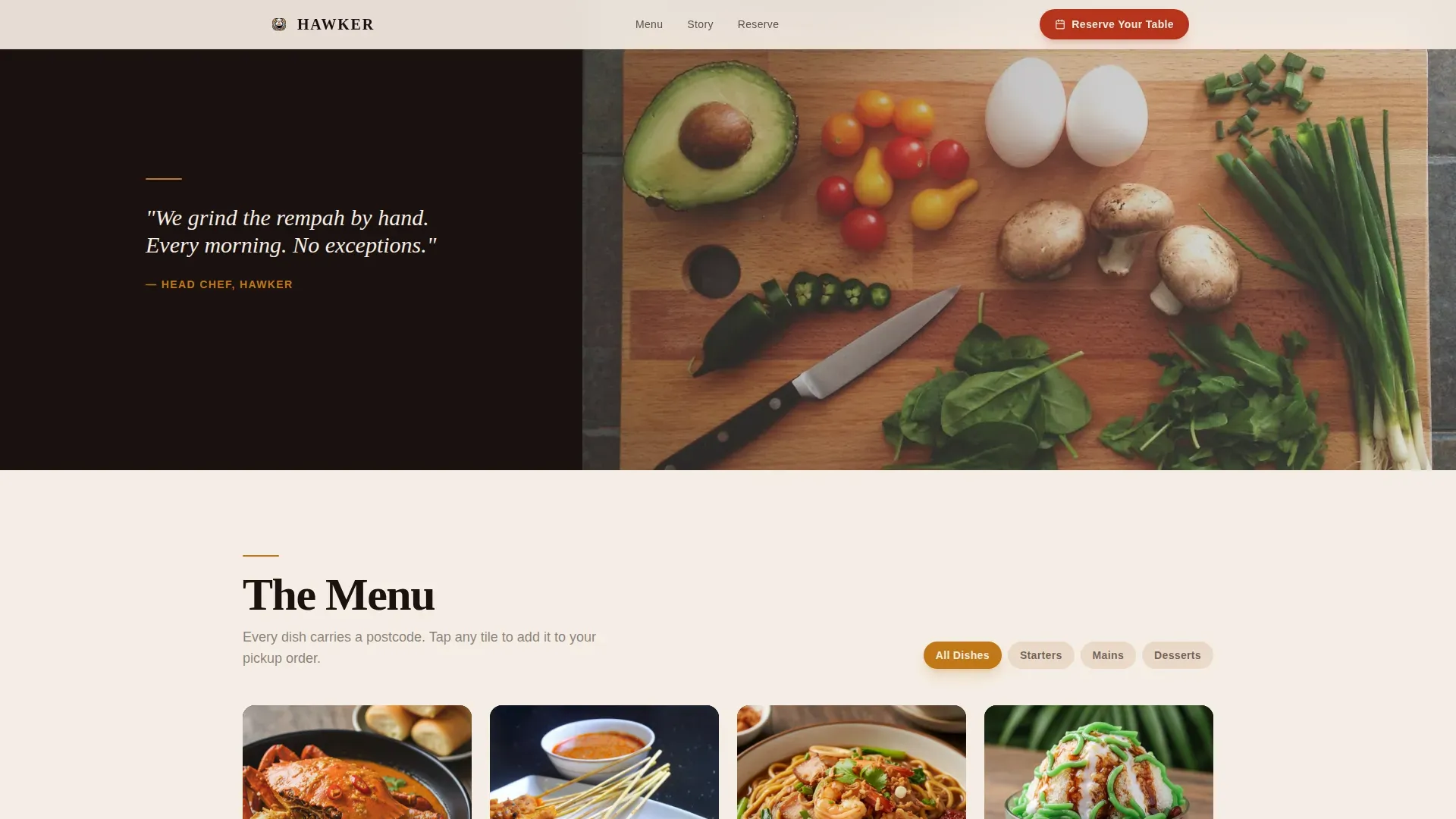
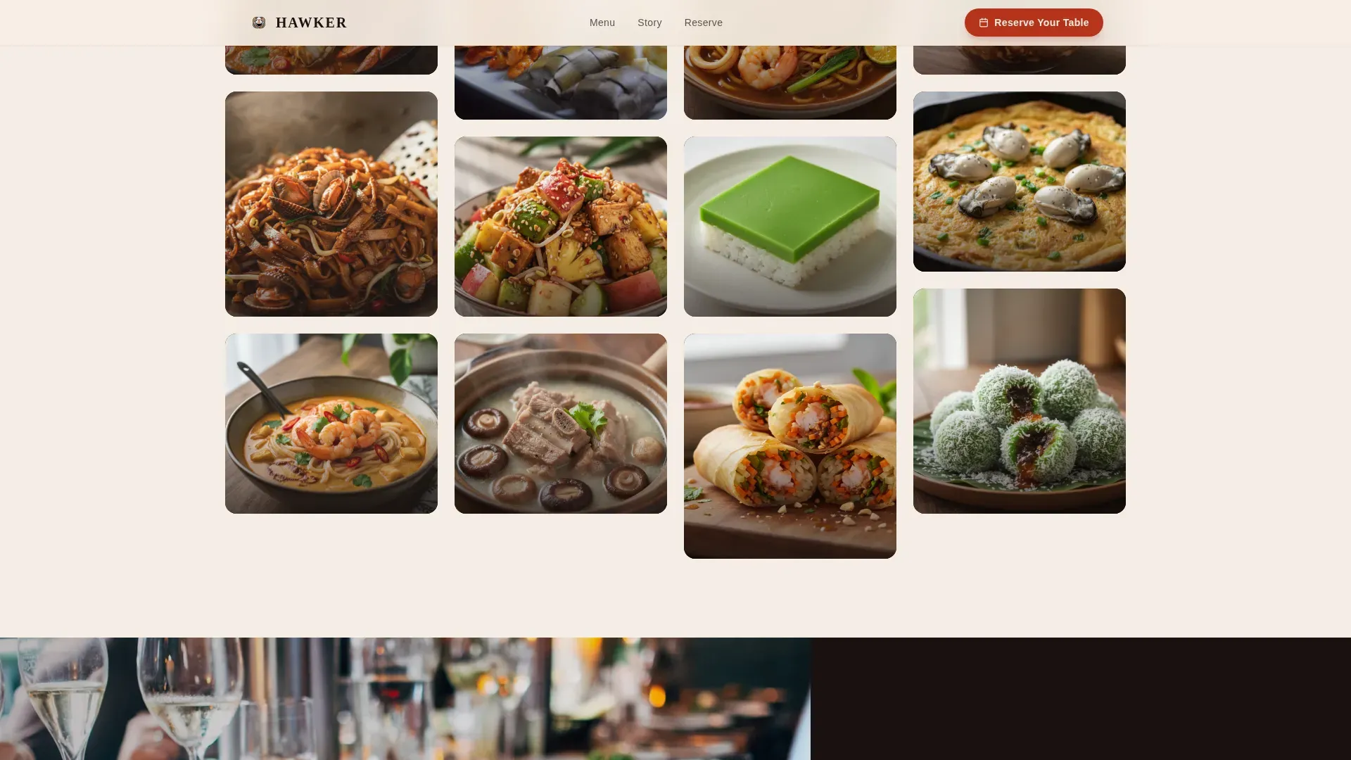
The Pinterest-style grid organizes food into appetizers, mains, and desserts using different tile sizes. Hovering any tile reveals the dish name, a one-line provenance story, and the price. The grid density shifts as you scroll, giving hero-sized views to mains and intimate square frames to desserts.
Tap-to-Order Cart System
Each menu tile is interactive. Tapping a dish lets visitors select a quantity directly. A sticky footer tallies the order in real time, keeping payments and orders visible without navigating away. The cart is built into the masonry grid itself, making pickup orders fast and easy on any device.
Inline Reservation Widget
A "Reserve Your Table" button is pinned in the navigation bar. Clicking it opens a booking form asking for date, party size, and seating preference (dining room or bar). The form sits inline on the page, so visitors never leave the site to complete a reservation.
Atmospheric Full-Bleed Interrupts
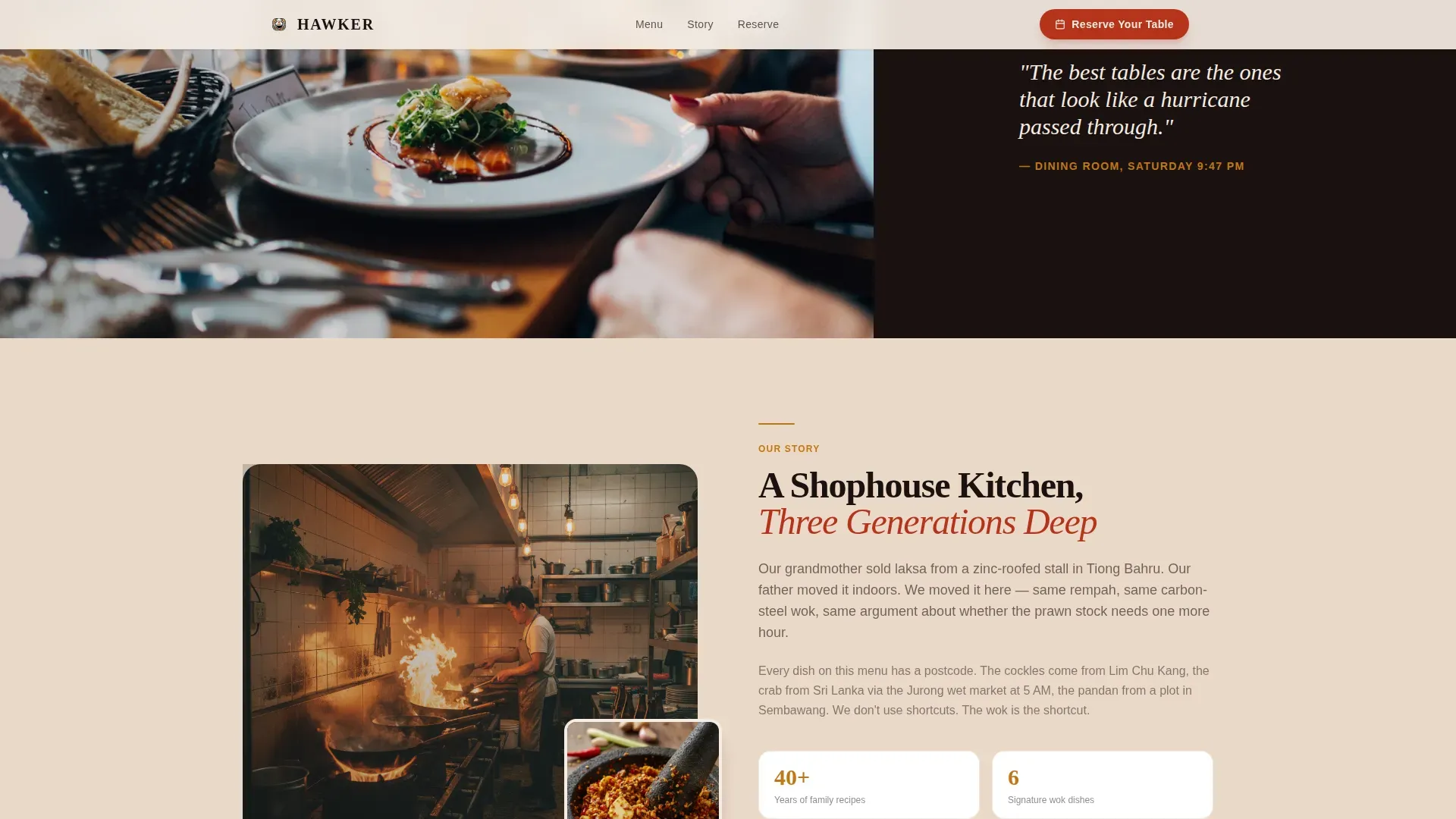
Between menu sections, full-bleed editorial photos interrupt the scroll. Shots of a mortar grinding rempah, a hand squeezing calamansi, and a crowded table of empty plates provide visual pauses. These images reinforce the food culture story and keep the scroll feeling experiential rather than transactional.
Marquee Testimonial Strip
A scroll-linked marquee displays diner quotes in a continuous horizontal band. Social proof from real diners builds credibility and trust, giving visitors confidence before they commit to a reservation or place an order.
Page sections overview
| Section | Purpose |
|---|---|
| Video Hero | Cinematic full-screen opening with floating headline |
| Masonry Menu Grid | Dish tiles with hover reveals and tap-to-order |
| Atmospheric Interrupts | Full-bleed editorial kitchen and table photos |
| Reservation Widget | Inline booking form for date and party details |
| Testimonials Marquee | Scroll-linked diner quote strip for social proof |
| Split Footer | Logo, tagline, and essential navigation links |
Design & branding system
The visual identity draws from the art of Singapore's shophouse kitchens and hawker centres. Every color and font choice is intentional, referencing the textures and tones of hand-thrown ceramics, carbon-steel woks, and pandan-steamed rice.
- Fire and Earth color system: charred wok black (#1A1110), turmeric clay (#C17817), sambal ember (#B5341B), steamed pandan leaf (#4A6741) as accent, and warm bone white (#F5EDE3) as the base, applied consistently across cards, hover states, and backgrounds
- Typography pairing: Fraunces serif for display headlines and DM Sans for body copy, creating contrast between editorial warmth and clean readability
- High-contrast color use across menu tiles and call-to-action buttons makes the design legible and memorable, sign of a layout that respects how fast people scan a food site
Mobile & speed optimization
The template is built mobile-first. Food photography and the tap-to-order system are the primary interaction layer on smaller screens. The masonry grid and sticky order footer are designed to function cleanly on any device without losing the richness of the desktop experience.
- Video is set to lazy-load, and above-the-fold images receive priority loading treatment to keep the initial display fast
- The sticky order footer keeps the running total and checkout access visible as visitors scroll through the menu on mobile
- The reservation widget and menu grid are fully usable on smartphone screens, so the business does not lose orders from mobile visitors
How this template helps you convert
The Hawker template is built around a Direct Sales direction. Every design decision, from the video hero to the masonry grid to the pinned navigation button, is aimed at shortening the distance between hunger and a confirmed reservation or completed order.
- The full-screen video hero earns attention and communicates the food story in the first few seconds, giving visitors an emotional reason to stay on the page and explore the menu
- The masonry menu grid lets visitors browse, read dish provenance, check prices, and place orders all in one continuous scroll, removing the dead clicks that cause drop-off on multi-page restaurant sites
- The pinned "Reserve Your Table" button combined with the testimonial marquee provides persistent access to booking and social proof throughout the entire scroll, so the path to conversion is always visible
Other information about this template
The Hawker template takes visual inspiration from the rich board of Singapore's hawker culture. Hawker centres in Singapore reflect the multicultural identity of the nation, and the design of this template aims to honor that culture through its food photography, typography, and color choices. Bilingual text support and local dish naming conventions fit naturally into the template structure, allowing operators to provide menu information in the format that best serves their Singapore audience.
A well-designed stall sign or menu board in a hawker centre gives patrons the information they need before they even join the queue. This template applies the same principle to the web: clear dish names, prices in a single currency, and food photos that communicate the offering instantly. The menu section is structured so that six to eight core items can anchor each category, keeping the grid easy to scan. Quality design helps visitors understand what a stall serves and builds trust before they commit to an order.
The template also draws design inspiration from effective hawker signboard principles: high-contrast colors, legible display fonts, and a visual layout that minimizes clutter to accelerate decision-making. These are the same qualities that make a sign readable from ten to twenty meters away in a crowded lane. On screen, those same principles make the menu grid scannable and the call-to-action buttons impossible to miss.
You can share the template landing page across platforms including Facebook to reach food-loving audiences in Singapore and beyond. Facebook remains an active channel for restaurant discovery, and the template's og-ready metadata fields make social sharing clean and accurate.
- The template is suitable for artisan food businesses wanting to communicate provenance, craft, and authenticity through food photography and editorial design
- Signboard design principles from Singapore hawker culture, such as sharp fonts, high contrast, and bilingual-ready layouts, are built into the template's visual structure
- The layout can support seasonal menu changes and promotional updates without structural redesign, making it a practical long-term business asset
Theme
Warm Artisan
Creative direction
Immersive Visual
Color system
Fire & Earth
Style
Masonry/Pinterest
Direction
Direct Sales
Page Sections
Full-screen Video Hero with Floating Headline
Masonry Menu Grid with Hover Reveals
Tap-to-order Cart with Sticky Footer
Inline Table Reservation Widget
Atmospheric Full-bleed Interruption Sections
Marquee Testimonials Strip
Related questions
Can I customize the menu items and prices shown in the masonry grid?
Does the template support both table reservations and pickup orders at the same time?
Is this template a good fit for a Singapore food business that is not fine dining?
How does the testimonial marquee section work?
Can I change the color palette and fonts to match my own brand?