Bold Singaporean Catering Landing Page Template
Hawker is a hero-dominant Singaporean catering landing page template built around a day-in-the-life narrative that follows one order from dawn kitchen to golden-hour close. The Organic Flow design, Sunset Mesa color palette, and Photo Grid Mosaic header work together to build appetite and trust before guiding every visitor toward the menu explorer and booking calendar.
by Rocket studio
Quick summary
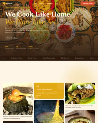
Hawker is a single-page catering template designed for authentic Singaporean food businesses. It opens with a nine-frame parallax mosaic, unfolds a day-in-the-life story across five scroll-linked sections, and closes with a warm call to action. The page earns the click by letting food photography and narrative do the convincing first.
Who this template is for
This template is built for Singaporean catering operators who serve events rather than dine-in guests. It speaks directly to the people placing the order and the people managing the event.
- Office managers booking Lunar New Year lunches, team celebrations, or company milestone meals
- Wedding planners who need a reliable satay station, banana-leaf spread, or full hawker buffet line
- Tech founders and event coordinators throwing ship-day parties where the food sets the tone
What problem this template solves
Most catering websites feel transactional. They list a menu, post a phone number, and leave the visitor cold. For a business rooted in Singapore's rich hawker culture, that approach loses the sale before the craving even starts.
- Visitors cannot picture the food at their event from a plain list alone
- Generic layouts fail to communicate the heritage and craft behind dishes like Hainanese chicken rice, laksa, or char kway teow
- There is no narrative journey to build appetite and trust before asking for the order
What you get with this template
You get a complete, scroll-driven landing page that carries the visitor from first light in the kitchen to the final thank-you moment at golden hour. Every section is designed to deepen appetite and confidence before the call to action appears.
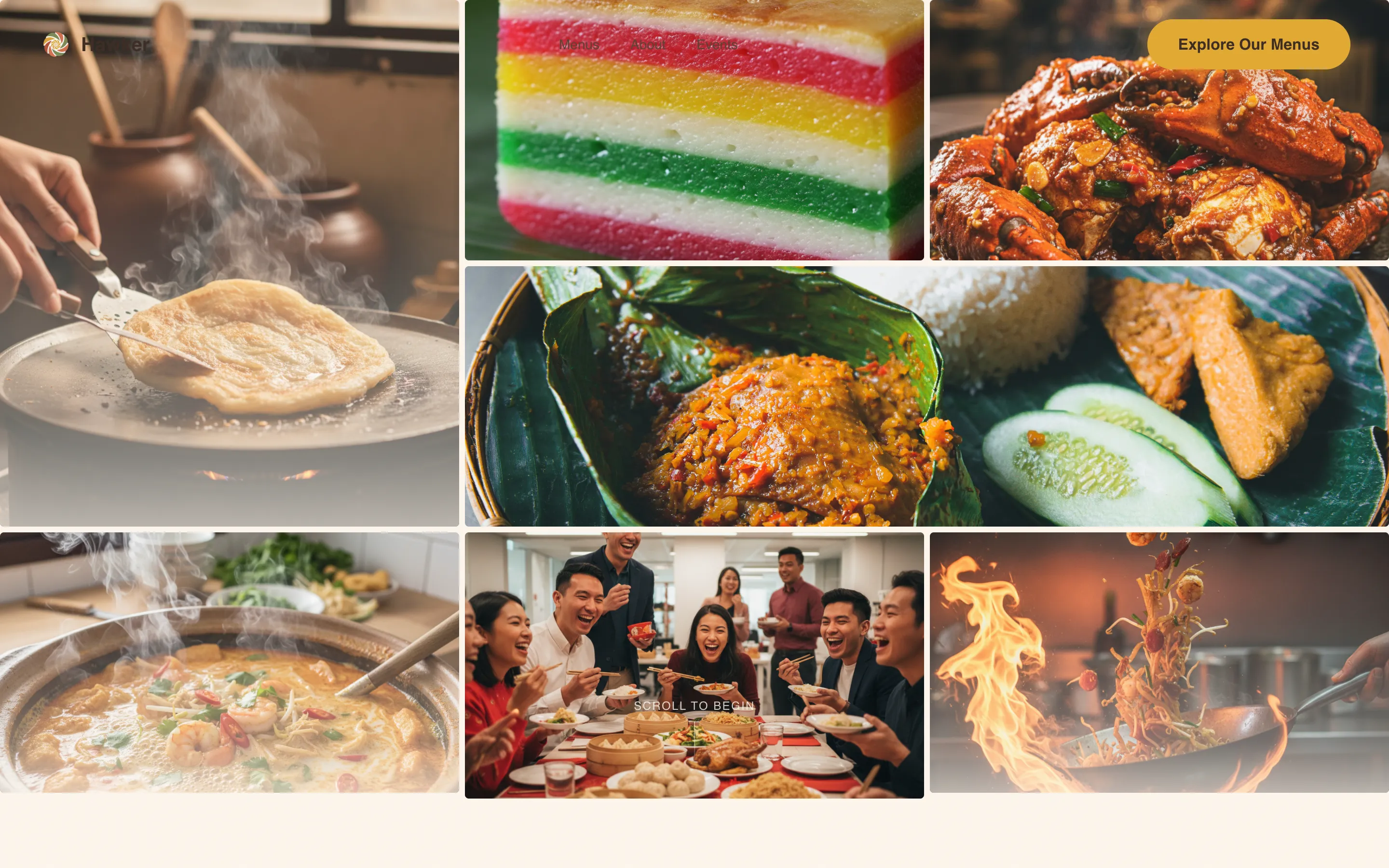
- A nine-frame Photo Grid Mosaic hero with parallax drift that collapses into a single buffet-line headline
- Five thematic content sections following the day-in-the-life arc, each blending into the next with organic curve dividers
- Three strategically placed "Explore Our Menus" calls to action, plus a secondary line that adds personality and lowers the barrier to contact
Feature list
This template is built around five prompt-defined capabilities. Each one serves a specific role in moving the visitor from curiosity to commitment.
Parallax Photo Grid Mosaic Header
Nine irregularly sized frames fill ninety percent of the viewport at load. Each frame holds a tight, steam-visible food shot: hands pulling roti prata, a cross-section of kueh lapis, glistening chilli crab claws, and laughing guests mid-bite. On scroll, the tiles parallax-drift like rising steam before collapsing into a single hero image with the headline fading in over a fully dressed buffet line.
Day-in-the-Life Scroll Narrative
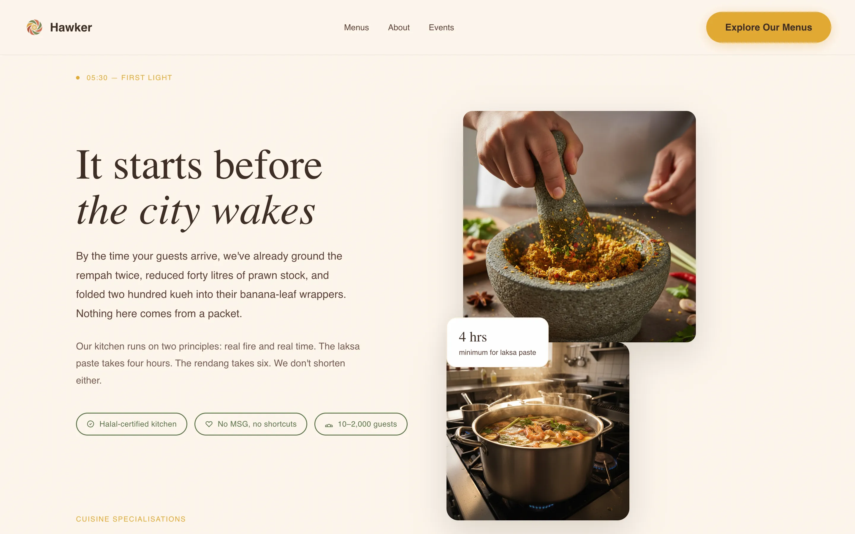
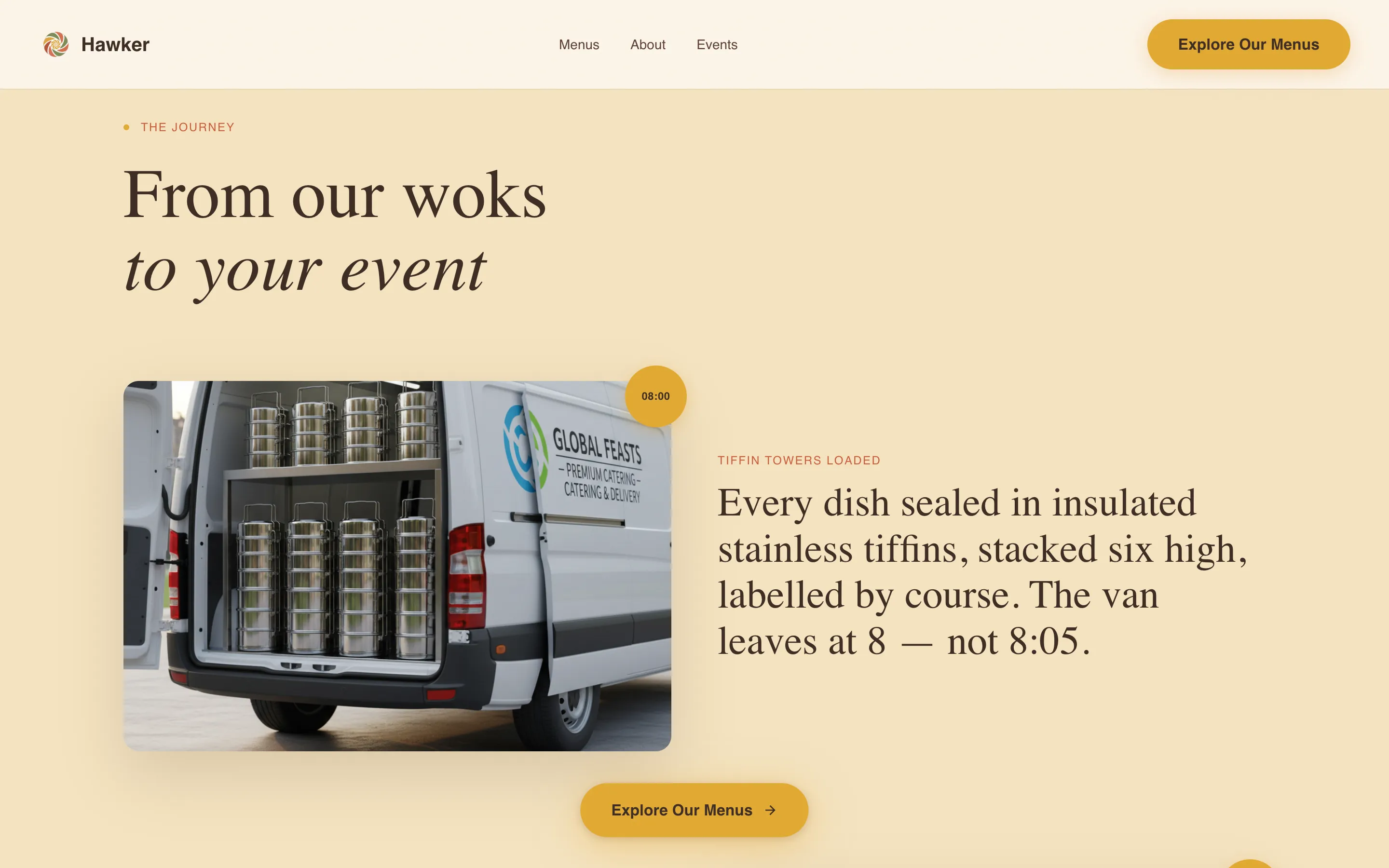
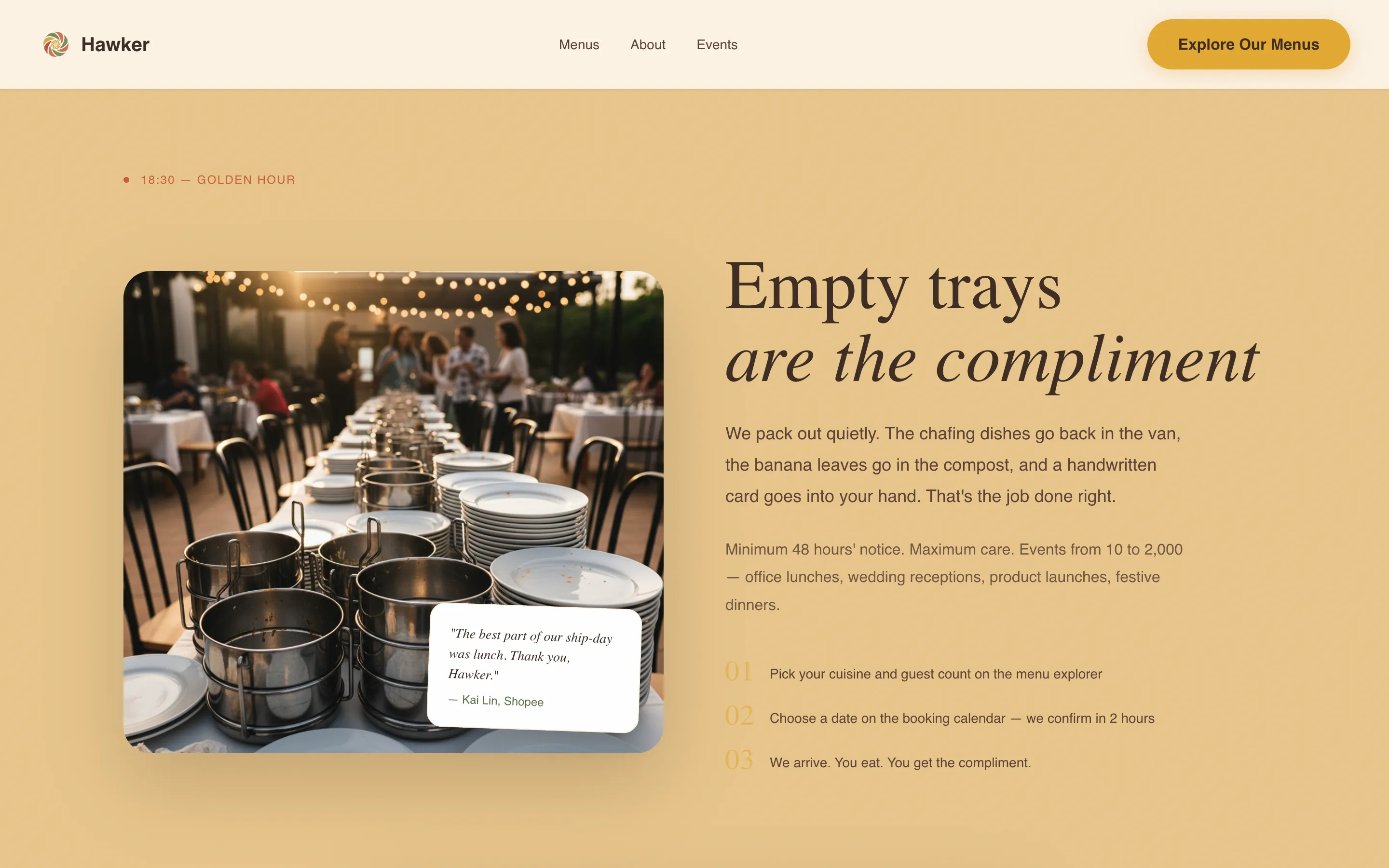
The page follows one catering order across five sections: dawn spice grinding, mid-morning tiffin loading, noon event setup, afternoon peak service, and evening close. Each section bleeds into the next using organic curve dividers rather than hard edges. The background warmth deepens from rice-paper white to turmeric to sambal as the day progresses, giving the scroll a natural rhythm that feels lived-in rather than produced.
Floating and Repeated Call-to-Action System
The primary call to action, "Explore Our Menus," appears first as a floating button after the mosaic settles, then repeats at the midday setup section and again at the golden-hour close. A secondary line beneath each instance adds warmth and personality. No form sits on this page; every click leads to the menu explorer where visitors can filter by event size, cuisine category, and dietary needs.
Sunset Mesa Color Progression
The color set moves intentionally through the page. Turmeric gold lights up calls to action and hover states. Sambal blush marks section transitions. Pandan leaf accents testimonials and trust badges. Coconut husk brown grounds the typography. Rice-paper white breathes across backgrounds so the food photography carries the visual weight without competition.
Fraunces and DM Sans Typography Pairing
Fraunces, a high-contrast serif display face, handles all headline text. DM Sans covers body copy and supporting information. The pairing balances the warmth of a handwritten market sign with the clarity needed for scanning a menu or reading a testimonial at a glance.
Page sections overview
| Section | Purpose |
|---|---|
| Hero Mosaic Grid | Nine-frame parallax opening that collapses into the buffet-line headline |
| Dawn Kitchen Scene | Establishes authenticity through spice grinding and stock-reducing visuals |
| Tiffin Journey | Shows reliability and scale through branded van and stacked tiffin tower imagery |
| Event in Full Swing | Delivers social proof with guest photography, satay stations, and banana-leaf platters |
| Golden-Hour Close | Final narrative beat with empty trays, thank-you card, and closing call to action |
| Footer Flow | Horizontal footer pattern with essential contact and navigation information |
Design & branding system
The Organic Flow theme draws from the feeling of walking through a wet market at golden hour. Steam, warmth, and unhurried energy inform every layout decision. No hard grid lines interrupt the scroll.
- Color palette: turmeric gold (#E2A832), sambal blush (#C95D3A), pandan leaf (#5A7247), coconut husk brown (#3E2C23), and rice-paper white (#FDF6EC)
- Typography: Fraunces serif for display headings, DM Sans for body text, keeping every word easy to read at any size
- Visual style: organic curve section dividers, scroll-linked color warmth progression, hover states on food images, and GPU-accelerated parallax transforms
Mobile & speed optimization
The template is designed desktop-first to match how office managers and event planners typically research catering services during work hours. Mobile rendering is fully considered for on-the-go checks.
- Image lazy loading is built into the mosaic grid so the nine-frame header does not delay the initial page load
- GPU-accelerated transforms power the parallax and scroll-reveal animations to keep motion smooth across devices
- The floating call-to-action button repositions cleanly on smaller screens so the primary action stays visible at all times
How this template helps you convert
This template does not ask for commitment before it earns it. The day-in-the-life structure builds craving section by section, so by the time the final call to action appears, the visitor already feels connected to the food and the experience.
- The mosaic hero creates immediate visual impact, pulling the visitor into the story before a single word of copy is read, which reduces early bounce and builds time on page
- The three-point call-to-action placement, at the mosaic settle, the noon setup, and the golden-hour close, catches visitors at natural decision moments in the scroll without feeling pushy or repetitive
- The click-through destination, a filterable menu explorer covering Peranakan, Malay, Chinese, and Indian-Singaporean cuisine options, lets each visitor self-select their relevant category and reach an order decision faster
Other information about this template
This template sits at the intersection of food storytelling and catering services conversion. It is designed with the specific rhythms of Singapore's hawker culture in mind, where the oldest stalls earn loyalty through consistency and craft, not advertising copy.
- Catering landing page templates work best when menu information, pricing context, and clear calls to action are all present. This template is structured to set up that flow before handing off to the menu explorer.
- Hawker chefs often offer personalized services for home events and can recreate heritage dishes that reflect Singapore's diverse culinary culture. This template gives that offer the visual home it deserves.
- The page is designed to communicate the world of a Singapore hawker stall, where long queues form at the most popular stalls because the food is worth the wait. That same sense of demand and authenticity translates into the imagery and narrative tone throughout.
- Singapore's hawker culture spans Chinese, Malay, Indian, and Peranakan food traditions. The menu explorer linked from this page is where visitors determine their cuisine focus and event needs.
- The Hawker Bold Singaporean Catering Landing Page Template is fully customizable. You can update the logo, color values, headline text, and food photography to match your specific brand and the events you serve.
- If you operate multiple stalls or a catering arm located across different parts of Singapore, the footer and navigation are easy to adapt to store additional location or contact information.
- Event planners who visit this site during peak booking periods, such as the weeks before Lunar New Year or the night before a major conference, will find a page built to answer their most frequently asked questions through imagery and narrative rather than a wall of text.
Theme
Organic Flow
Creative direction
Day-in-the-Life
Color system
Sunset Mesa
Style
Hero-Dominant (90/10)
Direction
Click-Through
Page Sections
Nine-frame Parallax Mosaic Hero
Day-in-the-life Scroll Narrative
Three-point Call-to-action Placement
Sunset Mesa Color Progression
Fraunces and DM Sans Type Pairing
Social Proof and Trust Badge Sections
Related questions
Can I customize the food photography in this template?
Does this template include a booking or order form?
Is this template suitable for catering services offering multiple cuisine types?
How does the day-in-the-life section order work?
Can I adapt this template for a catering business with multiple stall locations?