Luxe Minimal Origin Story Landing Page Template
Hawker is a single-page, card-grid landing page built for a third-generation Singaporean hawker stall. It uses an Origin Story creative direction, a Parchment and Rust color system, and a Macro Close-Up hero to pull visitors through six emotionally charged sections toward one clear action: joining the pre-order queue. No forms, no clutter, just craft, memory, and a button that earns its click.
by Rocket studio
Quick summary
Hawker is a luxe minimal, modular landing page that tells the story of a third-generation Singaporean hawker stall from the first pushcart to the Michelin mention. The page is built around a single call-to-action, a floating "Join the Queue" button, and an asymmetric bento-grid narrative that turns every scroll into a chapter of lived culinary history.
Who this template is for
This template speaks directly to food and beverage operators who have a story worth telling and a queue worth protecting. It works best when the brand carries genuine heritage, and when visitors arrive already curious, needing confirmation, not education.
- Heritage food and beverage businesses that serve a loyal, returning customer base and need a page that earns trust before it asks for a click.
- Hawker stall owners, supper club operators, and specialty food makers who want a direct-to-consumer pre-order or reservation page without the overhead of a full website build.
- Food entrepreneurs and culinary creatives who understand that strong visual storytelling and emotional copy convert browsers into regulars, and who want a template capable of doing that work at a premium level.
What problem this template solves
Most food and beverage landing pages feel like menus with a contact form bolted on. They list dishes, post a phone number, and wait. That approach fails the hawker stall model, where the craft, the family, and the story are the actual product. Without a structured narrative, potential customers, whether expat families, office workers from Tanjong Pagar, or visiting food journalists, land on the page and leave without feeling anything.
- The template replaces passive menus with a scroll-driven origin story that moves visitors through time, building emotional investment before any ask is made.
- It removes the friction of forms and multi-page navigation, replacing them with a single intent-capture click that sends visitors directly to a booking platform, cutting the distance between craving and commitment.
- It gives solo operators and small teams a polished, high-conviction presence that holds its own alongside well-funded restaurant groups, so the stall's reputation is protected and its story is told at the right register.
What you get with this template
The template is a complete single-page layout with six purpose-built sections, a carefully defined visual identity, and all interactions wired for mobile-first discovery. Every component is designed to serve the origin story arc from the opening hero frame to the final call-to-action card.
- A full six-section page structure: Hero, Origin Story Bento Grid, Craft Menu Showcase, Queue Social Proof, Final Chapter with anchored call-to-action, and a minimal horizontal footer.
- A Parchment and Rust color system with four defined values, a two-typeface typographic pairing of Fraunces serif headlines and DM Sans body text, and GSAP ScrollTrigger animations including clip-path reveals, staggered card entries, and a floating button that appears after the third card.
- A mobile-first layout with native smooth scroll, lazy-loaded images, and GPU-accelerated transforms, built for the commuter who discovers the stall on a phone between MRT stops, not just the desktop user who has time to sit with the story.
Feature list
This section takes a closer look at the core capabilities built into the Hawker template. Each feature is drawn directly from the project brief and reflects what the layout is actually capable of delivering.
Macro Close-Up Cinematic Hero
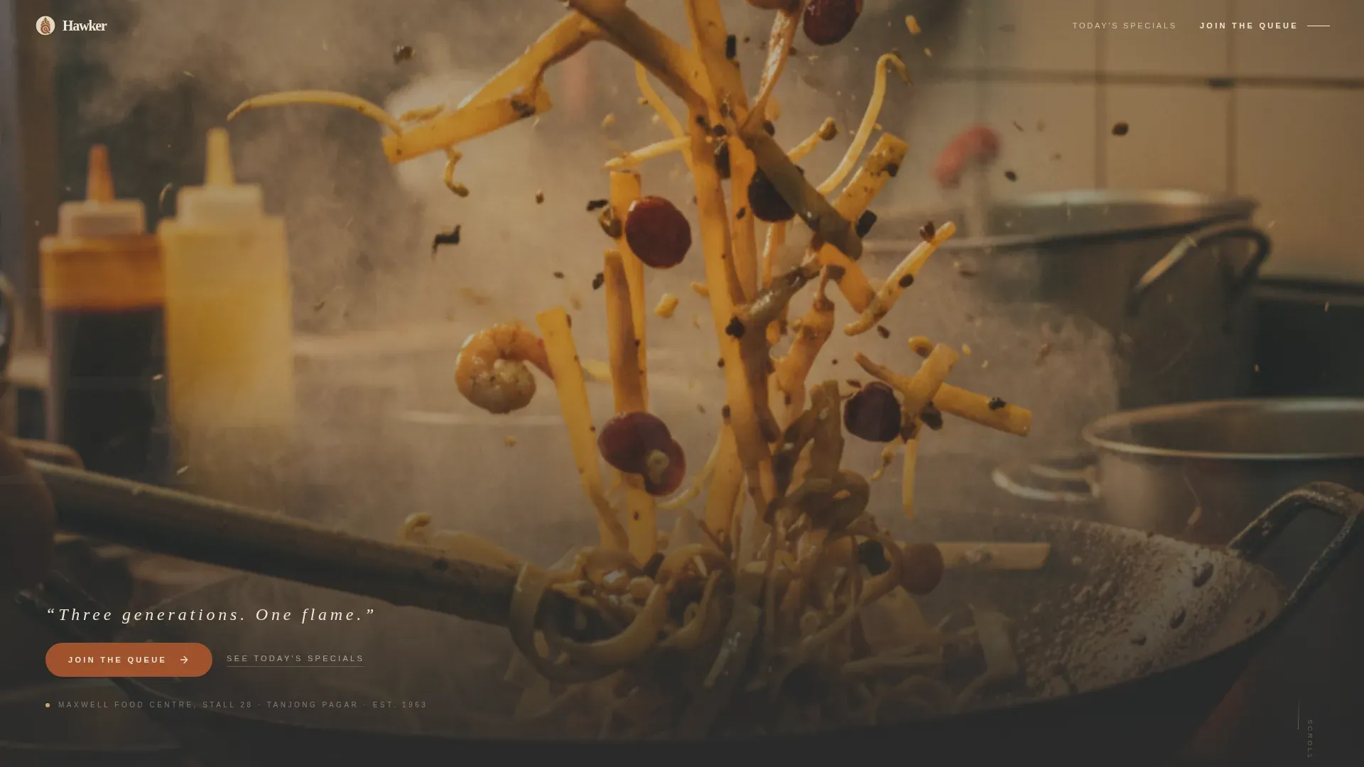
The hero section uses a full-bleed, tightly cropped photograph of char kway teow mid-toss, individual noodle strands suspended in wok smoke, edges caramelized to black, grease catching light like lacquer. After a two-second hold, a single line of hand-set serif type fades in at the bottom: "Three generations. One flame." A secondary text link, "See Today's Specials," sits beneath the hero for returning visitors who already know the story and just need today's menu. The hero does not breathe. It fills every pixel with intent.
Asymmetric Origin Story Bento Grid
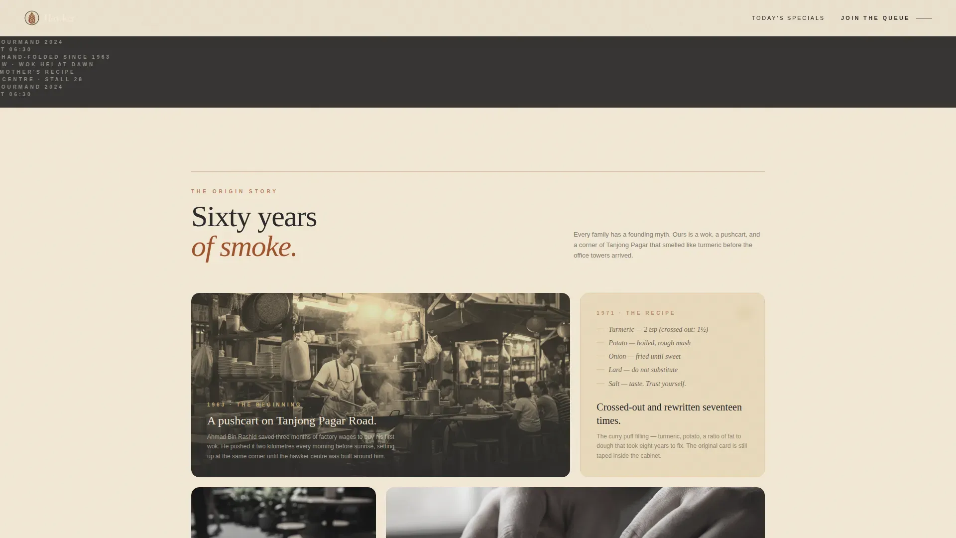
The bento grid is the narrative engine of the page. It arranges modular cards in an asymmetric layout, with each card acting as a chapter in the stall's history. Cards alternate between full-bleed food photography and intimate family artifacts: a sepia-toned 1960s photograph of the founder's first pushcart, a handwritten recipe with crossed-out measurements, the moment the Michelin inspector's photograph surfaced online. The rhythm accelerates toward the present, ending with a close-up of hands that echo the founder's. Every card takes the visitor one step deeper before the call-to-action appears.
Floating and Anchored Call-to-Action System
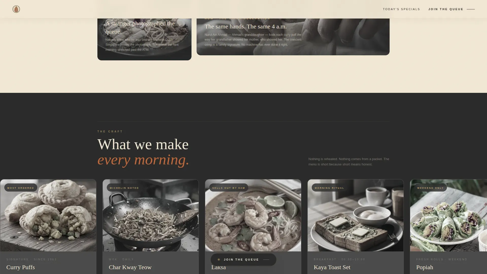
The primary call-to-action, "Join the Queue," is placed twice and with deliberate intent. It appears first as a floating button that surfaces after the third bento card, once the visitor has seen enough of the story to feel the pull. It anchors again at the bottom of the Final Chapter card, framed by a close-up of working hands. There is no form on the page. The click carries intent directly to an external booking platform. This approach focuses the entire page service on a single conversion goal without distracting the visitor.
Horizontal Scroll Craft Menu Showcase
The Craft section is a horizontal scroll gallery of food photography cards. Each card is a close-up study of a single dish, the kind of image that makes you aware of waiting for your own plate. The horizontal format rewards deliberate engagement and keeps the page's vertical momentum intact. Visitors who scroll through the menu cards arrive at the social proof section already primed, having spent time with the food before reading what others say about it.
Snap-Scroll Social Proof Queue Section
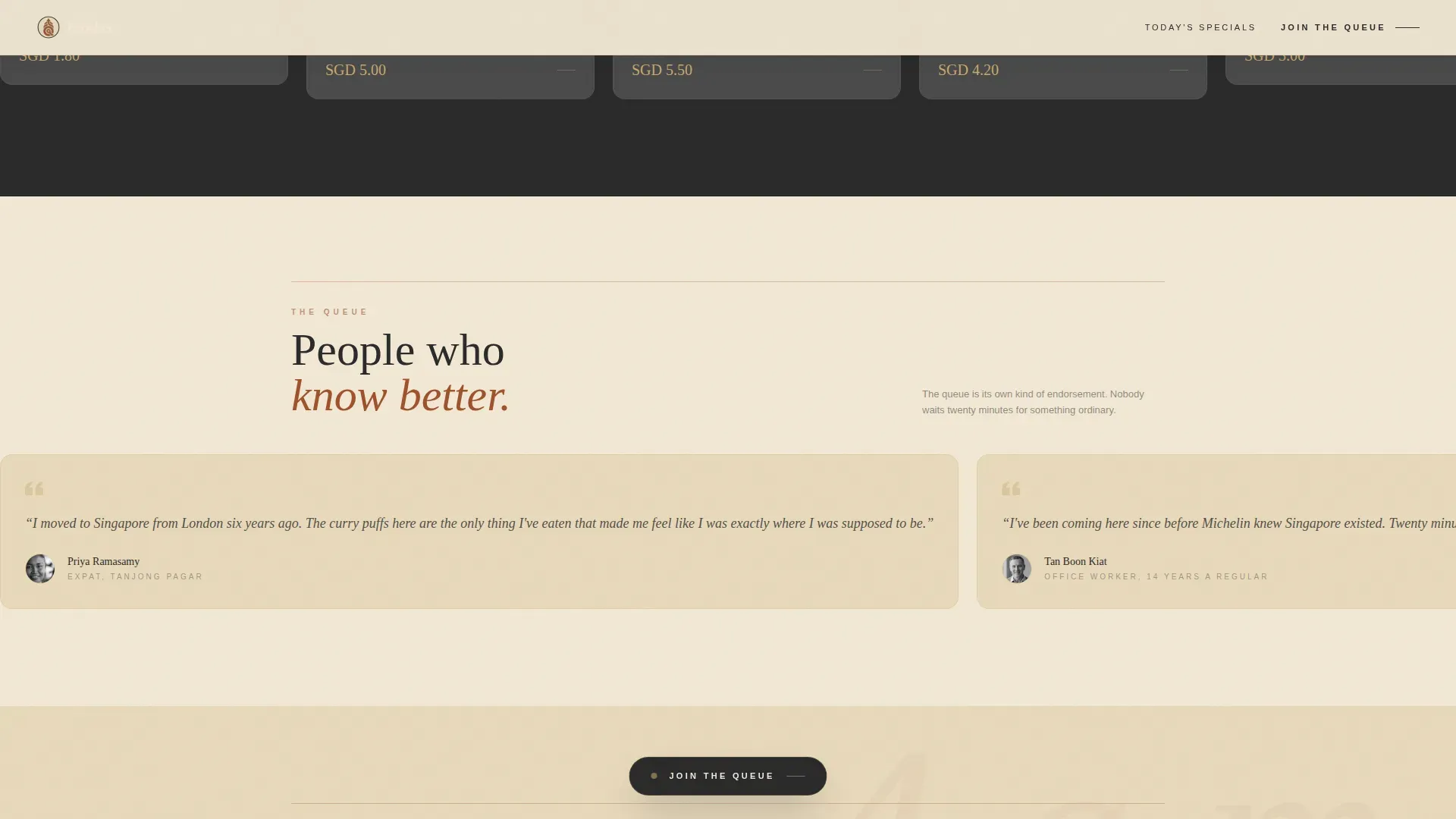
The Queue section delivers social proof through a horizontal snap-scroll carousel of testimonials from regulars. Including testimonials on origin story landing pages can validate a brand's journey and mission, and here, the queue itself becomes part of the proof. A twenty-minute wait in the CBD is not a complaint; it is a credential. The section frames waiting as a signal of worth, not an inconvenience, and reinforces the decision to pre-order before the visitor reaches the final card.
GSAP ScrollTrigger Animation System
The page uses GSAP ScrollTrigger to choreograph every transition. Clip-path reveals uncover cards as they enter the viewport. Staggered card entries give the bento grid a page-turning quality. The floating call-to-action button lifts subtly on hover using a brass accent state. GPU-accelerated transforms ensure that the animation layer feels considered, not performative. The result is a page that moves like a family album being opened, not a website being loaded.
Page sections overview
| Section | Purpose |
|---|---|
| Hero Full-Bleed | Establishes atmosphere with a macro food photograph and a delayed serif tagline |
| See Today's Specials | Gives returning visitors a direct path to the current menu without re-reading the story |
| Origin Story Grid | Narrates the stall's 60-year history through alternating photography and artifact cards |
| Craft Menu Showcase | Presents signature dishes through a horizontal scroll food photography gallery |
| Queue Social Proof | Reinforces trust through snap-scroll testimonials from regulars and the Michelin mention |
| Final Chapter call to action | Closes the story with a hands close-up and the anchored "Join the Queue" button |
| Minimal Horizontal Footer | Provides essential contact and location details without breaking the page's visual register |
Design & branding system
The Hawker template follows a Luxe Minimal philosophy: fewer elements, higher quality at every point of contact. The design philosophy follows the "less is more" principle, focusing on a small number of high-impact components rather than filling the page with noise. The Minimalist-Luxe movement emphasizes quality over quantity, and this template uses that low-key luxury approach as its primary signal of confidence. The result feels like a recipe card left on a kitchen shelf for forty years, oil-spotted, tea-stained, deeply trusted, displayed under gallery lighting.
- Color system: aged parchment (#F2E8D5) as the dominant background, oxidized rust (#A0522D) on all headlines and key accents, charcoal soot (#2B2B2B) for body text, and muted brass (#C9A96E) for interactive hover states and card borders. The palette is monochromatic with accents, creating a calming, professional register that does not compete with the food photography.
- Typography: Fraunces serif for all headlines (bold and authoritative) paired with DM Sans for body text (clean and functional), ensuring readability at every size and screen density. The pairing signals both editorial quality and practical clarity.
- Strategic whitespace guides the visitor's eye toward the call-to-action at each stage of the scroll. High-quality, singular, high-resolution images establish the premium luxe feel the template is designed to deliver.
Mobile & speed optimization
The Hawker template is built mobile-first, reflecting where hawker stall customers actually discover food, on a phone between MRT stations, not at a desktop during a lunch break. The layout and interaction system are designed for that context: fast to scan, easy to tap, and rewarding to scroll through even on a slower connection.
- Native CSS smooth scroll handles vertical momentum without JavaScript overhead, keeping the experience fluid on mid-range Android devices as well as premium handsets. Images are lazy-loaded so the page does not wait for off-screen assets before becoming interactive. GPU-accelerated transforms ensure that GSAP animations run on the compositor thread, reducing the chance of dropped frames during scroll.
- The floating "Join the Queue" button is sized and positioned for thumb reach on mobile viewports. The horizontal scroll sections use snap-scroll behavior so swipe gestures feel intentional rather than accidental.
How this template helps you convert
Minimalist landing pages focus on simplicity and clarity to enhance user experience, and effective minimalist landing pages use a single call-to-action to guide users toward a specific goal. The Hawker template is built entirely around one conversion outcome: the click to the pre-order or reservation platform. Every design and content decision serves that goal. By the time a visitor reaches the "Join the Queue" button, the page has done the emotional and informational work so completely that skipping the queue would feel like disrespecting the craft.
- The origin story arc builds emotional investment before any ask is made. Visitors move through six decades of family history, sepia photographs, handwritten recipes, a Michelin moment, so the call-to-action arrives as a natural conclusion rather than an interruption. Origin story landing pages enhance customer trust and loyalty precisely because they communicate mission and values through personal anecdotes rather than marketing claims. Visual storytelling elements are embedded in every card, and the page earns the click rather than demanding it.
- The single call-to-action removes decision paralysis. There is no form on the page, no secondary offer to dilute intent, and no navigation pulling the visitor sideways. The floating button appears at the exact moment the story has built enough momentum, after the third bento card, and the anchored button at the Final Chapter closes the loop. Using whitespace effectively ensures the call-to-action is always the most prominent element on screen at the moment it matters. A/B testing the button placement and copy against your specific audience can help refine performance over time, since optimizing even minimalist pages benefits from iterative testing.
- Social proof is woven into the scroll rather than isolated on a separate page. The Queue section uses real testimonials and frames the queue length itself as evidence of worth. The Michelin Guide mention appears as a card within the origin story, not a badge bolted to a header. Including testimonials in this way validates the brand's journey and makes the social proof feel discovered rather than declared.
Other information about this template
The Hawker template is one example of how a "Luxe Minimal" template serves high-end brands that need a clean, sophisticated, and high-conversion presence. A "Luxe Minimal" template is designed for brands that refuse to sacrifice quality for speed to market, the aesthetic signals exclusivity through restraint. Common use cases for Minimalist-Luxe templates include boutique hotels, high-end e-commerce, luxury real estate, and professional creative services, though the Hawker template is purpose-built for the food and beverage niche.
The origin story format is not exclusive to heritage food businesses. Tech and SaaS companies have found that origin story landing pages connect with audiences in ways that feature lists alone cannot. An effective origin story landing page can enhance customer trust and loyalty across industries by communicating mission and values through narrative rather than specification. This template is structured so that the story sections can be adapted to other heritage or founder-led brands without rebuilding the layout.
This template was generated through a vibe coding workflow, a process that allows users to create production-ready applications using natural language prompts instead of traditional coding skills. Vibe coding allows users to describe what they need in plain language, and AI-powered tools handle the build. No-code and low-code platforms enable users to build scalable and maintainable applications quickly, and users of these platforms can go from idea to live app without traditional programming. The platform handles backend integrations and deployment automatically, so operators can focus on the story, not the stack.
- The template is purpose-built as a single-page, click-through landing page and does not include multi-page navigation, a built-in menu management system, or an on-page checkout flow. The booking and pre-order experience happens on an external platform reached via the call-to-action click.
- The color system, typeface pairing, and section structure are defined in the template but are designed to be adapted. Operators can update the parchment and rust palette to match their own brand values while preserving the structural logic that makes the page convert.
- The animation system uses GSAP ScrollTrigger with clip-path reveals and staggered entries. Teams reviewing the template should ensure their target audience's devices support the animation layer, and should set a sensible fallback for users who prefer reduced motion.
- The page takes a deliberate stance on social proof: the queue, the testimonials, and the Michelin card work together as a layered trust system. Each element needs to be populated with real content to protect the credibility the layout is designed to project.
- Staff responsible for updating the template's photography and testimonial content should treat those assets as primary brand materials. The page's visual quality depends on high-resolution, genuine food photography, not stock imagery. High-quality visuals featuring singular, high-resolution images establish the premium luxe feel that the template's design system is built around.
- Luxury Editorial Layouts in the Luxe component of this template are inspired by high-end branding style guides that signal exclusivity. The template's card grid borrows the visual grammar of editorial design to ensure that every section feels curated, not assembled. This is the register at which the hawker luxe minimal origin story landing page template operates, not a directory entry, not a menu page, but a considered piece of brand communication that happens to sell food.
Theme
Luxe Minimal
Creative direction
Origin Story
Color system
Parchment & Rust
Style
Card Grid (Modular)
Direction
Click-Through
Page Sections
Macro Close-up Cinematic Hero
Asymmetric Origin Story Bento Grid
Floating and Anchored Call-to-action System
Horizontal Scroll Craft Showcase
Snap-scroll Social Proof Section
GSAP Scrolltrigger Animation System
Related questions
Does this template include an on-page ordering or checkout system?
Can I use this template for a food business that is not a hawker stall?
How many sections does the template include?
Is this template suitable for mobile users?
Can I adapt the color system and typography to match my own brand?



