Kitchen Renovation Professional Website Template
Hearth is a gallery and detail landing page built for artisan kitchen furniture and décor stores. It combines an editorially lit full-bleed header, a styled product gallery with click-to-expand detail panels, and a transparent ordering timeline. A sticky brass consultation bar and a lookbook download path capture both ready buyers and early-stage dreamers.
by Rocket studio
Quick summary
Hearth is a single-page showroom template for kitchen furniture and décor stores. It pairs a cinematic full-bleed photo header with a gallery grid, expandable product detail panels, and a step-by-step ordering timeline. Two built-in lead capture paths convert both decision-ready buyers and visitors still in the planning phase.
Who this template is for
Hearth is designed for businesses selling considered, craft-quality kitchen pieces. It speaks directly to buyers who want to understand what they are purchasing before they commit.
- Homeowners mid-renovation who need to see materials, dimensions, and lead times before placing an order
- Interior designers sourcing statement dining tables, custom cabinetry, or artisan ceramics for client installs
- Specialty kitchen furniture retailers and makers who want a showroom-quality online presence
What problem this template solves
Artisan kitchen pieces carry a higher price and a longer decision cycle than flat-pack alternatives. Most store pages fail to answer the questions that move a hesitant buyer forward. Hearth closes that gap by presenting every detail a buyer needs before they think to ask.
- Visitors leave pages that show product photos but hide material origin, joinery method, lead time, and care instructions
- Generic store layouts treat a solid walnut dining table the same way they treat a kettle, and that erodes trust
- No clear next step causes interested buyers to drift away before booking a consultation or joining a mailing list
What you get with this template
You get a complete, ready-to-customize landing page structured around the full buyer journey, from first impression to booked consultation. Every section is designed to earn trust one layer at a time.
- A full-bleed editorial header, a styled gallery grid with click-to-expand detail panels, and a visual ordering timeline
- A sticky lead capture bar with a multi-step consultation form covering project type, room dimensions, and style preference
- A secondary lookbook download path that captures email addresses from visitors still in the early dreaming phase
Feature list
This template ships with purposeful components drawn directly from the brief. Each one serves a specific moment in the buyer's decision process.
Full-Bleed Editorial Header
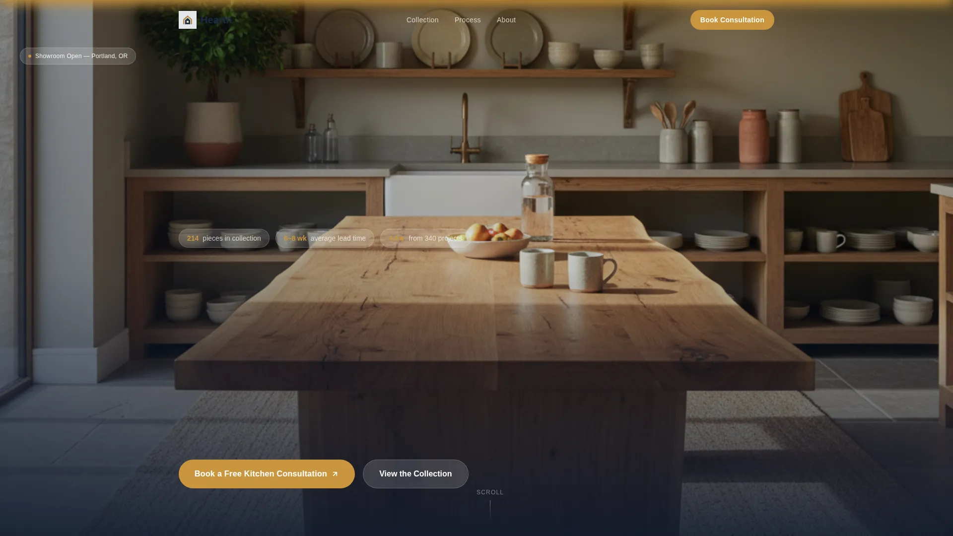
A wide-angle kitchen interior shot fills the viewport from edge to edge. Morning light catches the grain of an oak dining table set for four, open shelving holds stoneware, and a pendant lamp warms the counter below. A single tagline fades in at the lower third after the first visual beat.
Gallery Grid with Expandable Detail Panels
Products are presented in a styled grid showing finished pieces in real kitchen settings. Clicking any item opens a detail panel that reveals material origin, joinery method, estimated lead time, and care instructions. Buyers get the full picture without leaving the page.
Sticky Consultation call to action Bar
A brass-accented sticky bar appears after the first gallery row scrolls past. It anchors the primary call to action, "Book a Free Kitchen Consultation," so the invitation is always visible without interrupting the browsing experience.
Multi-Step Consultation Form
The form opens with a project type selector (renovation, new build, or single piece), then asks for room dimensions, followed by a four-option style preference image selector showing curated kitchen moods. Name and email come last, reducing friction at the most sensitive step.
Lookbook PDF Download Path
A secondary conversion path invites browsers who are not yet ready to book. Visitors exchange an email address for a downloadable lookbook, giving the business a way to nurture early-stage prospects over time.
Visual Ordering Timeline
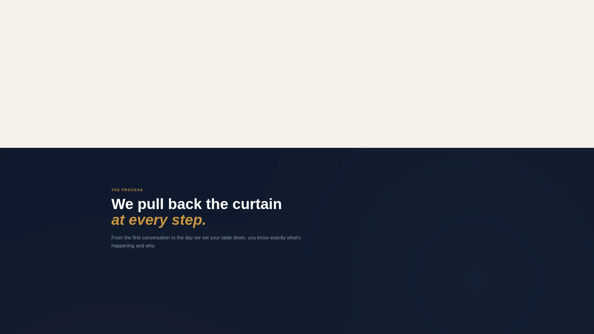
A step-by-step timeline walks visitors through the full ordering journey. Stages include consultation, material selection with swatch imagery, workshop photography of pieces in progress, and white-glove delivery. Each stage answers the next unspoken question before the visitor thinks to ask it.
Page sections overview
| Section | Purpose |
|---|---|
| Full-Bleed Header | Opens with an editorial kitchen interior shot and a single faded-in tagline |
| Gallery Grid | Displays styled product photography in a browsable grid layout |
| Detail Expand Panels | Reveals material origin, joinery, lead time, and care info per item |
| Sticky call to action Bar | Keeps the consultation booking prompt visible throughout the scroll |
| Multi-Step Form | Captures project context, room size, style preference, name, and email |
| Lookbook Download | Offers a PDF in exchange for an email from early-phase visitors |
| Ordering Timeline | Guides visitors through consultation to white-glove delivery step by step |
Design & branding system
The visual identity follows a Service Utility theme built on a Navy Authority color system. The palette feels like a well-organized craftsman's workshop: serious, trustworthy, and quietly proud of what it holds.
- Primary backgrounds use commanding naval blue (#1B2A4A), secondary text and dividers use brushed steel gray (#6B7B8D), and content panels sit on warm linen (#F4F1EB)
- Brass (#C9953D) accents appear on buttons, price tags, hover states, and the sticky call to action bar, providing warmth against the cooler base tones
- The overall tone is warm and editorial, referencing the grain and weight of solid wood rather than the bright minimalism typical of mass-market home stores
Mobile & speed optimization
The template is structured so every section reads cleanly on smaller screens without losing the editorial quality that makes the brand feel premium.
- The full-bleed header scales to portrait orientation without cropping the key kitchen composition
- The gallery grid reflows into a single-column layout on mobile, keeping detail panels tap-accessible and easy to read
- The sticky call to action bar repositions cleanly at the bottom of the mobile viewport so it never overlaps body content
How this template helps you convert
Hearth is built around two conversion paths that work in parallel, one for buyers ready to act and one for visitors still building confidence.
- The sticky brass call to action bar and multi-step consultation form reduce hesitation by asking for project context before personal details, making the form feel like a conversation rather than a data grab.
- The lookbook download gives early-stage visitors a reason to share their email address, creating a warm lead list from people who may not be ready to book today but will be soon.
Other information about this template
Hearth sits at the intersection of kitchen renovation planning and artisan home furnishing. It is a strong fit for businesses in the construction and home category, particularly those focused on kitchen furniture and décor.
- The template style is Gallery and Detail, making it well suited for stores where product photography and material storytelling are central to the sales process
- The Transparent Process creative direction means the page builds trust progressively, each section answering the question raised by the one before it
- This template can support customization of color values, photography, form field labels, and timeline stage copy to match any specific brand voice


Theme
Service Utility
Creative direction
Transparent Process
Color system
Navy Authority
Style
Gallery + Detail
Direction
Lead Generation
Page Sections
Full-bleed Editorial Header
Gallery Grid with Expandable Panels
Sticky Brass Consultation Bar
Multi-step Consultation Form
Lookbook PDF Download Path
Visual Ordering Timeline
Related questions
Can I use this template without a physical showroom?
How does the multi-step consultation form reduce friction?
Is the lookbook download separate from the main consultation form?
Can the color palette be customized to match my brand?
Who is this landing page template best suited for?



