High-Protein Food & Dining Booking Website Template
Hearth is a high-protein bakery landing page template built for food brands that earn trust through taste first and numbers second. The modular card grid layout, Agrarian Root visual identity, and built-in booking flow make it straightforward to launch a bakery landing page that converts meal-prep athletes, postpartum mothers, and gym owners into loyal weekly box subscribers.
by Rocket studio
Quick summary
Hearth is a warm, ingredient-honest bakery landing page template designed for high-protein specialty bakeries. It pairs a sensory-first card grid design with a structured weekly box booking flow. The result is a bakery website that makes visitors hungry before it asks them to buy, then guides them smoothly toward reserving a box or placing a wholesale inquiry.
Who this template is for
This template fits any food brand that needs a bakery landing page blending real-food storytelling with clear macro data. It works especially well for operators who need to convert health-conscious buyers quickly.
- Meal-prep athletes and CrossFit gym members searching for clean, high-protein baked goods
- Postpartum mothers looking for comfort food that supports recovery nutrition
- Gym owners and CrossFit box operators who want a wholesale ordering path for front-desk cooler stock
What problem this template solves
Health-conscious consumers are often skeptical of taste claims for high-protein goods. A generic bakery website fails to address that doubt. Hearth solves this by leading with sensory copy and appetizing imagery before presenting macro data, so the landing page earns trust before asking for the order.
- Visitors leave ordinary bakery pages unconvinced because nutrition facts feel clinical, not appetizing
- Most bakery landing page designs do not include a structured box-booking or wholesale inquiry flow
- Generic food pages rarely segment products by occasion, making it hard for busy buyers to find what fits their routine
What you get with this template
Hearth delivers a complete, ready-to-launch bakery landing page with every section pre-structured and styled. You get a design that is visually appealing, easy to customize, and built to guide buyers from first scroll to confirmed order.
- A hero section with a hand-illustrated mascot, benefit-driven headline, and sticky booking call-to-action bar
- A modular flip-card product grid grouped by occasion, with macro badge overlays and full ingredient reveals on hover
- A three-step booking flow covering box size, pickup or delivery day, and flavor preferences, plus a separate wholesale inquiry form
Feature list
Sensory-First Card Grid
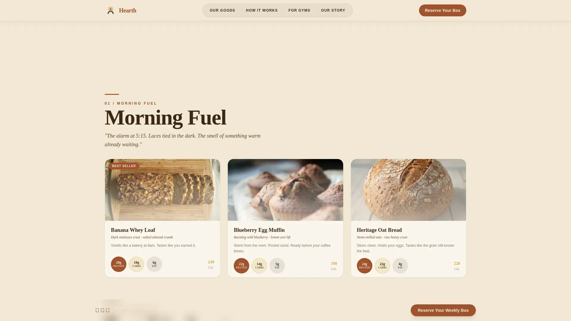
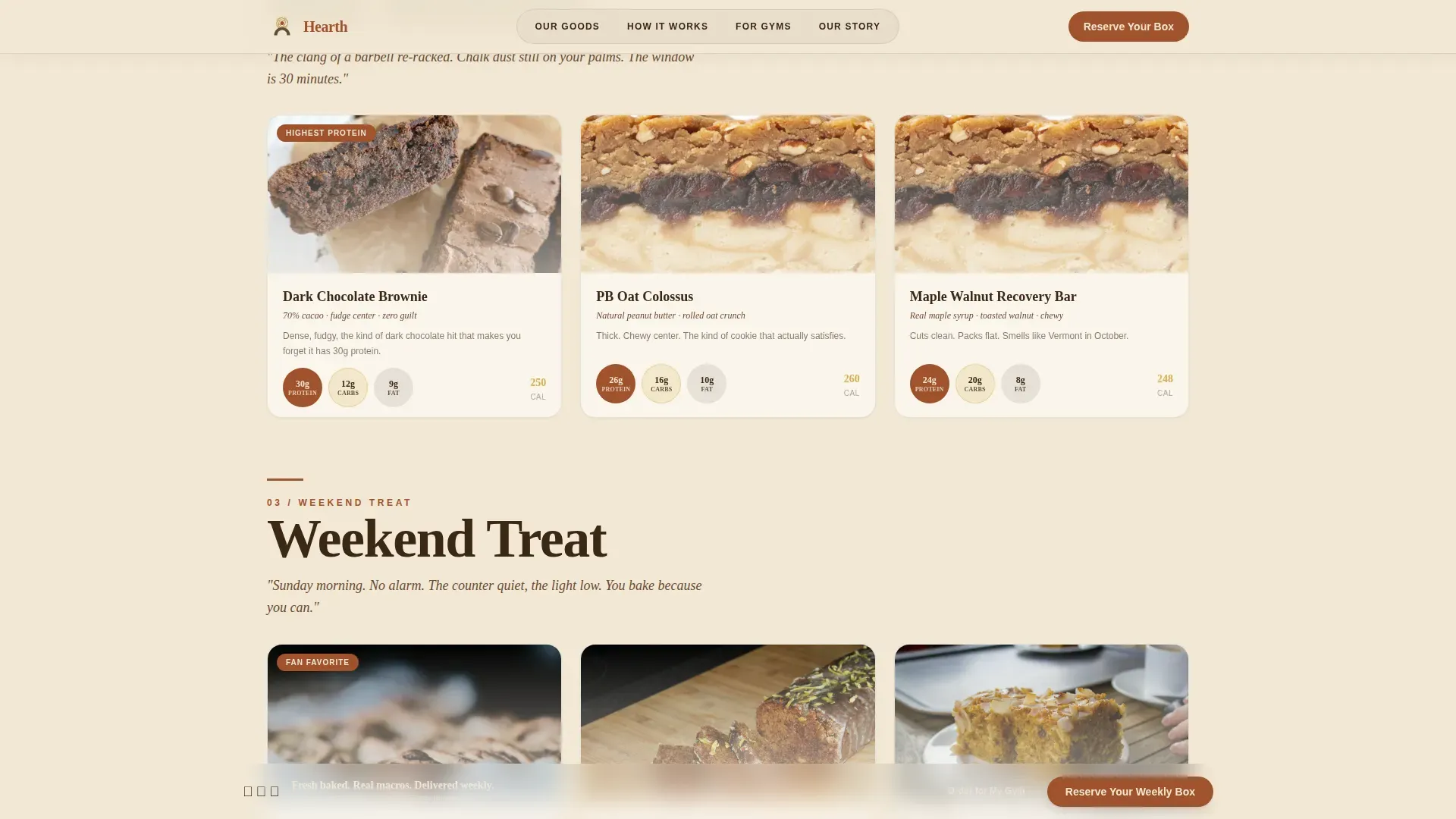
Each product card sits on raw butcher-paper styling with a single appetizing image, micro-copy describing aroma and taste, and a macro badge overlay showing protein, carbs, and fat. Hovering the card flips it to reveal full ingredients in a handwritten-style typeface. Cards are grouped into Morning Fuel, Post-Workout, and Weekend Treat occasion categories, each opened by a short italic sensory scene.
Sticky Booking Bar and Scheduling Flow
A sticky bottom bar appears after the first card row and anchors the primary call-to-action. Clicking opens a scheduling flow where buyers select box size (6, 12, or 24 pieces), choose a pickup or delivery day from a weekly calendar, and set flavor preferences across the three occasion groups.
Wholesale and Gym Inquiry Path
A dedicated arc-split section routes gym owners and box operators to a wholesale inquiry form. The form collects the gym name, weekly headcount, and preferred drop-off morning, keeping the path short and frictionless for busy client operators.
Mascot Hero Section
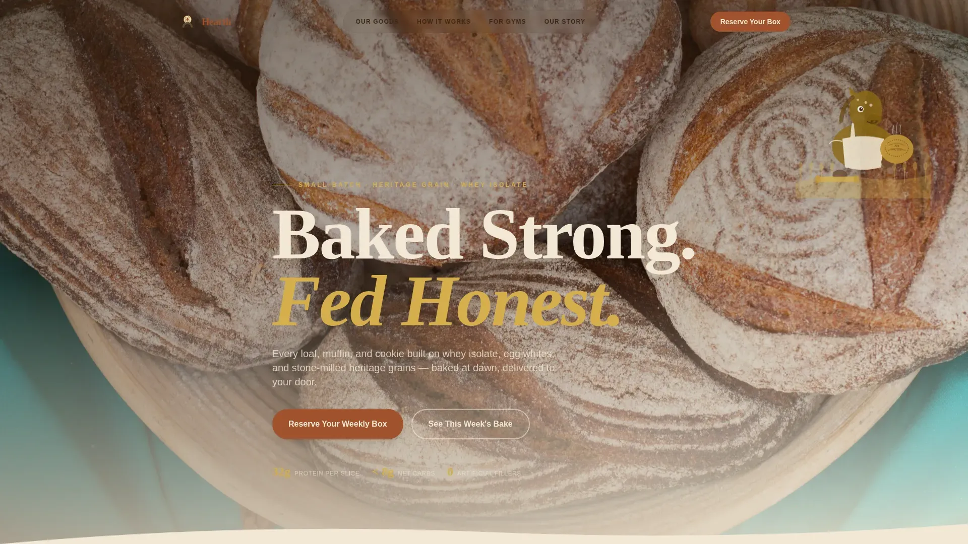
The hero opens with a hand-illustrated draft-horse mascot rendered in vintage agricultural-label style with crosshatched lines and muted earth tones. A high-resolution bakery image behind the mascot communicates the value proposition immediately. The benefit-driven headline "Baked Strong. Fed Honest." lands in a heavy slab serif beneath the character.
Occasion-Based Product Navigation
Products are organized by eating occasion rather than by item type, making it easy for users to browse and find what fits their day. Each occasion group functions as a tab, letting visitors search and move between Morning Fuel, Post-Workout, and Weekend Treat without scrolling past irrelevant items.
Sensory Story Section
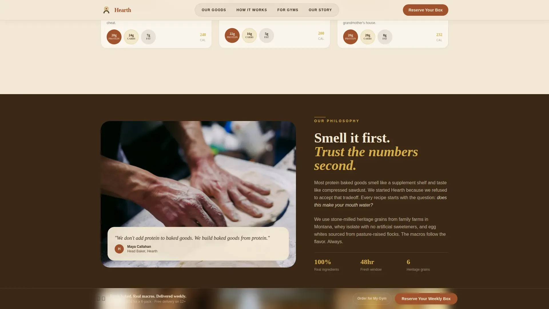
An asymmetric split section pairs full aroma and taste copy with a featured product callout. This section addresses taste and texture objections directly by making the sensory description as persuasive as any testimonial.
Page sections overview
| Section | Purpose |
|---|---|
| Hero with Mascot | Establishes brand identity and communicates the core protein-bakery value proposition |
| Product Card Grid | Displays modular flip-cards grouped by occasion with macro badges and ingredient reveals |
| Sensory Story Block | Delivers aroma and taste copy alongside a featured product callout |
| How It Works | Previews the three-step booking flow for box size, day, and flavor selection |
| Wholesale Gym call to action | Routes gym owners to a dedicated wholesale inquiry form |
| Footer Arc Split | Contains logo, tagline, and navigation links in a clean arc-browser split layout |
Design & branding system
The Parchment and Rust color system gives every page element the feeling of a well-used recipe card. The palette is warm, worn, and immediately recognizable as artisan rather than clinical. Consistent branding across all pages reinforces the bakery's identity and builds lasting recognition.
- Colors: unbleached parchment (#F2E8D5) backgrounds, oxidized rust (#A0522D) headlines and primary buttons, deep loam (#3B2716) body text, pale wheat gold (#D4AE4C) macro callouts and hover states
- Typography: Fraunces slab serif for all headlines, DM Sans for body text across the site
- Visual style: Agrarian Root theme with vintage crosshatch illustration, butcher-paper card textures, and a wheat-field horizon behind the hero mascot
Mobile & speed optimization
Many food shoppers browse and place orders on mobile devices, often between workouts or during short breaks. This bakery landing page template is built mobile-first so the card grid, sticky booking bar, and booking modal all perform cleanly on small screens. Responsive design ensures every layout adapts without breaking the card flip or macro badge display.
- Mobile-first layout prioritizes thumb-friendly tap targets on product cards, the sticky bar, and the scheduling flow
- Scroll-reveal animations and card flip interactions are handled by client-side components while static page sections load as server components
- The design uses whitespace carefully so the card grid never feels crowded on narrow screens
How this template helps you convert
A well-designed bakery landing page is crucial for attracting customers and increasing orders. Hearth stacks conversion-focused design decisions from the first scroll to the booking confirmation.
- The hero section communicates the high-protein value proposition immediately using a benefit-driven headline and a high-resolution bakery image, so first-time visitors understand the offer before reading a single description
- The sticky booking bar with a high-contrast rust button and clear action copy stays visible as users scroll through product cards, reducing friction between desire and commitment
- Macro badges act as trust signals on every card, and the ingredient-reveal flip addresses taste and texture objections that health-conscious buyers typically raise before purchasing high-protein baked goods
Other information about this template
This template is a strong starting point for any specialty food brand ready to launch or refresh their web presence. It covers the practices a modern high-protein bakery website needs to compete online and convert health-focused buyers.
- The Hearth artisan high protein bakery landing page template is listed in the Food and Beverage category and is suited for ecommerce-adjacent booking flows that do not require a full ecommerce store checkout
- Cake shop operators, artisan bread studios, and specialty cookie brands can adapt the card grid layout and booking components to their own product lines and occasion categories
- The template layout is easy to customize: colors, fonts, and section descriptions can be adjusted to match any bakery or restaurant brand identity
- Ingredient transparency is built into the card flip, making it easy for clean-label bakery brands to display full ingredient lists without cluttering the front of the card
- Examples of how the wholesale form and booking calendar sections can be repurposed include studio-bakery pickup scheduling, local delivery windows, and corporate catering inquiry flows
- The design is inviting by intention: warm earth tones, handwritten type accents, and farmhouse-style illustration work together to create an active sense of place before the visitor ever reads a macro number
Theme
Agrarian Root
Creative direction
Taste & Aroma
Color system
Parchment & Rust
Style
Card Grid (Modular)
Direction
Booking/Scheduling
Page Sections
Sensory-first Flip-card Product Grid
Sticky Booking Bar and Scheduling Flow
Wholesale and Gym Inquiry Section
Illustrated Mascot Hero Section
Occasion-based Tab Navigation
Sensory Story Split Section
Related questions
Can I use this template for a cake shop or cookie brand?
Does the template include the booking calendar and wholesale form as built-in components?
Is this landing page template suitable for mobile users?
How does the template handle ingredient transparency?
Can a gym owner use the wholesale section to place bulk orders?



