Nourishing Hearthealthy | Free Website Template | Rocket
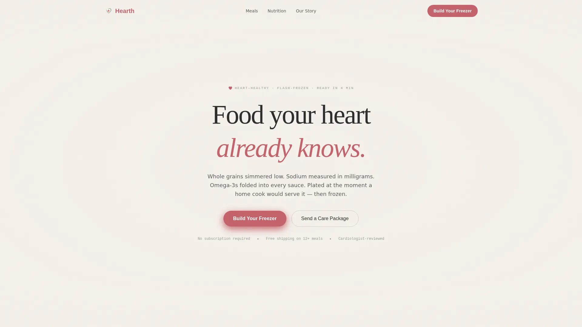
Hearth is a full-width immersive landing page template built for a heart-healthy frozen food brand. It pairs sensory storytelling with a visual meal-picker experience, guiding caregivers, post-cardiac patients, and busy health-conscious adults from emotional connection to a custom meal box. The design draws on a Japanese Zen color system and pastoral calm aesthetic throughout.
by Rocket studio
Quick summary
Hearth is a single-page, full-width landing page template for a heart-healthy frozen food brand. It moves visitors through sensory sections, aroma, nutrition, and meal choice, toward one of two conversion paths: building a custom freezer box or sending a care package. Every design choice, from washi paper backgrounds to ink-brush nutrition callouts, earns its place through quiet intention.
Who this template is for
This template is built for direct-to-consumer frozen food brands that lead with health, ingredient quality, and genuine care. It suits founders and marketers who want storytelling to do the selling, not aggressive promotions or cluttered product grids.
- Heart-healthy food brands targeting post-cardiac patients and their caregivers
- Frozen meal businesses serving time-poor, health-conscious adults such as night-shift workers
- DTC food brands that use gifting flows and custom box builders as their primary sales mechanism
What problem this template solves
Most food brand landing pages struggle to communicate trust and nourishment at the same time. They either look too clinical, leaning on nutrition labels and warning language, or too indulgent, hiding health credentials behind glossy food photography. Hearth bridges that gap.
- Builds emotional trust with real customer photo walls and care-package gifting flows rather than polished studio imagery
- Translates complex nutrition information into gentle ink-brush visuals that feel approachable rather than medical
- Removes conversion friction by combining a visual meal picker, a persistent checkout bar, and a gifting modal in one cohesive flow
What you get with this template
You get a carefully structured, full-width landing page with seven distinct sections and two separate conversion paths. Each section is purpose-built to move a specific type of visitor closer to action without pressure or rush.
- A hero section with a softly animated user-generated content photo wall mosaic and a centered headline fade-in
- Sensory and nutritional storytelling sections with ingredient provenance text, ink-brush illustrated callouts, and steam-animated meal cards
- A "Build Your Freezer" meal picker with tap-to-select cards, a gifting flow modal with a handwritten-note field, and a persistent bottom checkout bar
Feature list
This template is built around six core capabilities drawn directly from the design brief.
Animated UGC Photo Wall Hero
The header displays a drifting mosaic of real customer photos, plated meals on home tables, open freezer doors, handwritten care notes. The columns drift upward at a slow pace, like steam rising, while a single headline fades in over the grid. No studio lighting and no food styling; the imperfection signals authenticity.
Sensory Ingredient Storytelling Section
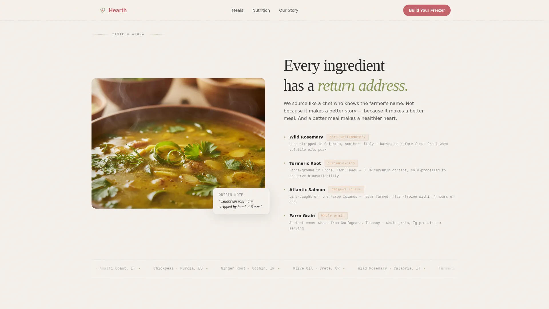
A macro close-up of turmeric-gold broth anchors a section devoted to ingredient origin. Provenance text is specific enough to evoke smell, for example "wild rosemary, hand-stripped in Calabria." This section uses scroll-triggered fade-in entrances to reveal text alongside the visual.
Ink-Brush Nutrition Callouts
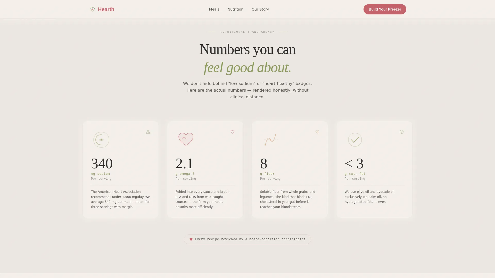
Sodium counts, omega-3 grams, and fiber percentages are presented as gentle ink-brush illustrations rather than clinical tables. Each number sits beside a hand-drawn element, keeping the nutritional transparency section warm and readable rather than medical or intimidating.
Steam-Animated Meal Showcase
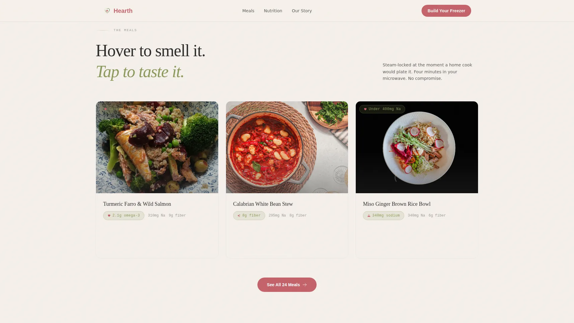
Three meals are displayed side by side with subtle CSS steam loops running above each dish. Hovering over a card reveals an aroma profile written in poetic shorthand, such as "roasted garlic, cracked black pepper, lemon zest lifted by heat." This section uses staggered reveal animations on scroll.
Visual Meal Picker with Persistent Checkout Bar
The "Build Your Freezer" section lets visitors tap meal cards to fill a custom box of 8, 12, or 20 meals. Each card shows the dish name, its key heart-health metric, and a single aroma note. A persistent bottom bar tracks the running meal count and shows a soft plum-colored checkout button that activates only once the minimum quantity is met.
Care Package Gifting Flow
A secondary conversion path labeled "Send a Care Package" opens a modal gifting flow. Visitors enter a recipient address and can add an optional handwritten-note field before checkout. This path is designed specifically for caregivers ordering remotely, such as a daughter restocking her parents' freezer from another state.
Page sections overview
| Section | Purpose |
|---|---|
| Hero Photo Wall | Drift-animated UGC mosaic with centered headline fade-in |
| Sensory Aroma Section | Macro broth visual paired with ingredient provenance text |
| Nutrition Transparency | Ink-brush illustrated callouts for sodium, omega-3, and fiber |
| Meal Showcase Cards | Three steam-animated meals with hover aroma profiles |
| Who It's For | Three customer portrait scenarios with specific life contexts |
| Build Your Freezer | Tap-to-select meal picker with box size and gifting modal |
| Footer | Linear single-row pattern with minimal brand details |
Design & branding system
The visual identity follows a Pastoral Calm theme expressed through a Japanese Zen color palette. Every color and typeface choice prioritizes negative space and breath over decoration.
- Color palette: washi paper white (#F5F0EB) for all backgrounds, soft matcha (#8A9A5B) for section dividers and nutritional callouts, sumi ink charcoal (#2C2C2C) for body text, and pickled plum (#C4626A) reserved exclusively for buttons and heart-health icons
- Typography: DM Sans for headings, IBM Plex Mono for labels and numbers, and Fraunces as a serif accent for moment-of-feeling copy
- Texture and feel: washi paper textures, unfinished cedar warmth, ceramic stillness, nothing competes, every element earns its presence through restraint
Mobile & speed optimization
The template is built mobile-first to serve caregivers ordering on phones and busy professionals browsing on a break. Interactive components and static layout sections are separated by design intent.
- Server Components handle all static sections such as the aroma section, nutrition callouts, and customer portraits, keeping initial load light
- Client Components are reserved for the meal picker, persistent bottom bar, and gifting modal to ensure smooth interactivity without blocking the page
- Steam CSS loops, stagger reveals, and the drifting photo wall are built at medium-high animation intensity, designed to feel fluid on mobile without sacrificing perceived speed
How this template helps you convert
The conversion strategy is built around reward and choice rather than urgency. Visitors are never rushed, they are guided through sensory proof before being invited to act.
- The UGC photo wall and customer portrait section build trust before any product is pitched, so visitors arrive at the meal picker already emotionally connected to the brand story.
- The persistent bottom checkout bar activates only once the box minimum is met, making the act of choosing feel like progress rather than pressure and reducing abandonment at the selection stage.
- The "Send a Care Package" gifting path opens a second conversion lane for caregivers who are not buying for themselves, capturing a high-intent audience segment that a single buy-now button would miss entirely.
Other information about this template
This template supports a direct-to-consumer frozen food brand positioned in the heart-healthy food and dining space. It is designed for brands competing in the health-conscious frozen meal category where both emotional resonance and nutritional transparency matter.
- The full-width immersive layout works well for brands in the food and beverage category that rely on visual storytelling rather than product catalogs
- Box size options of 8, 12, and 20 meals are built into the meal picker interaction, giving brands flexibility in how they price and bundle offerings
- The optional handwritten-note field in the gifting flow adds a personal layer suited to a care-giving purchase context, where the buyer and the recipient are often different people
- The footer uses a linear single-row pattern, keeping the close of the page clean and uncluttered in line with the overall Japanese Zen design philosophy
Theme
Pastoral Calm
Creative direction
Taste & Aroma
Color system
Japanese Zen
Style
Full-Width Immersive
Direction
Marketplace/Multi
Page Sections
Animated UGC Photo Wall Hero
Ingredient Provenance Storytelling
Ink-brush Nutrition Callouts
Steam-animated Meal Showcase
Visual Meal Picker with Persistent Bar
Care Package Gifting Flow
Related questions
Can I customize the meal cards in the picker section?
Is this template suitable for a gifting-only use case?
How does the persistent bottom checkout bar work?
Can the color palette be changed to match a different brand?
Does the template work well on mobile devices?



