Specialist Home Décor & Lifestyle Professional Website Template
Hearth is a bento grid landing page template built for seasonal home décor stores. It opens with a price-anchored hero that reframes your shop as accessible indulgence, then guides visitors through curated room and mood collections. A built-in style quiz turns browsers into buyers by delivering a personalised decorator identity and a ready-to-ship starter collection.
by Rocket studio
Quick summary
Hearth is a single-page bento grid template designed for seasonal home décor retailers. The layout combines a price-anchored hero, a mood-driven collection grid, and an interactive style quiz overlay. Every section is built to move visitors from curiosity to confidence, turning a casual browse into a styled collection they want to own.
Who this template is for
Hearth is made for home décor sellers who think in seasons, not just SKUs. If your product range shifts with the calendar and your customers buy with feeling rather than function, this template speaks their language.
- Seasonal décor stores selling curated room vignettes and lifestyle collections
- Rental hosts and short-term accommodation operators who style spaces for reviews
- Small home goods brands catering to newlyweds, empty-nesters, or style-curious first-time decorators
What problem this template solves
Most home décor storefronts ask shoppers to browse a catalogue. Hearth removes that friction entirely. Visitors arrive not at a product list but at an experience, and they leave knowing exactly what to buy and why it fits their life.
- Sticker shock puts buyers off before they even explore the range
- Generic grid layouts fail to communicate curation, mood, or seasonal identity
- Shoppers who lack decorating confidence abandon stores that offer no guidance
What you get with this template
Hearth delivers a fully structured single-page layout with every major section already in place. The design system, quiz logic structure, and bento grid are all built in, so you spend time on content, not construction.
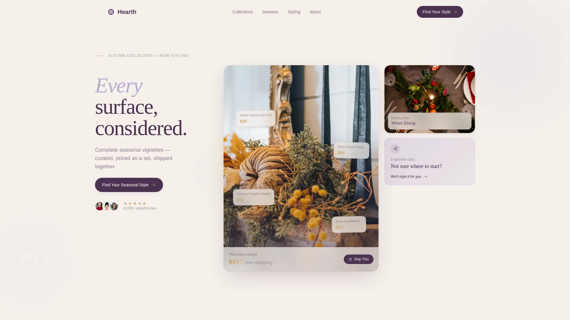
- A price-anchored hero bento tile with inline item pricing and a styled seasonal vignette
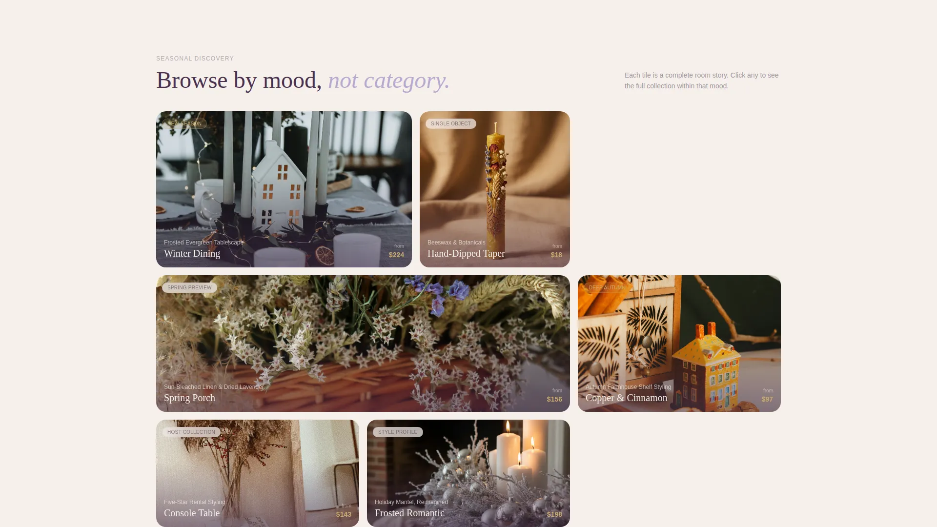
- An unevenly sized bento grid that expands from broad moods to specific micro-collections on scroll
- A five-question visual style quiz overlay that outputs a named decorator profile and a starter collection
Feature list
A paragraph introducing the features: Hearth is built around a small set of high-impact components. Each one serves a clear purpose in moving a visitor from arrival to purchase intent.
Price-Anchored Hero Tile
The hero opens with a fully styled seasonal vignette, each object tagged with its price in antique brass type. The total displays prominently before the first scroll, repositioning the store as achievable rather than aspirational. A secondary line below the total invites visitors into the style quiz.
Expandable Bento Collection Grid
The collection grid uses unevenly sized tiles to create visual rhythm across rooms, seasons, and moods. Each tile expands on click to reveal the full collection behind that mood, from broad seasonal themes down to specific micro-curation like "Copper and Cinnamon Shelf Styling." The deeper a visitor scrolls, the more specific the discovery becomes.
Visual Style Quiz Overlay
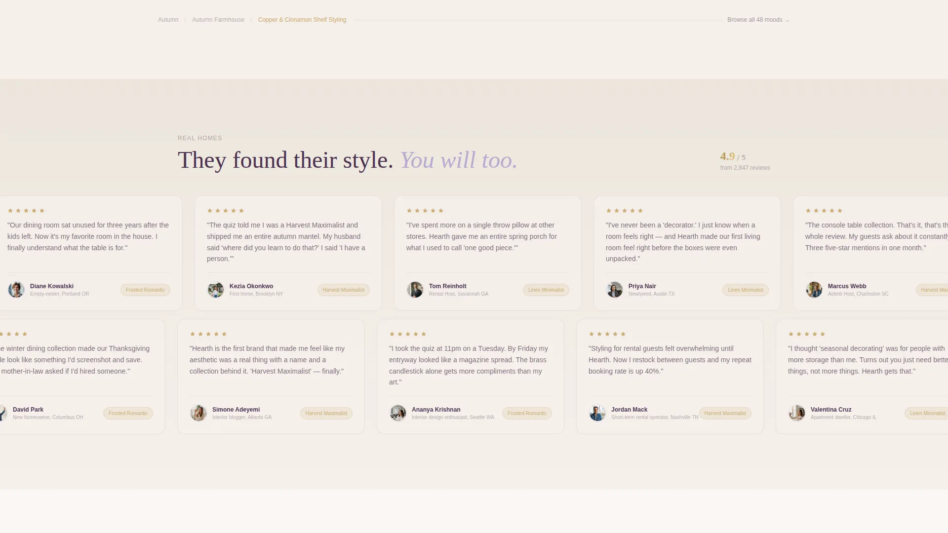
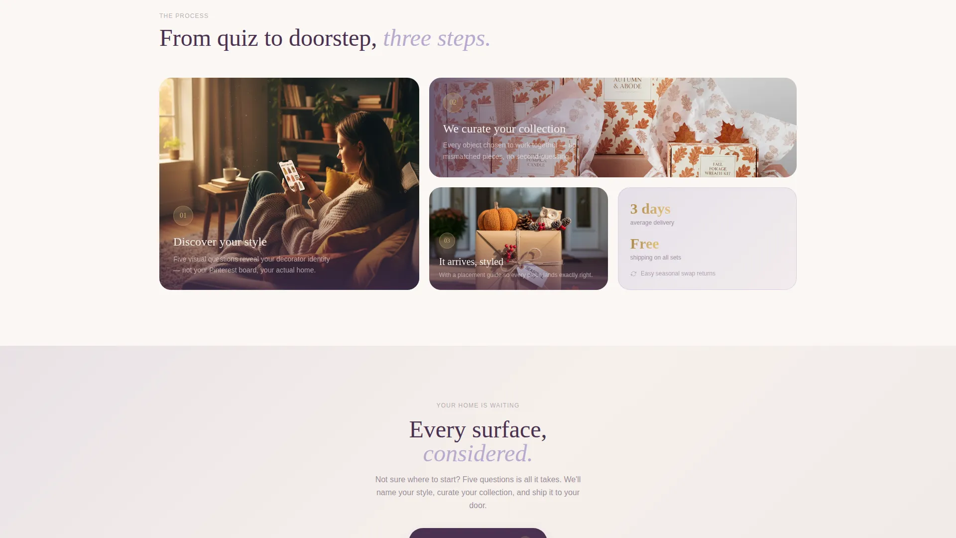
The quiz opens as a full-page overlay with five visual-choice questions. Visitors choose rooms, palettes, hosting scenarios, neglected spaces, and seasons they never decorate for. Results deliver a named style profile such as "Linen Minimalist" or "Harvest Maximalist," along with a curated starter collection and a one-click ship option.
Persistent Floating Call to Action
The "Find Your Seasonal Style" button floats on screen throughout the entire page. Placed both below the hero and as a persistent element, it keeps the primary action within reach at every scroll depth without interrupting the browsing experience.
Lavender Dream Colour System
The palette uses soft wisteria, dried-flower mauve, warm parchment, deep plum, and antique brass as an accent. Each colour has a defined role: parchment dominates the background, plum anchors all readable text, and brass appears only on hover states and pricing to guide the eye precisely.
Page sections overview
| Section | Purpose |
|---|---|
| Hero Bento Tile | Price-anchored seasonal vignette with inline item pricing and quiz entry |
| Curated Collection Grid | Expandable bento tiles organised by room, season, and mood |
| Mood Discovery Drill-Down | Progressive micro-collections revealed as visitors scroll deeper |
| Style Quiz Overlay | Five-question visual assessment delivering a named decorator profile |
| Style Profile Results | Named style output with starter collection and one-click ship call to action |
| Floating Quiz Button | Persistent call to action accessible at every scroll position |
Design & branding system
The Lavender Dream colour system gives Hearth its signature feel: soft and considered without ever feeling generic. Every colour has a specific role, so the palette works as a system rather than a mood board.
- Background in warm parchment (#F5F0EB), text and interactive states in deep plum (#4A3150), collection cards washed in soft wisteria (#B8A9D0) and dried-flower mauve (#D4C1D9)
- Antique brass (#C9A96E) reserved exclusively for hover states and pricing figures to create precise focal moments
- The overall tone follows a Directory and Discovery theme: structured enough to feel curated, open enough to feel like browsing a well-loved antique market
Mobile & speed optimization
The bento grid layout is designed to translate naturally to smaller screens. Section proportions adjust so that the visual hierarchy reads clearly whether a visitor arrives on a phone or a large desktop display.
- Unevenly sized bento tiles reflow for mobile without losing the rhythm of the original grid
- The floating call-to-action button remains accessible at all screen sizes so the quiz entry point is never buried
- The quiz overlay is built as a full-screen experience that works as comfortably on touch devices as on a desktop browser
How this template helps you convert
Hearth is structured to convert visitors who would otherwise browse and leave. Every layout decision serves a specific moment in the path from arrival to purchase intent.
- The price-anchored hero neutralises sticker shock in the first viewport, reframing the store as accessible before a visitor has scrolled once.
- The expandable bento grid rewards curiosity with increasingly specific curation, keeping visitors engaged longer and building purchase confidence as they explore.
- The style quiz turns a passive browser into an active participant, delivering a personalised collection that removes the guesswork from buying.
Other information about this template
Hearth is categorised under Retail and E-Commerce with a focus on the Home Décor and Lifestyle subcategory. The template is well suited to stores with rotating seasonal ranges, lifestyle-led product positioning, and customers who buy on identity and feeling rather than specification.
- The template uses a Gallery and Detail visual style, meaning styled photography and object-level detail coexist in the same layout without competing
- The bento grid structure supports a wide range of product photography formats, from full room vignettes to close-up single-object shots
- The quiz overlay is designed to earn the click through identity rather than discount, making it effective for stores that do not want to compete on price alone
Theme
Neo-Retro
Creative direction
Flash Deal
Color system
Sunset Gradient
Style
Gallery + Detail
Direction
Upsell/Upgrade
Page Sections
Price-anchored Hero Bento Tile
Expandable Mood-based Bento Grid
Five-question Visual Style Quiz
Persistent Floating Call to Action
Lavender Dream Colour System
Related questions
Can I use Hearth for a store that sells across multiple seasons at the same time?
Do I need to run a style quiz to make use of this template?
What kind of photography works best with the bento grid layout?
Who is this template designed for?
Can the colour palette be changed to match an existing brand identity?



