Local Business Specialist Booking Website Template
Hekwerk is an editorial-style landing page template built for an Amsterdam fence installation company. It combines data-driven headers, expert-panel content sections, and side-by-side comparison tables to position the business as the authoritative local choice. The primary call to action drives site survey bookings, with a secondary email capture path for undecided visitors.
by Rocket studio
Quick summary
Hekwerk is a single-page booking template designed for an Amsterdam fencing contractor. It opens with three city-specific data statistics, guides visitors through expert-framed comparison content, and closes with a structured survey-booking form. The editorial magazine aesthetic builds trust without relying on photography.
Who this template is for
This template is built for fencing contractors and trade businesses operating in Amsterdam and the wider North Holland region. It speaks directly to clients who face bureaucratic permitting hurdles, challenging soil conditions, and demanding installation environments.
- Property managers overseeing housing corporation portfolios who need reliable perimeter solutions
- School directors requiring playground enclosures completed before the academic year starts
- Warehouse and industrial operators on the IJ waterfront who need scheduled perimeter installations
What problem this template solves
Most local trade service pages look generic. They rely on stock photography, vague copy, and no clear reason to trust the contractor. This template solves that by turning real expertise into the visual and editorial identity of the page itself.
- Visitors arriving without a clear fencing brief cannot quickly compare materials, costs, or permit requirements
- Property managers and site operators need confidence before booking a site survey, not just a phone number
- Generic templates do not reflect the specific regulatory and environmental complexity of Amsterdam installations
What you get with this template
You get a fully structured, single-page layout that guides a commercial buyer from initial curiosity to a confirmed booking. Every section is purposefully sequenced to build authority before asking for commitment.
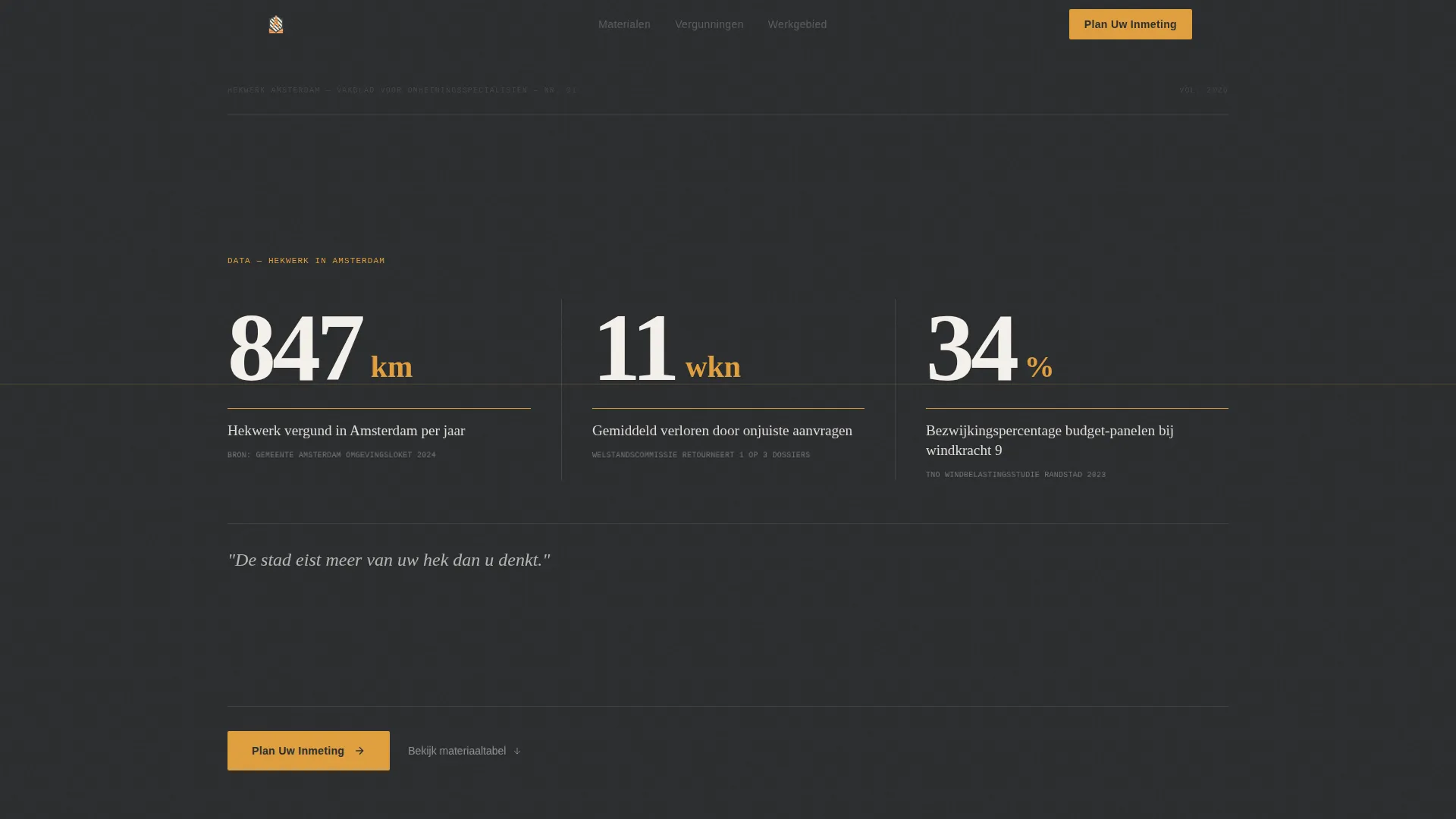
- A data-driven header with three Amsterdam-specific statistics set in oversized editorial numerals
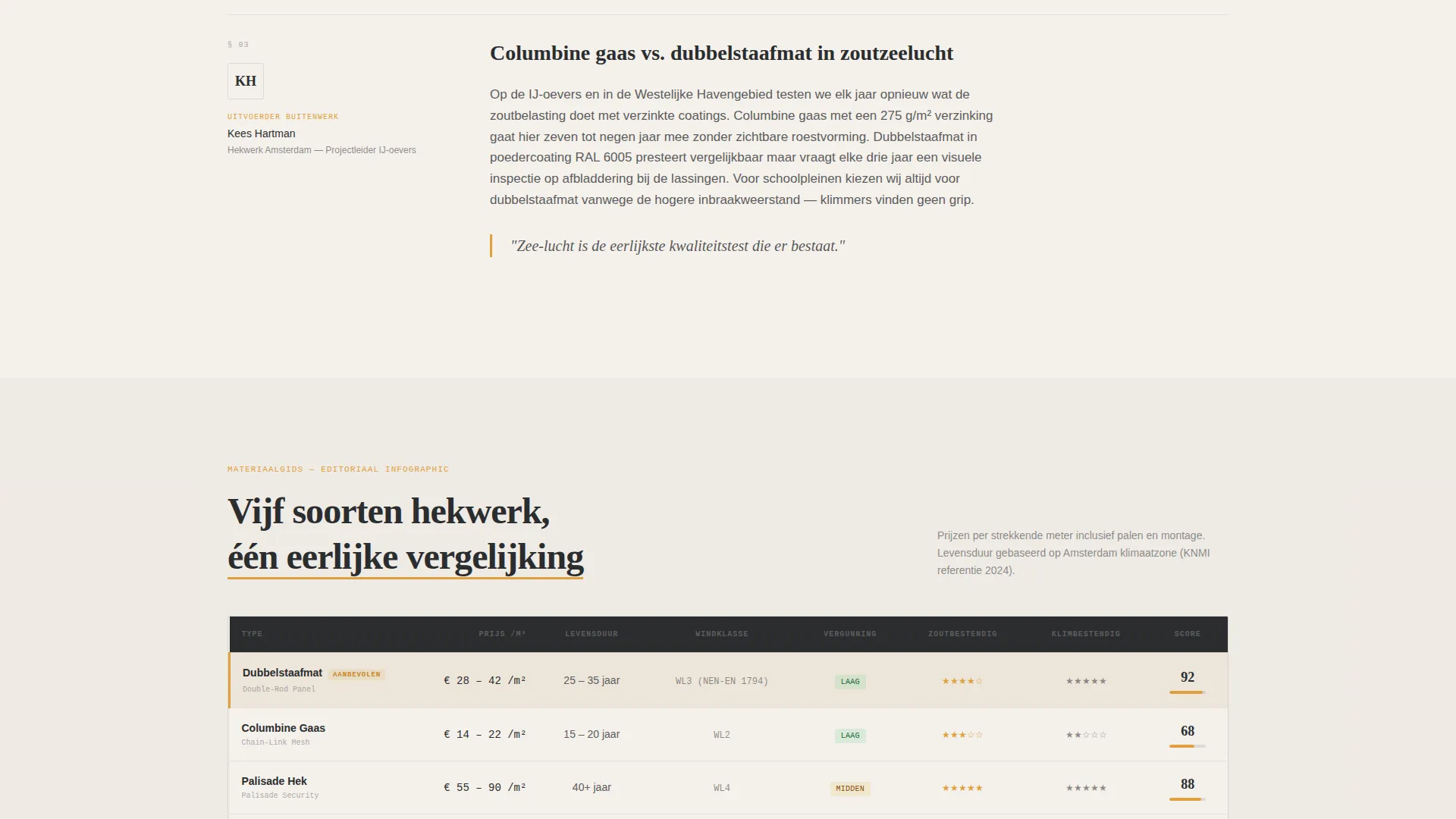
- Mid-scroll comparison tables styled as editorial infographics covering materials, lifespans, price-per-meter, and permit complexity
- A dual conversion path: a primary booking form for site surveys and a secondary email capture for a downloadable materials guide
Feature list
This template is built around six purposeful components, each designed to earn trust and move a commercial buyer toward action.
Data Storytelling Header
The header presents three Amsterdam-specific statistics in oversized bold serif numerals against a deep charcoal background. Each number covers a real operational dimension: annual permitted fencing kilometers, weeks lost to incorrect municipality applications, and wind-load failure rates for budget panel fencing. A single amber underline draws the eye across the composition. No photography is used; the data itself is the visual.
Expert Panel Content Sections
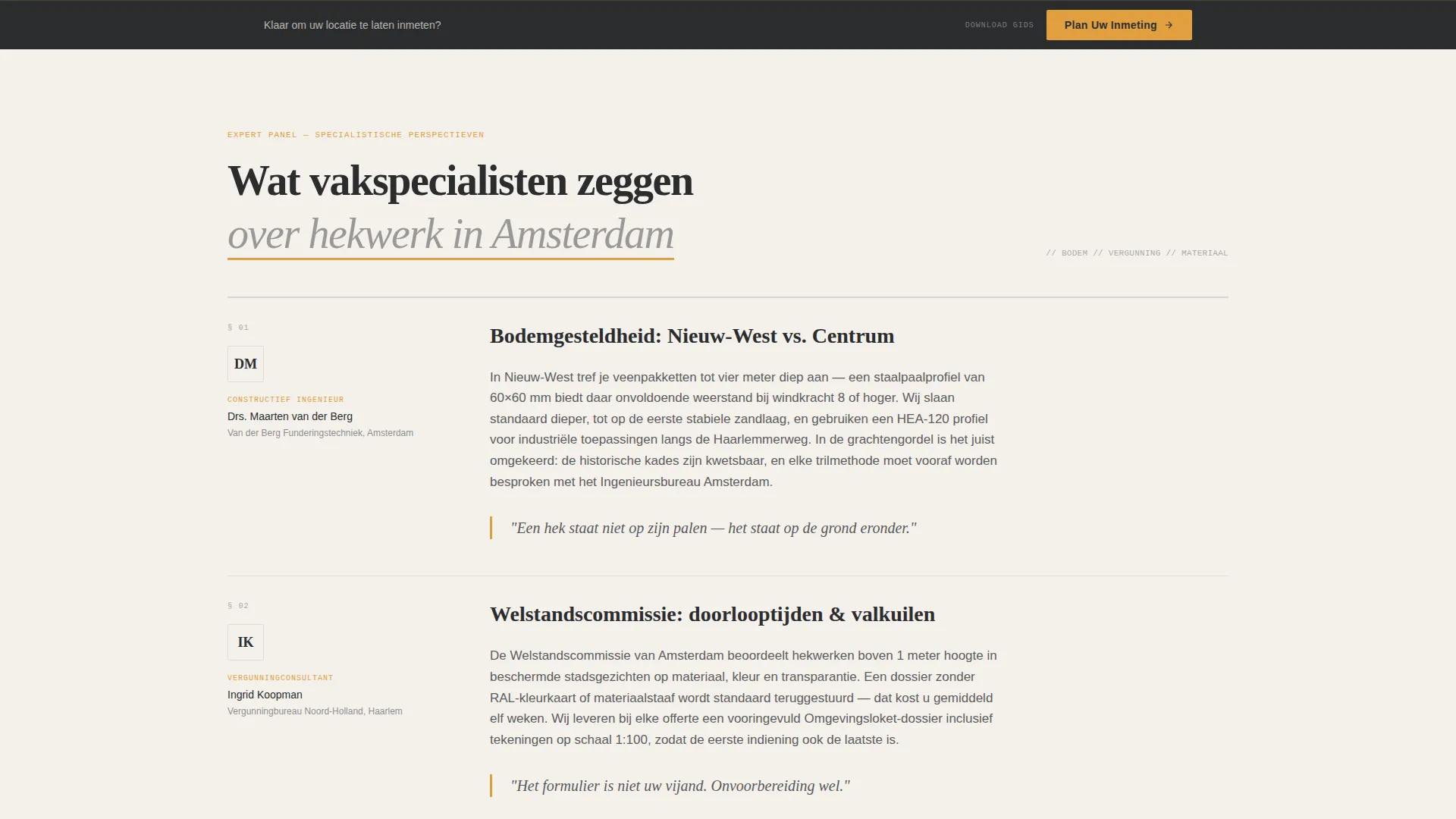
Each scroll section is framed as a specialist perspective. A structural engineer addresses soil conditions in Nieuw-West versus Centrum. A permit consultant covers Welstandscommissie (municipal aesthetics committee) approval timelines. A site foreman compares columbine mesh to double-rod panel fencing in salt-air environments. This structure makes the page read like an investigative feature rather than a sales pitch.
Editorial Comparison Tables
The comparison tables appear mid-scroll as styled editorial infographics. They let visitors weigh fencing materials, expected lifespans, price-per-meter ranges, and permit complexity side by side. The amber highlight system draws attention to key differentiating cells without overwhelming the layout.
Primary Booking Form
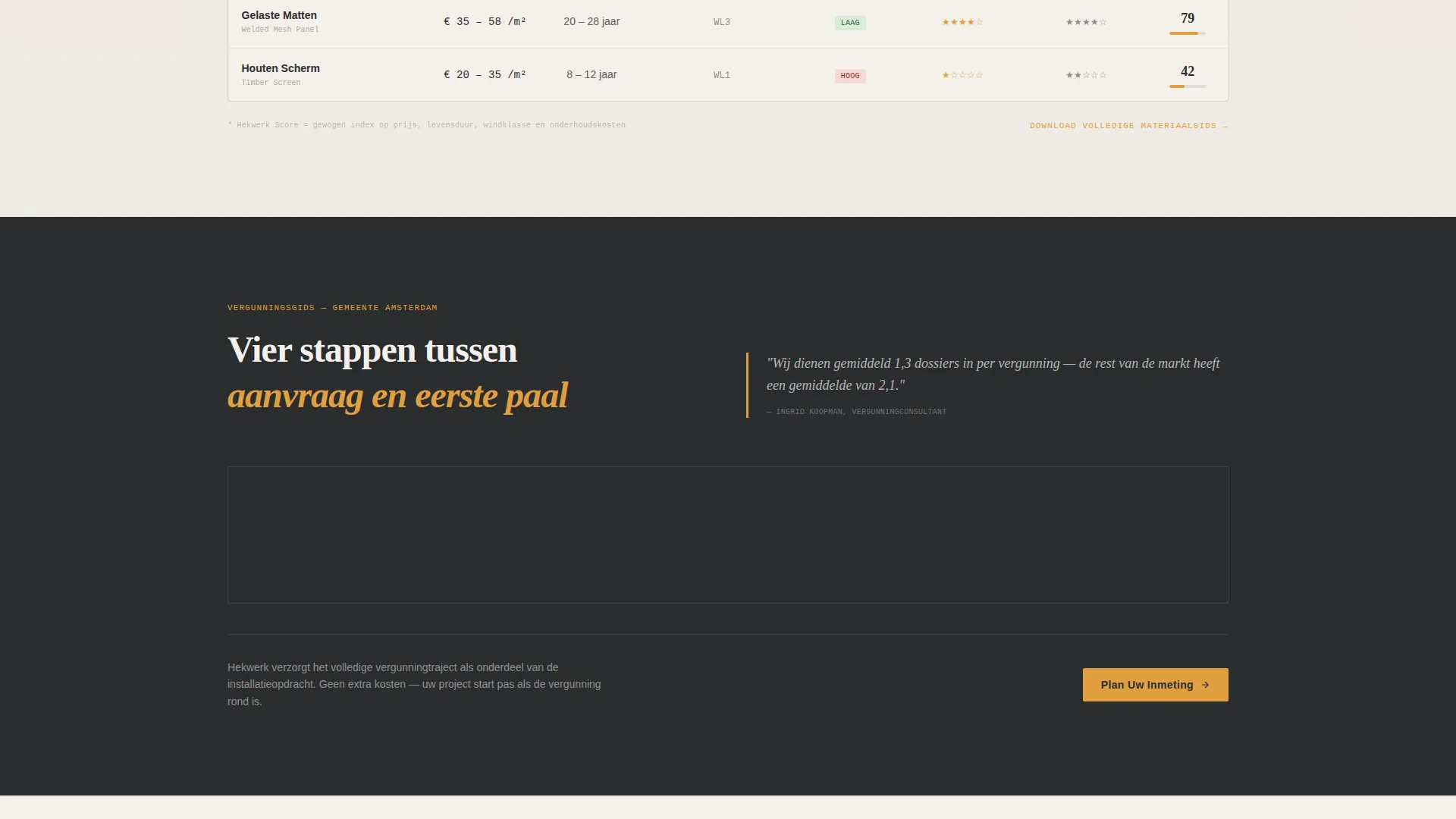
The "Plan Uw Inmeting" (Schedule Your Site Survey) call-to-action appears twice: first as an amber button anchored below the data header, then again as a sticky bar after the comparison tables. The form collects postcode first to confirm service area, then fence type interest via illustrated icons (garden, industrial, school, and canal-side), then a preferred survey week via a calendar picker.
Secondary Lead Capture Path
The "Download Materiaalgids" (Download Materials Guide) secondary path captures an email address in exchange for a PDF comparing all fencing types. This nurtures visitors who are researching but not yet ready to book a site survey, keeping them in the funnel.
Sticky Conversion Bar
After the comparison tables, a persistent sticky bar re-surfaces the primary call to action without interrupting the reading experience. It ensures the booking prompt remains visible as visitors continue scrolling through expert content.
Page sections overview
| Section | Purpose |
|---|---|
| Data Statistics Header | Opens with three Amsterdam-specific numerals to establish immediate local authority |
| Magazine Deck Subhead | Lands a single editorial line that frames the stakes of proper fencing |
| Amber call to action Button | First booking prompt anchored directly below the header data composition |
| Structural Engineer Panel | Addresses soil condition differences across Amsterdam districts |
| Permit Consultant Panel | Explains Welstandscommissie timelines and municipality application risks |
| Site Foreman Panel | Compares mesh and panel fencing performance in coastal salt-air conditions |
| Editorial Comparison Tables | Side-by-side material, lifespan, price, and permit complexity breakdown |
| Sticky Booking Bar | Persistent survey-booking prompt surfaced after the comparison section |
| Survey Booking Form | Postcode, fence type icons, and calendar picker for site survey scheduling |
| Email Lead Capture | Secondary path offering a downloadable materials guide for undecided visitors |
Design & branding system
The visual identity follows an Editorial Magazine theme. It is built to feel like a well-printed architecture quarterly: ink-dense, matte, and confident. No stock photography appears anywhere on the page.
- Deep charcoal (#2B2D2F) for masthead-weight headers, Dutch amber (#E09F3E) for pull-quotes, table highlights, and hover states, warm newsprint off-white (#F4F0EB) as the primary background, and smoked iron (#5C5D5E) for body text and rule lines
- Bold serif typography for oversized editorial numerals in the header, paired with clean body type for panel content and table data
- Amber underlines and highlight cells used as directional cues, guiding the eye left to right across the data header and down through comparison rows
Mobile & speed optimization
The layout is designed to remain readable and functional on smaller screens without sacrificing the editorial character of the desktop experience.
- Oversized editorial numerals reflow cleanly for narrow viewports so the data header retains its visual impact on mobile
- Comparison tables are structured to scroll horizontally or stack gracefully, keeping material data accessible on phone-sized screens
- The sticky booking bar remains anchored at the bottom of the viewport on mobile, ensuring the primary call to action is always reachable
How this template helps you convert
Every layout decision in this template is made to reduce hesitation and move a commercial buyer toward a confirmed site survey.
- The data header establishes local expertise within the first scroll, replacing the need for testimonials or hero photography with numbers that immediately signal operational knowledge of Amsterdam-specific conditions.
- The expert panel structure builds layered trust through three distinct professional voices, so visitors arrive at the comparison tables already confident in the contractor's authority before they see a single price-per-meter figure.
- The dual conversion path captures both ready-to-book visitors and slower-moving researchers, so no qualified lead leaves the page without taking a measurable action.
Other information about this template
This template is a strong fit for fencing contractors who want to differentiate on expertise rather than price. It is particularly well suited to the Amsterdam professional services market where permit knowledge and environmental understanding carry real commercial weight.
- The template style is a Comparison Table layout, making it easy to present multiple fencing product lines or service tiers in a single, scannable view
- The header concept follows a Data Storytelling approach, which works well for trade service businesses that have concrete operational statistics to share
- The booking flow is designed around a Booking and Scheduling direction, with the form sequence (postcode, fence type, preferred week) reducing friction for first-time commercial enquiries
- The creative direction follows an Expert Panel format, which can be adapted to other trade niches where specialist credibility is the primary purchase driver
Theme
Editorial Magazine
Creative direction
Expert Panel
Color system
Charcoal & Amber
Style
Comparison Table
Direction
Booking/Scheduling
Page Sections
Data-driven Editorial Header
Expert Panel Content Structure
Editorial Comparison Tables
Dual-path Conversion Flow
Structured Site Survey Form
Sticky Post-scroll Booking Bar
Related questions
Can I adapt the expert panel sections to reflect my own team's specialisms?
Does the comparison table support more than three fencing types?
How does the dual conversion path work in practice?
Is this template specific to Amsterdam, or can it work for other cities?
Can the fence type icons in the booking form be changed?



