Hematology Telemedicine Landing Page Template
Hema is a split-screen hematology telemedicine landing page built to connect anxious patients with board-certified hematologists online. The page guides visitors from a flagged lab result to a booked video consultation in a single scroll. It pairs a warm Medical Clarity visual identity with a calm, FAQ-driven narrative that answers fear before asking for action.
by Rocket studio
Quick summary
Hema is a single-page telemedicine landing page for a hematology video consultation service. It uses a 50/50 split-screen layout, a Forest Trust color palette, and a scroll-through FAQ format to walk worried patients from "What does this blood result mean?" to "Book Your Blood Specialist", all without a waiting room or a form on the page itself.
Who this template is for
This template is built for hematology telemedicine providers who need to earn patient trust before asking for a booking. It speaks directly to the anxiety that follows an unexpected lab result and guides visitors toward a scheduling portal.
- Adults aged 35 to 70 who received flagged complete blood count results from a primary care physician and want specialist guidance fast
- Newly diagnosed patients with conditions such as immune thrombocytopenia (ITP) or myelodysplastic syndrome (MDS) who live hours from the nearest specialist
- Anticoagulation patients on warfarin who want to replace routine in-office international normalized ratio (INR) checks with a video alternative
What problem this template solves
Getting an appointment with a hematologist through traditional channels can take weeks or months. Patients with flagged lab results often wait in uncertainty, unable to get a clear explanation of what their numbers mean. This template closes that gap.
- It removes the 12-week specialist wait by presenting a clear 48-hour video consultation offer right in the hero section
- It addresses the specific fears patients carry into their search, platelets, bone marrow biopsies, remote diagnosis, by building each page section around a real patient question
- It converts anxious browsers into booked patients by answering their five most urgent concerns before the primary call to action appears again
What you get with this template
You get a fully structured, single-page telemedicine landing page that mirrors the rhythm of an actual specialist consultation. Every layout decision supports one goal: move a worried patient from lab result to booked appointment.
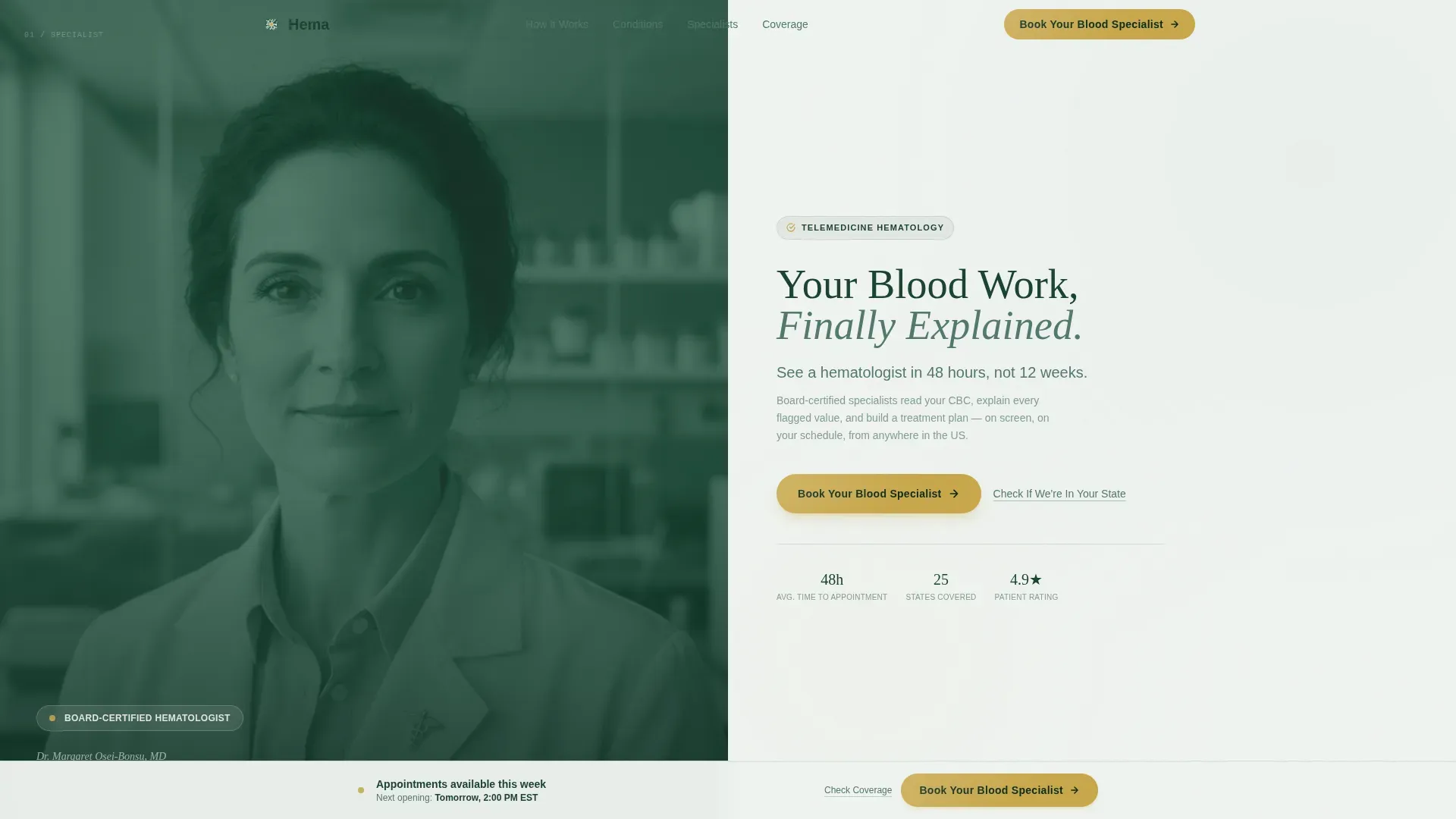
- A 50/50 split-screen hero with a hematologist portrait panel and a headline panel carrying the primary call to action
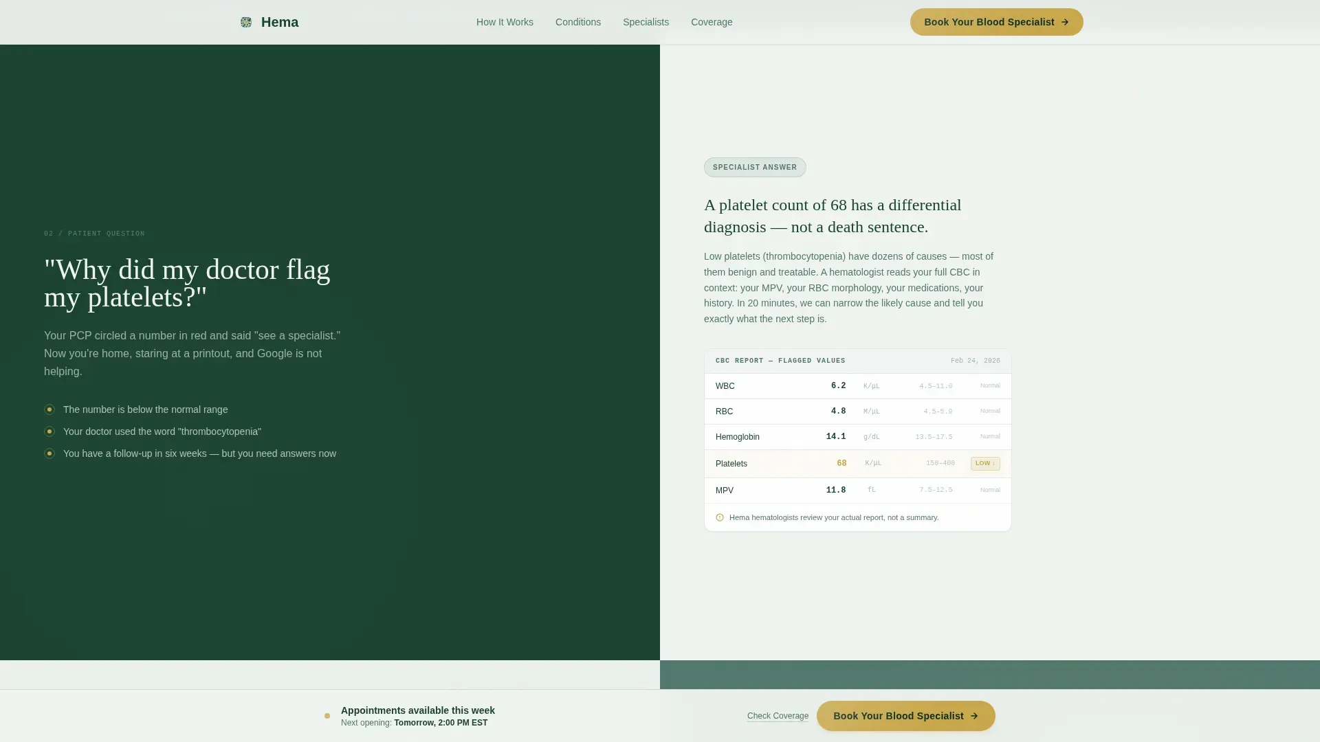
- Three FAQ-driven content sections, each pairing a patient-language question on the left panel with a specialist-grade answer and trust evidence on the right
- A persistent bottom call-to-action bar that appears after the third FAQ section, plus a secondary "Check If We're In Your State" text link that opens a lightweight coverage map modal
Feature list
A paragraph introducing what makes this template stand out from a generic healthcare landing page follows below.
This template combines clinical precision with genuine warmth. Every feature listed here is grounded in the layout and interaction design described in the source brief.
Split-Screen Hero with Portrait Composition
The hero divides into two equal panels. The left holds a shoulders-up photograph of a hematologist against a muted fern background, creating immediate personal connection. The right panel carries the headline "Your Blood Work, Finally Explained" in serif type, a 48-hour wait time subhead, and the primary gold-on-evergreen call-to-action button.
FAQ-Driven Scroll Narrative
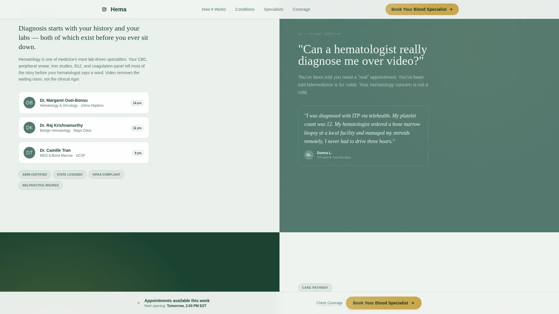
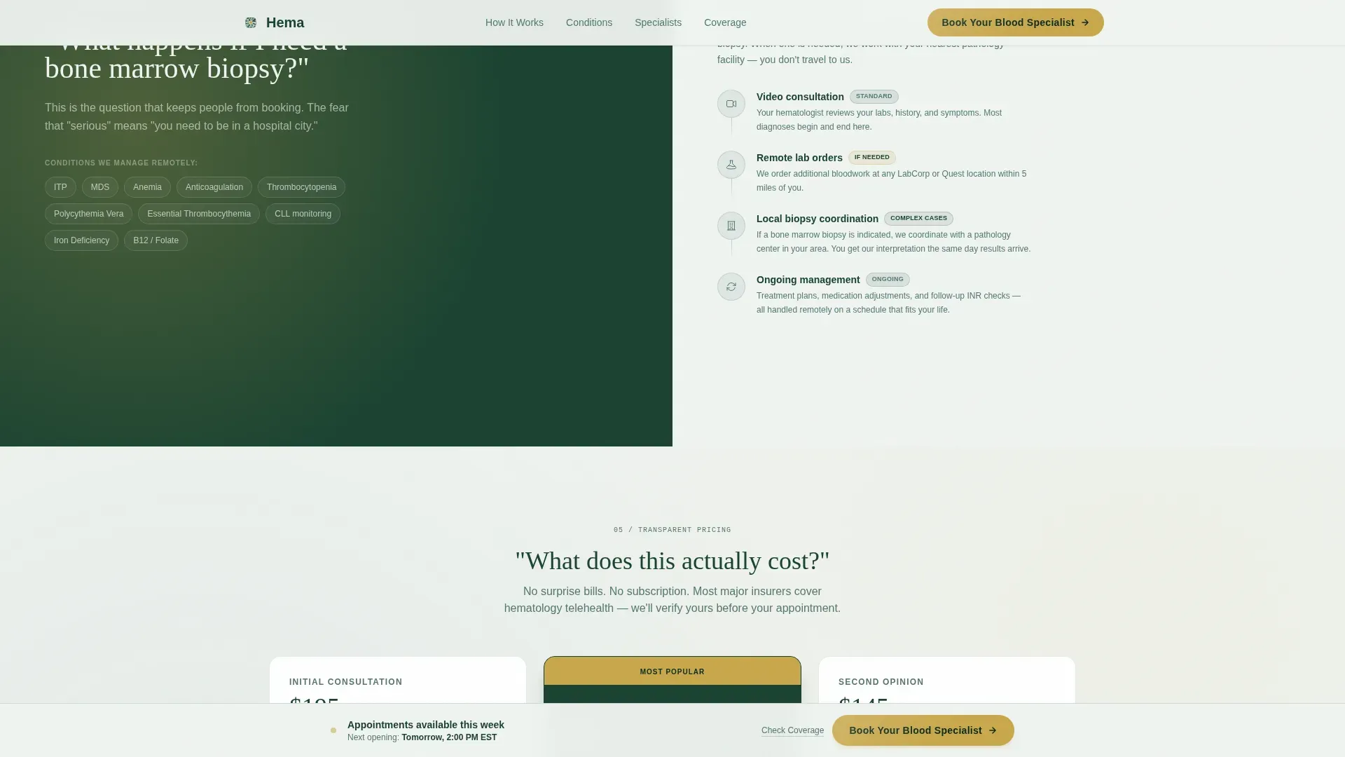
The page scroll is structured as a consultation. Three FAQ sections each open with a large, patient-language question on the left panel and close with a specialist-grade answer, lab callout micro-animations, and trust evidence on the right. The sequence moves naturally from confusion to confidence.
Persistent Bottom Call-to-Action Bar
After the visitor passes the third FAQ section, a fixed bottom bar appears carrying the "Book Your Blood Specialist" button. This ensures the conversion trigger is always visible without interrupting the reading experience earlier in the scroll.
Coverage Map Modal
A secondary text link beneath the primary call to action reads "Check If We're In Your State." Clicking it opens a lightweight modal displaying a state coverage map. This keeps undecided visitors on the page rather than losing them to an unrelated search.
Trust and Social Proof Layer
Board certification badges, state licensure counts, average wait time statistics, and patient testimonials are woven into the FAQ answer panels. The right-panel trust evidence builds credibility alongside each clinical explanation, so authority and warmth arrive at the same time.
Scroll-Reveal Animations and Lab Callout Effects
Medium-intensity scroll reveals, spotlight effects on FAQ cards, lab report callout micro-animations, and a parallax effect on the hero section add visual momentum without overwhelming a patient audience.
Page sections overview
| Section | Purpose |
|---|---|
| Hero split screen | Introduce specialist and primary call to action |
| FAQ section one | Answer platelet flagging concern |
| FAQ section two | Address remote video diagnosis credibility |
| FAQ section three | Explain bone marrow biopsy care pathway |
| Pricing and access | Show transparent cost and persistent call to action bar |
| Footer row | Deliver single-row navigation and legal links |
Design & branding system
The visual identity follows a Medical Clarity theme. It uses the Forest Trust color system to feel clinical enough to trust with bloodwork and warm enough to feel genuinely human. Typography pairs Fraunces serif headlines with DM Sans body text for readable contrast.
- Evergreen (#1B4332) anchors navigation and headers; fern (#52796F) carries section backgrounds and secondary text; birch white (#F0F4F1) opens reading space; quiet gold (#C9A84C) is reserved exclusively for calls to action and trust badges
- Fraunces is used for large serif headlines to project authority; DM Sans handles all body copy and interface labels for clean legibility
- The portrait-centered header composition uses a tight, breathing frame against a muted fern background to create the feel of a calm, unhurried specialist sitting across from the patient
Mobile & speed optimization
The template is designed desktop-first to match the real behavior of patients who look up lab results on a computer after a doctor's visit. Full mobile support is included so the experience holds for patients checking results on a phone.
- Server components handle static content to keep initial load lean; client components are reserved for interactive elements like the coverage map modal and the persistent call-to-action bar
- Scroll-reveal animations, FAQ spotlight effects, and hero parallax are implemented at medium intensity, keeping motion purposeful without creating distraction on smaller screens
How this template helps you convert
The page earns the booking click by resolving fear before requesting action. The structure mirrors a real consultation arc so the visitor feels informed and reassured by the time the call to action reappears.
- The hero delivers a credibility anchor immediately: a real hematologist's face, a 48-hour promise, and a clear primary button, so the visitor's first impression is calm expertise rather than a hard sell
- Each FAQ section raises the emotional stakes slightly, moving from "What does this mean?" through "Can you really help me remotely?" to "What if my case is serious?", so by the final FAQ the visitor already feels halfway through their first appointment
- The persistent bottom bar and the coverage map modal remove the two most common exit reasons, uncertainty about booking and uncertainty about availability, keeping the path to scheduling frictionless
Other information about this template
This template is built specifically for the hematology telemedicine niche within the broader Health and Medical category. It reflects the particular trust challenges of specialty telehealth, where patients must feel confident in remote diagnosis before they will commit to a video visit.
- The page uses English, United States geography, and USD pricing context, making it immediately relevant for domestic telemedicine providers targeting adult patients across multiple states
- The linear single-row footer pattern keeps the page clean and focused, avoiding visual noise at the bottom of a page where the visitor should be moving toward booking rather than browsing
- The template style is Split Screen (50/50), a layout that naturally supports the question-and-answer rhythm this niche requires
Theme
Medical Clarity
Creative direction
FAQ-Driven
Color system
Forest Trust
Style
Split Screen (50/50)
Direction
Click-Through
Page Sections
Split-screen Hero with Portrait Layout
Faq-driven Scroll Consultation
Persistent Bottom Call-to-action Bar
Coverage Map Modal
Scroll-reveal and Lab Callout Animations
Integrated Trust and Social Proof Layer
Related questions
Does this template include a scheduling portal or booking system?
What kind of photography works best for the hero section?
How does the 'Check If We're In Your State' modal work?
Is this template suitable for practices treating both newly diagnosed and ongoing patients?
Can I adjust when the persistent bottom bar appears during the scroll?



