Liver Disease Care Reviews Website Template
Hepatic is a single-page landing page template built for a wrist-worn bilirubin sensor. It combines a comparison table, a scrolling testimonial mosaic, and a five-question monitoring-gap quiz to convert fatty liver patients, transplant recipients, and gastroenterologists into qualified trial leads. The layout follows a clinical-educational visual style with an Arctic White palette.
by Rocket studio
Quick summary
Hepatic is a focused landing page template for a wrist-worn liver monitoring device. It guides visitors from a bold centered headline through a side-by-side comparison table, a growing testimonial mosaic, and a personalized five-question quiz. The result is a segmented, qualified lead ready for a device trial, a physician referral, or a downloadable baseline guide.
Who this template is for
This template is designed for health technology teams launching or promoting a continuous liver monitoring device. It speaks directly to three distinct groups who each arrive with different levels of urgency and technical comfort.
- Newly diagnosed fatty liver patients who want clarity and control over their condition
- Transplant recipients and gastroenterologists who need continuous data between clinic appointments
- Health tech marketers and product teams converting medical device interest into trial sign-ups
What problem this template solves
Quarterly blood draws leave patients in a long stretch of uncertainty. A lab report full of numbers does not tell someone whether their liver is getting worse or holding steady. This template addresses that communication gap head-on.
- Patients wait months between results and have no way to track daily changes
- Clinicians lack continuous data and must make decisions from infrequent snapshots
- Medical device pages often fail to translate clinical value into plain language a patient can trust
What you get with this template
You get a fully structured single-page layout with every section mapped to a specific conversion role. Nothing is decorative without a purpose.
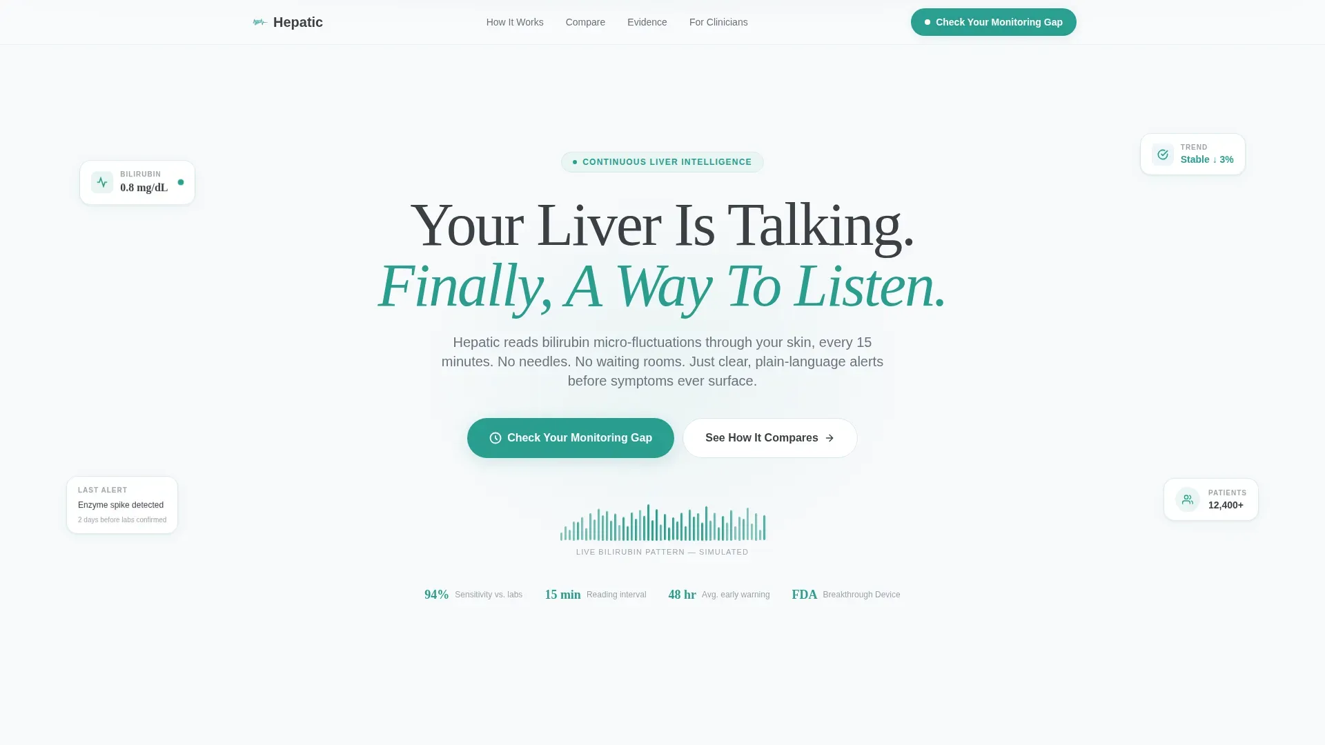
- A hero section with a giant centered headline and an animated teal bilirubin waveform
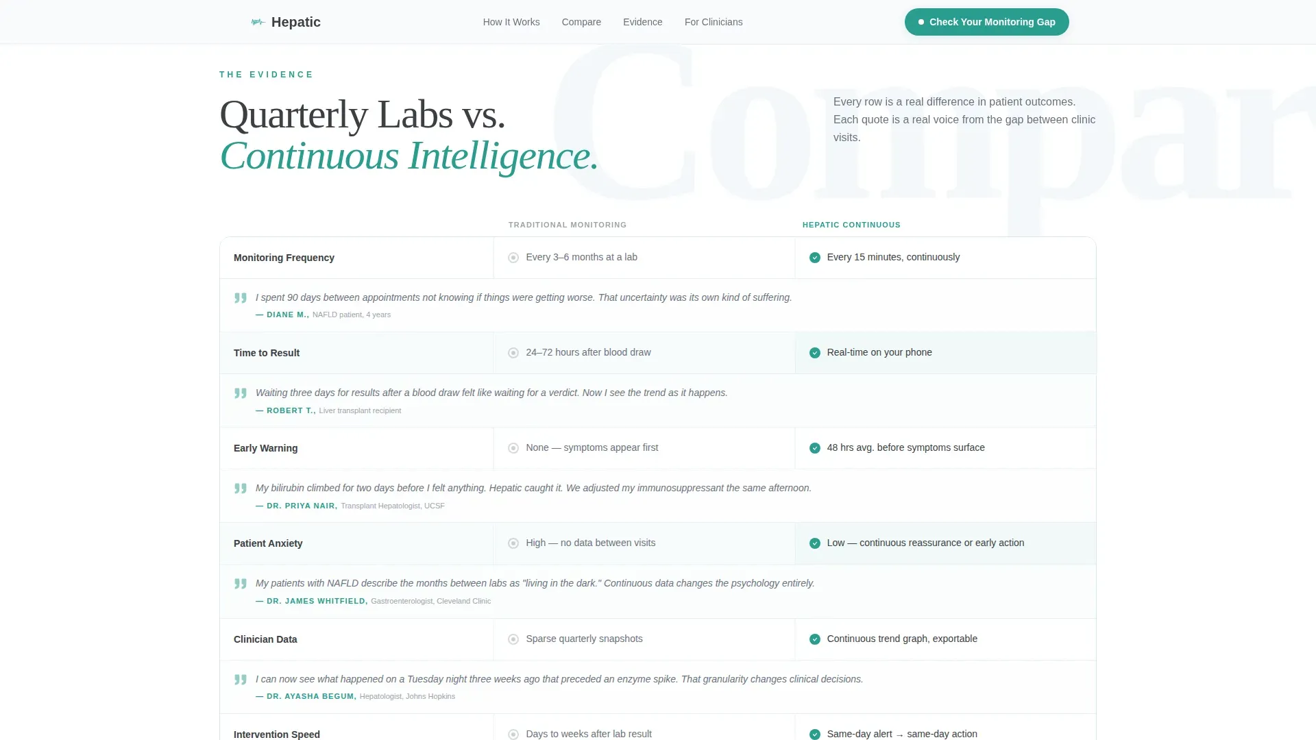
- A comparison table contrasting traditional quarterly monitoring against continuous wearable tracking, each row paired with a patient or clinician quote
- A five-step progressive quiz with personalized result scores and segmented next-step recommendations
Feature list
This template includes purpose-built components that work together to educate, build trust, and convert the right visitor at the right moment.
Giant Headline Hero with Animated Waveform
The hero opens with one oversized graphite headline centered on clinical snow white space. Beneath it, an animated SVG waveform in vital-sign teal pulses slowly, mimicking a real-time bilirubin reading. The visual metaphor grounds the product claim before the visitor reads a single word of body copy.
Side-by-Side Comparison Table
The comparison table places traditional monitoring beside continuous wearable tracking row by row. Each row covers a specific pain point such as result timing, symptom visibility, or visit frequency. Short patient and clinician quotes are embedded directly in the table rows, so social proof appears exactly where skepticism would otherwise arise.
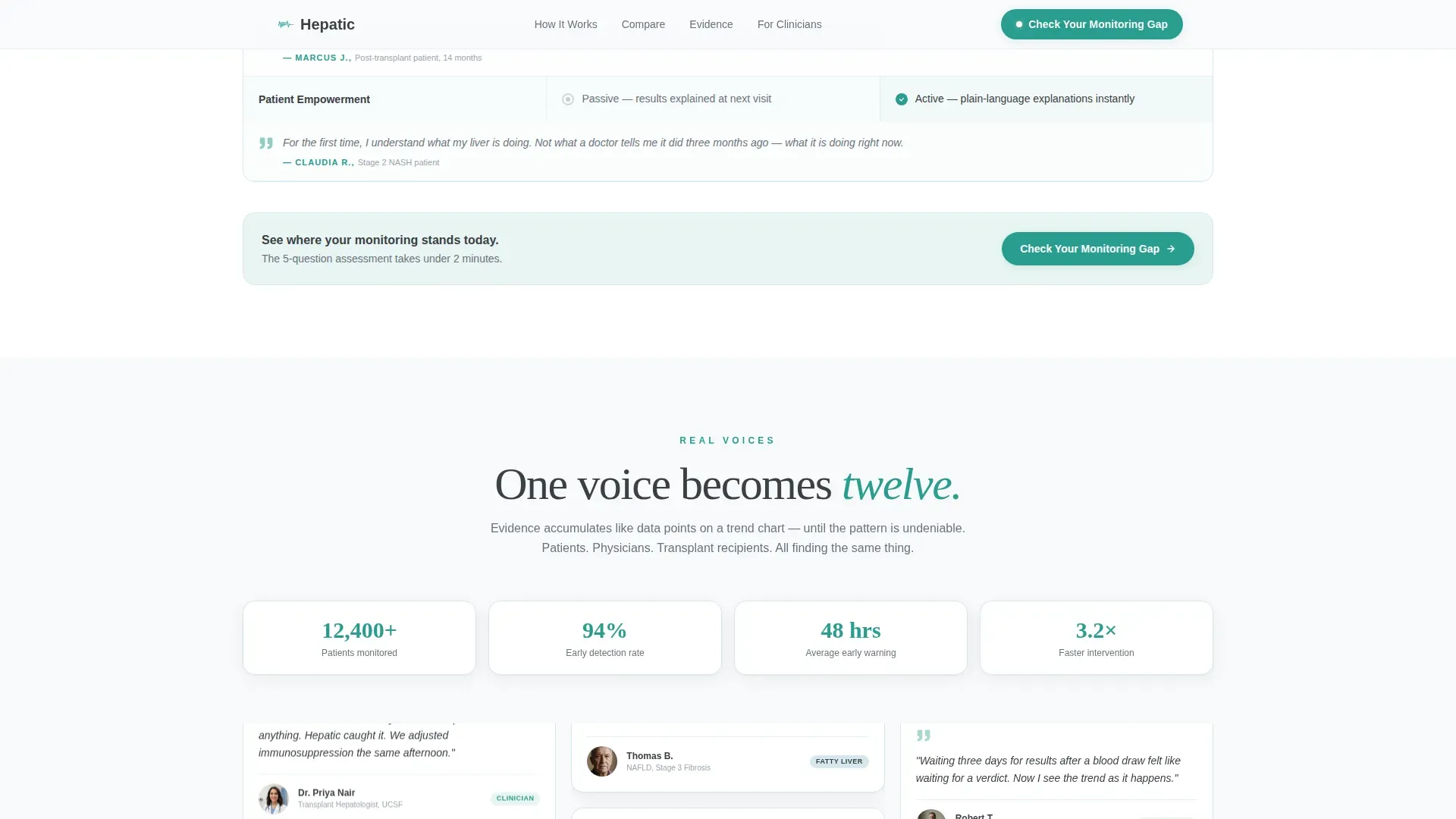
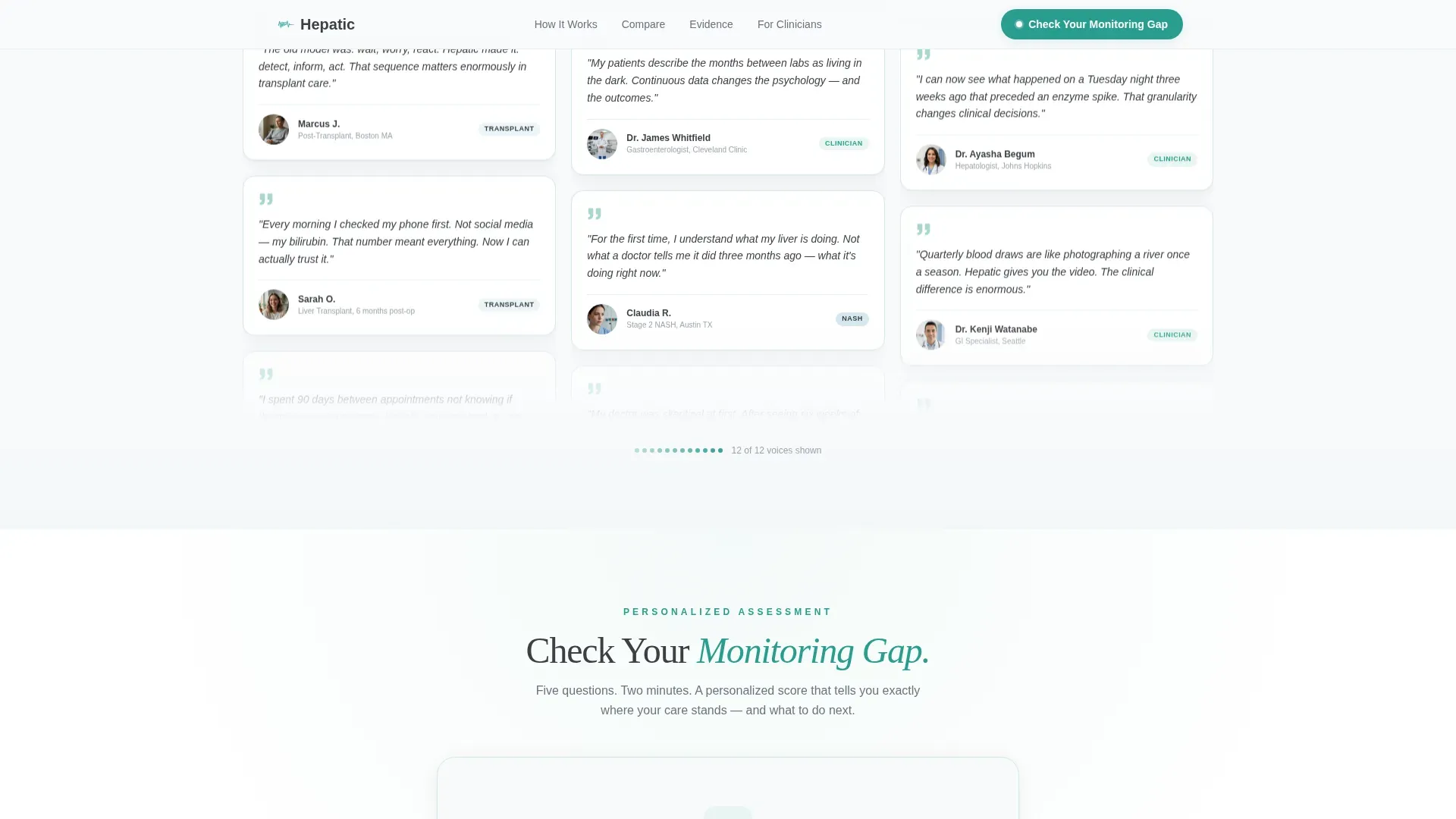
Scroll-Triggered Testimonial Mosaic
As the visitor scrolls, a mosaic of patient and clinician faces and first names grows progressively on screen. One voice becomes five, five become twelve. The scroll-triggered accumulation mirrors the idea of data building into a clear pattern, reinforcing trust through volume rather than a single featured quote.
Five-Step Monitoring Gap Quiz
The primary call to action opens a five-question progressive assessment. Questions cover diagnosis stage, blood work frequency, symptom history, comfort with wearable technology, and physician referral status. The quiz closes with a personalized monitoring-gap score and one of three recommended next steps: request a device trial, share results with a doctor, or download a liver-health baseline guide.
How It Works Explainer Section
A dedicated section walks through the sensor mechanism and how it translates bilirubin micro-fluctuations into plain-language alerts. It is designed to answer the most common clinical and patient questions without requiring a separate page or PDF download.
Clinical-Educational Design System
The layout uses DM Sans for body text and Fraunces serif for display headlines. The palette of clinical snow, soft graphite, glacier blue, and vital-sign teal creates a whiteboard-in-a-specialist's-office feeling. Every color has a defined role: backgrounds, body text, dividers, and interactive elements never compete.
Page sections overview
| Section | Purpose |
|---|---|
| Hero Headline | Establishes the core value proposition with a centered headline and animated waveform |
| Comparison Table | Contrasts traditional quarterly labs with continuous wearable tracking row by row |
| Testimonial Mosaic | Builds social proof through a scroll-triggered accumulation of patient and clinician voices |
| Monitoring Gap Quiz | Qualifies and segments leads through a five-question personalized assessment |
| How It Works | Explains the sensor mechanism and plain-language output in plain terms |
| Footer | Provides a single linear row of supporting links and contact information |
Design & branding system
The visual identity follows an Educational Guide theme. Every design decision reinforces the feeling of a freshly wiped whiteboard in a specialist's office: sterile without being cold, and organized with teaching intent.
- Color roles: clinical snow (#F8FAFB) for backgrounds, soft graphite (#3B3F45) for body text, pale glacier blue (#D6E8EE) for section dividers and table rows, vital-sign teal (#2A9D8F) for interactive elements and data highlights
- Typography: DM Sans handles all body copy for clean readability; Fraunces serif is reserved for oversized display headlines to create visual authority
- Interaction style: high animation fidelity including an animated SVG waveform in the hero, scroll-triggered mosaic growth, and a stateful five-step quiz interface
Mobile & speed optimization
The template is built desktop-first with a strong mobile adaptation layer. Interactive components are separated by rendering role to keep static content fast and dynamic elements responsive.
- Server Components handle all static sections including the hero, comparison table, explainer, and footer for efficient initial load
- Client Components manage the quiz state machine, animated waveform, and scroll-triggered mosaic growth
- The comparison table and testimonial mosaic reflow cleanly on smaller screens without losing the row-level quote pairing
How this template helps you convert
Every section moves a specific type of visitor one step closer to a qualified action. The layout does not rely on a single call to action at the bottom of the page.
- The comparison table creates immediate recognition of the monitoring gap, making the device's value concrete before the visitor reaches the quiz
- The testimonial mosaic adds layered social proof that accumulates as the visitor scrolls, reducing hesitation through familiarity and volume
- The quiz segments each lead by diagnosis stage and referral status, so every completion delivers a personalized next step rather than a generic sign-up form
Other information about this template
This template is suited for health technology teams operating in the medical wearable device space, particularly in liver disease care and hepatology-adjacent markets. It is localized for English (United States) with USD currency formatting and MM/DD/YYYY date display.
- The footer follows a Pattern 1 linear single-row layout, keeping the page clean and focused on the primary conversion path
- The quiz result tiers map to three distinct lead segments: device trial candidates, physician-referral candidates, and content-download candidates, supporting downstream qualification without manual sorting
- The template style is a Comparison Table landing page sitting within the Health and Medical category, Liver Disease Care subcategory, and Liver Disease Wearable Monitor niche
Theme
Educational Guide
Creative direction
Testimonial Mosaic
Color system
Arctic White
Style
Comparison Table
Direction
Quiz/Assessment
Page Sections
Animated Hero with Bilirubin Waveform
Row-by-row Comparison Table
Scroll-triggered Testimonial Mosaic
Five-step Personalized Quiz
How It Works Explainer
Clinical-educational Design System
Related questions
Who is this landing page template designed for?
What does the five-question quiz actually do?
Can I customize the comparison table rows?
How does the testimonial mosaic work on mobile?
Does the quiz require a separate back-end system?



