Liver Disease Care Booking Website Template
Hepatica is a sidebar companion landing page built for liver disease clinical trial matching services. It connects patients with NASH, cirrhosis, hepatitis, and autoimmune hepatitis to active research studies near their location. The layout pairs a persistent eligibility sidebar with a calming Alpine Fresh visual identity, a trust-forward award badge header, and a booking-focused three-step form.
by Rocket studio
Quick summary
Hepatica is a single-page clinical trial finder template designed for liver disease care. It guides scared patients, midnight-searching caregivers, and referring physicians toward active research studies near their zip code. A fixed sidebar tracks reading progress and surfaces a persistent eligibility prompt. The whole experience earns trust before it asks for anything.
Who this template is for
This template is built for organizations running liver disease clinical trial matching programs. It works equally well for patient-facing portals and physician referral tools.
- Patient-facing trial services targeting people newly diagnosed with NASH, cirrhosis, hepatitis, or autoimmune hepatitis
- Caregiver and family support portals where someone is searching late at night for options their specialist did not mention
- Referring physicians and hepatology practices that need a credible, readable resource to hand to patients who have exhausted standard treatment
What problem this template solves
Patients diagnosed with chronic liver disease often find clinical trial information buried in clinical language, scattered across disconnected registry pages, and stripped of the human reassurance they need to act. Fear of placebos, insurance questions, and uncertainty about withdrawal rights stop people from enrolling even when a study is available nearby.
- Visitors land without context and leave before they find a relevant trial because nothing answers their specific fears
- The gap between "I found a trial" and "I scheduled a call" is filled with unanswered questions about cost, safety, and eligibility
- Referring physicians have no clean, shareable page that speaks to their patients in plain language
What you get with this template
Hepatica delivers a complete, conversion-ready landing page layout that carries a visitor from frightened first-reader to scheduled eligibility call. Every section is designed to reduce hesitation and build trust before the form appears.
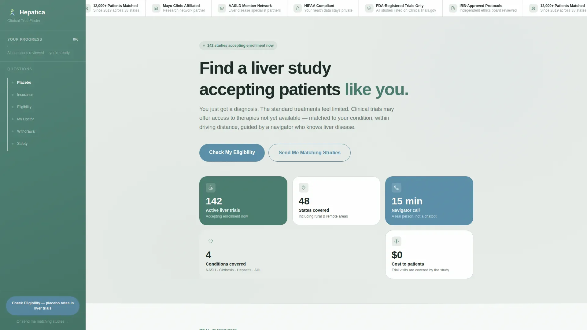
- A full hero section with an award badge row, a single direct headline, bento-style stats, and a sidebar companion introduction
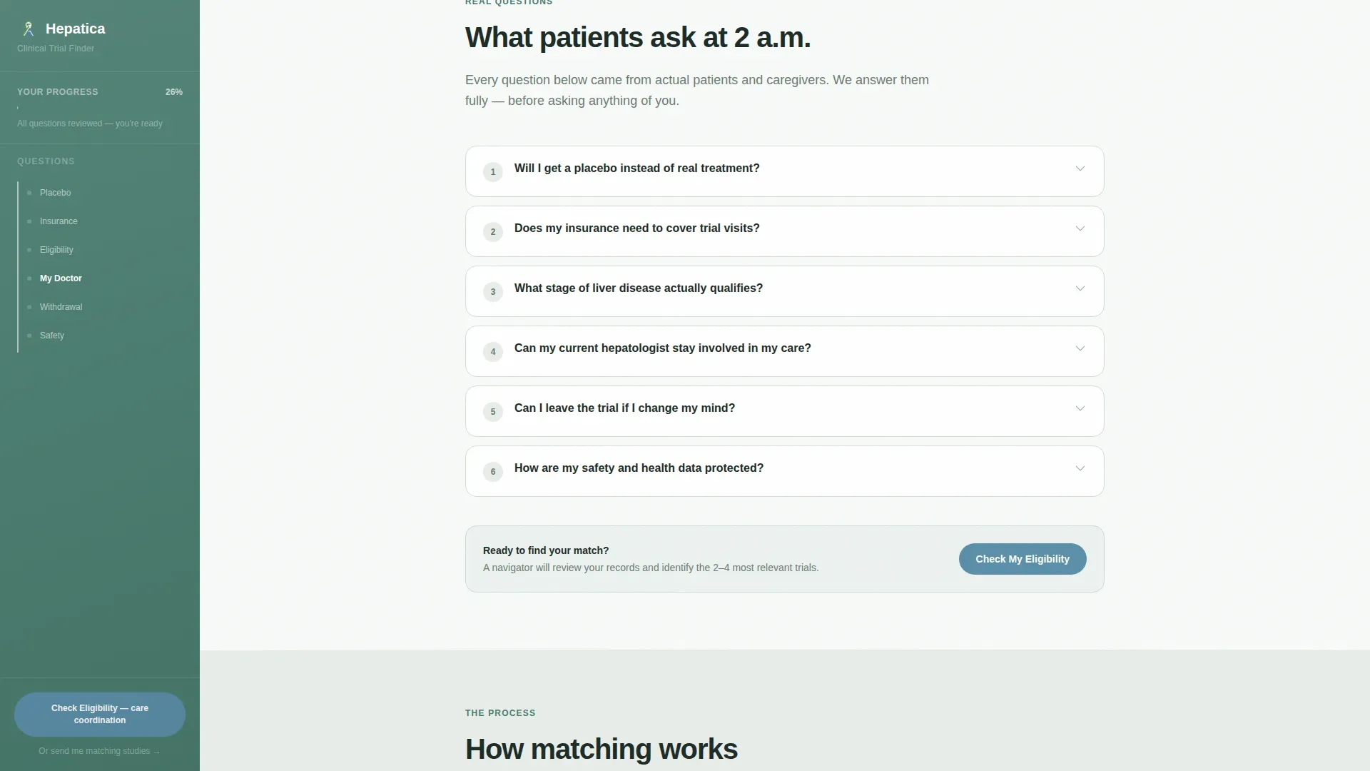
- A FAQ-driven scroll section where real patient questions open into warm answer panels with embedded eligibility micro-checks
- A progressive three-step booking form collecting condition type, location, and a preferred fifteen-minute navigator call window
Feature list
This template is built around one clear goal: move the right patient toward the right trial with as little friction as possible. Every feature below is drawn directly from the template brief.
Fixed Sidebar Progress Tracker
The left sidebar stays anchored while the visitor scrolls. It displays a reading progress bar and a persistent "Check Your Eligibility" prompt. The prompt language shifts from general to condition-specific based on which FAQ sections the visitor has already read.
FAQ Accordion Scroll
The main content area unrolls as a series of real patient questions drawn from actual late-night search behavior. Each question opens an animated accordion panel with a thorough answer, embedded eligibility micro-checks, and links to relevant trials.
Progressive Three-Step Eligibility Form
The primary call to action leads through three focused steps: condition type and diagnosis year, current treatments and zip code, then preferred appointment window for a fifteen-minute matching call with a trial navigator. A secondary path collects only email and condition for visitors not ready to speak with someone.
Award Badge Trust Header
The top of the page displays a credentialed row of trust signals including FDA partnership seals, IRB (Institutional Review Board) approval marks, patient enrollment milestones, and research institution affiliations. This row functions like framed credentials on a specialist's wall before a single word of copy is read.
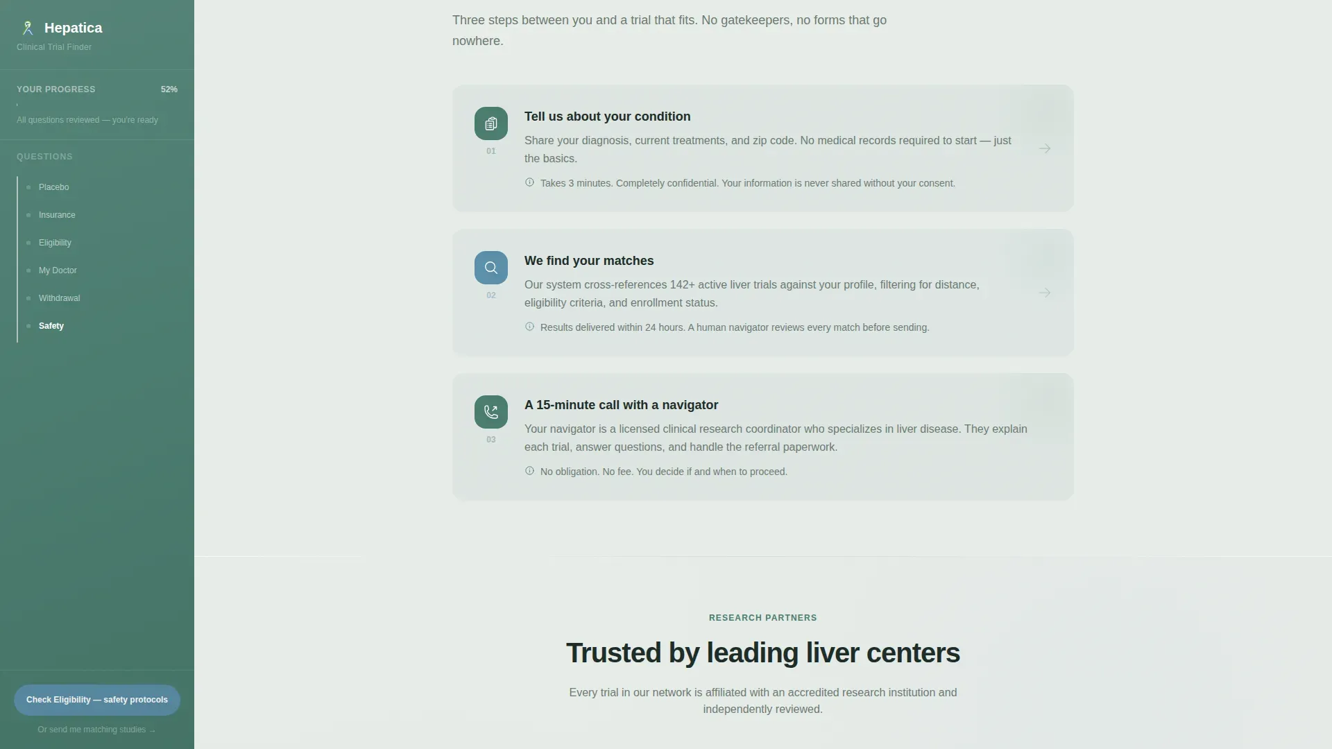
Asymmetric How It Works Panel
A three-panel visual section explains the matching process without using a timeline format. The asymmetric layout keeps the section visually active and skimmable for busy caregivers and physicians.
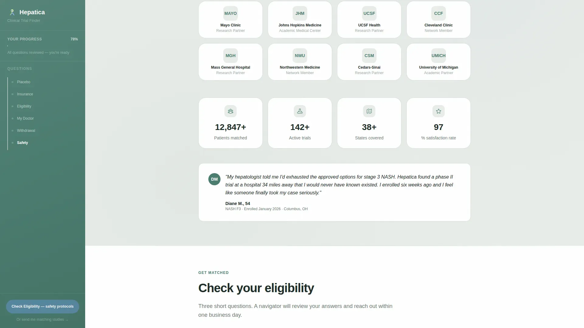
Research Partner Trust Wall
A dedicated section houses a logo trust wall paired with live-style patient milestone counters, including enrollment totals and institutional partner counts, to reinforce credibility at the point where visitors are closest to converting.
Page sections overview
| Section | Purpose |
|---|---|
| Hero with Badges | Opens trust with credentials, headline, sidebar intro, and bento stats |
| FAQ Scroll | Answers real patient fears through animated accordion panels with eligibility checks |
| How It Works | Three-panel asymmetric layout explaining the matching process |
| Research Partners | Logo trust wall with patient enrollment milestone counters |
| Eligibility Form | Progressive three-step form leading to a navigator scheduling call |
| Footer | Single-row linear footer with secondary links |
Design & branding system
Hepatica uses an Alpine Fresh color system that evokes elevation and clean air rather than a clinical setting. The palette is calm and intentional, with every color assigned a specific functional role.
- Pine green (#4A7C6F) anchors the persistent sidebar and section headers; fog gray (#E8EDE9) washes background panels; glacier white (#F7FAF8) holds content cards
- Lake blue (#5B8FA8) appears only on interactive elements: buttons, progress indicators, and active FAQ items, so the eye is drawn only where action is needed
- Typography pairs DM Sans for body text with Plus Jakarta Sans for headings, keeping the page readable and warmly professional without feeling sterile
Mobile & speed optimization
The layout is built desktop-first to support the sidebar companion structure. On smaller screens, the sidebar collapses gracefully so mobile visitors still reach the eligibility form without losing context.
- The sidebar progress tracker and FAQ accordion adapt to a single-column flow on mobile, keeping the reading experience intact
- Server Components handle static sections while Client Components power the interactive sidebar, FAQ accordion, and three-step form, keeping the interactive parts responsive without slowing the static load
How this template helps you convert
The page earns the click by removing every known barrier before it ever asks for contact information. Visitors who reach the form have already had their fears addressed in plain language.
- The FAQ scroll answers safety concerns, cost questions, placebo odds, and withdrawal rights before any form field appears, so the visitor arrives at the eligibility step already reassured
- The sidebar progress tracker keeps the "Check Your Eligibility" prompt visible throughout the scroll without interrupting reading, making the conversion path feel like a natural next step rather than a push
Other information about this template
Hepatica is a purpose-built template for the liver disease clinical trial finder niche within the broader Health and Medical category. It is designed to serve the specific emotional state of its audience, people who are afraid, exhausted, and looking for clarity.
- The template supports both a direct booking path (three-step eligibility form leading to a navigator call) and a softer secondary path (email capture for study match delivery), giving you two conversion lanes for different visitor readiness levels
- The creative direction is FAQ-Driven, meaning the structure prioritizes answering documented patient fears over promotional messaging, which makes the page well-suited for sensitive health-related audiences
- GSAP-powered scroll reveals, sidebar tracking, FAQ accordion interactions, and staggered content animations are specified in the template brief as medium-intensity motion, keeping the page lively without feeling overwhelming
- The template targets a US-based audience and is localized for English, USD pricing references, US date formats, and US zip code input fields
- The Healing Space theme ties together the Alpine Fresh palette, the calm typographic choices, and the quiet structural pacing to position the service as a trustworthy, human-first guide rather than a data-collection tool
Theme
Healing Space
Creative direction
FAQ-Driven
Color system
Alpine Fresh
Style
Sidebar Companion
Direction
Booking/Scheduling
Page Sections
Fixed Sidebar Progress Tracker
FAQ Accordion Scroll
Progressive Three-step Eligibility Form
Award Badge Trust Header
Asymmetric How It Works Panel
Research Partner Trust Wall
Related questions
What types of liver conditions is this template built for?
Can this template serve both patients and referring physicians?
How does the sidebar eligibility prompt work?
What does the three-step eligibility form collect?
Does this template include pre-written FAQ content?


