Liver Disease Care Booking Website Template
Hepato is a liver disease telehealth landing page template built for hepatology specialty practices. It features a calm three-step intake form, zigzag alternating content sections, and a transparent process layout. Designed for adult patients living with fatty liver disease, hepatitis B or C, or cirrhosis, it guides visitors from first concern to scheduled appointment without friction or confusion.
by Rocket studio
Quick summary
Hepato is a single-page telehealth landing page template for liver disease specialty care. It opens with a conversational multi-step intake form and guides visitors through alternating content sections that peel back the process one layer at a time. Every design decision builds procedural clarity, not emotional pressure, so visitors arrive at the scheduling flow already informed and ready.
Who this template is for
This template is built for hepatology telehealth practices serving adult patients across the United States. It fits practices that want to remove waitlist friction and connect rural or underserved patients with board-certified hepatologists quickly.
- Telehealth hepatology practices serving patients with fatty liver disease, hepatitis B or C, or cirrhosis
- Care teams whose patients were recently flagged with abnormal labs or a concerning ultrasound result
- Practices supporting caregivers who coordinate complex care between gastroenterology, radiology, and pharmacy
What problem this template solves
Patients with serious liver conditions often wait months to see a specialist. They leave their primary care appointment with a scary lab result and no clear next step. This template dissolves that anxiety by showing visitors exactly what happens when they reach out.
- Patients in rural zip codes cannot easily access in-person hepatology care and need a trustworthy remote path
- Visitors arrive confused after abnormal results and need procedural clarity before they will book
- Practices lose potential patients who leave the page before understanding how the telehealth process works
What you get with this template
You get a fully structured alternating-layout landing page built specifically for liver disease telehealth. Every section has a defined purpose, and the visual flow guides visitors from intake to scheduling with no dead ends.
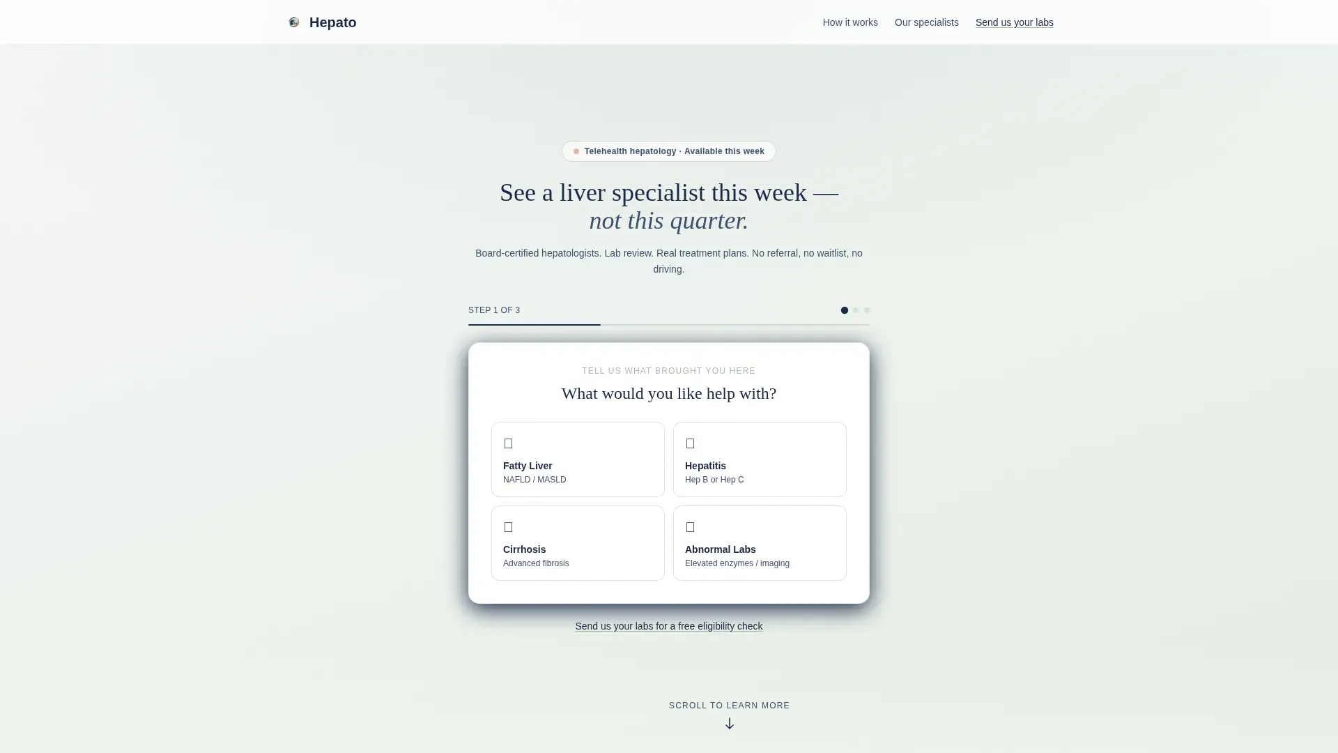
- A three-step intake form widget that opens mid-conversation, asking plain-language questions about condition, recent labs, and appointment preference
- Two zigzag content sections revealing the matched hepatologist experience and a sample visit summary with realistic clinical context
- A fixed floating call-to-action button and a secondary low-commitment text link that catch visitors at every stage of readiness
Feature list
This template includes purposeful components tied directly to the hepatology telehealth use case. Each feature below reflects what is built into the layout.
Three-Step Intake Form Widget
The header replaces a traditional hero image with a calm, staggered intake widget. Step one presents four plain-language condition tiles: Fatty Liver, Hepatitis, Cirrhosis, and Abnormal Labs. Step two uses a yes or no toggle to ask about recent bloodwork or imaging. Step three collects state of residence and preferred appointment window.
Zigzag Alternating Content Sections
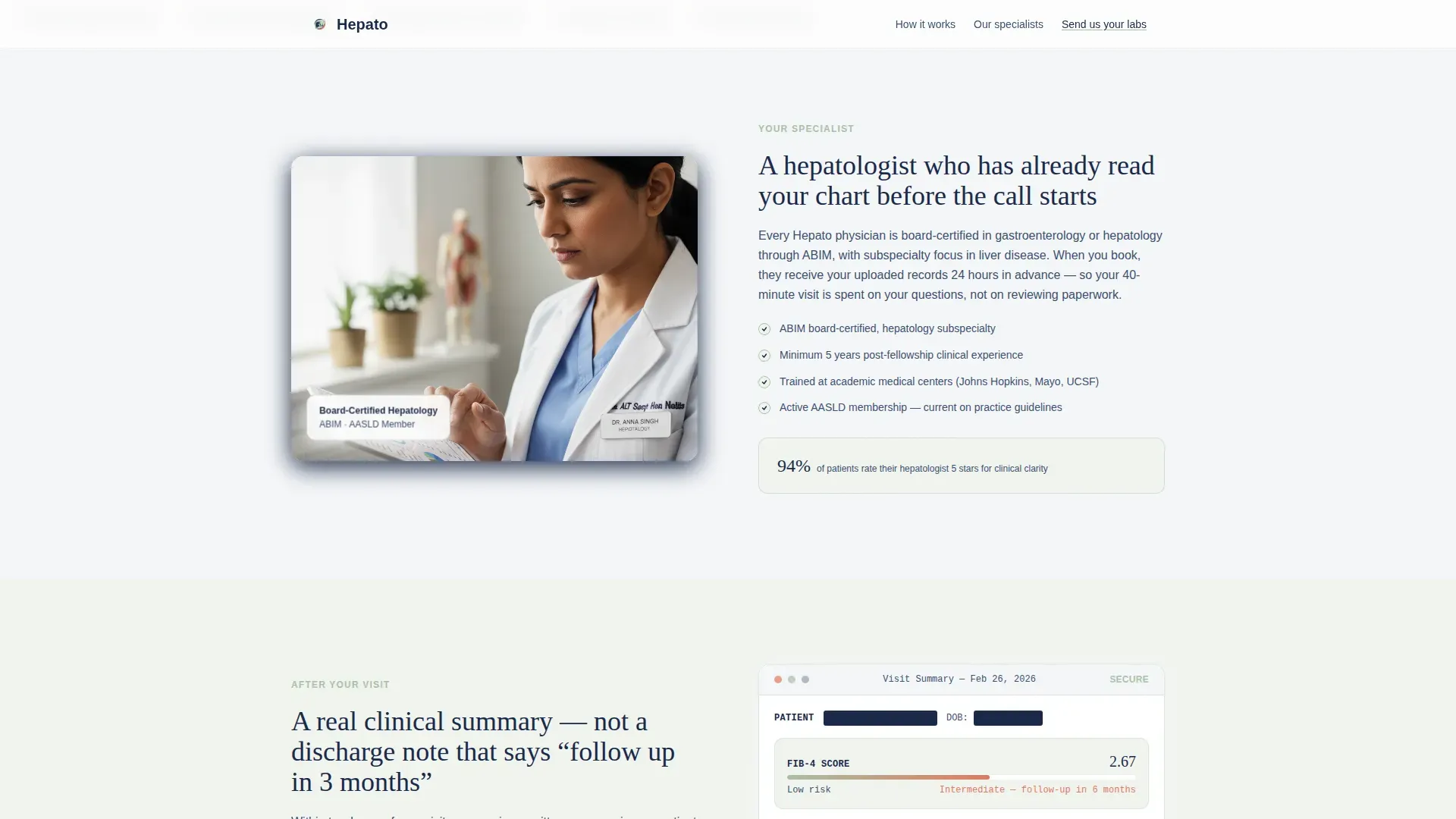
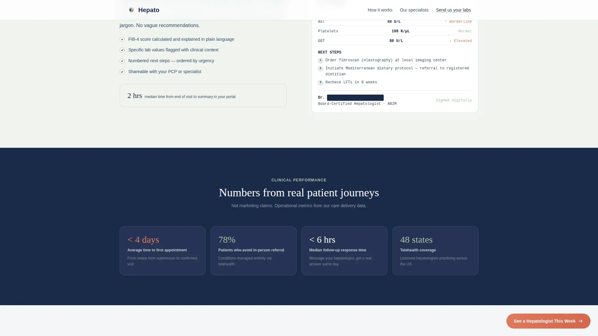
Two alternating sections follow the header. The first places an image on the left and explanatory text on the right, showing a matched hepatologist reviewing uploaded labs. The second reverses the layout with a sample visit summary including redacted but realistic clinical notes, FIB-4 scores (a standard liver fibrosis marker), and next-step recommendations.
Clinical Metrics Trust Indicators
Each zigzag section ends with a sage-bordered callout block quoting a real clinical metric. These include average time to first appointment, percentage of patients who avoid an in-person referral, and median follow-up response time. The numbers are visible and specific.
Fixed Floating Call-to-Action Button
After the second zigzag section, a coral-colored button stays fixed in the viewport as the visitor scrolls. This keeps the primary scheduling action reachable at all times without interrupting the reading flow.
Secondary Low-Commitment Path
A muted navy text link reading "Send us your labs for a free eligibility check" runs alongside the primary call to action. It catches visitors who are not yet ready to book but are willing to take a smaller first step.
Process Timeline Section
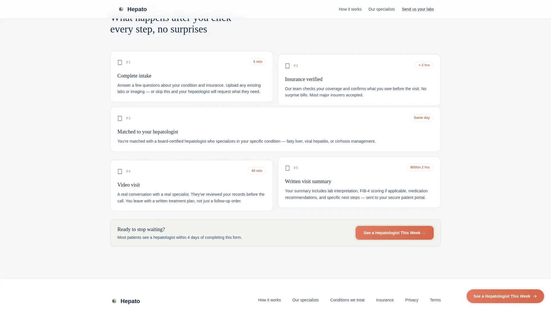
A bento-style asymmetric section maps what happens after a visitor books. It answers the "but what actually happens?" objection with a step-by-step visual timeline, replacing uncertainty with a clear procedural sequence.
Page sections overview
| Section | Purpose |
|---|---|
| Header intake form | Opens conversation with three-step condition and scheduling widget |
| Zigzag left section | Shows matched hepatologist reviewing uploaded labs |
| Zigzag right section | Displays sample visit summary with clinical notes and FIB-4 score |
| Clinical metrics row | Builds trust through specific appointment and referral statistics |
| Process timeline | Shows step-by-step flow after booking is confirmed |
| Footer arc split | Closes the page with navigation and secondary contact options |
Design & branding system
The template uses a Medical Clarity visual theme built on the Soft Mist color system. The palette is designed to feel clinically trustworthy while remaining warm enough to reduce patient anxiety.
- Four core colors: fog white (#F4F6F8) for backgrounds, quiet sage (#A7BFA5) for section washes and trust indicators, deep hepatic navy (#1B2A4A) for all headlines and primary text, and warm signal coral (#E07A5F) reserved exclusively for calls to action and urgency cues
- Typography pairing: DM Sans for body text and Fraunces serif for display headlines, giving the page a calm but authoritative voice
- Backgrounds alternate between fog white and a pale sage wash, anchored by navy headings that carry the weight of clinical authority throughout
Mobile & speed optimization
The template is built mobile-first because many of its target patients are accessing the page from phones in rural zip codes. Layout decisions prioritize small-screen usability at every section.
- The multi-step intake form is designed to work smoothly on a phone screen, with tap-friendly condition tiles and a simple toggle for the lab question
- Static sections use server-rendered components for fast initial load, while the interactive form widget runs as a client component
- Scroll reveal animations and the staggered form step transitions are set to medium intensity so they feel smooth without slowing the experience
How this template helps you convert
This template is built as a click-through landing page. Its single conversion goal is to move visitors into the scheduling and insurance verification flow. Every layout decision supports that goal without using pressure or scarcity tactics.
- The three-step intake form starts the conversation before the visitor has read a single line of body copy, reducing the activation energy required to begin the process
- The zigzag sections systematically answer the most common objections by showing exactly what a visit looks like, who the hepatologist is, and what the summary will contain
- The fixed coral call-to-action button and the secondary eligibility check link give visitors two routes forward based on their readiness level, so no one leaves without a clear next step
Other information about this template
This template is suited for practices launching a liver disease telehealth service or updating an existing page that is not converting rural or post-diagnosis patients. It is built with the full intake and insurance verification flow in mind as the destination page after the click.
- The page style is Zigzag/Alternating, making it easy to extend with additional condition-specific sections if the practice serves a broader range of hepatic diagnoses
- The coral call-to-action pulse animation is applied only to primary scheduling buttons, keeping the visual hierarchy clean and focused
- The footer follows an Arc Browser Split pattern, creating a two-column closing section that separates navigation from contact options without feeling crowded
Theme
Medical Clarity
Creative direction
Transparent Process
Color system
Soft Mist
Style
Zigzag/Alternating
Direction
Click-Through
Page Sections
Three-step Conversational Intake Form
Zigzag Alternating Layout Sections
Clinical Metrics Trust Callouts
Fixed Floating Call-to-action Button
Secondary Low-commitment Engagement Path
Bento Process Timeline Section
Related questions
What type of medical practice is this template designed for?
Does this template include the full booking or insurance verification page?
Can I update the condition tiles in the intake form to match my patient population?
Is the sample visit summary in the template based on real patient data?
How does the secondary engagement path work for visitors who are not ready to book?



