Job Board & Portal Careers Website Template
Hired is a single-column job board landing page built around a five-step career-match quiz. It opens with a bold question, guides visitors through skills, values, and salary inputs, then delivers a personalized shortlist of roles. The immersive Electric Indigo palette and Hero's Journey structure keep users scrolling from curiosity to account creation.
by Rocket studio
Quick summary
Hired is a single-column job board landing page that turns passive browsing into active career discovery. A five-step quiz captures what visitors actually want from work, then surfaces a curated shortlist of matched roles. The Electric Indigo color system and Hero's Journey structure make the experience feel guided, not generic.
Who this template is for
This template is built for anyone launching or relaunching a general job board who wants to stand out from plain listing pages. It suits teams and founders who believe matching matters more than volume.
- Recent graduates who want direction, not just a list of open roles
- Mid-career professionals quietly exploring a change without committing publicly
- Hiring platform builders who want a quiz-first engagement model over a static search bar
What problem this template solves
Most job board pages ask visitors to search before they know what to search for. That mismatch creates frustration and early exits. This template flips the flow by leading with intent capture.
- Visitors arrive without a clear job title in mind and leave before finding a match
- Standard listing pages deliver no value until a visitor already knows what they want
- Generic boards feel cold and impersonal, reducing trust and return visits
What you get with this template
You get a fully structured single-column landing page that combines a career-match quiz with a curated results experience. Every section is designed to move a visitor one step closer to creating an account.
- A five-step interactive quiz covering passion, skills, industry, salary, and location
- A blurred results preview that unlocks only after free account creation
- A secondary path for visitors who prefer to browse all listings directly
Feature list
This template delivers a tightly focused set of components, each serving the quiz-to-account funnel described in the brief.
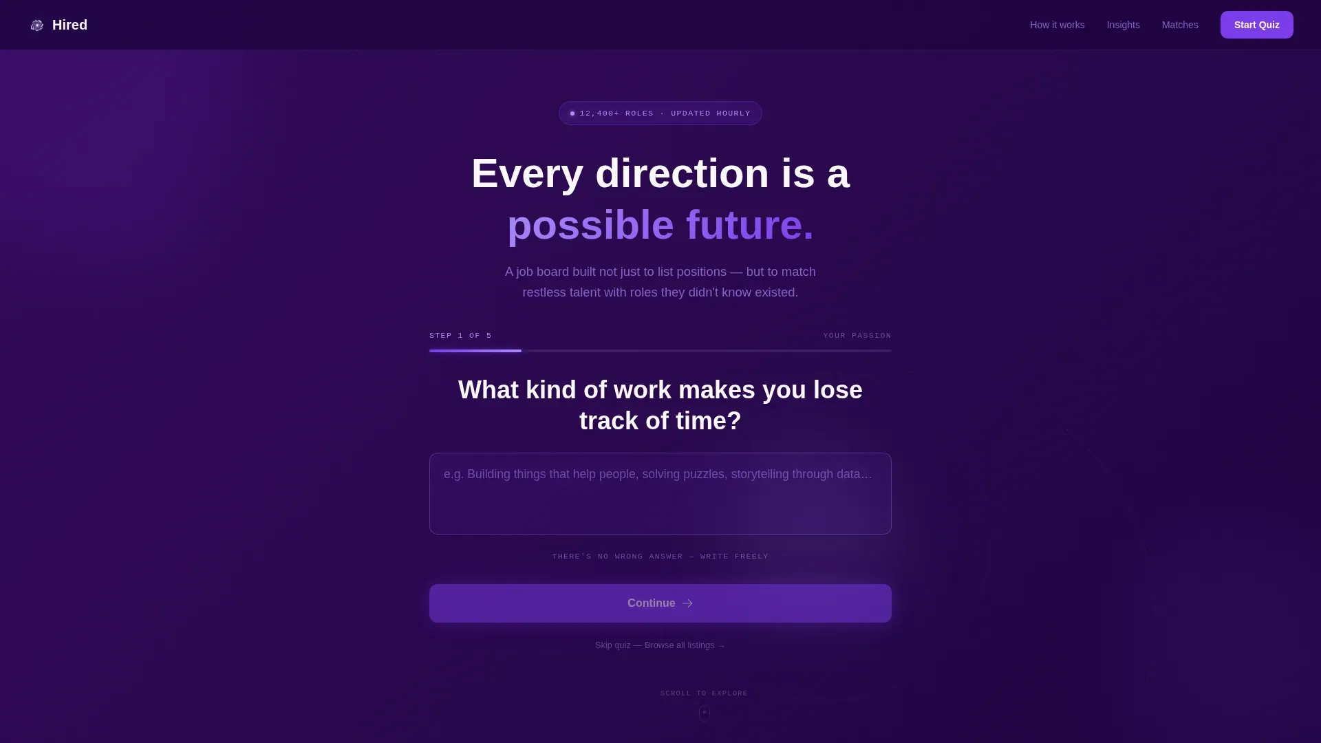
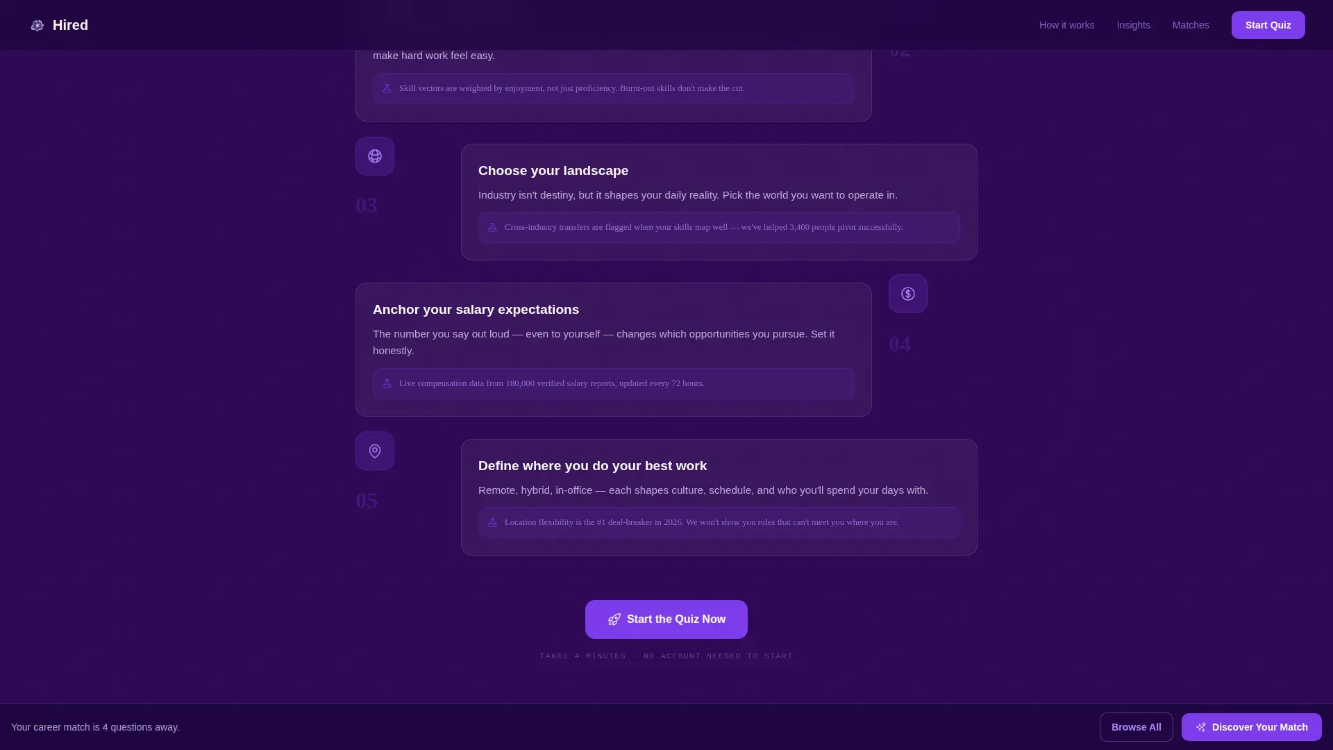
Five-Step Career Match Quiz
The quiz collects work passion via open text, top skills via a tag selector, preferred industry via a visual grid, salary expectations via a slider, and location flexibility via a toggle. Each step builds a clearer picture of the visitor's ideal role.
Multi-Step Form Header
The page opens with a single bold question centered on a deep indigo background. A glowing violet button and a visible progress bar showing Step 1 of 5 signal that a journey is already underway, reducing hesitation at the first interaction.
Role Match Results Cards
At the bottom of the page, a curated shortlist of roles appears as cards with match-percentage badges. Results are partially blurred, creating a natural motivation to complete account creation to see the full details.
Sticky Secondary Call to Action
After the first scroll, a sticky bottom bar repeats the primary call to action. This ensures the main prompt stays visible without interrupting the quiz flow, keeping conversion intent present throughout the page.
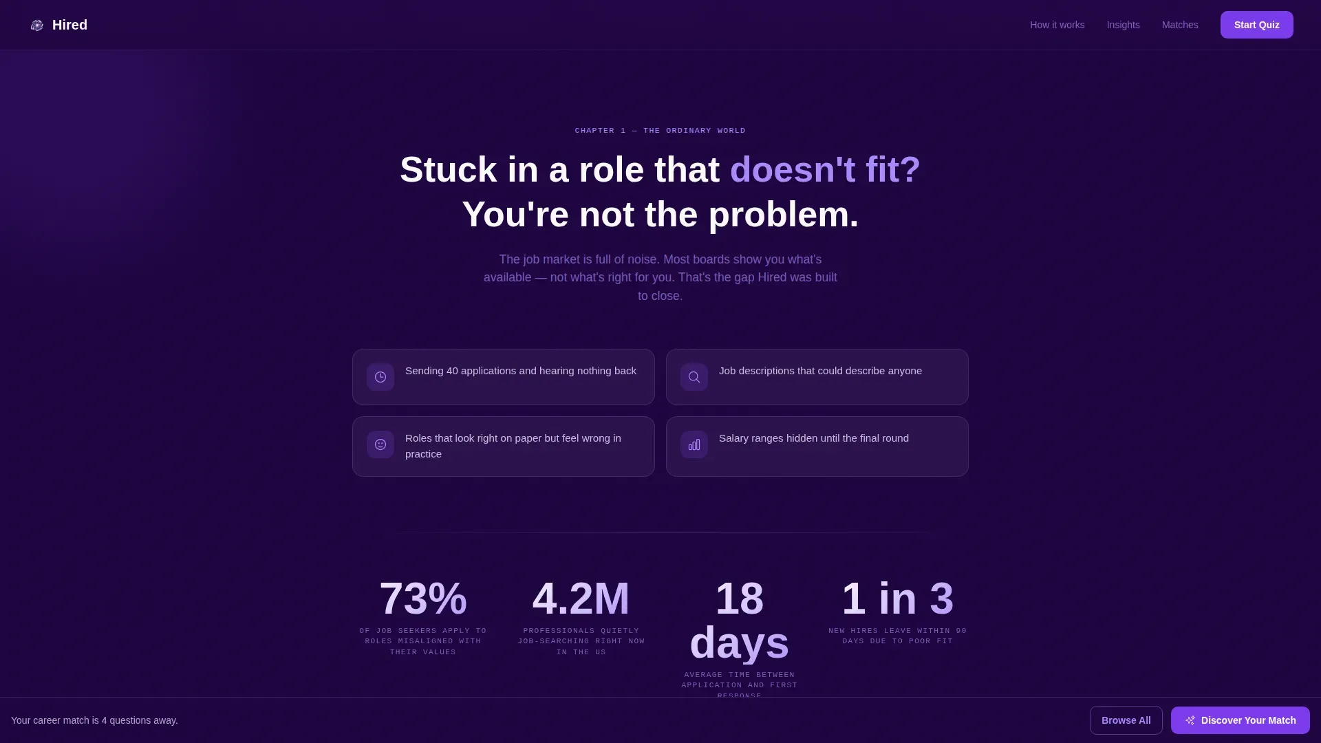
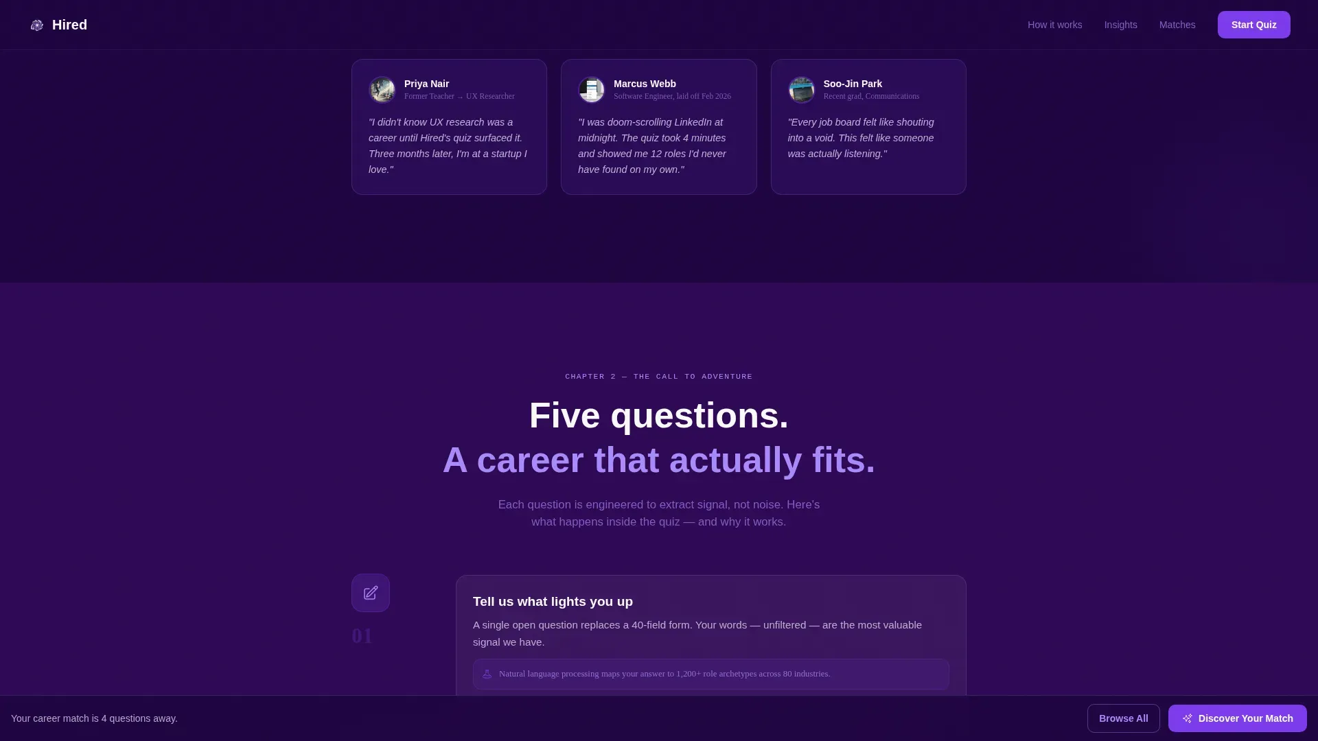
Diagnostic Scroll Sections
Between the quiz steps, short narrative sections name the visitor's likely frustration, deepen the skill and values questions, and present industry insights alongside salary benchmarks and growth projections drawn from the quiz responses.
Animated Gradient Background
The header background uses a faint animated gradient pulse on deep indigo. The motion is subtle enough to feel atmospheric without distracting from the form input, reinforcing the immersive planetarium-lobby aesthetic.
Page sections overview
| Section | Purpose |
|---|---|
| Multi-Step Form Header | Captures work passion and initiates the quiz journey |
| Ordinary World Diagnostic | Names the visitor's current frustration to build empathy |
| Call to Adventure Quiz | Collects skills, values, and deal-breakers across multiple steps |
| Mentor Data Section | Presents salary benchmarks, industry insights, and growth projections |
| Role Match Results | Delivers a blurred shortlist unlocked by account creation |
| Browse All Listings | Offers a secondary path for visitors who skip the quiz |
Design & branding system
The visual identity follows an Educational Guide theme built on an Electric Indigo color system. The palette balances depth and legibility, feeling immersive without becoming hard to read.
- Deep cosmic indigo (#2E0854) anchors all backgrounds, creating a focused, distraction-free canvas
- Vibrant electric violet (#7C3AED) drives buttons and the progress bar, drawing the eye to every action point
- Soft lavender mist (#EDE9FE) surfaces role cards and breathing-room sections, keeping content light and scannable
- Sharp white (#FAFAFA) holds body text containers for clean contrast against the dark backdrop
Mobile & speed optimization
The single-column flow is inherently well-suited to smaller screens, where vertical scrolling matches natural thumb movement. The quiz steps are spaced to feel like one focused task at a time rather than a long form.
- Each quiz step occupies its own screen moment, reducing cognitive load on mobile
- The sticky bottom bar keeps the call to action reachable without requiring a scroll back to the top
- Card components in the results section stack cleanly in a single column on narrow viewports
How this template helps you convert
The template earns trust before it asks for anything. By delivering a personalized preview first, it makes account creation feel like a reward rather than a gate.
- The quiz captures intent early, so visitors feel understood before they see a single job listing
- Blurred results create a natural unlock moment, making free sign-up feel low-risk and high-reward
- The sticky call-to-action bar keeps the next step visible throughout the page without interrupting the experience
Other information about this template
This template is designed as a standalone single-column landing page. It works well as an entry point for a broader job board product or as a standalone campaign page for a new hiring platform launch.
- The Hero's Journey creative direction structures the page as a narrative arc, not a menu of features
- The Educational Guide theme positions the platform as a knowledgeable guide rather than a passive directory
- The template style and quiz flow are compatible with general job board use cases across multiple industries and experience levels
- The "Browse All Listings" secondary path ensures the page serves visitors who resist guided flows without losing them entirely
Theme
Educational Guide
Creative direction
Hero's Journey
Color system
Electric Indigo
Style
Single Column Flow
Direction
Quiz/Assessment
Page Sections
Five-step Career Match Quiz
Multi-step Form Header
Blurred Role Match Results
Sticky Secondary Call to Action
Diagnostic Narrative Sections
Animated Indigo Background
Related questions
Does the template include all five quiz steps?
Can someone use the page without taking the quiz?
When do visitors see their matched job results?
What does the sticky bottom bar do?
Is this template suitable for a niche job board?


