Hispanic-Owned Business Portfolio Website Template
Tinta is a bento grid landing page built for a bilingual marketing agency that earns trust through accumulated proof before asking for anything. The layout pairs an ink-and-paper visual identity with a campaign-card grid structure, a sticky call-to-action bar, and a full-width closing button, designed to move culturally fluent brands toward a discovery call or case study download.
by Rocket studio
Quick summary
Tinta is a single-page bento grid landing page for a Hispanic-owned marketing agency. It opens with a full-bleed editorial photo and builds credibility through campaign cards before introducing any call to action. The Neo-Retro ink-and-paper palette, uneven grid rhythm, and two-path conversion structure make this template feel earned rather than sold.
Who this template is for
This template is built for bilingual creative and marketing agencies that serve multicultural clients. It works especially well for founders who are tired of generic agency page templates that reduce cultural fluency to surface-level aesthetics.
- Hispanic-owned marketing and strategy agencies with a portfolio of real campaign results
- Bilingual brand consultancies working across consumer packaged goods, healthcare, or retail sectors
- Cultural marketing studios that need a landing page reflecting depth of work, not just a logo grid
What problem this template solves
Most agency landing pages lead with credentials and end with a contact form. That order rarely builds trust with buyers who have been burned by agencies that pitched "¡Hola!" as a multicultural strategy. Tinta flips the sequence entirely.
- Visitors see ten campaigns worth of results before they ever see a call to action
- The page removes the friction of a contact form by routing clicks to a short intake quiz instead
- A secondary PDF download path captures lower-commitment visitors without losing them from the funnel
What you get with this template
The template delivers a fully structured single-page layout with a clear visual logic and two conversion paths. Every section has a defined purpose and a defined position in the scroll sequence.
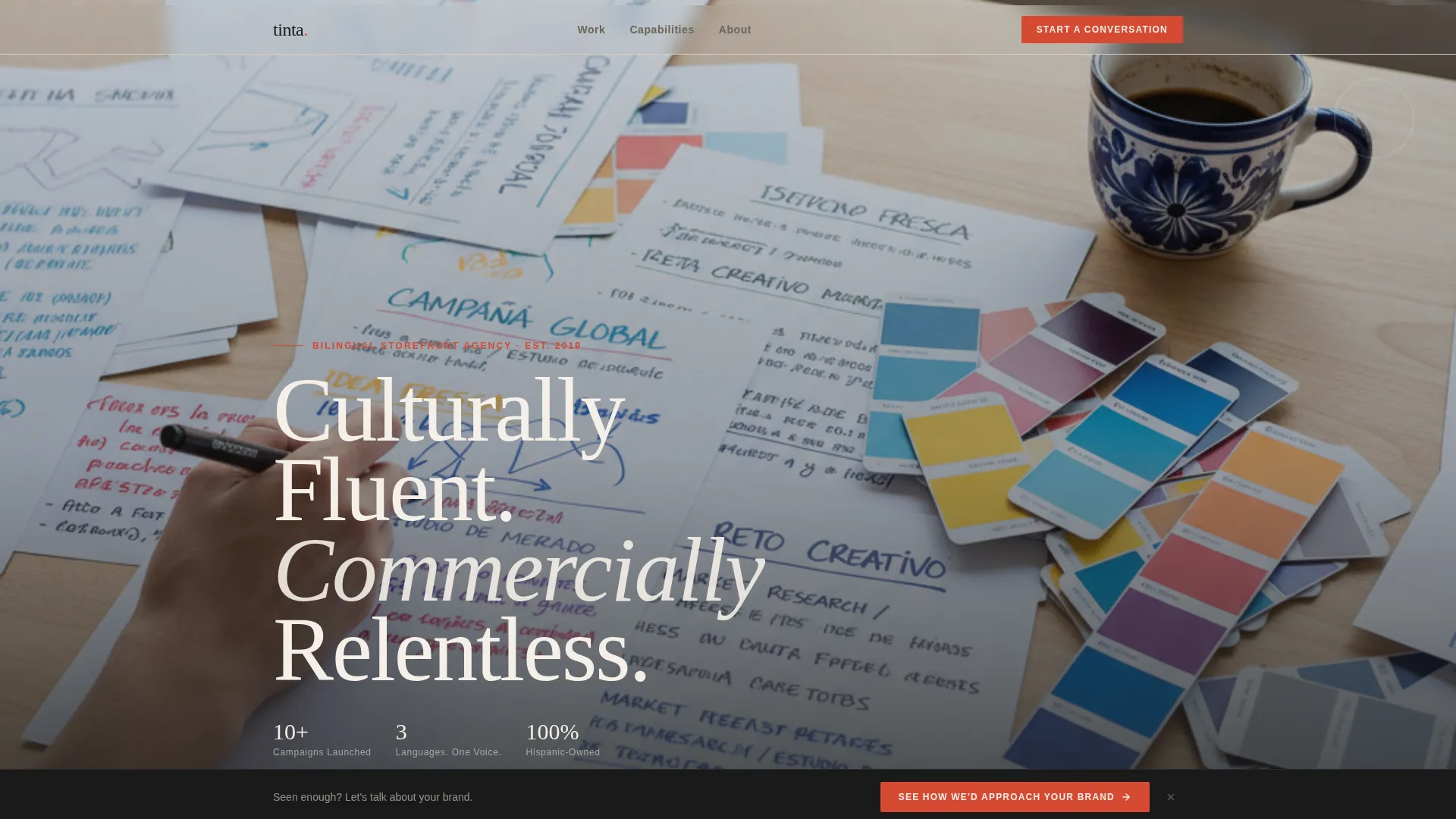
- A full-bleed editorial photo header with a bold serif headline placed low-left
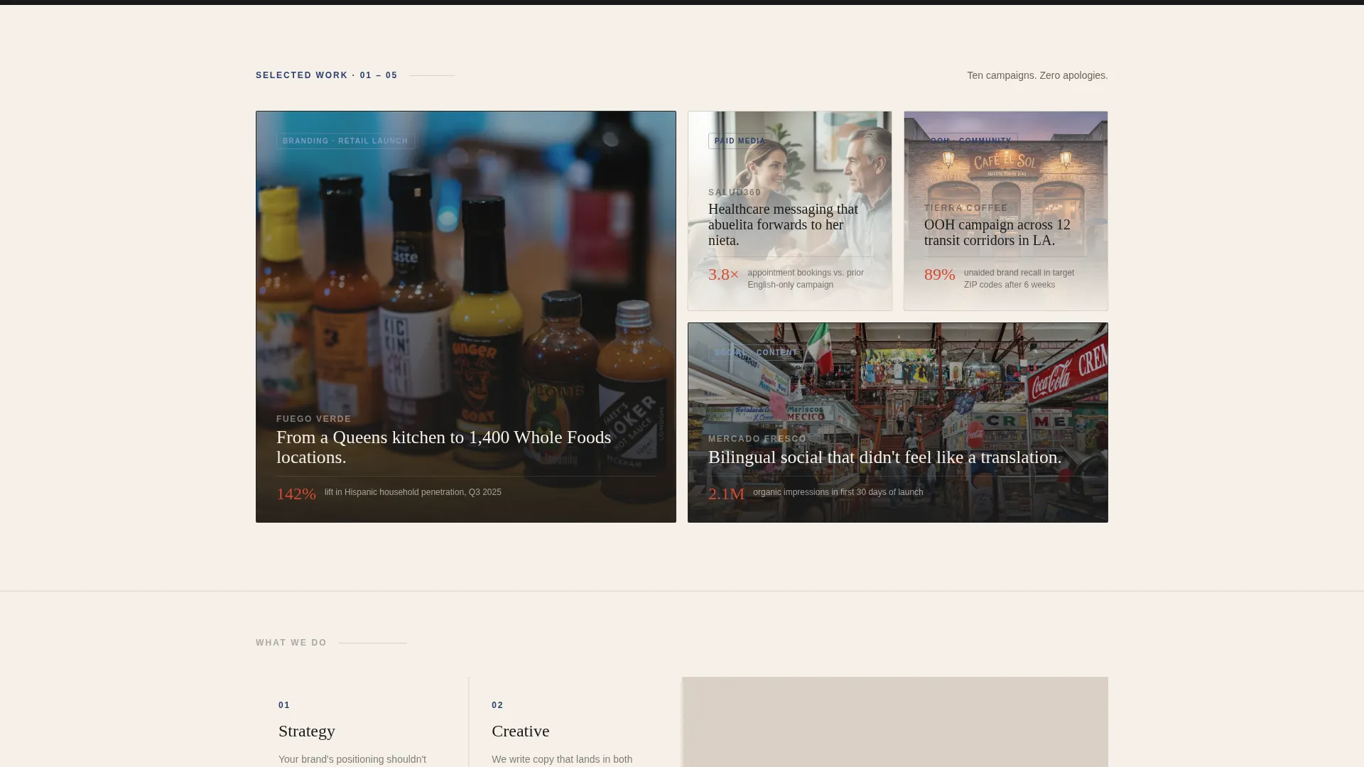
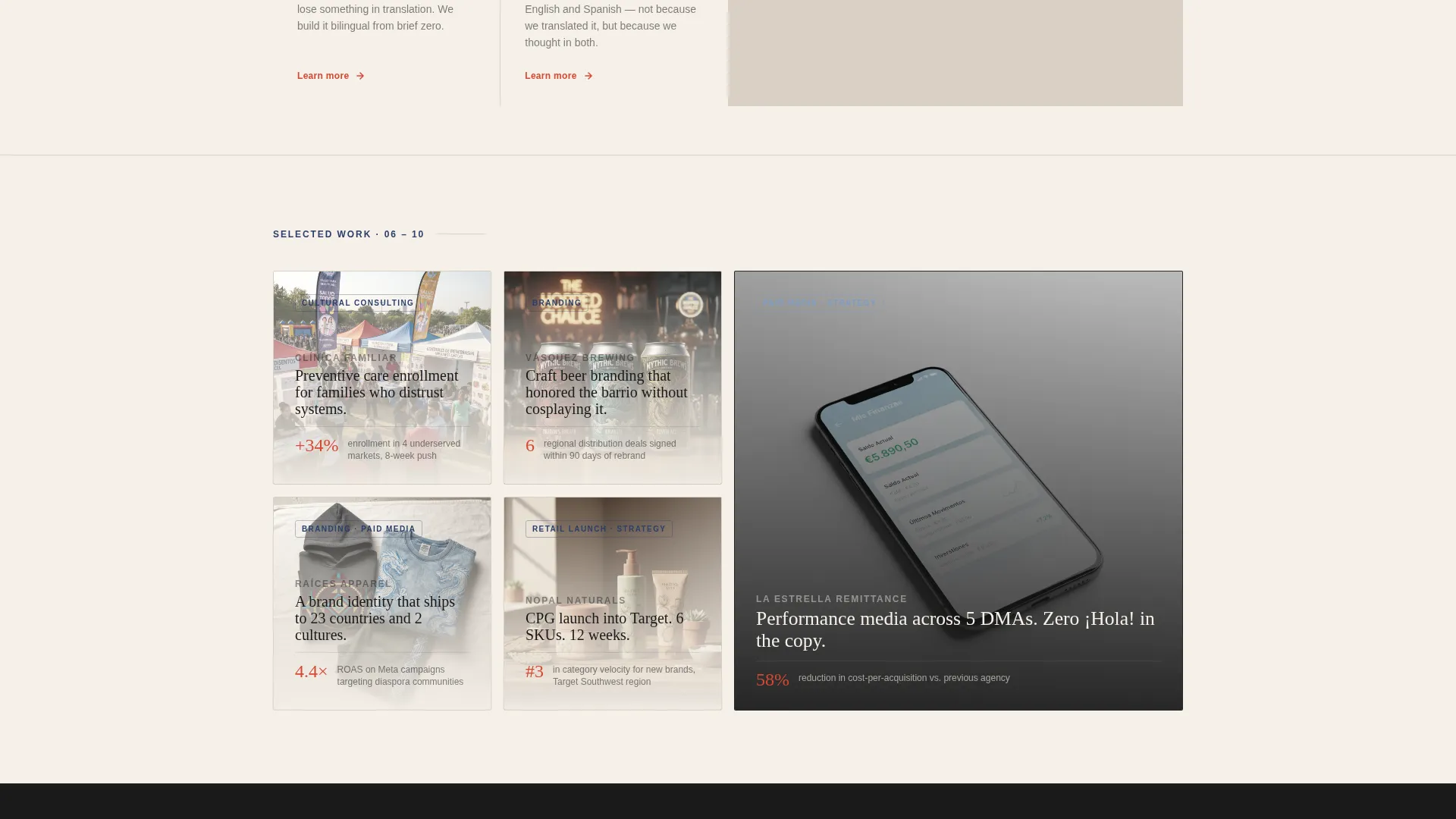
- An intentionally uneven bento grid of campaign cards, each carrying a logo, hero asset, two-line result, and category tag
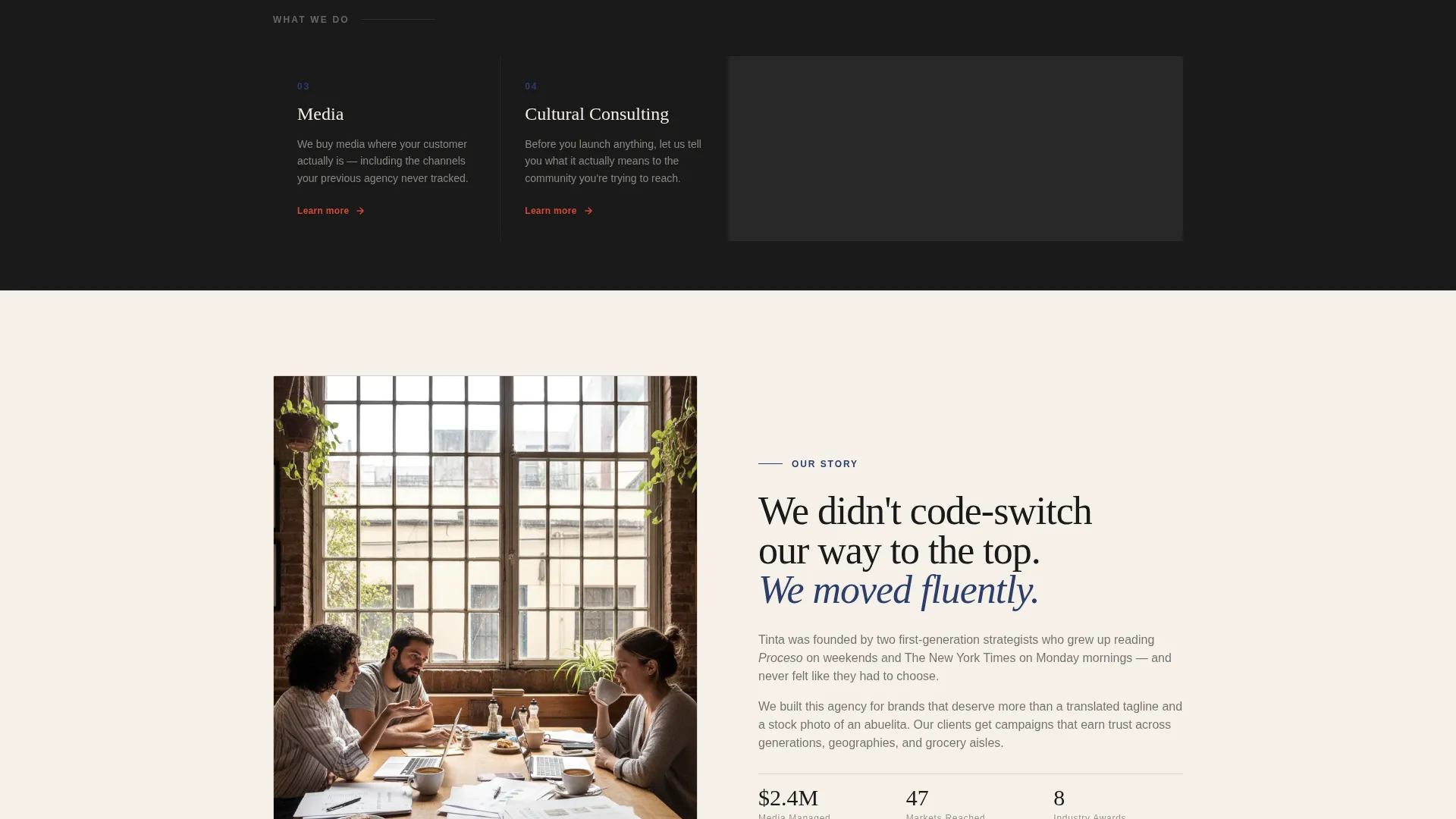
- Narrow full-width capability strips that introduce Strategy, Creative, Media, and Cultural Consulting between campaign clusters
- A sticky bottom call-to-action bar that appears after the third bento row, plus a full-width vermillion closing button
Feature list
This template is built around a specific structural argument: show proof, then ask. Every feature below supports that sequence.
Full-Bleed Editorial Header
The header uses an overhead photo of a real working surface, Spanglish briefs, Pantone swatches, a cafecito in a Talavera mug, and a hand mid-sketch. A bold serif headline sits low-left: "Culturally Fluent. Commercially Relentless." No subhead competes with the image.
Uneven Bento Campaign Grid
The bento grid is intentionally asymmetric. Some cells span two columns; others are tight squares. Each card holds a brand logo, a single hero asset, a two-line result, and a category tag such as Branding, Paid Media, or Community. The uneven layout encourages the eye to browse rather than skim.
Capability Strip Dividers
Between campaign clusters, a narrow full-width strip introduces one agency capability per appearance. Each strip carries one provocative line. The rhythm alternates: proof, proof, proof, capability, proof, proof, proof, capability. The argument builds through evidence, not assertion.
Two-Path Conversion Structure
The primary call to action routes visitors to a short intake quiz covering industry, budget range, and cultural gap. A secondary path offers a one-page case study PDF download in exchange for an email address. No form lives on this page itself.
Sticky and Closing Call-to-Action Layers
The primary call to action, "See How We'd Approach Your Brand," appears first as a sticky bottom bar after the third bento row. It reappears as a full-width vermillion button at the page close. The placement is calculated: the visitor has already seen the results before the ask arrives.
Page sections overview
| Section | Purpose |
|---|---|
| Full-Bleed Header | Opens with editorial photo and bold serif headline to establish credibility immediately |
| Bento Campaign Cluster One | Displays first set of campaign cards with logos, hero assets, results, and category tags |
| Capability Strip One | Introduces Strategy capability with one provocative line |
| Bento Campaign Cluster Two | Continues proof sequence with second set of campaign cards |
| Capability Strip Two | Introduces Creative capability with one provocative line |
| Bento Campaign Cluster Three | Third campaign cluster triggers sticky call-to-action bar on scroll |
| Capability Strip Three | Introduces Media capability with one provocative line |
| Bento Campaign Cluster Four | Final proof block before page close |
| Capability Strip Four | Introduces Cultural Consulting capability |
| Closing call to action Block | Full-width vermillion button and secondary PDF download path |
Design & branding system
The visual identity follows a Neo-Retro theme built around an Ink and Paper color system. The palette references mid-century editorial design, the kind of typographic authority that carries warmth in its grain.
- Deep editorial black (#1A1A1A) owns the body type; unbleached stock cream (#F5F0E8) dominates the canvas background
- Fountain-pen blue (#2C3E6B) anchors section dividers and secondary labels; stamped vermillion (#D64933) is reserved strictly for calls to action and hover states
- The header photo is warm, high-grain, and slightly desaturated to read like a film stock photograph rather than a polished studio shot
Mobile & speed optimization
The bento grid layout adapts to narrower viewports by collapsing multi-column cells into a single-column stack. The sticky call-to-action bar remains visible on mobile scroll without blocking content.
- Campaign cards restack vertically so logo, hero asset, result line, and category tag remain readable at smaller sizes
- Capability strips maintain their full-width presence on mobile, keeping the proof-to-capability rhythm intact across devices
How this template helps you convert
Tinta earns the click by making the visitor feel like they are already behind by not working with this team. The conversion logic is structural, not decorative.
- The page shows ten campaigns worth of results before the sticky call-to-action bar ever appears, so the ask arrives after trust is already built
- Two conversion paths serve two buyer temperatures: the intake quiz captures ready buyers, and the PDF download captures browsers who need more time before committing
Other information about this template
This template is categorized under Retail and E-Commerce with a Hispanic-Owned Business subcategory. The intersection context aligns with a Hispanic-owned art gallery niche, making the template adaptable for creative studios, cultural consultancies, and portfolio-forward service businesses beyond pure marketing agencies.
- The template style uses an Overlap and Layered approach for visual depth within the bento grid cells
- The creative direction is a Curated Collection, meaning each bento cell functions as a self-contained exhibit rather than a repeating module
- The landing page direction is oriented toward Direct Sales, routing visitors efficiently toward a booked discovery call or a captured email address
- No form appears on the page itself; all data collection happens off-page through the intake quiz or PDF download flow
Theme
Neo-Retro
Creative direction
Curated Collection
Color system
Cloud Canvas
Style
Overlap/Layered
Direction
Direct Sales
Page Sections
Full-bleed Editorial Photo Header
Asymmetric Bento Campaign Grid
Capability Strip Dividers
Two-path Conversion Flow
Sticky and Closing Call to Action Placement
Related questions
Can I use this template without a large portfolio?
Does the template include the intake quiz or PDF download as built components?
Can I edit the headline and capability strip copy?
Is this template suitable for agencies outside the marketing sector?
Can I adjust the color palette for my own brand?



